47

We've been brainstorming a lot lately with the product team about how to improve the experience of joining and participating on Stack Overflow. One project is meant to help users find better content and allow everyone to share more about themselves.

Today, we're shipping the first pieces of these projects:

  • New users will now go through a new signup confirmation screen which:

    1. captures tags preference (which will make browsing question list more relevant), and
    2. lets them share where they code (which will eventually be linked to the team pages)
  • Existing users will also be able to share where they code (in the settings on your profile page).

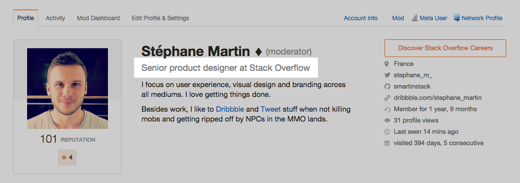
Profile page

N.B.: all of this can be skipped during signup and is always optional to everyone editing their profiles.

Once it's fully tested, we'll announce it to all existing users and provide for them an easy way to share this information.

In the mean time, if you see any bugs or would like to share thoughts about this please let us know in the form of answers to this post (please try to limit bug reports to one bug per answer so I don't miss anything!)
10
  • 1
    So is the twitter link. and dribble. point?
    – Kevin B
    Commented Oct 9, 2015 at 15:53
  • You're right @davidism, I was so focus on making the perfect screenshot that I forgot to remove those information. I will update my profile and so the screenshot. Regarding the twitter & dribbble links, that's my personal choice :). But you're also touching another great point, your information (about where you code) can be now well organized. It's easier to scan VS everything in about me
    – Stéphane
    Commented Oct 9, 2015 at 16:00
  • Would you consider adding other dedicated links? For example, you have a GitHub but not a BitBucket link. At least for me, that's why I have my links in my about me. I agree it's easier to scan though.
    – davidism
    Commented Oct 9, 2015 at 16:11
  • Yes @davidism we want to explore that road. Github and twitter appeared because people used them a lot in about me, it'd be the same for others. I'm not saying "we'll do it" but if a lot of people use it we'll consider adding another field.
    – Stéphane
    Commented Oct 9, 2015 at 16:13
  • 6
    Why is there a sudden surge of changes with SE and SO in general? Are the investors getting worried? And based on your screen shot this goes to integrate with the new teams functionality? I take it the reason why it says "...at StackOverflow" is because stackoverflow would be your "team" or "company" page? This then links or integrates with careers???
    – JonH
    Commented Oct 9, 2015 at 17:07
  • 11
    It's harvesttime, @JonH. The seeds that were planted are beginning to bear fruit.
    – Shog9
    Commented Oct 9, 2015 at 17:10
  • 2
    @Shog9 - Not all fruit is delicious..some can be rotten!
    – JonH
    Commented Oct 9, 2015 at 17:11
  • 7
    Hence the need for skilled harvesters
    – Shog9
    Commented Oct 9, 2015 at 17:12
  • 15
    I'm not sure I want to know more about other users on SO. At the moment, they're just coders of a certain skill level with a problem or a solution, and I like it that way. What you don't know doesn't cloud your judgement. Commented Oct 9, 2015 at 19:53
  • 2
    "allow everyone to share more about themselves" A bit disingenuous. The new career information fields don't allow anyone to share more than they already can in the free-form "About me" box. I feel like the real reason for the new fields is just to push the teams feature (and the careers site?) and make career information easier to process by machine.
    – Boann
    Commented Oct 9, 2015 at 21:29

5 Answers 5

27

I like it! Seems like a nice touch and another way for us to engage each other and know more about those who we see here and to find more information on those whose answers we like.

One thing I noticed is that "Where I code" can only be one place (work, school, I just <3 to code) but many of us fit into one, two, or all of those categories. Wouldn't it be good to be able to choose any?

Let me show you with a drawing:

enter image description here

11
  • 2
    Actually we want to do more or less something like this, but we wanted to test the basic concept before going too crazy about it :)
    – Stéphane
    Commented Oct 9, 2015 at 15:25
  • 4
    @StéphaneMartin fair enough. And now you have my approval to move forward on it :P
    – codeMagic
    Commented Oct 9, 2015 at 15:25
  • 11
    "Seems like a nice touch and another way for us to engage each other and know more about those who we see here and to find more information on those whose answers we like." AAAHHH!!! SOCIAL NETWORKING!!! GET THIS FILTH AWAY FROM ME!!!
    – BoltClock
    Commented Oct 9, 2015 at 16:32
  • 6
    (current status: thinking of something to put in my profile's "Just <3 Code")
    – BoltClock
    Commented Oct 9, 2015 at 16:33
  • @BoltClock Haha! I knew something like that was coming as I was writing that. But it's a way to learn more about each other's code and things related to code. Not posting about what we had for dinner or the new outfit I bought for my dog, err...unicorn :P
    – codeMagic
    Commented Oct 9, 2015 at 16:36
  • Actually, why does it ask this at all ? (Where) does it actually display the choice you made ? cc @Stéphane Commented Oct 9, 2015 at 17:36
  • @JonasCz Presumably if you choose Work or School, the system would try to suggest team pages for you in the future. Commented Oct 9, 2015 at 17:38
  • @JonasCz Everything is displayed below your name on the profile page.
    – Stéphane
    Commented Oct 9, 2015 at 17:39
  • I mean the "I code for Work / School / Fun" choice ? I don't see it in my profile, I only see what I entered into the textbox. @StéphaneMartin Commented Oct 9, 2015 at 17:43
  • @JonasCz oh I see, the choice isn't displayed. Only what you entered in the fields.
    – Stéphane
    Commented Oct 9, 2015 at 17:44
  • Using the "Work" field isn't a big deal and makes sense. But if you use "<3 code" it could be confusing because it just shows whatever the project name is.
    – codeMagic
    Commented Oct 9, 2015 at 17:46
21

It's not immediately clear to me (and probably to others) what "Just <3 Code" means:

enter image description here

Maybe it could be changed to something more obvious ?

12
  • 1
    That's a fair concern. We created this bucket for all the people who don't fit into "work" or "school", you can love code and code every weekend but not be a professional coder. That said, I do agree that it has to be clear.
    – Stéphane
    Commented Oct 9, 2015 at 15:22
  • 18
    I personally liked it :(
    – codeMagic
    Commented Oct 9, 2015 at 15:23
  • 1
    Or... "Other:"​
    – user4639281
    Commented Oct 9, 2015 at 16:40
  • 11
    Or "Enthusiast", since that's already in the description of who the site is for.
    – davidism
    Commented Oct 9, 2015 at 16:45
  • 5
    "I code for work/school/fun" is another idea we floated around internally the other day.
    – Adam Lear StaffMod
    Commented Oct 9, 2015 at 17:22
  • 5
    @AnnaLear Work | School | Other ? It may not be fun; it could be OCD instead. Or community service. Or something you once promised to help someone with and now regret. Commented Oct 9, 2015 at 19:45
  • 6
    I don't like that "<3" neither. It always looks like a ball sack to me.
    – honk
    Commented Oct 10, 2015 at 16:48
  • 4
    "Just icecream code" doesn't make sense to me either Commented Oct 12, 2015 at 6:46
  • Maybe Just &#9829; code looks better. OOOOPS! comments don't allow for Unicode characters! But it's a filled heart, believe me. Link Commented Oct 12, 2015 at 7:53
  • 5
    It means you have to choose "fewer than 3" options. Obviously. Commented Oct 12, 2015 at 8:13
  • 3
    :-) for "Obsessive Coding Disorder" @m69 Commented Oct 12, 2015 at 11:02
  • 1
8

The new job field doesn't show up in the hover card. In fact, only the location, website, and about me are shown. Moving information out of the about me section to avoid duplication when filling in the field makes it harder to see quickly; the hover card is the most prevalent way to see someone's information.

If showing the job is important enough to get its own field, perhaps it should be added to the hover card, or a more powerful way to choose what's shown on the card needs to be added.

7

I like giving new users a more up front introduction to favorite tags. That's a great way to get them more involved with questions they can answer.

If users want to share about their job, they can already do that in the "About Me" section below it or by linking their Careers profile. It seems like this is trying to make it a little bit more about the user's credentials rather than their contributions.

Is it just supposed to be another granular field like the website, Twitter, and GitHub links, or is there another purpose? Why add more dedicated fields if it can all be well organized in your about me section already?

8
  • Having a "title" of sorts for the about me text is nice IMHO, although it could be done with markdown in the actual text too. Commented Oct 9, 2015 at 15:47
  • 3
    I think separating it out has the same benefit that separating out the twitter and such links out has; it gives you one place where you can expect that information to live: Right above the about me section. you now don't have to search the about me section for this information, where it could be formated in thousands of different ways.
    – Kevin B
    Commented Oct 9, 2015 at 15:55
  • 6
    You don't need any of this, @davidism. Plenty of folks participate without ever filling in anything on their profiles. For those that do, it's nice to break out stuff that's commonly used and optimize the display for it - see Stephane's screenshot. As Grant noted, "twitter handle" and "github name" didn't used to exist either, but since lots of folks included them anyway it was worth optimizing for. We're hoping to build on top of this later on (see the Team Pages link), but even without that it's kind of a nice option for the folks that would be doing it anyway.
    – Shog9
    Commented Oct 9, 2015 at 16:09
  • @Shog9 yeah, I agree, it makes it look nicer for those that want to present it that way. What about other fields such as a BitBucket account? I'd personally find that useful, since more of my work is there than on GitHub.
    – davidism
    Commented Oct 9, 2015 at 16:14
  • 3
    For everything that doesn't have a dedicated field, there's still full Markdown support in your bio, @davidism. If enough people are including some particular bit of info, then maybe it's worth building in specialized support for it.
    – Shog9
    Commented Oct 9, 2015 at 16:15
  • 1
    @Shog9 yeah, it's a balance. One thing I noticed is that only the location and website fields show up in the hover card, so moving information out of the about me section actually might make it harder to convey quickly.
    – davidism
    Commented Oct 9, 2015 at 16:53
  • 3
    We do need to update that hover card logic.
    – Shog9
    Commented Oct 9, 2015 at 16:54
  • @Shog9 it's on our list of next steps :)
    – rla4
    Commented Oct 9, 2015 at 19:01
5

When I edit my profile, after answering the "where do you code?" question, I have two options: either to Save changes just for this community, or Save and copy changes to all Stack Exchange communities.

I haven't tested either of them, but if I click on the latter, will this information be shown on other SE sites?

I suppose it will not, as the question is not seen on e.g. English SE. This means that the button is not doing what it describes, which sounds like a UI bug to me.

If it will be copied to all sites, this also seems problematic - suppose someone is using the SE sites for non-computer related stuff only, then he/she won't be able to display information about his/her career, which seems discriminatory. A better question would then be "where do you work?" instead of "where do you code?".

You must log in to answer this question.

Not the answer you're looking for? Browse other questions tagged .