55

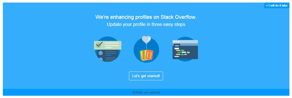
Your profile is used to show off a bit about who you are as a developer, who you are as a user of Stack Overflow, or whatever else you want to include in it. In our ongoing efforts to improve it, we recently performed some minor tests for both new and existing users. The testing went well and today, we're excited to announce that we're shipping some new pieces of the profile to everyone. You can easily make these edits by going to your profile, doing so, you'll be presented with:

Hero - step 0

If you don't want to add these details, you can close the box; you can always add them later (in your settings) if you change your mind. If you choose "Let's get started", then you'll go through a series of quick questions:

Where do you code?

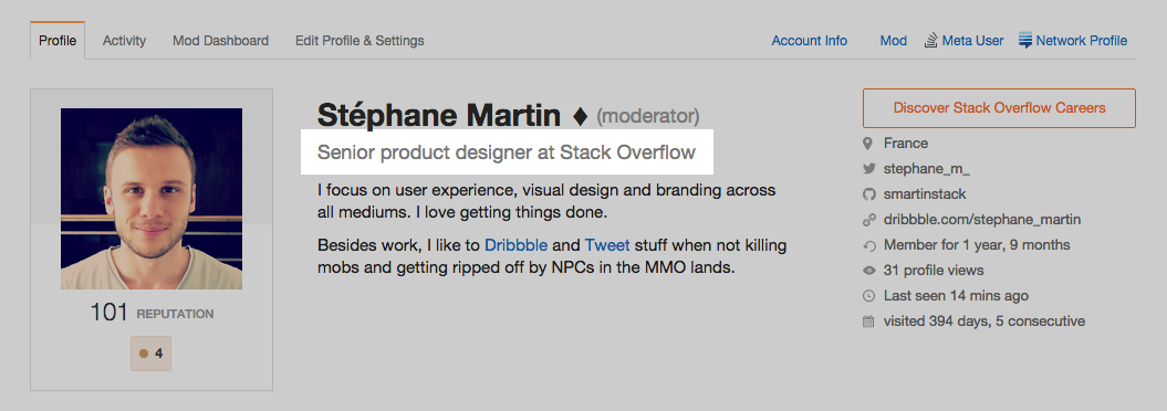
We're giving you a way to show off where you do your coding...it'll appear right under your name.

Profile page

Whether it's at work, school, or you code for fun, you can now easily display it.

Where do you code

Favorite Tags

While Favorite Tags isn't a new feature, we're trying to encourage users who don't have them, or don't update them, to pick some tags that they like. We've never highlighted favorite tags to new users, but they improve the home page for users who want to give back and find questions they may be able to answer, so we're fixing that.

Fave Tags

Job Status

We have a Careers site and we'd love to help you find a better job. You'll be able to tell us whether or not you are looking for a job. If you are, then we'll send you an invitation to join Careers. If not, you won't hear from us.

Interested in Jobs

Feedback

We're still improving the profile for both new and experienced users, and there is more to come in the future, but, in the meantime, we want your feedback and comments about these new changes. Let us know what you think!
11
  • 27
    Not a big deal but it sends a careers invitation even if you already have a careers profile.
    – codeMagic
    Commented Nov 10, 2015 at 16:20
  • @codeMagic Checking.
    – Taryn
    Commented Nov 10, 2015 at 16:23
  • 6
    What if you code at school and for fun and at home? It shouldn't be a radio button but a checkbox list control...should be able to select multiple.
    – JonH
    Commented Nov 10, 2015 at 20:45
  • 3
  • 2
    @codeMagic That should be fixed up now.
    – Adam Lear StaffMod
    Commented Nov 11, 2015 at 22:08
  • 6
    I see many argumentations ans suggestions, but not a single "thanks" for these new improvements. So thanks =)
    – Metafaniel
    Commented Nov 11, 2015 at 22:11
  • 4
    When I went through this wizard, I didn't realize that the "pick a few tags that interest you" step would mutate my favorite tags list. There wasn't any obvious indication that I was updating them, though in retrospect, there were hints. I don't think anything on the page was enough to make that clear, though. I use the favorite tags feature to highlight questions, not what my actual favorite tags are, so I put in a different set of tags, and it clobbered my favorite tags list. Commented Nov 11, 2015 at 23:38
  • @AlexisKing Thanks for bringing that up, we'll keep that in mind in a future announcement.
    – Taryn
    Commented Nov 12, 2015 at 14:24
  • 1
    @AnnaLear Thanks for the update! I really like these new features. Curious since I already have a careers account, what would ticking 'Not interested in jobs' do? Depending on what it does after you're set up, I could see a potential for a bug there (hopefully not unlinking the careers profile or anything of that nature)
    – codeMagic
    Commented Nov 12, 2015 at 16:15
  • 1
    @codeMagic Right now, you'd only get an invite to join careers if you click "actively looking" or "open to looking", we wouldn't unlink your profile from Careers if you selected "not interested".
    – Taryn
    Commented Nov 12, 2015 at 16:18
  • 1
    @bluefeet awesome, thanks! I didn't expect you to but I thought I'd make sure there weren't any unintended consequences there while on the subject.
    – codeMagic
    Commented Nov 12, 2015 at 16:26

10 Answers 10

65

The "Pick a few tags that may interest you" prefills your current favourite tags if you have any, so the page looks like this;

enter image description here

However, to me it looked like these tags were suggestions, and I was trying to click them to add them to my selection.

In other words, the current UI wasn't very intuitive to me. Instead, I've have expected something like this;

enter image description here

... which is more inline with the other UI elements on the site.

14
  • What do you mean by clickable? Clickable meaning it doesn't open the tag page or what, aren't you able to click the tag to remove it? There should be an "X" to remove it.
    – Taryn
    Commented Nov 10, 2015 at 16:42
  • 2
    @bluefeet: Can I trigger the dialogue again? I don't think clicking it opened anything. Clicking to remove it worked, AFAIK. I wanted to click the tag, then for it to be added to the tag text box below, a'la how the tags suggestion works on /questions/ask... isn't that the intended behaviour? It's how I interpreted the UI.
    – Matt
    Commented Nov 10, 2015 at 16:45
  • The list of tags you were presented with were the ones you already had selected for your favorite tags, it was a way to review them to remove some, or add more.
    – Taryn
    Commented Nov 10, 2015 at 16:47
  • 18
    @bluefeet: Ahhhhhh, in which case it works as designed. It is however, completely uiintuitive for me... I'd expect the UI to resemble the editing-a-question-tags UI, where the tags are prefilled into the text box. Lemme edit my post to make it a feature-request.
    – Matt
    Commented Nov 10, 2015 at 16:49
  • Well the tags were editable from that dialog - you could remove them via the "X" on the tag. :P
    – Taryn
    Commented Nov 10, 2015 at 16:51
  • 3
    @bluefeet: I get that now... but it's just unintuitive to me. I thought those tags were suggestions for me to add to my text box, and that clicking "x" was going to prompt more suggestions to inspire me (it seems CodeCaster thought the same thing). Perhaps my reworded post makes my issue more clear...
    – Matt
    Commented Nov 10, 2015 at 16:56
  • This version did seem a intuitive to us, obviously we missed it a bit. We'll take a look at improving. If not for this release, maybe for the next. Thanks for pointing out the issue.
    – Taryn
    Commented Nov 10, 2015 at 17:14
  • 8
    I had the same thought as Matt. Not sure why the whole tag is clickable above the input box if only the X on the end will do something. Also I'm not sure why this page even exists since it's not part of the profile view; it's more a preference/setting.
    – TylerH
    Commented Nov 10, 2015 at 19:24
  • 2
    I agree with this, I didn't get it..it should show the tag inside of the textbox.
    – JonH
    Commented Nov 10, 2015 at 20:47
  • Thanks for your report <3 I changed the cursor style to make the tags look less... clickable. Rendering them inside the textbox was actually our first idea, but it kind of looks weird when you have too many favorite tags, as some of them are just cropped. We'll add this to our list of improvements for our next release.
    – rla4
    Commented Nov 11, 2015 at 2:32
  • 1
    Just to add, I had exactly the same reaction as Matt. I thought I was supposed to click them to "add" them Commented Nov 11, 2015 at 20:05
  • 6
    It also doesn't make it obvious that these tags are your current tags, I removed a whole heap to make the list "clean" without realising I'd be removing a whole heap of my favourite tags :(
    – user764357
    Commented Nov 11, 2015 at 22:33
  • @LegoStormtroopr, as I've added tags I really don't care to follow.. like interface Commented Nov 11, 2015 at 23:56
  • And I was looking forward to 'much more relevant questions and answers', but it seems like perhaps I already got all of the benefit that exists since I already have 15 tags and I don't want more or less right now. This dialogue should probably have different text for experienced users - it's an opportunity to TUNE your existing favourite tags.
    – Alex Brown
    Commented Jul 7, 2016 at 19:53
43

Now, we're inviting you to join Stack Overflow Careers, a job platform with no spam and no scams, where developers are always in control.

I have a careers profile and it is linked to my SO account.

Why was I even shown this question? Or at least show it to me with my current job hunting status selected.

2
  • 13
    Yep, it's a bug, working on it
    – rla4
    Commented Nov 10, 2015 at 16:36
  • 3
    Thanks for your report <3 This has now been fixed. We will no longer send you an invitation if you already have a Careers profile, regardless of it being publicly linked to your SO profile. We still ask if you'd like to update your current job hunting status, but users who already have a Careers account will not see the "we'll send you an invitation" message.
    – rla4
    Commented Nov 11, 2015 at 1:42
19

Why can I only choose between one option of "Where do you code?"

I code at work (Gupta, Java, PL/SQL) and I code in my freetime (PHP) - so how to choose two?

6
  • The question is to pick the one that you want to display on your profile - whether it's where you work or what you do in your free-time. At this time, it's not multiple options.
    – Taryn
    Commented Nov 10, 2015 at 18:30
  • 7
    @bish We're currently building the ability to add several, but it will be another release :)
    – Stéphane
    Commented Nov 10, 2015 at 18:44
  • 1
    I could answer all 3 and would like to. I'm working full-time and going to school and code in my spare time... I should get out more. But I digress, These shouldn't be mutually exclusive. It's not like I can't do one because of the other.
    – Dan
    Commented Nov 10, 2015 at 23:07
  • I used a work email for my other SO account, so the distinction is clearer to me.. I would use a student email if I were a student... I suspect the mutually exclusive concept is based on your contact info.. Commented Nov 12, 2015 at 0:01
  • +1 one. I want to select ALL THREE options.
    – Alex Brown
    Commented Jul 7, 2016 at 19:46
  • Agreed that these shouldn't be mutually exclusive and should possibly be decoupled from the "X Developer at Y Company" description under profile name. I was surprised that this hasn't been mentioned more, surely a lot of SO users are in this situation? I genuinely do code for work, school and fun and wouldn't want to set up three different SO accounts to handle that
    – Parrybird
    Commented Aug 9, 2016 at 21:06
14

Couple of things:

  • It would be nice if on beforehand, the "wizard" would explain where and to whom the entered information will become visible.
  • Clicking the suggested favorite tags doesn't do anything (Chrome)
  • I don't have my Careers profile linked to my SE account, but I do have one. Yet I did get a Careers invitation in the mail.
5
  • We're checking why the 3rd bullet.
    – Taryn
    Commented Nov 10, 2015 at 16:35
  • The jobs interest box DOES convey that it's not public. Did you mean the others, or that you wanted more info on that one?
    – Jaydles
    Commented Nov 10, 2015 at 17:07
  • 4
    @Jaydles to me it looks like a dialog that Facebook or LinkedIn would show you. Like "Do you know X" or "Did you work at Y". There, it's clear what will happen with what I enter. Given the average user is not an avid MSO reader, they may not even know about what fields are available on their profile. Which is my point: the dialog does not clearly show what happens when you enter the requested information.
    – CodeCaster
    Commented Nov 10, 2015 at 17:15
  • 4
    I agree, this is very reminiscent of LinkedIn and Facebook, and not in a great way.
    – TylerH
    Commented Nov 10, 2015 at 19:21
  • And clicking the X in the tags removes them here but not in your overall favorites. meta.stackoverflow.com/questions/310054/…
    – Jan Doggen
    Commented Nov 18, 2015 at 22:41
11

Sounded exciting. So here's what I did:

  1. Go to SO home page;
  2. Click my user name;
  3. Click "Let's get started";
  4. Fiddle around with the options, but decided I don't want to show anything from step 1 on my profile at all;
  5. Quit the wizard.

At this point it told me it wouldn't bother me anymore.

However, when I check my profile in an incognito tab, I see the "My Work" settings I had selected in step 1 of the wizard, even though I thought I had cancelled it. Apparently it saved my choices, even though I exited the wizard.

Expected outcome: no saved "Where do you code" section.


Following up on the previous, I went to my profile to remove this information. However, it's not possible to unselect the "Where do you code" option: it acts like a radio button list where it's not possible anymore to unselect all options.

Expected: an option to clear that section or unselect all three options or...


Following up on the previous, I left things at "Work", but cleared the two text input fields and saved. I refreshed the incognito window, but it was still there. Only after a short while did it dawn on me that this would perhaps be cached information. (Then again, just now there was nearly no delay. Perhaps I'm imagining this part of my report? (Then again, right after that, it does have a delay when I switch the "radio button"? (Then again, play inception soundtrack here...))).

Expected: a warning on my profile page that changes might take a bit to percolate.

1
  • 2
    Those are fair points, we'll fix them in the near future
    – Stéphane
    Commented Nov 12, 2015 at 14:14
9

The "All fields are optional" line at the bottom should be more readable. Right now it's a different color from the rest of the text, hidden on a darker background with poor contrast, smaller, and shoved to the bottom.

It's almost as if you don't want people to realize they don't have to do this.

Also, clicking the tags in this wizard doesn't add them to my interested tags list, even though my cursor changes to a pointer when I hover over them. Edit: I see Matt has already reported the tag bug.

8

I don't really like the highlighting of questions with tags that I'm interested in after selecting interests for my profile. I'm interested in popular topics so the majority of my homepage is highlighted now and the experience feels jarring. At least its not blinking I guess.

2
  • 8
    This is not a new issue, but I agree 100%. We've been looking at better ways to handle this, and even considered trying to ship another way to handle this with this feature, but didn't get to a solution we liked in time. We'll keep considering ways to solve this, though - I don't love it myself.
    – Jaydles
    Commented Nov 10, 2015 at 17:04
  • I guess I'd never set my interests before I was prompted to today? Anyway, thanks for the response.
    – Mike K.
    Commented Nov 10, 2015 at 17:31
8

I really like this idea however I want to display more than one "Job". I both work and study I would like to be able to show both.

I think it would look something like this.

Nice descriptions

3
  • 1
    Thanks for the suggestion, at this time we will only be displaying a single "primary" job. Maybe we'll look at adding this in the future.
    – Taryn
    Commented Nov 16, 2015 at 13:57
  • Thanks @bluefeet for me I'd rather show nothing than just one, thats just my personal preference. Commented Nov 16, 2015 at 17:38
  • 1
    @AshleyMedway meta.stackoverflow.com/questions/310641/… Commented Nov 20, 2015 at 9:18
3

I just noticed this problem through its symptoms, so I do not know whether this it still persists, as I don’t know how to access the current version of the interface:

To add to Matt’s answer, it wasn’t clear to me at all that Pick a few tags that may interest you was about favourite tags. This lead to my favorite-tags filter for all of Stack Exchange to be flooded with and questions.

1

There should be a link from the wizard to this answer "Help improve this process>", or "What is this?" so people can comment/complain about it. As it was, I searched meta for 'profile and information' to find this, but that's not necessarily obvious to all users.

You must log in to answer this question.

Not the answer you're looking for? Browse other questions tagged .