144

Can we have an automatic filter/block or some other mechanism to prevent submission of posts in which people leave "enter code here" in the default code blocks created by the post editor?

Background

When a user is writing a post, if the user is on a blank line (or if the post is blank) and either types Ctrl+K or clicks the {} editor button, the editor adds an indented line with "enter code here" boilerplate, like this:

enter code here

If the user hits Ctrl+K or the {} button on a line that already contains text, the editor adds an inline enter code here block (with backticks).

The Problem

Some new users leave these boilerplate blocks in their posts. Others start every line of what should be an indented code block with the code block enter code here, as opposed to using four spaces like they should. As a result, they often produce truly horrific posts, such as the initial version of this question, that are absolutely riddled with this phrase. (Screenshot below for your convenience.)
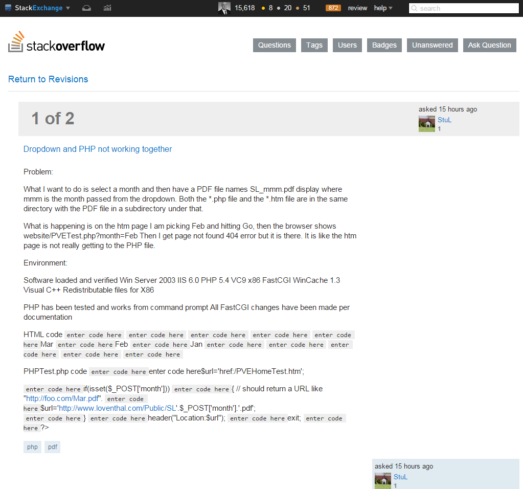
screenshot of enter code here blocks run amok

Obviously, people sometimes need to use this phrase once or twice, as this question demonstrates. But when it shows up in backticks 20 times, as in the example above, an automatic block on the post seems reasonable. The alternative is that we continue getting posts that clutter the site and require significant editing to be legible. As discussed in the comments, this actually happens quite a bit. Searching the site for the phrase in question yields 767 hits, and those are just the ones that haven't been edited or closed and deleted.

The Solution

Proposed resolution: reject the post and alert the user that they appear to have clutter in the form of the text "enter code here" in their post. Require the user to fix the problem before posting or at least verify that they want to use the phrase "enter code here."

EDIT: As an alternative or additional solution, consecutive lines starting with a backticked enter code here block should be automatically indented. For example, this raw text:

`enter code here`<html>
`enter code here`<head>
`enter code here`<title>something</title>
`enter code here`</head>

should at least be automatically rewritten as

<html>
<head>
<title>something</title>
</head>

(with four leading spaces to create a code block).

Maybe we can't save lazy or incompetent users from themselves, but we can at least reduce the retina burn that they can inflict on the rest of us.

EDIT: This link was posted in the comments and is too on-point not to share here.

22
  • 55
    Is this something you see on a regular basis? Looks like they just didn't understand how code formatting works...
    – apaul
    May 28, 2015 at 23:57
  • 19
    @apaul34208 I've seen it maybe a dozen times this week. One example, which I can't find at the moment, was much worse than this one.
    – elixenide
    May 29, 2015 at 0:04
  • 10
    People are using all leak-holes possible to post their crappy code, questioning for debugging it, and undergo the engine's declination of code only questions without proper explanations. I've even seen lorem ipsum added, to get a question going through the engine's filter. May 29, 2015 at 0:18
  • 3
    @πάνταῥεῖ Yep. Sad but true. This seems like a simple fix, though, compared to some of the other filtering that is in place.
    – elixenide
    May 29, 2015 at 0:20
  • 11
  • 2
    @GEOCHET thanks. Here's another good example: stackoverflow.com/revisions/30480466/1
    – elixenide
    May 29, 2015 at 1:20
  • 3
    @GEOCHET and another: stackoverflow.com/revisions/30477292/1
    – elixenide
    May 29, 2015 at 1:22
  • 34
    If we had trending topics like in twitter, Enter code here will be trending too.
    – 0xC0DED00D
    May 29, 2015 at 7:23
  • 1
    It looks more like they thought <kbd>ctrl+k</kbd> would act as a tab character. May 29, 2015 at 9:22
  • 6
    That screenshot is completely unreadable.
    – JLRishe
    May 29, 2015 at 9:52
  • 32
    If you make it monkey proof, they just invent a better monkey.
    – GolezTrol
    May 29, 2015 at 14:01
  • 2
    @Zizouz212 I understood you, but I disagree that your proposal would fix this problem. First of all, lots of people do use markdown elements such as the indentation and backticks, especially if they use this site often. Second, many users of this site are not HTML experts and wouldn't know to use <pre>. Why not <code>, also a valid tag? Third, using <pre> wouldn't fix the problem here, which is lazy/sloppy/incompetent editing. What if the editor automatically created blocks like <pre>enter code here</pre> to help the user? We'd have the same problem, but with different syntax.
    – elixenide
    May 29, 2015 at 20:24
  • 2
    Could we really have something to fix this, it's still going on... Jun 18, 2015 at 9:46
  • 1
    Fixing meta.stackoverflow.com/questions/300679/…, while generally unrelated, would at least block some of the most egregious instances of this, like the example in your screenshot above. Nov 15, 2015 at 6:09
  • 1
    Similar issue with "enter image description here" (except you see dozens, if not hundreds of those every day).
    – Dan Mašek
    Oct 5, 2016 at 0:24

8 Answers 8

41

I'd quite like to see the post preview rendered horizontally alongside the entry box. I think it's the only way we could even get close to persuading these morons to use it.

Beyond that, no. Just downvote and delete. If they can't be bothered to spot this obvious horridness, what do you think the rest of the question's going to be like? Odds of value: 0.06%.

As for an automatic block, well, I don't support that until basic moderation (by that I mean downvoting, closing and deleting) is overwhelmed by volume. I see no evidence of this here, personally.

10
  • 3
    I agree with the first part of this. As to the second part, at least some of the posts that have one or more stray enter code here blocks have value; in many cases, it seems like it's just an oversight. The extreme cases are probably beyond hope. But that is precisely why a complete block on such garbage makes sense.
    – elixenide
    May 29, 2015 at 15:41
  • 5
    @EdCottrell: I don't support automatic blocks until basic moderation (by that I mean downvoting, closing and deleting) is overwhelmed by volume. May 29, 2015 at 15:43
  • Fair point. I don't agree -- I think certain levels of garbage should be blocked as a preventative measure -- but I certainly see your point. For the record, I upvoted your answer, even though I'm not 100% on board with it.
    – elixenide
    May 29, 2015 at 15:45
  • 3
    @EdCottrell: They're just flawed by nature and I think we've seen that time and time again here :) (recent example: "|-|elp me") May 29, 2015 at 15:45
  • 1
    Yeah, I saw that one. What a disaster. The key difference between that post and the example in my question, though, is that the latter is extremely easy to filter. The example you gave is a terrible question, but hard to filter automatically. On the other hand, I can't think of a single scenario in which a valid question would contain enter code here 20 times, particularly in multiple consecutive lines, as in the raw source for my example. That is easy to filter.
    – elixenide
    May 29, 2015 at 16:00
  • 2
    @EdCottrell: But it's also easy to just delete when you see it, and loading up the system with specific cases seems like a pointless uphill battle :P Keep it lean and mean I say. Besides, if someone is stupid enough to write posts like this I'd rather the result contributed to a question ban. May 29, 2015 at 16:21
  • Rather than having the current plain text and preview windows, a big improvement would be where the user edits in a wysiwyg window. That way, when the user clicks the code button or hits ctrl+K, he'll see his mistake right away. For power users who want to make the most of markup, there could be a button that toggles between that mode and the current two window mode. Or, it can be done like in Jira, Confluence and other Atlassian web style products. There, you have a wysiwyg window that lets you enter markup, HTML, etc., and there's a button that toggles between edit window and preview.
    – RobH
    May 29, 2015 at 16:55
  • 3
    @RobH: Meh, maybe. I must admit I'm becoming gradually less averse to WYSIWYG as the editors improve. Still, for Markdown, I love the way MarkdownPad does it. And honestly if somebody can't figure out Markdown and a preview pane, they have no bloody hope of success in software development anyway. May 29, 2015 at 17:42
  • 2
    This answer sums up my view the best. Fact is, this is a feature request and as such starts out with the proverbial -100 points. We have tools available to us to deal with poorly-written posts, including of this sort, and there are other things the time of the SE devs would be better spent on. Would it be nice to auto-block something like this? Maybe. Is it worth the effort to write code to do that, before SE writes code to do something else useful? I don't see how it could be. May 31, 2015 at 0:24
  • 1
    I decided I would finally accept this answer. It's probably the best approach (for now) to handling the mix of (1) good questions with bad editing and (2) utter garbage.
    – elixenide
    Nov 9, 2015 at 21:58
39

I think we should emphasize looking at the preview in the error message (because, if the user did, they, more often than not, would've seen the problem).

8
  • 6
    I think the edit link should also be emphasized, because I have seen people searching for it on the post, but they interestingly ended not finding it at all.
    – falsarella
    May 29, 2015 at 14:35
  • 3
    This definitely needs to be part of the solution.
    – elixenide
    May 29, 2015 at 14:42
  • 1
    @Radiodef Given that I can't possibly hope to understand the type of people who post questions like the one mentioned in this question, my suggestions are more like throwing darts while blindfolded. I have no idea whether it would help to try to emphasis it more, but, I mean, it can't really hurt if we're showing the message anyway. Well, someone could maybe lose an eye. May 29, 2015 at 16:18
  • I think we should emphasize looking at the preview. Full stop. May 31, 2015 at 7:32
  • big bright edit and delete buttons
    – user4639281
    May 31, 2015 at 7:42
  • Re emphasizing the preview: meta.stackoverflow.com/questions/295682/… May 31, 2015 at 8:44
  • Would be nice to have something done about this, there are currently over 1.3K posts featuring the infamous enter code here.
    – Luuklag
    Nov 9, 2018 at 13:50
  • @Radiodef scrolling past things to get to the end, and not looking at them, is easy (well, except on infinite-scrolling social media sites). In UX circles, It Is Known that people tend to skip through the middle part. It is much harder to ignore something that is taking up half the screen for the entire time that you are writing your message. Jun 1, 2022 at 3:53
6

Yes, I agree, but only for snippets where the complete snippet consists of the placeholder text. I still want to retain the possiblity to write "enter code here" in a comment in code or something like that.

3
  • Looking at some examples, this clearly won't catch a lot of these. I think legitimate use of enter code here"enter code here" is rare enough that a simple string search is acceptable. May 29, 2015 at 14:08
  • 1
    Alternatively, check for "enter code here" appearing directly before or after a code sample, or as the first or last text of one (although I suspect that will still miss some cases). May 29, 2015 at 14:21
  • Just check if it shows up multiple times? May 29, 2015 at 15:13
5

I think part of the problem is the edit link that isn't enough emphasized.

I have seen people searching for it on the post, but they interestingly ended not finding it at all.

That's really bad, because they found something wrong in their post that they accidentally haven't noticed on the preview, but just left it incorrect just because he/she couldn't find out how.

5
  • 5
    big bright edit and delete buttons
    – user4639281
    May 31, 2015 at 7:45
  • It's perfectly easy to find. Making it bold and big and in flashing colours is (a) obnoxious, and (b) spoonfeeding. I'll have no part of it! Nov 9, 2015 at 22:33
  • 1
    @LightnessRacesinOrbit I agree, the edit does not need to be a big blinking button to be findable. The point is: I've seen newcomers not finding how to edit their own post. In my opinion, a deeper usability analysis with A/B tests focused on those types of users, for example, could be suitable to mitigate such inefficiencies. One of the possible outcome could be, i.e.: "add a help text guide after someone submits the first post so they become familiar with the UI".
    – falsarella
    Nov 10, 2015 at 17:20
  • @falsarella: There is a help text guide that is shown to all users before their first post. If they are not familiar with the UI by the time they write their first post, we know that they ignored it! Nov 10, 2015 at 17:43
  • 1
    @LightnessRacesinOrbit As I've said, it was an example. Analytics data is much more valuable than expecting we know and understand the user. I am not saying what's correct or incorrect here. Just saying it might be worth taking a further look on it, given the enhancements we'd get from it.
    – falsarella
    Nov 10, 2015 at 18:07
2

Originally I thought that the user entered write your code here by himself, which lead to an answer which is irrelevant.

Nonetheless, I still think that there will be little value of this feature. In my opinion, SO devs would spend hours designing/implementing/testing a feature, which will only give value (not sure it will give) to people who do not bother spending their 10 seconds reviewing the post. How hard is it to take a look at your question and ask yourself: 'what is the chance that a person looking at my wall of text would spend his time to answer it'.

So my suggestion (which I highly doubt that will be popular) is close downvote/delete and ban if such behavior continues. SO will not lose much if a posts similar to this would not exist, but community would have more time saving something savable, or answer more suitable questions.

8
  • 'write code here' appears when u click the add code button, it's not something a user might write himself.
    – Junaid
    May 29, 2015 at 10:26
  • 7
    "SO will not lose much if a posts similar to this would not exist" - which is exactly why SO should implement a filter to disallow posting those questions. It seems like you've misunderstood the issue - "enter code here" is an artefact automatically generated by the SE editor, which the users fail to use correctly, so it wouldn't make sense to change it to a similarily worded alternative (of course, some people might be stupid enough to do so). Removing the phrase increases question quality (a tiny bit), and putting a filter in place might stop some bad questions from being posted at all.
    – l4mpi
    May 29, 2015 at 10:30
  • @Junaid how exactly should I click it. When I am clicking it I do not see write code here. May 29, 2015 at 10:31
  • @l4mpi 'It seems like you've misunderstood the issue - "enter code here" is an artefact automatically generated by the SE editor', you are right. I did not know about that this is SE editor's fault. The problem is that I can not find out how can I get this behavior. May 29, 2015 at 10:34
  • 3
    Simply press Ctrl-K or the {} button in the editor to reproduce that for yourself (make sure you've not selected anything). And it's not exactly the SE editors fault, it's just that some people seem to be unable to use it or to look at the preview of their post.
    – l4mpi
    May 29, 2015 at 10:36
  • @l4mpi was using it for ages and never noticed that. Now I really wonder how much should you not care about your post to not notice a line of write code here May 29, 2015 at 10:39
  • 1
    yep, you can't fix stupid. May 29, 2015 at 13:33
  • 2
    I'd hope a string sniff for enter code here would be pretty easy to add ("hours" is certainly still fair). I hate scope creep as much as anyone, but after looking at GEOCHET's link, above, wow, it's a problem. Btw, fwiw, @SalvadorDali, the girl's picture has been gone from your profile pic (but its desc still on your profile) for a while. ;^)
    – ruffin
    May 29, 2015 at 13:40
1

I think blocking a user for this is going a bit too far, and downvoting/commenting for this specific issue is just too much work for something that could be rightly automated.

You can say that in most instances when this happens, it's either because the user posting is a new user and is slightly unfamiliar with the environment, or because they overlooked it and so it's a trivial error like typos are.

So putting up a helpful prompt like "Oops, looks like you forgot to edit the content here. Proceed anyway?" pointing to the line where the mistake is, would be helpful in both of these instances. Especially the former since the regular user could just edit it immediately after spotting it whereas a new user may struggle with figuring out how to edit a post as well.

This error message could trigger after the submit button is pressed, whenever any boilerplate text at all is detected in the answer, which could include :

**strong text**, *emphasized text*, [enter link description here][1], 
enter code here
> Blockquote
 1. List item
 - List item
## Heading ##
  [1]: http://

I think implementing this would be better than other suggestions because

  • The mistake is too trivial to make a big fuss about (comment, downvote, block)
  • This should be standard, since the placeholder text ships with the editor, there's a greater probability that this kind of mistake may be made, so it makes sense to include a warning note
  • It's new-user friendly. We want them to get familiar with the SO environment and not deter them for such a trivial mistake.
  • SO already does this: when you accidentally try to submit a question without tags, or post an answer without signing in or providing your guest name and email, SO prompts to correct you.
0

Based on the side-by-side markdown, it looks like the user in OP's example thought the code button was intended to be used like this:

  1. Find a line of code.
  2. Put the cursor at the beginning of the line.
  3. Click the code button.

Perhaps we need another button that actually does work like that.

2
  • 21
    I really don't think we should be catering to people who clearly couldn't bother looking at the preview. Also, what makes you think they'll click on the right button? May 29, 2015 at 13:51
  • 3
    Emphasizing the preview could help too. Feel free to post that as an answer.
    – Kevin
    May 29, 2015 at 14:05
0

What about an option that for new users when they submit a question it goes to a page that previews how the post will look to the community and then has a button for them to approve it to actually post it to the site. If they are not happy with it then we could have another button to take them back to creating the question.

Maybe we could also emphasize more that there is a preview below the text entry box that shows what their question will look like.

2
  • 4
    That's what happens. While writting, it shows a preview, and when the answer is submitted, the asker can edit it.
    – falsarella
    May 29, 2015 at 14:32
  • 5
    Emphasizing the preview below the post seems like a better idea than taking the user to a page which just duplicates the already-shown preview. May 29, 2015 at 14:41

You must log in to answer this question.

Not the answer you're looking for? Browse other questions tagged .