76

enter image description here

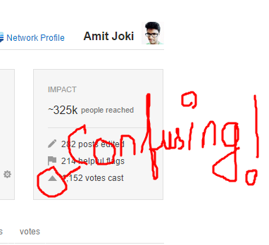
I've cast 1,152 votes, fine. But the icon beside it in my honest opinion seems to indicate that they are upvotes.

It's like I've upvoted 1152 posts, when I've clearly not. I've predominantly downvoted if you ask me. Can something more generic be used to indicate votes? Maybe a stat like icon or both up and down arrow?
19
  • 64
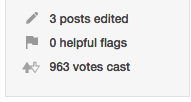
    I lol'd. Check out Eric Lippert's profile.
    – BoltClock
    Sep 21, 2015 at 15:43
  • 19
    I wonder who received that one upvote
    – Kevin B
    Sep 21, 2015 at 15:49
  • 36
    Jon Skeet. Jon Skeet is always the answer.
    – Amit Joki
    Sep 21, 2015 at 15:50
  • 29
    @AmitJoki, unfortunately the upvote was a random mistake.
    – Zanon
    Sep 22, 2015 at 0:19
  • 2
    Good on him for being an all-rounded contributor to the community...
    – scrowler
    Sep 22, 2015 at 1:18
  • I thought at one point it was the up/down arrow pair used on the privileges page (or maybe someone suggested that in the feedback question on the Big Meta). Sep 23, 2015 at 1:05
  • 2
    The tooltip says Total number of up and down votes cast. But your point seems legit.. Sep 23, 2015 at 4:08
  • 6
    "But the icon beside it in my honest opinion seems to indicate that they are upvotes.". I my humble opinion they seems that they are triangles. Sep 23, 2015 at 11:16
  • 4
    @FlorinGhita and in my humble opinion, the triangle pointed upwards in SE sites mean an upvote. Context matters.
    – Amit Joki
    Sep 23, 2015 at 11:29
  • 5
    But, but, but... I don't vote up or down. I vote to close!
    – vhu
    Sep 23, 2015 at 11:29
  • 1
    @AmitJoki sure, it was a joke Sep 23, 2015 at 11:32
  • 2
    @CodeCaster a small stat like icon might be used. And as far as a downvote and upvote, I'd expect the icon designers to distinguish between an upvote and a downvote and presumably, there would be a visible space between those(as is in the actual upvote and downvote buttons), which well, might clear any ambiguity that might crop up.
    – Amit Joki
    Sep 23, 2015 at 11:32
  • 2
    @CodeCaster - this ∨∧ is not like a diamond ;) Sep 23, 2015 at 16:48
  • 5
    Looks like an oversight on our end. I'm putting a status-review on this while I confirm that. Sep 24, 2015 at 10:57
  • 1
    @SheshankS. Yes, but this one has an official response (the [status-review] tag) and the other one doesn't, so I voted to close the other one as a duplicate of this one. Jul 13, 2018 at 0:48

3 Answers 3

32

Just inspect the element and change the span class to icon icon-up-down Problem solved (until you reload the page)

3
  • Yeah! This clears ambiguity. It's from privileges section I guess, but I'm not sure. FTW!
    – Amit Joki
    Sep 23, 2015 at 11:37
  • Unfortunately that icon is wider and makes the text not line up :(
    – gla3dr
    Sep 23, 2015 at 15:56
  • 25
    We might need to turn this into a browser extension, before the problem gets out of hand.
    – fstanis
    Sep 23, 2015 at 18:07
19

Stackoverflow Profile Vote Icon Changer UserScript

Until this very important feature request is made , well...

Am I doing this right?

// ==UserScript==
// @name         Stackoverflow Profile Vote Icon Changer
// @version      0.1
// @description  This script changes the votes icon to up AND down. Very important.
// @author       @misterManSam
// @match        *://*.stackoverflow.com/users/*
// @require      https://code.jquery.com/ui/1.11.4/jquery-ui.js
// ==/UserScript==

$('.impact-card .icon').css({'width':'18px'});
$('.impact-card .icon-vote-cast').switchClass('icon-vote-cast','icon-up-down').css({'width':'23px','margin-left':'-5px'});

It feels better now:

Screenshot

1
6

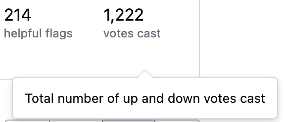
This portion of the user profile page has since been changed, and now looks like this:

screnshot of "votes cast" section of user profile page, with explanatory tooltip

You must log in to answer this question.

Not the answer you're looking for? Browse other questions tagged .