Tag hover experiment wrap-up and next steps is not monitored for feedback any more (only until yesterday - August 21, 2024) and neither is Upcoming sign-up experiments related to tags (which was until June 26th, 2024) and that last question said something has been released:
Update August 22nd, 2024
As discussed in the section referring to experiment three, we have released the simplified tag page header to Stack Overflow. We will revisit whether to release this change network-wide in the future.
(I am not clear whether it means an experiment was released, which affects some users, or it is related to all users)
With no other option for where to post feedback, I made it a discussion.
The top of the tag page (using javascript as an example) now looks like this:
Inconsistent "Watch tag" button
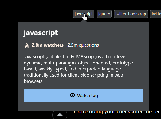
The "Watch tag" button lost the eye symbol and is now inconsistent with the "Watch tag" button on hover:
Feedback
At least make them consistent, if the goal is for the hover and the tag page to have similar look and feel
Inconsistent title
Similar to the button, it is different to the hover popup:
- on the tag page it is in square brackets
- on hover it is not.
Feedback
As with the button - maybe have it consistent.
Alternatively, lean into the inconsistency and add any other information on the tag page, as it has more visual space. Previously, the title said "Questions tagged [tag name]"
Watched tags
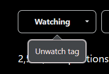
This is how it looks when a tag is watched:
 to me this does not at all indicate that the button is "active" other than reading the text. In fact, both seem to be inactive. If anything, it seems that clicking it will initiate "watching".
Feedback
Make it clearer that the button is "pressed" or "active" in some way. Right now it just blends with the background. Which is the same as the other button and that one is not "active".
Stop watch with extra steps
Trying to stop watching a tag presents you with a menu with a single item in it:
Feedback
Please do not make me click twice. Unless there might be other items in that menu but right now it just seems completely out of place.
Tag excerpt wiki as description
Seriously... we talked about how the excerpt was useful and it has been removed again. You1 seemed surprised by this2 and you1even tried to recognise this.
Yet you have now gone ahead and made the same change as before on the tag page.
Feedback
The tag excerpt is gone from that page. With the initial hover experiment, at least I could click on the tag to see the usage guidance. Now I have to click one more time (on "Go to Wiki") after loading that page to get to see it.
Compared to pre-experiment, the information is now two clicks and two full page loads away.
STOP MAKING ME CLICK MORE AND MORE!!!
Moreover, the choice to include the first sentence from the wiki means that often visiting a tag leaves you with about as much useful information as without even looking at it:
Let us suppose somebody was not aware of what an iPhone was. That is not going to be a lot of people. After reading this description these rare few would barely know anything about the tag. Nothing useful for using it on the site to be sure.
More missing tag information
Tags that have no wiki (but have an excerpt) show nothing on the tag page. This looks quite jarring.
More tags have the reverse situation - they have an excerpt but no wiki. So, visiting the tag page was at least of some use. Now more tags require more clicks to get to see any information about what the tag is about.
Feedback
You1 stop hiding useful information.
No "Ignore tag" button
About the hover graduation, you1 said:
We recognize that graduating this variant means one place fewer from which users can ignore tags.
Which was already a lie at that point, since
- The "Ignore tag" button was removed from the tag page during the experiment (for users who got variant other than A).
- You1 were fully aware a second way to ignore tag was going to be removed anyway.
Feedback
I seem now have an answer whether the "Ignore tag" button would be reinstated.
STOP MAKING IT HARDER TO USE STANDARD FUNCTIONALITY!!!
The two remaining3 places that allow tag ignoring in the UI are not very easy to find or use. Certainly much harder than clicking a single button. Seems even veteran users are not fully aware of one or both of these options.
1 as in collective for the whole Stack Exchange company
2 the excerpt being useful and how the tag wiki was not an ideal replacement was part of the initial feedback
3 finding which two left as an exercise to the reader4
4 if there is more than two, I do not know what those are. I hope you take that as "it is even harder to find and use"


![Old view of the tag page which reads "Questions tagged [javascript]" as a title on the top. Old view of the tag page which reads "Questions tagged [javascript]" as a title on the top.](https://i.sstatic.net/YGcgflx7.png)

![Tag page for the [iphone] tag. The description reads "The iPhone is a smartphone made by Apple Inc.". Tag page for the [iphone] tag. The description reads "The iPhone is a smartphone made by Apple Inc.".](https://i.sstatic.net/oTQxKTuA.png)
![The tag page for [http-redirect] which shows no description at all, although it has an excerpt. The tag page for [http-redirect] which shows no description at all, although it has an excerpt.](https://i.sstatic.net/GsUbH5ZQ.png)