34

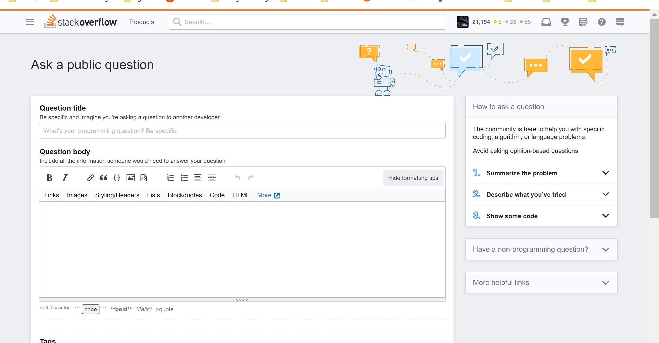
I went to ask a question just now, and was met by a new page:

New Question Screen

This seems like it's pretty new and I haven't seen any meta posts on it. I thought I'd give some immediate gut-thoughts on this new page

  • Honestly, I think the top-right is a little goofy and flashy looking. I think the simpler more reduced look that it had before was less jarring and was less to process. There's too much going on.

  • I like the right hand bar. The step-by-step streamlined guide says a lot of stuff that we've been needing to say in comments. The external SE links are nice too. It's all prominent enough that most people should be able to notice it no problem.

  • You got rid of the link to see the wizard. I kind of liked being able to see what new users were shown.
13
  • 14
    Wow. It's certainly an improvement; that much I can say.
    – Makoto
    Commented Sep 16, 2019 at 23:23
  • 17
    About half the people who see this post won't see this version of the ask page as it's part of an ongoing A/B test. We're taking some of the things we learned with the wizard and integrating them into the traditional form. Expect changes as we learn more from this test.
    – Jon Ericson Staff
    Commented Sep 17, 2019 at 1:16
  • 1
    It's possible we need to add it to the side bar, but check out the "Code" link in the formatting tips bar.
    – Jon Ericson Staff
    Commented Sep 17, 2019 at 1:17
  • @JonEricson Oh, you're right. There is an example in that tab. I missed that somehow. Commented Sep 17, 2019 at 1:30
  • 3
    @Carcigenicate: We'll have to see how it plays out for people who don't already know how to format. Really no reason you should click around since you already know how to do all of those things. ;-)
    – Jon Ericson Staff
    Commented Sep 17, 2019 at 1:33
  • 2
    Thanks for sharing your thoughts!
    – Meg Risdal StaffMod
    Commented Sep 17, 2019 at 13:29
  • 3
    @JonEricson - The tags are present now when the search for the title is done. Is it possible to consider them for the results of the search? A good example is to use the tag javascript, and the title how to sort an array. The search stackoverflow.com/… returns quite nice material, as opposed to the current search which does not consider the tag and returns a set which makes it seem that no one had asked this before.
    – Travis J
    Commented Sep 17, 2019 at 14:32
  • 1
    @TravisJ: That's a good suggestion. It's not on the plan yet, but I'll bring it up for future phases.
    – Jon Ericson Staff
    Commented Sep 17, 2019 at 16:04
  • FWIW, I saw the page (though I was visiting the Ask a question page for another reason than to ask a question) and I did not like the notion of reviewing my answer rather than directly posting it cc @JonEricson -- A second iteration would probably benefit from restricting it to folks who don't have a positive question record. Or something similar to the criteria I listed in my call for a question wizard, which I still think SO needs
    – TylerH
    Commented Oct 21, 2019 at 19:47
  • 1
    @TylerH: Our early results suggest that the review step is very nearly as effective as the ask wizard. It might be worth looking at whether the benefit is primarily to people new to the site or if it's a universal sort of thing. Maybe we can save people a step if there's strong statistical evidence it wouldn't help.
    – Jon Ericson Staff
    Commented Oct 22, 2019 at 2:43
  • @JonEricson So the review step is not just a review step, but a multi-step wizard-like process?
    – TylerH
    Commented Oct 22, 2019 at 14:53
  • To be honest, I hate this new thing. It just adds an extra step of friction to my productivity because of the review button. (which I don't use as I always review before hitting submit anyway) Commented Oct 27, 2019 at 12:14
  • Related: The new ask page is now live on the network!
    – V2Blast
    Commented Mar 5, 2020 at 0:40

2 Answers 2

5

It's jarring. There's too much text everywhere, with no button to hide it, so it's difficult to focus on the question I'm trying to write. And the pictures don't help either – it's really loud! The question box spills into the left margin, which makes it off-centre and not the centre of attention.

I went to ask a question, and came away without typing anything into the box at all – not because I had solved my problem, but because I couldn't think straight long enough to write it up. I'd much appreciate it if there were ways to get rid of the noisiness of the page without resorting to userstyles, which I think I'll have to do.

5

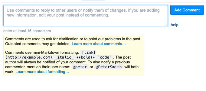
When I, a new user asked a question, I was shown the comments help on every comment that I was posting under my question. Can it be set to some threshold? 3-4 comments or when I had used some formatting tools should be enough to tell the UI to stop pestering me with the guide.

At least add a close button? Turns out help link below add comment button can be used to close it. Make it intuitive?

comment screenshot

5
  • You should be able to click "help" to close that. Commented Oct 25, 2019 at 22:37
  • 9
    that was very unintuitive.
    – user10854041
    Commented Oct 25, 2019 at 22:37
  • 1
    For older users, it's closed by default, so you click to open, then again to close. From new user's perspective though, I agree, it doesn't make sense. Commented Oct 25, 2019 at 22:38
  • 3
    Then it should be labeled "toggle help" or something like that (cc @Carcigenicate)
    – Cody Gray Mod
    Commented Oct 25, 2019 at 22:51
  • @CodyGray Posted an FR meta.stackoverflow.com/questions/390825 :)
    – user10854041
    Commented Oct 26, 2019 at 17:22

You must log in to answer this question.

Not the answer you're looking for? Browse other questions tagged .