15

I have over 1K questions on SE/SOF family so might not want to see the extra fanfare of the newish design (as of 9/26/19) that seems directed towards new users:
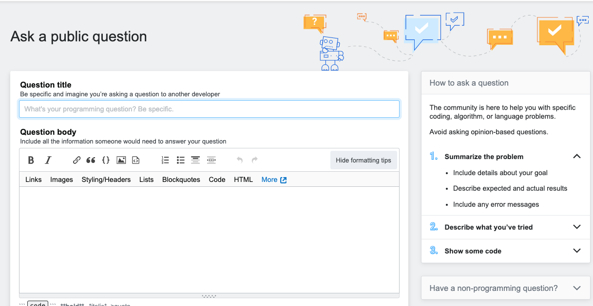
enter image description here Is it possible to see the more streamlined interface that we had until yesterday?

Update In response to a question about "what is the extra fanfare": The entire top bar is higher now /takes more space - to make space for the robot and those question balloons. In addition the entire right hand nav area explaining how to ask a question: that is a big waste of real estate for experienced users. The screen real estate is no longer dedicated to the content of the question being entered.

Another update (11 days later). Asking a question now feels like being transported to nursery school.
33
  • 1
    Why do non-teams members see the callout to "public"?
    – Kevin B
    Commented Sep 26, 2019 at 18:20
  • 4
    That is the streamlined interface. It just includes updated graphics and sidebar.
    – Travis J
    Commented Sep 26, 2019 at 18:22
  • 4
    It's filled with so much noise, it feels more like an attempt to scare people off. Commented Sep 26, 2019 at 18:23
  • 2
    "Streamlined": it is not so compared to the prior interface. Commented Sep 26, 2019 at 18:23
  • 6
    It’s impossible making any change without annoying someone. I find it OK, but I don’t ask questions often. And if it results in better quality questions; I’ll take even if I the extra graphics gave me seizures.
    – yivi
    Commented Sep 26, 2019 at 18:26
  • 3
    @javadba because that would require maintaining two solutions that serve the same purpose.
    – Kevin B
    Commented Sep 26, 2019 at 18:27
  • 4
    Because it would add a new path for testing and maintenance; and it may not be worth it if the benefit for newer users outweigh the possible bother for users with more experience.
    – yivi
    Commented Sep 26, 2019 at 18:29
  • 1
    This change literally does nothing but make it look better. the blog post seemed to indicate it was a more significant change.
    – Kevin B
    Commented Sep 26, 2019 at 18:29
  • 3
    This is much busier and looks worse. Commented Sep 26, 2019 at 18:30
  • 3
    Nothing in this change would help people ask questions better.
    – Kevin B
    Commented Sep 26, 2019 at 18:32
  • 2
    Well, that’s the stated objective. I’m sure they tested the design and have an idea about why it would make an impact. I know nothing of the subject and I find it easy to ignore a few extra robots. So I’m OK with SO trying new things
    – yivi
    Commented Sep 26, 2019 at 18:33
  • 2
    I think it's good SE focuses a bit on new users (as long as that doesn't directly contradict SE's mission), and I think an update to the page is due, but this is just noisy. They should've kept it simple at least. Using that page feels awkward Commented Sep 26, 2019 at 18:36
  • 1
    Every time anything changes meta moans and complains. I say let’s give the change some time to see how it feels and if it works or not. The important things are the tools for quality rating and curation; a slight adjustment in UI should not be the thing to make a huge deal about, IMO.
    – yivi
    Commented Sep 26, 2019 at 18:39
  • 3
    I don't mind that it changed. But to pretend it's far more significant than it is, and to continue tieing the Teams UI into the base product, it's troubling.
    – Kevin B
    Commented Sep 26, 2019 at 18:40
  • 3
    FWIW when I read the blog, I interpreted it as this view becoming the new asking view for everyone, not just new users. Maybe I misread it, though. Also FWIW I agree that the fanfare is too Neopets-esque (which would take more than a comment to fully unpack) and I will be removing the content with user styles/user scripts as soon as it is presented to me. EDIT - I see it's live for all users--time to open up Stylus...
    – TylerH
    Commented Oct 1, 2019 at 13:51

1 Answer 1

4

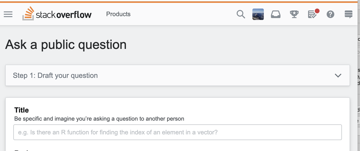
Update This evening the GUI was finally updated - to a wizard mode. Much better ..

enter image description here

Another update We're back to square one?? The robot and balloons are back again. Maybe I was seeing an A/B test two days ago ?? If so then yea that was better than the robots and balloons..

Older information: applicable from Sept 2019 to late June 2020

It has been over three months - and the last contact from the team that made the change was over two months ago. Are we stuck with .. this .. ?

enter image description here

Well given the lack of activity it seems so.

Another update (6 months later) Well this request has been gathering dust. I would note: the UI could really use a fix in the following way:

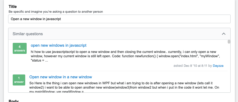
There is insufficient space provided to review the existing questions. I made up a new Question that is obviously already answered.

enter image description here

Notice that only two of the (many) related answers fit here. Providing more space to view more existing questions would be a better use of screen real estate (and designer efforts..) than that robot with the answer balloons..

1
  • 2
    As always a custom blocking rule for an ad-blocker can help there somewhat. Commented Feb 6, 2020 at 9:39

You must log in to answer this question.

Not the answer you're looking for? Browse other questions tagged .