80

There are currently three different shades of green (or red) used to show reputation gains (or losses), depending on where you view your reputation.

The colors on the recent achievements dropdown (1) appear to be slightly lighter than the summary tab (2). The summary tab uses the new shades that were just rolled out, but the reputation tab (3) still shows the older color scheme.

If possible, it would benefit the site to use a consistent color scheme for these reputation changes, regardless of where they appear on the site.

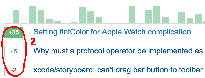
  • Recent achievements dropdown

    Recent achievements dropdown


  • User profile, summary tab

    User profile - Activity, Summary tab


  • User profile, reputation tab

    User profile - Activity, Reputation tab

23
  • 56
    Technically of course you're totally correct, but I do sometimes wonder why people notice this stuff and care... :/ Commented Apr 26, 2016 at 12:43
  • 5
    @DavidMulder partly consistency, partly accessibility. When you put the two solid background examples next to each other, you really notice just how different they are: jsfiddle.net/a8hkqyg4. In that example I've used buttons as well. These colours are supposed to represent the same thing, but these buttons look different enough to potentially make users think they convey different meanings. Commented Apr 26, 2016 at 12:48
  • 6
    IMO, the green from the first picture is the best.
    – user2535467
    Commented Apr 26, 2016 at 12:58
  • 7
    @JamesDonnelly: OCD, like many neurological disorders, is a spectrum. It ranges from "pretty severe" to the relatively benign but annoying. The phrase "I have OCD" is oft-abused by many, but one certainly does not need to be completely debilitated to suffer from it. Mine results in a strong compulsion to touch certain objects at a certain position as I walk past them (a feeling and requirement that's extremely hard to explain) but I don't have to walk around my bed 1,024 times before I can sleep. Commented Apr 26, 2016 at 13:24
  • 4
    The grey square border should be red around the -2 in the second image Commented Apr 26, 2016 at 16:33
  • 1
    y'all all trippin. monochromatic themes FTW! Commented Apr 26, 2016 at 16:50
  • 15
    While we're on this topic - anybody making the changes should have a look at jfly.iam.u-tokyo.ac.jp/color or similar page. Using true red and green to distinguish between two things can be challenging to some. I suspect this may have led to why slightly different shades have been used in the first place.
    – Joel
    Commented Apr 26, 2016 at 16:51
  • 1
    @IMTheNachoMan Wait, you don't read StackOverflow in Lynx? CSS and images are just fads that will go away any day now...
    – Machavity Mod
    Commented Apr 26, 2016 at 20:23
  • 2
    I feel like this whole green theme change was rushed. I get that the team is looking to consolidate CSS, but it doesn't seem like it got scoped out correctly. I had just submitted an issue yesterday in pretty much the same fashion as this question and got the same ol' you have OCD runaround. Consistency shows attention to detail, and I simply don't get a sense of consistency here.
    – Cᴏʀʏ
    Commented Apr 26, 2016 at 21:45
  • 1
    @DavidMulder: The way I'd put it is that everybody notices, but not everybody notices it consciously. Everyone else will register it on some level and may just think "something's off", but not know why - or it may just manifest as a general reduced enjoyment in engaging with the site. c.f. showing a non-musician a live performance with a sloppy drummer, they may not be able to pinpoint why they don't like it but it'll be because of the drummer's poor timing.
    – Claudiu
    Commented Apr 26, 2016 at 22:45
  • 1
    @DavidMulder One reason it's worth paying attention to these sorts of details is that two colors that may look similar to you and me may look very different to someone with some variety of colorblindness. So while for me these look roughly consistent, I bet I can find people for whom these aren't at all similar - especially the two reds. You'd probably be confused if on one screen something looked purple and on another the same thing looked blue.
    – Joel
    Commented Apr 26, 2016 at 22:46
  • 1
    @Claudiu: That's just not the way the brain works, the brain doesn't remember specific colors, but instead remembers colors very vaguely and is able to compare things it sees at the same time (and even that intelligently rather than mechanically). Commented Apr 27, 2016 at 0:14
  • 1
    @DavidMulder - I think you've misinterpreted what I was saying. I wasn't claiming anything about people seeing purple/blue instead of red. I was claiming that two colors that look similar to someone who isn't colorblind can look very different to someone who is and just gave a hypothetical example about "similar" colors looking quite different to some people. Based on jfly.iam.u-tokyo.ac.jp/color the bluish green and light green look very similar to me, but they apparently appear pretty different to protanopes and deuteranopes. Apologies if I've offended.
    – Joel
    Commented Apr 27, 2016 at 5:00
  • 1
    @BeshoyHanna See the accepted answer here meta.stackoverflow.com/questions/321413/…
    – TylerH
    Commented Apr 27, 2016 at 12:59
  • 1
    @TylerH "a reproducible problem on the site that you believe is due to a mistake, malfunction, or programming error." The color inconsistency isn't a mistake/error?
    – user4151918
    Commented Apr 27, 2016 at 13:10

1 Answer 1

3

This should be fixed now, and will be live after our next production build.

You must log in to answer this question.