10

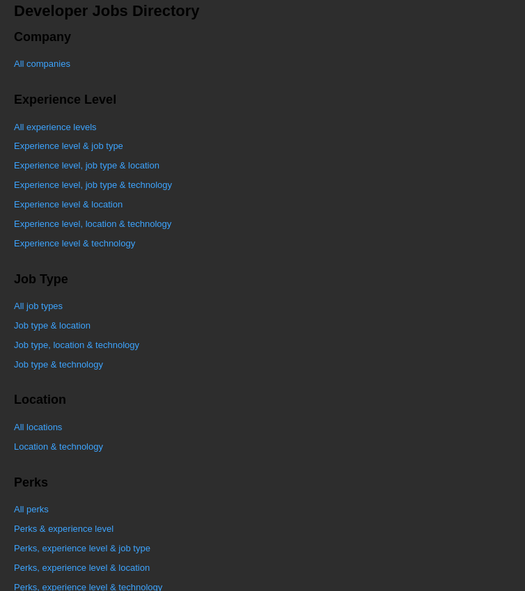
The headings in the Developer Jobs Directory have bad contrast when using dark mode:

Screenshot of Developer Jobs Directory page in dark mode

This problem seems to have existed since dark mode was introduced, as it can also be seen in this capture of the Wayback Machine that is from even before the official beginning of the dark mode beta (add class theme-dark to the body via Dev Tools to see dark mode).

According to this, the directory page is mainly for SEO purposes, so this behavior might be accepted because no human being would look at this page anyway (well, except me, obviously). However, I guess it's still better to have it documented here than to not know about it.
1
  • 1
    Looks like these pages were never updated to use Stacks and therefore never became dark mode friendly. We've got a PR in place to fix this
    – allejo Staff
    Commented Aug 3, 2021 at 19:10

2 Answers 2

2

This page and its related sublisting pages have been updated to be dark mode friendly. While we were at it, some free simple mobile responsiveness was added too.

1

In short, here is the offending CSS ruleset from the Directory-specific stylesheet, note the plain black value set on the color rule:

.-title {
    color: black !important;
    /* other rules */
}

Give it 6 to 8 weeks to be fixed. In the meantime, you have a couple of options:

  1. Remove the -title class from the element (admittedly makes the headings look huge as they are <h2> elements, but it fixes the colour).
  2. Override the color rule to match other headers by setting the value to var(--black-600) (see MDN on CSS variables). Note that there is no need for !important.

If you choose, to go with option #2, you'll get this, which should've been the case from the start:

option #2 preview

Not the answer you're looking for? Browse other questions tagged .