128

I hit F5 just now and saw this on top of my page:

Was it added just now, or is it something weird that happens?

How can registered users opt-out (forever) from all future Teams ads, including banners, left side panels ads, right side panel adds, all Teams menus, and links on all pages?

28
  • 10
    If only there was some consistent className used in all of them so we can just nuke them all at once without worry of also nuking actually important information/popups.
    – Kevin B
    Commented Apr 14, 2021 at 14:45
  • 7
    How can registered user opt-out ... sign-up for a team ...
    – rene
    Commented Apr 14, 2021 at 14:50
  • 53
    Just click on the little X and be done with it. "How can I opt-out forever from all future rants about any inconsequential thing?"
    – yivi
    Commented Apr 14, 2021 at 14:58
  • 10
    Combined with meta.stackexchange.com/questions/362091/…, the page is looking like a geocities site. Not terrible to just dismiss the Teams banner, though, since it's fortunately not sticky.
    – mbauman
    Commented Apr 14, 2021 at 15:00
  • 34
    @rene Doesn't seem to help. I'm in two teams, and still got the banner.
    – Baum mit Augen Mod
    Commented Apr 14, 2021 at 15:27
  • 17
    On SO it's at least understandable. On most other sites they don't give a hill of beans about developers and dev tools. Keep the Teams spam on the SO site, please.
    – Chindraba
    Commented Apr 14, 2021 at 15:59
  • 58
    The point of the ad aside, this is not okay. I've developed banner blindness on SO purely because they keep spewing out blatant trash like this - and I know I'm not the only one to ignore popups as a result. This is honestly destructive in terms of getting users to read important popups regarding question and answer quality, and other post warnings, by pushing banner blindness. Ads for teams are fine, but not as massive, 1/3rd of the window height banners... Commented Apr 14, 2021 at 16:37
  • 5
    I clicked the "X" once and haven't seen the ad again on any SE site. I'm not interested in SO Teams myself, but I am interested that SO has a viable business model somehow that doesn't involve me paying (much) for it (and also doesn't involve "welcoming" non-serious developers). If putting a one-time-only banner ad - animated or not - on top of a SE site every once in awhile helps them get the revenue they need to keep this going then I'm totally ok with that.
    – davidbak
    Commented Apr 14, 2021 at 17:54
  • 30
    BTW, stack exchange business managers: I would pay ~$100/yr for a no-ad non-welcoming homework-problems-dealt-with-by-permanent-banning site. Happily.
    – davidbak
    Commented Apr 14, 2021 at 17:57
  • 6
    @davidbak Indeed. If we can have Mathematics and MathOverflow to segregate n00bs from serious researchers, surely we can have a development stack for beginners too. Every time it's been brought up in the past this idea has died a fiery death, but I can't quite understand why, other than that Joel was vocal about being friendly to beginners... I think Math/MO has proven that the fearmongering arguments against are nothing but FUD.
    – J...
    Commented Apr 14, 2021 at 18:23
  • 2
    @Zoe I am with you... through it was really hard to be banner blind on this one ;)
    – Dalija Prasnikar Mod
    Commented Apr 14, 2021 at 18:40
  • 3
    before davidbaks comment I didn't see the "X", which on my screen is Exactly on the corner of the orange square and appears like a "sparkle". Thanks david.
    – Stax
    Commented Apr 14, 2021 at 23:11
  • 4
    @Stax - I've had many years experience searching out the hiding "X"s on websites ... it's sad to think of mybrain cells that are now part of the neural network to recognize that task ... instead of being dedicated to something useful like finding patterns in the stock market ...
    – davidbak
    Commented Apr 15, 2021 at 3:14
  • 11
    It is truly annoying!
    – Ajeet Shah
    Commented Apr 15, 2021 at 9:19
  • 4
    @Michael - that's not necessarily why these posts exist. It is a minor inconvenience of course, but these posts serve a purpose - they create publicity by calling out the sneaky features / marketing schemes that make the user experience worse. If SE profits from an unpaid work of thousands of volunteers, those volunteers have a right to fret about every such banner, especially when it is taking between 1/3 to 1/5 of the viewport hight, is an autoplay carousel, and is a giant add for Teams (which, frankly, sits in my throat already due to the amount of advertising).
    – 0Valt
    Commented Apr 15, 2021 at 15:45

7 Answers 7

27

Yesterday a banner about Stack Overflow for Teams was made live and we've heard how this has been impacting community members' experience on the site. This coupled with some known bugs around the cookies prompt, have obscured the view on the site for a number of users.

We apologize for this experience on Stack Overflow and the Stack Exchange network that has been far from user friendly and wanted to share how we are fixing it.

In response to your concerns, we've removed the banner.

The bugs related to the cookies prompt are a separate issue and are being inspected and worked on by the team. We will be posting an update on that separately once we have one.

We want to thank everyone who brought this to our attention and again apologize for anyone who's had a negative experience on the sites over the past day as a result. We take user experience seriously and are working hard to resolve this and ensure that these issues don't happen again in the future.

3
  • 8
    Thank you! Seriously, the front page looks a lot better now. Most importantly, it's readable.
    – 10 Rep
    Commented Apr 15, 2021 at 18:04
  • 2
    Step one done, step two (revamped and reloaded) best left undone. SO users, though often abused, might at least be interested in Teams. 90%, or more of the rest of the network couldn't care less (to be nice) about Teams, or developer tools of any stripe. For at least half of the network the Teams add is nothing but a block of jargon anyway. Why on earth torture your users with seemingly spamish banner ad?
    – Chindraba
    Commented Apr 15, 2021 at 19:02
  • 2
    "We take user experience seriously" If that were true, you wouldn't have shoved a huge banner Ad in everyone's face. Everyone else in the world pays for the expertise given away freely here, and your response is to try and monetise people you should be paying for their contribution.
    – Basic
    Commented Apr 17, 2021 at 12:01
75

At the very minimum SO should not autoplay the animation that cycles through the different quotes. Animated ads are really a no go

enter image description here

13
  • 8
    eh, auto-running sliders are actually pretty common.... on marketing/ecommerce site home pages
    – Kevin B
    Commented Apr 14, 2021 at 15:48
  • 20
    @KevinB That they are common, makes things even worse. I though SO had higher standards then the common sales site, but apparently I was wrong Commented Apr 14, 2021 at 15:56
  • 3
    I mean, the design has been lead by a marketing team for the past what, 6 years now?
    – Kevin B
    Commented Apr 14, 2021 at 15:57
  • 34
    i still remember when there was a big push to normalize the way information is presented to users via banners so that only important information was presented in specific banners, only for it to be abused a month later to promote SO Jobs and podcasts.. now we get full blown ads in those places with dancing bologna
    – Kevin B
    Commented Apr 14, 2021 at 16:04
  • 19
    this stuff never ceases to amuse me. I opened SO today to find some marketing text taking a third of my screen and actively changing... And then it turned out to be a testimonials slider set on autoplay. This a wet dream of a sales agent: promoting the blog, the podcast, and Teams in one package. We are truly doomed. P.s. More on point - the speed of the slider [live, not in the gif] is too high and a bit sickening.
    – 0Valt
    Commented Apr 14, 2021 at 16:10
  • 5
    For reference, meta.stackoverflow.com/a/401672/400654 (hard to believe that was only months ago)
    – Kevin B
    Commented Apr 14, 2021 at 16:16
  • 1
    @OlegValter Not to worry about the speed. If you hover your mouse over it, it will stop giving everyone ample time to read the text ;)
    – Scratte
    Commented Apr 14, 2021 at 16:28
  • 36
    ShouldIUseACarousel.com Commented Apr 14, 2021 at 16:56
  • @SebastianSimon Brilliant site! Commented Apr 14, 2021 at 16:58
  • 10
    Something the carousel site doesn't mention is when you're reading one section and then it automatically goes to the next section and you have to go back. That one got me a number of times just on that site.
    – pushkin
    Commented Apr 14, 2021 at 18:14
  • 1
    @Scratte - oh, now I will be able to read what SE thinks of their own product at normal speed :) Ok, Elasticsearch as well.
    – 0Valt
    Commented Apr 15, 2021 at 6:55
  • 3
    My eyesight is getting really bad and, I'm trained to look for "blinky" stuff near the top of the screen so the animation is a bit too much for me. I'm absolutely fine with them advertising their paid services and I know it's tough to find the intersection of doing that effectively and courteously, but the animation is difficult for me. That and not being able to find a means of closing it. Animation of mostly any kind has to be really minimal if it shares space with long-form content.
    – user50049
    Commented Apr 15, 2021 at 15:08
  • 1
    I usually keep SO opened in a tiled window, and combined with auto-running the result is INSANELY frustrating: text wraps differently for each ad, periodically shifting the vertical position of the question, comments and answers. Even when I'm scrolled down to an answer and the ad is nowhere in sight. Commented Apr 15, 2021 at 15:24
52

Usually I go to https://stackoverflow.com/questions in Incognito/Inprivate (because I like the incognito/inprivate windows) to get to questions that the main SO page (https://stackoverflow.com/) doesn't list.

Some time ago I saw the new front page (not signed in). Makes sense (sort of) to put some advertisements (of yourself) on your front page. Recently this cookie popup started coming, and I thought, "OK, that makes sense, let's just pick cookies and continue."

Now this banner appeared and when I open https://stackoverflow.com/questions for the first time over half of my screen is covered with popups and banners (along with Overflow Blog, Featured on Meta, but those are usually OK as they don't take up any/much space that could be taken by questions).

This is even worse for new users. They think,

Hmmm, I remember hearing that Stack Overflow was a place where you can get your coding question answered. I wonder if I can find my answer there.

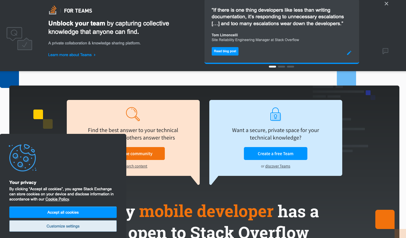
[arrives at https://stackoverflow.com/ and sees this:
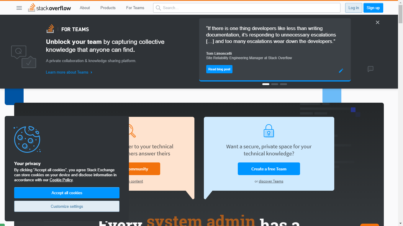
Stack Overflow front page

OK, so it looks like you make accounts and have them in teams to ask questions [or whatever reasoning]. [clicks button to create team]

Hmmm, not what I need.

Case 1: They see the sign up button and create an account. Now time to face the real challenge - posting a question that won't give you downvotes and/or close votes.

Case 2: They can't figure out what is wrong and give up. They're not joining Stack Overflow.

Everything is going wrong here.

Suggestion for logged in users: add a button I don't want SO for Teams or Check back with me after: [a <select> containing from 30 minutes to 3 days to 1 week to NEVER into our profiles, so that we get none of these ads. It's really disturbing when I want to look at questions.

Suggestion for logged out users: Make sure that if they click "Create a Team" that they want to create a team and not a normal account, for example make a popup asking them if they want to make a normal account or a team.

Edit: I just calculated the percentage of space in my visible viewport that is useful to people who want to join SO - it's only 15%.

These are the steps I took:

  1. Open the console of the devtools (make it pop out in another window so it doesn't affect the page size).

  2. Run var viewport=window.innerHeight*window.innerWidth;viewport. This is the viewport size.

  3. Run var login=$(".login-link.s-btn__filled")[0];var la=login.clientWidth*login.clientHeight;la. This is the size of the login button.

  4. Run var signup=$(".login-link.s-btn__primary")[0];var sa=signup.clientWidth*signup.clientHeight;sa. And probably guessable, this is the signup button.

  5. Run var join=$(".grid--cell.p16")[0];var ja=join.clientWidth*join.clientHeight;ja. This is the speech bubble thing that says "Find the best answer to your technical question (...)". Even this is partly covered by the cookie popup!

  6. That makes up all of the useful things. Now just to calculate: (100*(la+sa+ja))/viewport. This is the amount of space that is actually useful to people just joining.

It's very confusing as to why so much space is taken up by SOFT (Stack Overflow for Teams). It is not useful to non-logged in users who just want an answer to their questions.

19
  • 5
    "Recently this cookie popup started coming," - I see that popup daily. It comes back no matter what options I choose. Since I never close my browser session, on any device I use, that clearly isn't the cause. It's extremely annoying. If I see the banner for Team more than once, I am opening up my own meta question, asking how to permanently disable it. Commented Apr 14, 2021 at 19:16
  • 1
    "Make sure that if they click "Create a Team" that they want to create a team and not a normal account" Hahahaha!
    – 41686d6564
    Commented Apr 15, 2021 at 4:47
  • 1
    The main SO page (in private / incognito / to new users) looks so bad that I would do anything, even a sign-up, to stop seeing that.
    – Ajeet Shah
    Commented Apr 15, 2021 at 9:30
  • @SecurityHound what browser are you using?
    – Rojo
    Commented Apr 15, 2021 at 14:02
  • "Hmmm, I remember hearing that Stack Overflow was a place where you can get your coding question a̴n̴s̴w̴e̴r̴e̴d̴" more like downvoted
    – aheze
    Commented Apr 15, 2021 at 14:05
  • @aheze Downvotes aren't bad. I have never seen a good question being downvoted. Sometimes if I see a good question with downvotes, I put a comment - Why downvotes? I see nothing wrong in the question. And, the magic starts, after a few minutes Upvotes would supersede the downvotes.
    – Ajeet Shah
    Commented Apr 15, 2021 at 14:37
  • @Rojo - The current version of Chrome, Edge, iOS Safari. The only time I close my browser session is to perform a restart, after the restart, I restore the same browser session I was using. Commented Apr 15, 2021 at 15:13
  • @SecurityHound: meta.stackexchange.com/q/363245 - see the list item where it says, "The cookie banner keeps coming back unless both third-party JavaScript and third-party cookies are enabled". Probably that's what's happening. Commented Apr 15, 2021 at 15:53
  • @LakshyaRaj - Nope; I have accepted all cookies; Within 24 hours I am given the same prompt again, mind you I have closed the original tab within my browser, where I accepted it the first time. The cookie prompt is broken. Commented Apr 15, 2021 at 15:56
  • @SecurityHound - let me guess, are you on macOS/iOS? It seems like the cookies set by the popup handler are susceptible to Apple's Intelligent Tracking Protection (ITP). The cookies set in certain ways expire either in 24 hours or 7 days. This explains why the popup shows up again after a while (as a separate JS-set cookie keeps it from popping up again)
    – 0Valt
    Commented Apr 15, 2021 at 16:03
  • @OlegValter - Yes; That explains the behavior on my iPhone but not on my numerous Windows machines. Commented Apr 15, 2021 at 16:06
  • @SecurityHound - huh, so you say the same thing happens on Windows-based machines or are there differences? The cookies mess amuses me beyond belief - I am looking through posts and trying to connect all the dots where something went wrong :)
    – 0Valt
    Commented Apr 15, 2021 at 16:09
  • @LakshyaRaj - yep, I got that part right, however, I am trying to eliminate possibilities because there is no way something like ITP exists on Windows. Which leads us to browser behaviour, but if the issue is the exact same one, then this is very unusual.
    – 0Valt
    Commented Apr 15, 2021 at 16:14
  • @OlegValter - I see the cookie prompt almost daily on my work machine running Chrome 89 (Windows 1909). Commented Apr 15, 2021 at 16:16
  • @SecurityHound - just wondering - do you keep the Chrome always open on your work machine? P.s. Hell, if SE does not debug this mess, we will ourselves :)
    – 0Valt
    Commented Apr 15, 2021 at 16:19
45

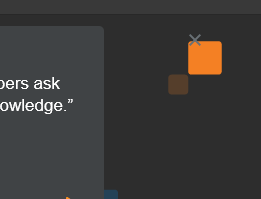
There is an "X" there... it seems to be missing a "U", however. I think we have a stack for that...maybe the designers should consult it?

enter image description here

11
  • 13
    Honestly didn't see the X, so I started searching meta for this post. Thanks for showing.
    – Mixxiphoid
    Commented Apr 14, 2021 at 18:09
  • 3
    @Mixxiphoid Indeed, I couldn't find it either. Hence the UX issue...
    – J...
    Commented Apr 14, 2021 at 18:17
  • 6
    As a kinda unrelated comment, this same bright orange square in the top right on the stack overflow blog site kinda bugs me because in my peripheral vision I keep thinking I have a notification there :P
    – ahiijny
    Commented Apr 14, 2021 at 18:39
  • 5
    About the "X but missing U" - do you mean that it doesn't have UX? I only figured that out recently (tricked me about what you meant for some hours there...). Commented Apr 14, 2021 at 23:48
  • 1
    @LakshyaRaj Sounds like you answered your own question. ;)
    – J...
    Commented Apr 15, 2021 at 2:14
  • 1
    It took me a few minutes to find the X as well. But the designers are incredibly competent people who, like other incredibly incompetent people, sometimes make mistakes :)
    – user50049
    Commented Apr 15, 2021 at 12:42
  • 2
    @TimPost Mistakes are a process problem, not a people problem, I agree. The process here was clear - rush it out and get some clicks. Making it easy to dismiss was clearly not on anyone's radar.
    – J...
    Commented Apr 15, 2021 at 12:45
  • 1
    I think you and I keep our browser windows at a similar size. When it's not superimposed on that little orange square, you can actually see the darn X (I only found it because I poked around that area thinking something should be there) - I think I have a theory as to how they didn't notice it :D It's good feedback for future testing.
    – user50049
    Commented Apr 15, 2021 at 12:56
  • 1
    @TimPost perhaps your keys are near the X as well?
    – Luuklag
    Commented Apr 15, 2021 at 13:10
  • @TimPost I don't think testing responsive designs is anything novel - it feels like it was just not done. Like I said, process issue.
    – J...
    Commented Apr 15, 2021 at 13:47
  • @TimPost And yeah, my browser is usually around 1650px wide - just under half of a UWQHD display, but it depends on what I'm doing. The width changes throughout the day - I'm sure I'm not alone in doing this, and people have displays of all sizes so layout testing for different viewport sizes is pretty basic stuff, I think.
    – J...
    Commented Apr 15, 2021 at 13:58
45

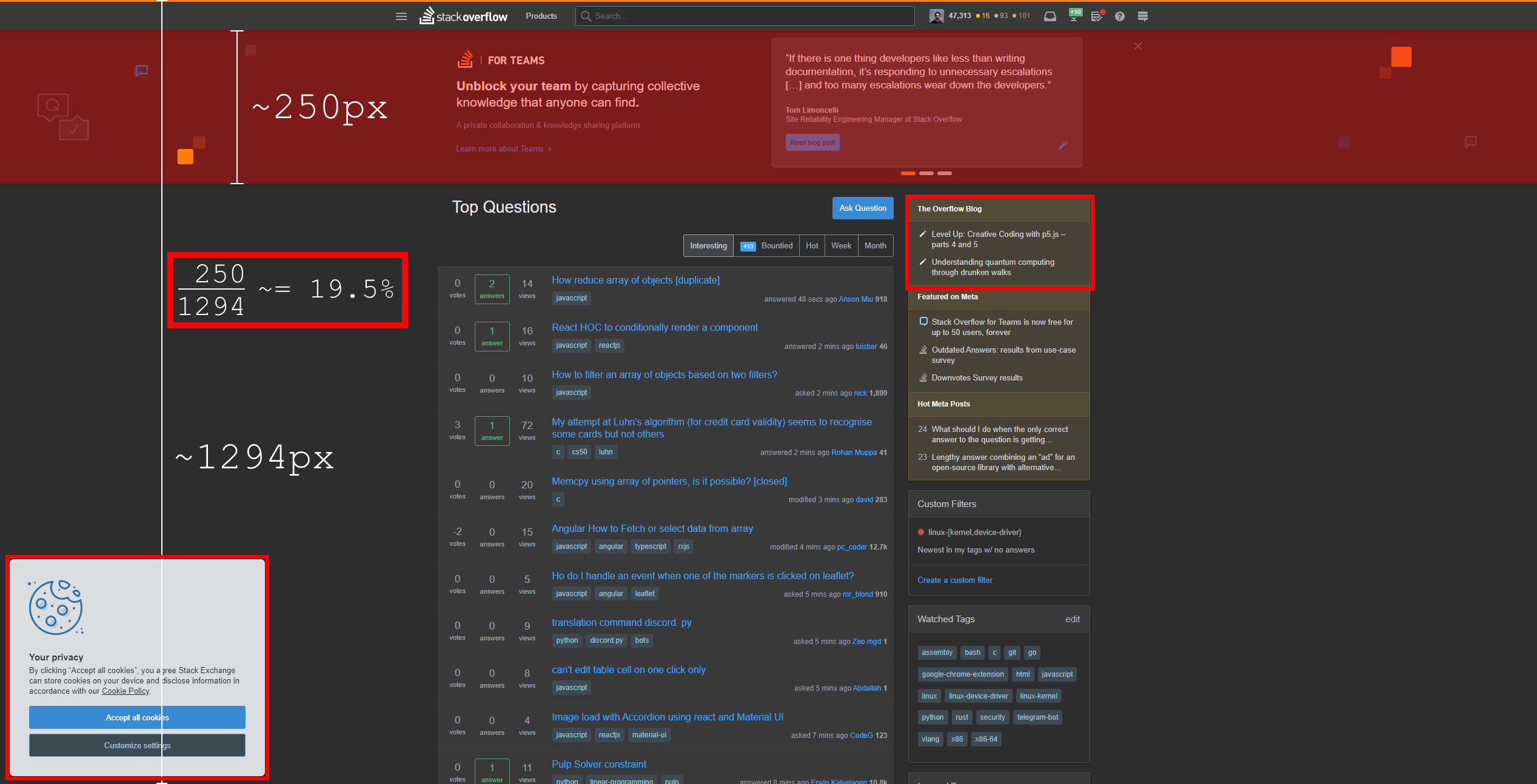
I see the post is tagged with . Let's talk about it: this new banner is taking up one fifth of my entire browser's viewport. That is, ignoring the recently added cookie notice banner and the SO blog section on the sidebar.

screenshot

It really blows my mind how completely tone deaf the entire SO/SE team has to be to this kind of issue in order to keep pushing out something like this. How many times has this happened? How many different banner designs were implemented and instantly generated a question here on Meta? We get it, you want to advertise your paid products, is this the right way to do it though? Showing your loyal users enormous advertisement banners does not seem like a good move to me. You most probably already know through your analytics whether or not we care about Teams. This MSE post has been on the sidebar for almost a month now.

Can't I just please live my life in peace, without being punched right in the face with this kind of obnoxious UX/UI design every time? Why do I have to be forced to keep adding one cosmetic filter every N months for this? When will I inevitably end up blocking some actual content by mistake?

! SO announcement banner
stackoverflow.com###announcement-banner
! SO blog sidebar
stackoverflow.com##.s-sidebarwidget--item:has(a[href*="stackoverflow.blog"])
stackoverflow.com##.s-sidebarwidget--header:has(+ .s-sidebarwidget--item:has(a[href*="stackoverflow.blog"]))
! Annoying full width orange top border thingy
stackoverflow.com##header.top-bar:style(border-top-color: transparent !important)
! Profile job recommendations
stackoverflow.com##.js-jobs-recommendations
! Cookie banner
stackoverflow.com###js-gdpr-consent-banner
stackoverflow.com##div.js-consent-banner
! Yet another full width banner
stackoverflow.com##aside.teams-promo

The above screenshot is taken without these filters enabled. I almost managed to gaslight myself for a moment into thinking that I'm some kind of insane person for using so many filters on a single website. Had to stop and think after adding the last one.

Sooner or later, the time will come when you folks will put up an actually useful/serious banner to grab my attention on an important problem and my brain will simply ignore it like it does with my nose and eyeglass frames. Stop crying wolf with this trash.

And come on, SO blog? It's right there on the sidebar. I have it under my eyes all the time. Why would a banner be needed? Seriously, there was a time when I enjoyed reading those blog posts, but this is just starting to make me actively hate it.

4
  • 1
    Usually I don't care about ads or popups but this seems way too much, especially when you consider that I am actually registered in two teams, and I am an admin in one of the teams.
    – 10 Rep
    Commented Apr 14, 2021 at 22:07
  • 1
    @10Rep well, that just goes to show that when I say "You most probably already know through your analytics whether or not we care about Teams" it's even more true than I thought. Surprised they wouldn't even bother filtering out people who already use Teams. Commented Apr 14, 2021 at 22:13
  • I recently updated my answer to show about how much the useful-to-new-users part takes up - SOFT (Stack Overflow for Teams) takes up more than 4 fifths of the space! Commented Apr 15, 2021 at 16:30
  • One fifth? It took 2/3 for the zoom level I used (fortunately, scroll worked to hide it). Commented Apr 16, 2021 at 17:26
32

Relating to Marco Bonelli's answer: If I am a new user who has never visited Stack Overflow,

bruh

All the ads and whatnot cover up 95 percent of the screen, making it a complete mess. I have mild banner blindness, and this will just worsen it.

But it gets worse. Seeing all the questions without signing up has become extremely difficult to find. See if you can spot how to go to the questions link without signing up for Teams or for a main account.

You click on the tiny "Search Content" link.

Not only that, but when I opened Stack Overflow today, I see the banner even though I am logged in. I'm in two teams, and for one of the teams, I am an admin.

Additionally, you might think signing up for a free team might hide the banner. But 1. Why should I have to sign up for a team that I will maybe never use? and 2. Unless you click the X, you will keep seeing the banner.

At the very least, don't show the banner to people in a team, and please clean up the front page of Stack Overflow, because it's unusable. Thank you.

7
  • 1
    I remember the time when they added this tiny "search content" link so people who wanted the content could get there from the front page. The cookie popup + teams banner + teams ad right at the top = 98% distractions. Not very easy to search content or create an account. Good thing I'm not a new user! Commented Apr 15, 2021 at 0:25
  • @LakshyaRaj exactly. I know someone who is taking programming, and they use Stack regularly. I can't wait to see if they figure out how to look at questions without signing up.
    – 10 Rep
    Commented Apr 15, 2021 at 0:27
  • I don't understand how you calculated the percentage. It's bad, but I don't think from the screen shot it's more than maybe 70%. (Granted, the welcome tour on the lower right looks bewilderingly similar to the banner spam.)
    – tripleee
    Commented Apr 15, 2021 at 6:12
  • 11
    I looked at incognito yesterday (because caching), and it still shocks me how much of an absolute mess the front page is now. You have an ad over an ad both of which are overlaid by cookies. It's worse on mobile of course, where the ad takes nearly 100% of my viewport and makes the content jump (S9 in Chrome because FF was cached), as well as about a third of the screen being covered in a cookie note. To be honest, these types of front pages make me turn in the door and leave - it's an extremely confusing mess of ads and cookies now. I really miss the old home page Commented Apr 15, 2021 at 7:12
  • 1
    Isn't optimizing the frontpage like polishing a turd? How many people do you know that would type in stackoverflow.com in their browser. I think 99% of inbound traffic, from non-registered users, comes from google. That will always point them directly to a question or an answer.
    – Luuklag
    Commented Apr 15, 2021 at 13:13
  • @Luuklag but that doesn't mean we should leave any page of Stack Overflow to look like that, does it? At the very least the teams banner should be removed.
    – 10 Rep
    Commented Apr 15, 2021 at 15:58
  • @tripleee: It doesn't take up that much space (see my answer on how much it seems to take up), but it does make that much distraction - new users would be confused. Commented Apr 15, 2021 at 16:27
31

I'm not getting this ad. My guess is that it's because I already am a part of (several) teams. Indeed, logging into a sock puppet account allows me to see the ad. That suggests a simple solution: sign up for a free team. Only that seems to not help. :-(

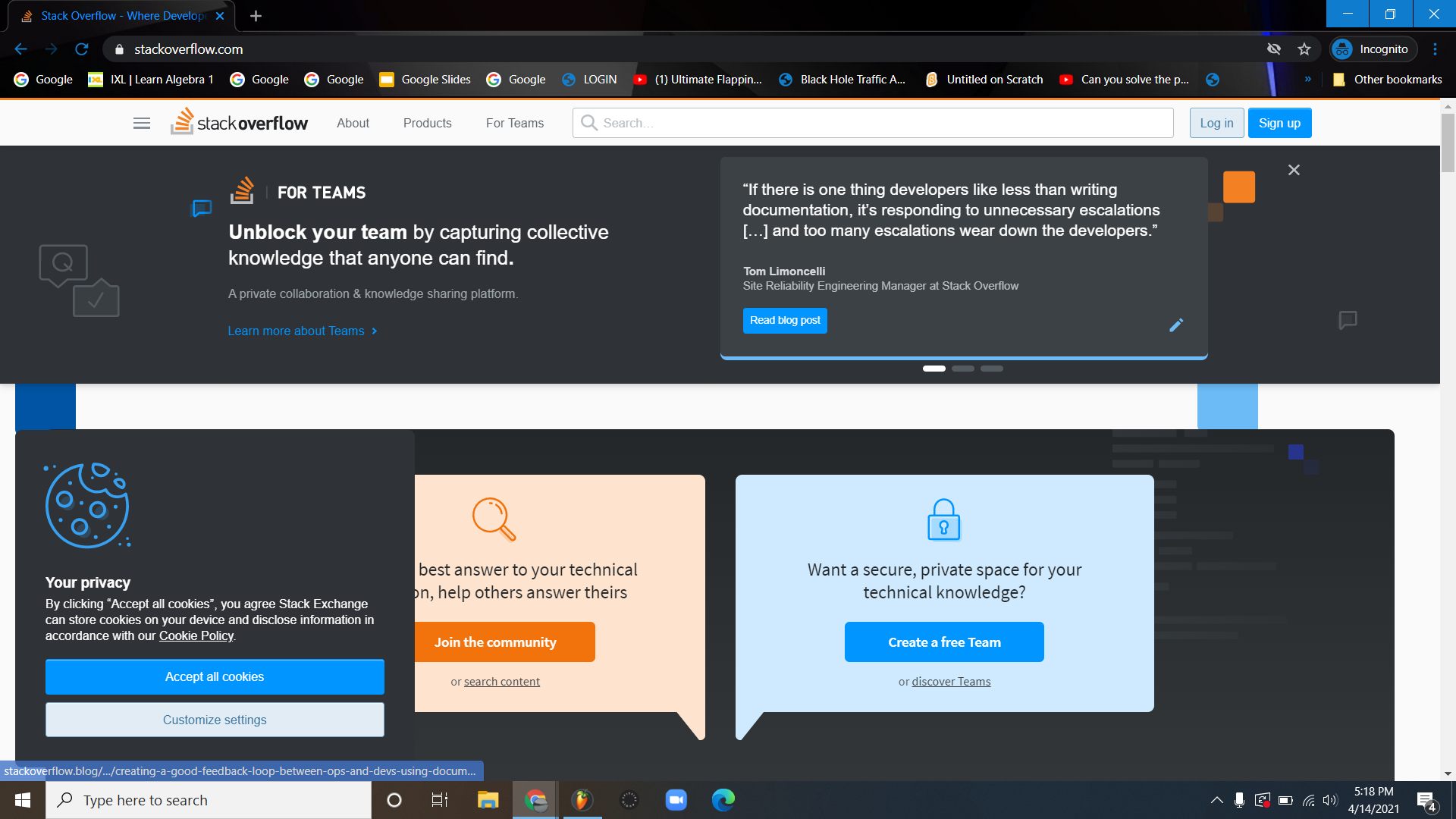
Still, at least people with accounts have it better than the unwashed masses who must endure this main page:

What the main SO page looks like without an account.

It always shocks me how little some sites think of unregistered users. It's not just SO. When I worked at College Confidential it was a constant struggle to encourage management to consider the cost of adding yet another banner/popup/ad.

9
  • 1
    apparently, this isn't the case for everyone
    – Kevin B
    Commented Apr 14, 2021 at 20:30
  • @KevinB: Well that's obnoxious. Maybe it's because I'm an admin on a team I created? Commented Apr 14, 2021 at 20:31
  • 1
    Huh. I'm an admin and I saw it on another site (not SO). It's on all the tech-related sites so I dismissed it on a site before seeing it here.
    – Catija Staff
    Commented Apr 14, 2021 at 21:00
  • Side note: you don't need a sock puppet account. Just open your incognito/inprivate and type in stackoverflow.com - you can find that banner right there (and the front page includes the ad at the top of its content also). Commented Apr 14, 2021 at 21:38
  • I am in 2 teams and I still see it.... I am an admin in one of the teams as wel...
    – 10 Rep
    Commented Apr 14, 2021 at 22:04
  • 4
    Wow, that is just horrible. Commented Apr 14, 2021 at 22:43
  • @ChiefTwoPencils agreed. Not only that but it's come back everytime I open a new SE site.
    – 10 Rep
    Commented Apr 15, 2021 at 0:16
  • 2
    I saw it this morning myself, and I am in 3 teams
    – Machavity Mod
    Commented Apr 15, 2021 at 0:58
  • 1
    My teams account just finished deleting itself and I still got it. They've got sufficient data to know the product isn't a good fit for my group right now (I left a lot of feedback), I wish they wouldn't keep pushing it.
    – jrh
    Commented Apr 15, 2021 at 12:22

You must log in to answer this question.

Not the answer you're looking for? Browse other questions tagged .