415
votes

With the full launch of Dark Mode on 17 June 2020, we've shut down this post as a way to get feedback and bug reports. Thank you to the many people who have posted answers, comments, and done the curation work of keeping this post in order so that Aaron could more easily find and address the issues. As of posting, Aaron has updated the status of all the posts in the compilation answer.

There are some outstanding issues, particularly related to the Developer Story page, which is difficult to fix without breaking a lot of things. There are also a handful of items that we've deferred acting on but there shouldn't be anything critical that is left. Being out of beta doesn't mean we won't look at these or new bugs brought to our attention, only that we feel this project is stable and ready to go.

Our team working on this is pretty small but they're excited to have this project in a good place so they can move on to other things like working on getting the rest of the site responsive.

From today on, If you find new bugs, please post them as a new question here on MSO.


Thank you so much for your interest in helping us find bugs in our dark mode version! The response to this has been amazing! My one request is that you look through existing answers before posting a new one. Nearly all of the newer answers I’ve gotten have been identified previously so the answers are duplicates!

For those of y’all waiting for fixes, we’re already working on many of them and you should start seeing status tags added to the answers soon. We appreciate your help and feedback!

—-

For years the answer to "can we have dark mode" has been a resounding "no!" Because of a huge number of technical complexities, which our design systems lead Aaron discusses in this blog post, creating dark mode has been too big of a project to take on with such a small team. You can read a bit about it in this discussion about dark mode.

As Aaron’s been working on building Stacks styles and he and the other developers have been gradually converting site elements to Stacks, Dark Mode was finally in reach for development. We've had Dark Mode in mind with our Stacks updates since July 2019 and started really focusing on it for the last two months.

Starting today Dark Mode is in beta for all logged-in users on Stack Overflow

It’s going to be a long road to complete this project but we felt that we were finally in a place where we could get your help finding all of the long tail bits we may have missed. For now, this is Stack Overflow in English only at this point - it doesn’t even work on MSO currently. The beta test will also be active on any Teams you may be on, so switching between the two shouldn’t cause blindness.

Thank you so much for your patience with us in getting this out. It’s been really neat to see the work some of y’all have done in creating userscripts to emulate dark mode here on SO and I hope you enjoy our version of it. I’ve been pestering Aaron with bugs for the last couple of weeks and I’m sure he’s going to love getting them from all of you!

Beta means some pages are out of scope

There are some parts of Stack Overflow that are currently opted out during the beta for various reasons. These include:

  • Homepage of Stack Overflow for non-logged in users
  • Jobs
  • Talent client portal

How to enable it:

To enable this, visit your Stack Overflow profile, go to the "Edit profile and settings" tab, scroll down to "Preferences" under "Site Settings" and find the "Theme" section at the top of the page. You have three options - light, dark and "system setting" which will adjust the theme based on what your system prefers.

Screenshot of the preferences page, showing the three options, light, dark, and system setting.
(click the image to see a gif of the path)

How to give feedback:

Write an answer below. Be sure to give us the following information:

  • Description of the issue
  • Screenshot of the issue
  • Link to the page you’re seeing this problem

There are a couple of issues we’re already aware of that we’re working on but weren't able to clean up before release:

Badges

  • We still need to do an audit of our badges and see if we can simplify them a bit on our way to dark mode.

Various tabs

  • There are still some legacy filter tabs on a few pages that we need to convert to newer components.

Tables

  • Mostly impacts moderator (/admin) pages, though there are a couple on /tools pages.

Future releases

At this point, the focus of Dark Mode is on Stack Overflow and we’ll eventually bring it to MSO. While the retheming we did across the network two years ago makes updating our LESS easier, creating dark versions of all of our sites, particularly the custom-designed ones, is going to be a huge challenge we’re not able to contemplate at this time. The artwork on some of those sites simply can’t be made dark because we don’t have access to the original art files and, to be honest, some of the themes will always be better as-is.

If you have questions about dark mode on the network, please ask them on MSE rather than here.


In addition to bug reports, let me know if you have any questions or things I can clarify.
34
  • 94
    Thank you! Exciting to see such developments.
    – deceze Mod
    Commented Mar 30, 2020 at 17:24
  • 43
    Nice, was expecting an April joke, but was offered something much better :) Commented Mar 30, 2020 at 17:43
  • 14
    Could this possibly be extended into chat.SO? Commented Mar 30, 2020 at 17:49
  • 24
    Not really a fan of dark mode, but it is extremely encouraging to see a feature that so many users in the community clamored for for so long. Well done!
    – Travis J
    Commented Mar 30, 2020 at 18:36
  • 12
    This is great; thank you very much Catija, Aaron, and the rest of the team! Can't wait to see it make its way to Meta.
    – TylerH
    Commented Mar 30, 2020 at 18:49
  • 12
    ... OK... so... I'm not sure what y'all think about things... we're getting a handful of different kinds of answers below - some things are bugs with one bug per answer and others are huge digests of many bugs... some answers are FRs and some are a combo of bugs and FRs... some of the digests include individual answers. I usually prefer single answers but I'm wondering if it makes sense to have one big bug wiki answer and FRs as separate answers... or something else... thoughts?
    – Catija Staff
    Commented Mar 30, 2020 at 19:01
  • 3
    YES!! Dark mode is 99% there. Biggest issue I see is syntax highlighting.If the color used is Saturated, then it will lack almost all contrast in dark mode. The same "color" can be used, but it needs to be de-saturated (using HSV values). The less saturation used, the more contrast with dark backgrounds there is (it doesn't effect light-mode to desaturate up to 50%+, but will make dark-mode readable) We know how much you try to stick to the international standard colors -- worth a check of the HSV values to see if they need tweaking for dark-mode. Commented Mar 30, 2020 at 21:57
  • 12
    It's almost perfect, but I'd like to see more lens-flares in the banner animation.
    – alain
    Commented Mar 30, 2020 at 23:17
  • 6
    I was afraid this was an early April Fools joke due to the timing and the animated banner, and I'm so pleasantly surprised that it's real, and has been so lovingly crafted. This is a much tougher feature to implement in an established site. Thank you so much for taking the time to work on it! It looks great.
    – Blank
    Commented Mar 31, 2020 at 0:53
  • 5
    Wow, impressive to see how many people are putting effort into reporting all the little dark mode fails. Commented Mar 31, 2020 at 2:54
  • 12
    background-color: #2d2d2d is a bit too bright for me. The low contrast looks nice at first glance, but for longer periods of browsing, I prefer things a bit more contrasty: background-color: #222 and color: #ddd. Luckily, there's always custom CSS styling... Commented Mar 31, 2020 at 3:12
  • 12
    I just came to meta (non-darkmode) from Darkmode main site, and I'm miserable now.
    – Pac0
    Commented Mar 31, 2020 at 15:52
  • 16
    I hope the feature of dark mode will be added in meta too. Well done, stack team! Commented Mar 31, 2020 at 17:42
  • 4
    The "ultra" dark is really cool for really late night work, but still a little "too" dark, especially if you lower your screen brightness to adapt to other windows. Commented Apr 1, 2020 at 21:12
  • 6
    @HadiPawar I am guessing that the bug you’ve reported was already reported in one of the answers so it’s been downvoted because it’s a duplicate answer. I know it’s hard because there’s a ton of answers but it’s difficult for us to gauge what needs to be fixed if I have multiple answers saying the same thing. We love y’all for helping, we just need y’all to be thoughtful about checking existing answers before adding a new one.
    – Catija Staff
    Commented Apr 6, 2020 at 13:05

154 Answers 154

1
vote

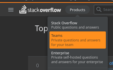
Hovered items in the Products menu at the top of the main page are too bright and could do with some more contrast:

bright orange


Maybe kind of subjective.

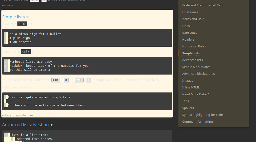
Highlighted sections when you click a link on the Markdown Editing page are unreadable:

unreadable

This may be related to https://meta.stackoverflow.com/a/395983/7518910

8
  • @double-beep was the second one already reported?
    – retnikt
    Commented Apr 7, 2020 at 12:32
  • 1
    Yes, it is reported Commented Apr 7, 2020 at 12:34
  • @double-beep your link to the duplicate is wrong.
    – bad_coder
    Commented Apr 9, 2020 at 0:17
  • @bad_coder how? Have you looked at the revision history? Did you check the original version of the post? Wasn't the second bug already reported? Commented Apr 27, 2020 at 17:07
  • @double-beep your link is wrong because this isn't a duplicate. Simple.
    – bad_coder
    Commented Apr 27, 2020 at 17:23
  • @bad_coder the second one, which the OP asked, is this image. How are the answer I linked and the image different? Commented Apr 27, 2020 at 17:27
  • @double-beep They might be related (I don't know), but are definitely in two separate parts of the site. The one I linked is on stackoverflow.com/editing-help#simple-lists, while the answer you linked is when you click the Help button while answering a question - i.imgur.com/tuNHFzs.png
    – retnikt
    Commented Apr 28, 2020 at 8:13
  • Disagree. Check the HTML classes. You'll realise they're the same. Check the URL. You'll realise it's the same. Also, how do you explain that also this page was fixed when Aaron added [status-completed] to my answer? They're not related, but the same. Commented Apr 28, 2020 at 8:42
1
vote

Note: I'm quite sure that no one has already posted this, please let me know in the comments if so and I will immediately delete my answer.

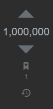
Please increase the contrast on the elements alongside the question (upvote/downvote buttons, vote total, bookmark button and timeline button).

They don't stand out from the rest of the page as much as in light mode.

screenshot

1
vote

Note: I'm quite sure that no one has already posted this, please let me know in the comments if so and I will immediately delete my answer.

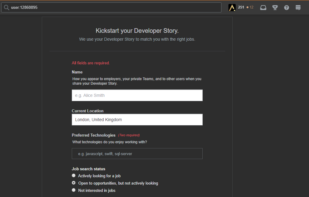
Developer story form input fields are still white instead of dark grey like the search bar with my user tag:

screenshot

1
1
vote

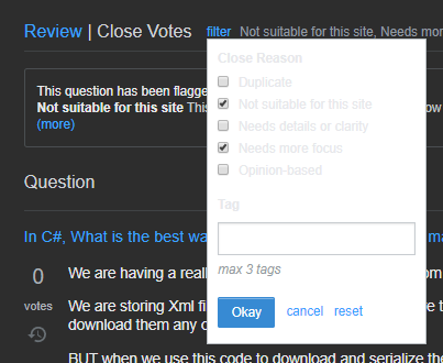
The filter on the Close Votes is not in Dark Mode.

enter image description here

1
vote

Note: I'm quite sure that no one has already posted this, please let me know in the comments if so and I will immediately delete my answer.

The text in the selected navigation tab on my profile page should be white, not black:

screenshot1

screenshot2

Fails WAIM contrast checker for normal text

1
  • 2
    If it was white, it would lack sufficient contrast (2.63:1). Black does have sufficient contrast (7.95:1). Commented May 12, 2020 at 20:28
1
vote

The Help Center > Badges page navigation is a bit unusually coloured

enter image description here

Especially on hover:

enter image description here

2
1
vote

I strictly advise you to glance at the website using the DarkReader extension. I think it's looking exactly like what is expected.

4
  • If you want to keep using plugins for dark mode, go ahead 🖤
    – Aaron Shekey StaffMod
    Commented May 11, 2020 at 20:14
  • @AaronShekey You've got me wrong. Actually, it signals thou - moderators - to how you should actually make the no-frills dark mode for the platform. Commented May 11, 2020 at 21:18
  • What browser did you try the extension on? Firefox? Commented Jun 11, 2020 at 14:11
  • @PeterMortensen chrome, sir Commented Jun 11, 2020 at 14:13
1
vote

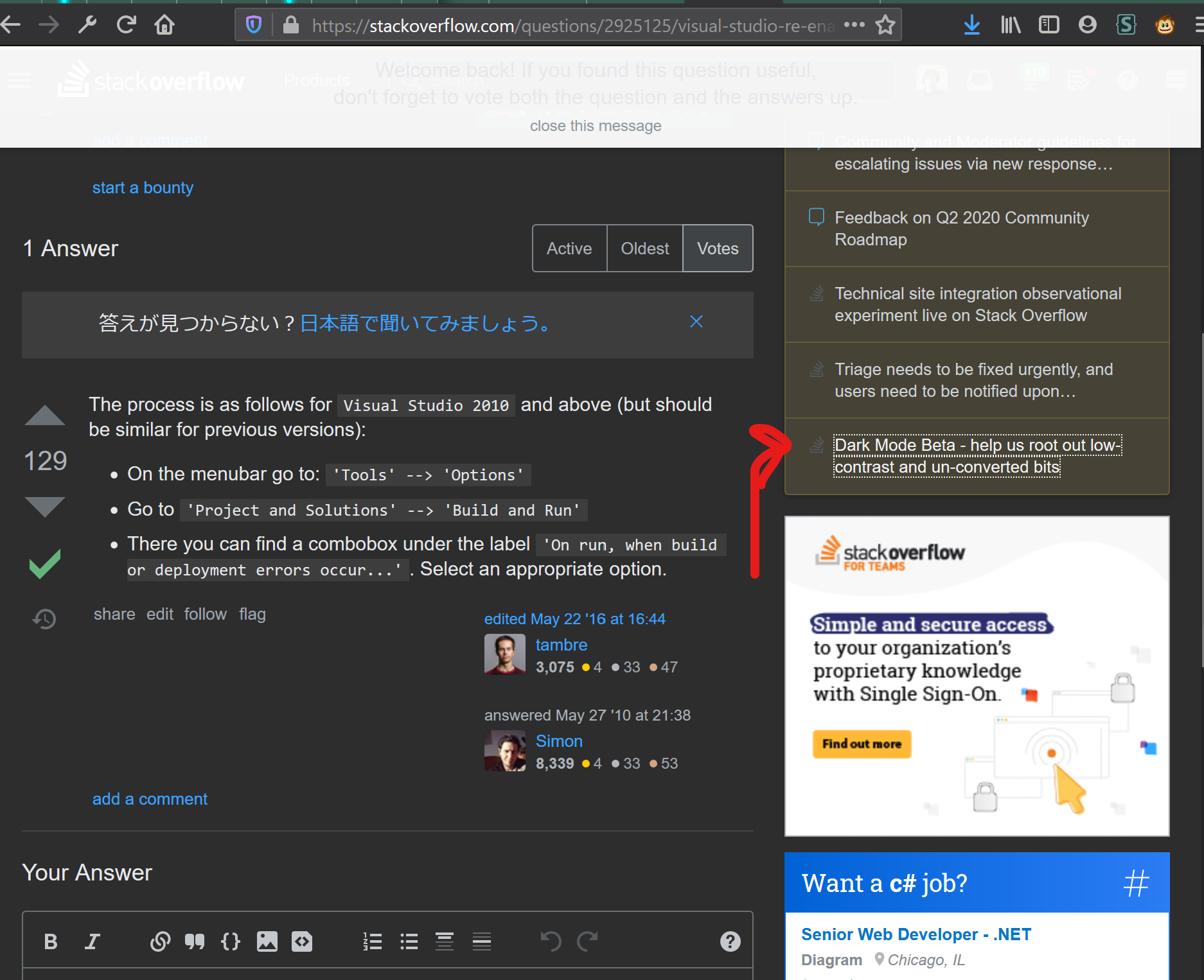
The very link to this page has a low-contrast Meta Stack Overflow logo in it:

Sidebar link “Dark Mode Beta - help us root out low-contract and un-converted bits” beside a low-contrast Meta Stack Overflow logo

With more context:

Page with more context

0
votes

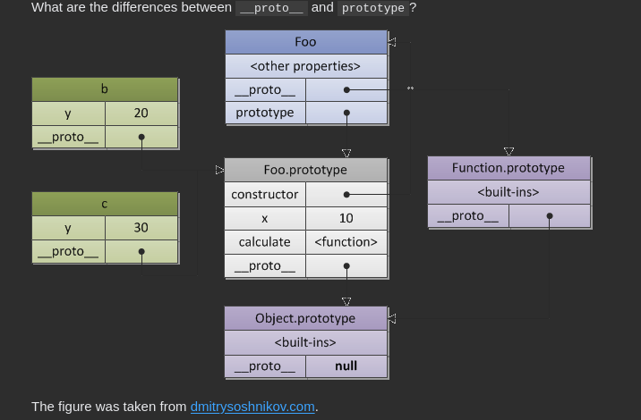
Images in questions are affected by dark mode, Question link: __proto__ VS. prototype in JavaScript

Real Image: Image showing all the arrows correctly

Image after dark mode:

Image shown in dark mode

2
  • 1
    Already reported - meta.stackoverflow.com/a/396071. Commented Apr 2, 2020 at 9:35
  • 1
    This is a good example of the issue though so I added a note about it in my answer with a reference to you in case this is closed.
    – Alex Telon
    Commented Apr 2, 2020 at 10:59
0
votes

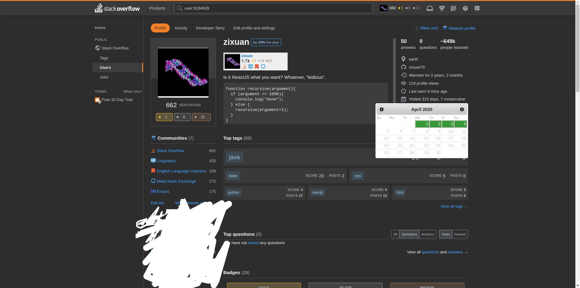
Right now, even if you put on Dark Mode, the calendar (the one that shows your consecutive days) is still bright. It doesn't fit in with the rest of the profile on Dark Mode.

See: enter image description here The consecutive days calendar in the middle right is white, but I want it to be a bit darker to blend in with the other ones. Also, the color of the text should stay white and the green consecutive days should stay green. Just the background should be a little bit darker.

1
  • This is the only mention of the calendar, afaik. It's a legitimate feature-request if not a bug.
    – bad_coder
    Commented Apr 17, 2020 at 21:13
0
votes

In the profile section where you may select which badge to track, the text sort of blends in and is hard to read.

the issue

1
  • 4
    Did you check out the rest of the answers to see if this has already been reported? Commented Apr 7, 2020 at 5:46
0
votes

Found another one: the text for the decline reason is hard to see against the dark background.

screenshot

2
0
votes

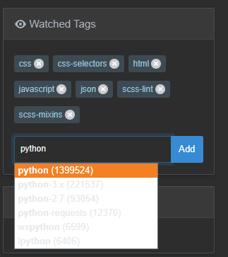
This bug is similar as https://meta.stackoverflow.com/a/396056 but I found it at "Watched Tags" section.
The dropdown selection at edit "Watched Tags" with white background.

Watched Tags

And the textbox background still white color while loading tag.

search tag

0
votes

In User Profile Activity the meta-SO icon is very low contrast.

enter image description here

6
  • FYI this specific one isn't a duplicate, I checked. Although similar icons occurring in other parts of the site have been reported.
    – bad_coder
    Commented Apr 17, 2020 at 5:45
  • Site sprites (appear in the site switcher or on profile pages) haven't been adapted to the dark theming. This means sites icons with dark colors (e.g. Super User, U&L, Salesforce, Wordpress, etc) may be difficult to see. - from the question. Commented Apr 17, 2020 at 6:02
  • @double-beep The question didn't say we shouldn't post this. Users perusing are bound to enjoy an illustrated inventory.
    – bad_coder
    Commented Apr 17, 2020 at 6:07
  • Then it's a duplicate - meta.stackoverflow.com/a/396048 (so, don't hurry to mention you checked all the answers). Commented Apr 17, 2020 at 6:10
  • @double-beep obviously isn't a duplicate. The icons are placed in completely different sections. Take notice of detail before erroneously claiming a post is duplicate, I've seen other instances where you claimed duplicates that weren't true with broken links to go with it.
    – bad_coder
    Commented Apr 17, 2020 at 6:14
  • So, what if they are placed in different section? Aren't they the exact same icons (only the background differs)? They even have the same classes: site switcher, user profile. Not sure why you mention a bug SE staff already knows! Commented Apr 17, 2020 at 6:24
0
votes

The overlay-header div hasn't been converted yet.

overlay-header screenshot

Here's the tag for the div:

<div id="overlay-header" style="display: block; opacity: 1;">Welcome back! If you found this question useful,<br>don't forget to vote both the question and the answers up.<br><a class="close-overlay">close this message</a></div>
1
0
votes

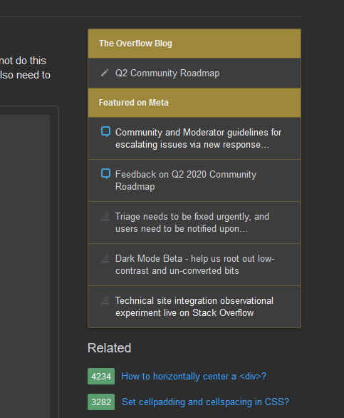
The current color weights for the announcements/pinned posts header look a little... bleurgh...

It's not perfect (contrast is still an issue with the chosen favicons, and a small problem with the white on gold background), but I've found these color changes to be a good start on fixing that:

.s-sidebarwidget__yellow .s-sidebarwidget--header {
    background-color: #9e883b;
}

.s-sidebarwidget__yellow {
    background-color: #3d3d3d;
}

Example:

New

5
  • 2
    This looks like something out of Star Trek TNG. 💚
    – Catija Staff
    Commented Apr 9, 2020 at 13:49
  • 2
    @Catija It does give off Geordi LaForge vibes, now that you mention it.
    – TylerH
    Commented Apr 9, 2020 at 13:54
  • If we're going to touch this component, I'd like to just change it to grayscale, which already exists as a variant. stackoverflow.design/product/components/sidebar-widgets
    – Aaron Shekey StaffMod
    Commented May 11, 2020 at 19:54
  • @AaronShekey To be clear, are you declining the request to adjust the current colors? Or did you intend to decline the suggested colors? The colors I suggested in the answer were just an example. Your comment about grayscale already existing is a bit confusing.
    – TylerH
    Commented May 11, 2020 at 23:02
  • 1
    I'm declining the colors as they're proposed. If anything, we'd remove the class .s-sidebarwidget__yellow to go with the default grayscale colors from that component.
    – Aaron Shekey StaffMod
    Commented May 11, 2020 at 23:05
0
votes

https://stackoverflow.com/users/########/xxxxxxxxxxx

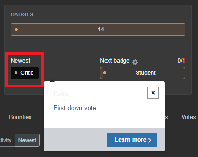
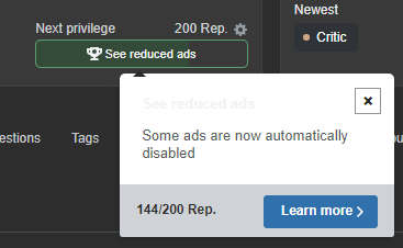
When clicking on a badge (the "next badge" and "next privilege" also act in the same way):

enter image description here enter image description here

3
  • 6
    already reported here: meta.stackoverflow.com/a/395950/578411
    – rene
    Commented Mar 31, 2020 at 9:23
  • My bad ... I scrolled through the answers too fast. I'm leaving this answer here in any case since I also mentioned "next badge" and "next priviliege".
    – GChuf
    Commented Mar 31, 2020 at 9:24
  • Yeah, I knew I saw it earlier but couldn't find it easily either.
    – rene
    Commented Mar 31, 2020 at 9:26
0
votes

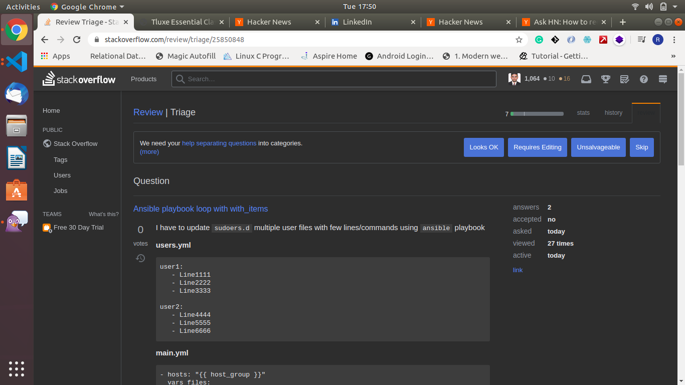
Triage review queue: The review tab has unreadable black text and turns white when hovered over.

enter image description here enter image description here

Found at: https://stackoverflow.com/review/triage/26143865

4
0
votes

Overlay header Overlay header

1
0
votes

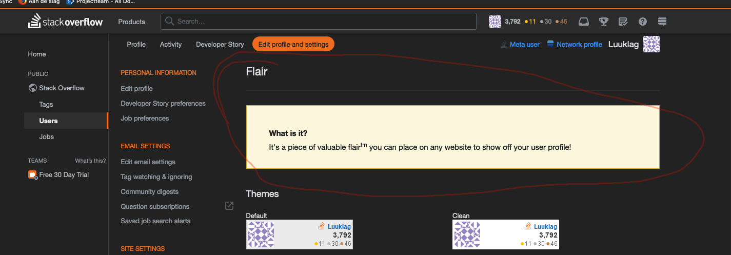
This box about Flair, see freehand circle, could use some love.

enter image description here

0
votes

Accepted answers have a weird, bright yellow selected like background around them. This doesn't happen on every accepted answer, and so far I've only had it happen to answers accepted a long time ago.

The only way I can seem to make it go away is by selecting the text (which doesn't highlight as selected because of it) and then click outside the text a couple of times. Refreshing the page makes the text background yellow again.

enter image description here Answer from the screenshot is this one: https://stackoverflow.com/a/4642146/8628766

Using Google Chrome 83.0.4103.97 (Official Build) (64-bit) on Windows 10 (64-bit)

2
  • 4
    Can't reproduce this with Firefox. Could it be related to this? Commented Jun 15, 2020 at 8:34
  • Yes that does seem to be it @BillTür . Looking at Martijn's answer and my url it does contain the :~:text he mentions. I should've looked for global bug (feature?) reports rather than just in here. Thanks for bringing up that post.
    – Remy
    Commented Jun 15, 2020 at 8:55
0
votes

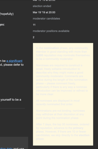
The contrast of the box in the sidebar on the election page is low:

Low contrast on election page

Link: https://stackoverflow.com/election/11

2
  • Not quite sure what warrants a downvote here... is this a duplicate? Commented Jun 11, 2020 at 22:30
  • Seems to be fixed now, I'll mark completed. Commented Jun 17, 2020 at 19:19
-1
votes

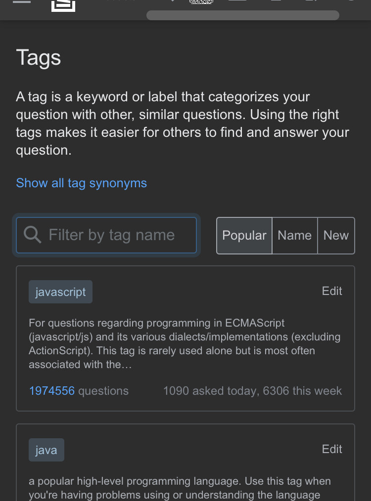
The mobile site doesn't seem to have a dark theme at all. This is no big deal (well, it's be nice but I'm not expecting the mobile site to get much love until the main site is fully ironed out), except that switching to dark theme on a desktop now seems to mean that some parts of the mobile site, that were mobile presented, have acquired the desktop dark theme page - for example the tags list used to be a nice compact listing of all the tags and no extra descriptive blurb. Now on a mobile it seems to be the desktop version of he tag list, replete with verbiage and it has lost the nav at the top:

enter image description here

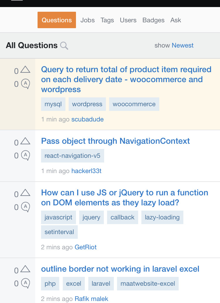
Of the following nav bar items:

enter image description here

Questions, jobs and badges remain white mobile, and tags, users and ask drop to desktop version dark pages. I'd like the mobile site to be consistently mobile at least

-1
votes

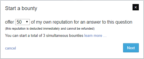
The bounty sum still has white text:

enter image description here

It also appears in the list of questions as white:

enter image description here

And the blue around it looks suspiciously light to me, too.

White text sticks out like a sore thumb in the ultra-dark mode, for ease of detection, even if that style is not going to be persisted in public.

2
  • If it was darker, then you couldn't see it. Commented Apr 4, 2020 at 14:57
  • @zixuan That would be compensated for by reducing the brightness of the blue. Commented Apr 4, 2020 at 14:58
-1
votes

Images in " Help Center > Privileges " are not set as dark mode images:

For example:

Help Center > Privileges > Set bounties:

enter image description here

Help Center > Privileges > Flag posts:

enter image description here

and we can see the same images without dark mode in:

Help Center > Privileges > Established user

Help Center > Privileges > Reduce ads

Help Center > Privileges > Access to site analytics

Help Center > Privileges > Access to moderator tools

Help Center > Privileges > Create tag synonyms

5
  • 1
    We don't really have a way to change these images based on background color. These pages are created pretty much with the same editor as posts are made with, so there's no way to serve a different image based on the mode you're using.
    – Catija Staff
    Commented Apr 2, 2020 at 22:08
  • but it's not good at dark mode Commented Apr 2, 2020 at 22:13
  • 1
    Images aren’t something any site can really solve for... so, say we make this part of the site in dark mode... your answer here will have the identical problem. We just can’t fix that. An image is an image.
    – Catija Staff
    Commented Apr 2, 2020 at 22:18
  • ok I just suggested that Commented Apr 2, 2020 at 22:21
  • 1
    Also, @Alirezaaraby, you don't need to have both light and dark mode. This is just to show new privilege earners what it looks like. Light and dark mode have the same text. The only difference is the colors. Commented Apr 4, 2020 at 15:05
-2
votes

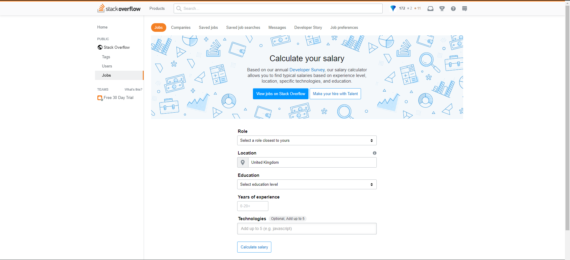
Entire page is still light mode

enter image description here

https://stackoverflow.com/jobs/salary

-2
votes

Selected tabs are not visible

2
-2
votes

In dark-mode privileges page, the active tab has hard-to-read font color (e.g. selected tab "milestone" at the bottom of screenshot). To this moment nobody report this bug on this page. Maybe similar problem occures in other pages, bud I don't know that that pages are independent or they use some shared code - so I report it

enter image description here

1
-2
votes

When I type a comment:

enter image description here

Really hard to see what to type in...

6
  • This has already been reported! Commented Apr 6, 2020 at 5:21
  • 4
    @double-beep If you're going to leave comments like that on answers, please include a link to the answer where you think it's already been reported. Otherwise, the comment is useless.
    – Cody Gray Mod
    Commented Apr 7, 2020 at 8:19
  • Already covered in double-beep's answer.
    – Scratte
    Commented Apr 7, 2020 at 8:44
  • @CodyGray isn't that something that should be done by the OP? Commented Apr 7, 2020 at 10:43
  • 2
    @double-beep I don't see how that would be the OP's job. If they'd seen the other answer you had in mind, then they wouldn't have posted a duplicate. On the contrary, if you're going to make the claim that the answer is a duplicate of an existing answer, then you should provide some evidence. Think of it this way: if I have proof that the answer is a duplicate, it makes it easier for me to prune.
    – Cody Gray Mod
    Commented Apr 8, 2020 at 8:08
  • @double-beep Yes, the OP should be searching for duplicates. But if you're going to comment about it being a dupe, just like with a question, point to the dupe. OPs are supposed to search for those too... Commented Apr 16, 2020 at 16:32
-3
votes

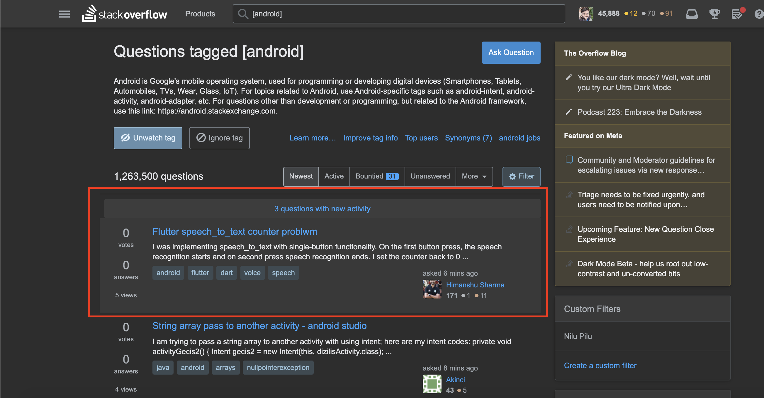
When a new question arrived in your watch list tag

enter image description here

You must log in to answer this question.

Not the answer you're looking for? Browse other questions tagged .