replaced http://meta.stackoverflow.com/ with https://meta.stackoverflow.com/
Source Link

(Check the revision for fixed bugs)

  1. Vote count overflow in the sidebar [FIXED]

  2. Jon Skeet's problem (preemptive)

I modified the badge count in the DOM inspector to check whether it has space for high count of badges.

  1. Pagination is located at a weird position [FIXED]

  2. The tags are 1px too close to their description on the tags pagetags page. Although it is only 1px, it is enough to cause the impressions that they are closer than they should be.

Overlay for comparison

  1. Misaligned drop-down on favorite tag/ignored tag

The same problem on main site, but the difference is not as striking.

There are also too much space between "Ignored tags" and the box.

  1. Misaligned vote count in list of posts (e.g. http://meta.stackoverflow.com/tags/design/newhttps://meta.stackoverflow.com/tags/design/new)

There are also too much spaces to the left.

On the main site, the vote count has a colored background, but the new design make the background white, so the number looks floating.

  1. On home page, the color is not applied to the numbers on questions with high view [FIXED]

  2. On badges pagebadges page, the check mark is misaligned [FIXED], and the space to the right for the names seems to be lacking [FIXED], causing it to wrap to the next line.

  3. Contact pageContact page

  1. Quote starting a post breaks the preview [FIXED]

(Check the revision for fixed bugs)

  1. Vote count overflow in the sidebar [FIXED]

  2. Jon Skeet's problem (preemptive)

I modified the badge count in the DOM inspector to check whether it has space for high count of badges.

  1. Pagination is located at a weird position [FIXED]

  2. The tags are 1px too close to their description on the tags page. Although it is only 1px, it is enough to cause the impressions that they are closer than they should be.

Overlay for comparison

  1. Misaligned drop-down on favorite tag/ignored tag
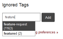
The same problem on main site, but the difference is not as striking.

There are also too much space between "Ignored tags" and the box.

  1. Misaligned vote count in list of posts (e.g. http://meta.stackoverflow.com/tags/design/new)

There are also too much spaces to the left.

On the main site, the vote count has a colored background, but the new design make the background white, so the number looks floating.

  1. On home page, the color is not applied to the numbers on questions with high view [FIXED]

  2. On badges page, the check mark is misaligned [FIXED], and the space to the right for the names seems to be lacking [FIXED], causing it to wrap to the next line.

  3. Contact page

  1. Quote starting a post breaks the preview [FIXED]

(Check the revision for fixed bugs)

  1. Vote count overflow in the sidebar [FIXED]

  2. Jon Skeet's problem (preemptive)

I modified the badge count in the DOM inspector to check whether it has space for high count of badges.

  1. Pagination is located at a weird position [FIXED]

  2. The tags are 1px too close to their description on the tags page. Although it is only 1px, it is enough to cause the impressions that they are closer than they should be.

Overlay for comparison

  1. Misaligned drop-down on favorite tag/ignored tag

The same problem on main site, but the difference is not as striking.

There are also too much space between "Ignored tags" and the box.

  1. Misaligned vote count in list of posts (e.g. https://meta.stackoverflow.com/tags/design/new)

There are also too much spaces to the left.

On the main site, the vote count has a colored background, but the new design make the background white, so the number looks floating.

  1. On home page, the color is not applied to the numbers on questions with high view [FIXED]

  2. On badges page, the check mark is misaligned [FIXED], and the space to the right for the names seems to be lacking [FIXED], causing it to wrap to the next line.

  3. Contact page

  1. Quote starting a post breaks the preview [FIXED]
deleted 81 characters in body
Source Link
nhahtdh
  • 56.8k
  • 1
  • 22
  • 27

(Check the revision for fixed bugs)

  1. Vote count overflow in the sidebar [FIXED]

  2. Jon Skeet's problem (preemptive)

I modified the badge count in the DOM inspector to check whether it has space for high count of badges.

  1. Pagination is located at a weird position (as seen in this question)

    Pagination is located at a weird position [FIXED]

  2. The tags are 1px too close to their description on the tags page. Although it is only 1px, it is enough to cause the impressions that they are closer than they should be.

It is not align with anything.

  1. The tags are 1px too close to their description on the tags page. Although it is only 1px, it is enough to cause the impressions that they are closer than they should be.

Overlay for comparison

  1. Misaligned drop-down on favorite tag/ignored tag

The same problem on main site, but the difference is not as striking.

There are also too much space between "Ignored tags" and the box.

  1. Misaligned vote count in list of posts (e.g. http://meta.stackoverflow.com/tags/design/new)

There are also too much spaces to the left.

On the main site, the vote count has a colored background, but the new design make the background white, so the number looks floating.

  1. On home page, the color is not applied to the numbers on questions with high view

    On home page, the color is not applied to the numbers on questions with high view [FIXED]

  2. On badges page, the check mark is misaligned [FIXED], and the space to the right for the names seems to be lacking [FIXED], causing it to wrap to the next line.
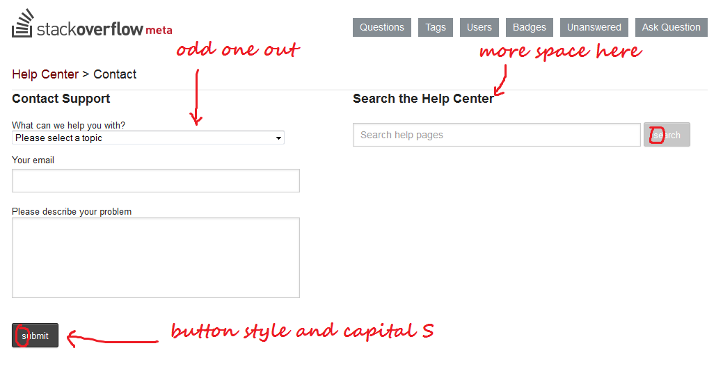
  3. Contact page

  1. On badges page, the check mark is misaligned [FIXED], and the space to the right for the names seems to be lacking [Partial fix], causing it to wrap to the next line.

  1. Contact page

  1. Quote starting a post breaks the preview [FIXED]

On preliminary investigation, it is probably caused by float property.

(Check the revision for fixed bugs)

  1. Vote count overflow in the sidebar [FIXED]

  2. Jon Skeet's problem (preemptive)

I modified the badge count in the DOM inspector to check whether it has space for high count of badges.

  1. Pagination is located at a weird position (as seen in this question)

It is not align with anything.

  1. The tags are 1px too close to their description on the tags page. Although it is only 1px, it is enough to cause the impressions that they are closer than they should be.

Overlay for comparison

  1. Misaligned drop-down on favorite tag/ignored tag

The same problem on main site, but the difference is not as striking.

There are also too much space between "Ignored tags" and the box.

  1. Misaligned vote count in list of posts (e.g. http://meta.stackoverflow.com/tags/design/new)

There are also too much spaces to the left.

On the main site, the vote count has a colored background, but the new design make the background white, so the number looks floating.

  1. On home page, the color is not applied to the numbers on questions with high view

  1. On badges page, the check mark is misaligned [FIXED], and the space to the right for the names seems to be lacking [Partial fix], causing it to wrap to the next line.

  1. Contact page

  1. Quote starting a post breaks the preview

On preliminary investigation, it is probably caused by float property.

(Check the revision for fixed bugs)

  1. Vote count overflow in the sidebar [FIXED]

  2. Jon Skeet's problem (preemptive)

I modified the badge count in the DOM inspector to check whether it has space for high count of badges.

  1. Pagination is located at a weird position [FIXED]

  2. The tags are 1px too close to their description on the tags page. Although it is only 1px, it is enough to cause the impressions that they are closer than they should be.

Overlay for comparison

  1. Misaligned drop-down on favorite tag/ignored tag

The same problem on main site, but the difference is not as striking.

There are also too much space between "Ignored tags" and the box.

  1. Misaligned vote count in list of posts (e.g. http://meta.stackoverflow.com/tags/design/new)

There are also too much spaces to the left.

On the main site, the vote count has a colored background, but the new design make the background white, so the number looks floating.

  1. On home page, the color is not applied to the numbers on questions with high view [FIXED]

  2. On badges page, the check mark is misaligned [FIXED], and the space to the right for the names seems to be lacking [FIXED], causing it to wrap to the next line.

  3. Contact page

  1. Quote starting a post breaks the preview [FIXED]
deleted 256 characters in body
Source Link
nhahtdh
  • 56.8k
  • 1
  • 22
  • 27
  1. Vote count overflow in the sidebar

As seen in this question: Feedback requested: New "recommended" homepage, phase 4 - filters

Funny thing is that on Firefox, it only appears like that around(Check the default zoom level. The problem goes away when zooming up or zooming down a bitrevision for (but it should be fixed regardlessfixed bugs).

  1. Jon Skeet's problem (preemptive)
  1. Vote count overflow in the sidebar [FIXED]

  2. Jon Skeet's problem (preemptive)

I modified the badge count in the DOM inspector to check whether it has space for high count of badges.

  1. Pagination is located at a weird position (as seen in this question)

It is not align with anything.

  1. The tags are 1px too close to their description on the tags page. Although it is only 1px, it is enough to cause the impressions that they are closer than they should be.

Overlay for comparison

  1. Misaligned drop-down on favorite tag/ignored tag

The same problem on main site, but the difference is not as striking.

There are also too much space between "Ignored tags" and the box.

  1. Misaligned vote count in list of posts (e.g. http://meta.stackoverflow.com/tags/design/new)

There are also too much spaces to the left.

On the main site, the vote count has a colored background, but the new design make the background white, so the number looks floating.

  1. On home page, the color is not applied to the numbers on questions with high view

  1. On badges page, the check mark is misaligned [FIXED], and the space to the right for the names seems to be lacking [Partial fix], causing it to wrap to the next line.

  1. Contact page

  1. Quote starting a post breaks the preview

On preliminary investigation, it is probably caused by float property.

  1. Vote count overflow in the sidebar

As seen in this question: Feedback requested: New "recommended" homepage, phase 4 - filters

Funny thing is that on Firefox, it only appears like that around the default zoom level. The problem goes away when zooming up or zooming down a bit (but it should be fixed regardless).

  1. Jon Skeet's problem (preemptive)

I modified the badge count in the DOM inspector to check whether it has space for high count of badges.

  1. Pagination is located at a weird position (as seen in this question)

It is not align with anything.

  1. The tags are 1px too close to their description on the tags page. Although it is only 1px, it is enough to cause the impressions that they are closer than they should be.

Overlay for comparison

  1. Misaligned drop-down on favorite tag/ignored tag

The same problem on main site, but the difference is not as striking.

There are also too much space between "Ignored tags" and the box.

  1. Misaligned vote count in list of posts (e.g. http://meta.stackoverflow.com/tags/design/new)

There are also too much spaces to the left.

On the main site, the vote count has a colored background, but the new design make the background white, so the number looks floating.

  1. On home page, the color is not applied to the numbers on questions with high view

  1. On badges page, the check mark is misaligned, and the space to the right for the names seems to be lacking, causing it to wrap to the next line.

  1. Contact page

  1. Quote starting a post breaks the preview

On preliminary investigation, it is probably caused by float property.

(Check the revision for fixed bugs)

  1. Vote count overflow in the sidebar [FIXED]

  2. Jon Skeet's problem (preemptive)

I modified the badge count in the DOM inspector to check whether it has space for high count of badges.

  1. Pagination is located at a weird position (as seen in this question)

It is not align with anything.

  1. The tags are 1px too close to their description on the tags page. Although it is only 1px, it is enough to cause the impressions that they are closer than they should be.

Overlay for comparison

  1. Misaligned drop-down on favorite tag/ignored tag

The same problem on main site, but the difference is not as striking.

There are also too much space between "Ignored tags" and the box.

  1. Misaligned vote count in list of posts (e.g. http://meta.stackoverflow.com/tags/design/new)

There are also too much spaces to the left.

On the main site, the vote count has a colored background, but the new design make the background white, so the number looks floating.

  1. On home page, the color is not applied to the numbers on questions with high view

  1. On badges page, the check mark is misaligned [FIXED], and the space to the right for the names seems to be lacking [Partial fix], causing it to wrap to the next line.

  1. Contact page

  1. Quote starting a post breaks the preview

On preliminary investigation, it is probably caused by float property.

HTTPS
Source Link
Ry- Mod
  • 224.4k
  • 21
  • 21
Loading
added 191 characters in body
Source Link
nhahtdh
  • 56.8k
  • 1
  • 22
  • 27
Loading
added 178 characters in body
Source Link
nhahtdh
  • 56.8k
  • 1
  • 22
  • 27
Loading
added 117 characters in body
Source Link
nhahtdh
  • 56.8k
  • 1
  • 22
  • 27
Loading
added 223 characters in body
Source Link
nhahtdh
  • 56.8k
  • 1
  • 22
  • 27
Loading
added 173 characters in body
Source Link
nhahtdh
  • 56.8k
  • 1
  • 22
  • 27
Loading
added 340 characters in body
Source Link
nhahtdh
  • 56.8k
  • 1
  • 22
  • 27
Loading
added 162 characters in body
Source Link
nhahtdh
  • 56.8k
  • 1
  • 22
  • 27
Loading
added 162 characters in body
Source Link
nhahtdh
  • 56.8k
  • 1
  • 22
  • 27
Loading
added 162 characters in body
Source Link
nhahtdh
  • 56.8k
  • 1
  • 22
  • 27
Loading
added 171 characters in body
Source Link
nhahtdh
  • 56.8k
  • 1
  • 22
  • 27
Loading
added 205 characters in body
Source Link
nhahtdh
  • 56.8k
  • 1
  • 22
  • 27
Loading
Source Link
nhahtdh
  • 56.8k
  • 1
  • 22
  • 27
Loading