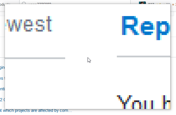
When looking at the lines below, the section headers like "Questions" or "Answers" on the activity summary page, you will notice that they are off by one pixel in comparison to the ones right next to them (in this case "Reputation" and "Tags"). I tested this in Firefox and Chrome on different resolutions, using Windows 10 without scaling.
This seems to be related to the selectable tabs in these sections, since "Questions", "Answers" and "Offered Bounties" are lower on the left side of the summary, while on the right side "Badges" is lower than the "Accounts" located on the left side. Each of these has tabs, which use an orange marker with a two pixels height:
It seems that this pushes down the line by one pixel. The line is achieved through a border-bottom on the .subheader class. The reason for the lower placement is the bigger bounding box of the subheader when tabs are visible:
Disabling the border-bottom on .subtabs a results in a correct placement, but of course the selection indicator for the tabs is no longer visible. Fascinatingly the border of the marker is also declared with a width of 1 pixel, so I don't quite understand why it's 2 pixels high on my screen (I'm not a web developer, though).


