-100

Update August 16th, 2024

We appreciate all of the feedback and perspectives that have been shared. Some of the feedback we received around RSS feeds and curation activities was not anticipated. We would like to hear a bit more from you about those things.To keep the conversations a bit more streamlined, we have created a separate post here to collect that feedback.


Back in June, we announced some upcoming experiments surrounding tags. I’m here to tell you how those experiments — the tag hover experiment, listed as “experiment 2” on the original post — fared and the next steps based on the experiment results. In addition to that experiment’s results, I also want to share some of the feedback we collected from “experiment 1,” where we prompted anonymous users who clicked the “ignore” button in the tag hover pop-up for what they thought the button did.

three sample mockups of how hover tag descriptions will look.

Of the three variants used during the experiment on Stack Overflow, variant B outperformed the others. Additionally, most of the feedback collected from “experiment 1” revealed that most users click “ignore” because they want the tag hover modal to go away. Together, these reasons led us to graduate variant B and consider two additional areas that require attention. We anticipate variant B will be released in the coming weeks. For now, this is only coming to Stack Overflow, and we will consider expanding this to the rest of the network later.

Ignoring tags

Current stats show us that the “watch tag” button gets a lot more clicks than the “ignore tag” button. We found around 15,000 anonymous users selected 'ignore' compared to 7,000 who chose 'watch.' Among registered users, the ratio of watching to ignoring is 7,755 to 3,663. That seems to indicate that some users might find the message box distracting, leading to a preference for dismissing it rather than using it to filter content.

Additionally, we’re trying to reduce the number of options available on some of these places to favor the most used actions or the actions we want to drive users towards in order to have them engage with the product earlier on before they move on to deeper engagement with other areas of the product.

We recognize that graduating this variant means one place fewer from which users can ignore tags. Some of the feedback from the original announcement post, as well as the feedback-gathering post about a future homepage, touched on how y’all use (or don’t use) the ignore feature, and it’s given some ideas on how questions can be filtered, etc.

Up Next

For “Experiment 3,”we’ll keep the “watch tag”as the call-to-action and will consider how to address where users ignore tags. In addition, we will be pushing the anonymous user experience on the tagged questions page in the coming weeks, with the registered user experience coming shortly after that. We will make updates to this post as each is rolled out.

Tag hover descriptions

As mentioned in the original announcement

Variants B and C show slightly shorter tag descriptions. For the purposes of this experiment, we’ll be grabbing the first line from the full tag wiki and using it in this context, but should the experiment prove successful, we’ll need to think of a better long-term solution. In the context of tagging questions (either when asking a question or editing it), the current excerpt, along with the usage guidance present in it, will still be used even during the experiment.

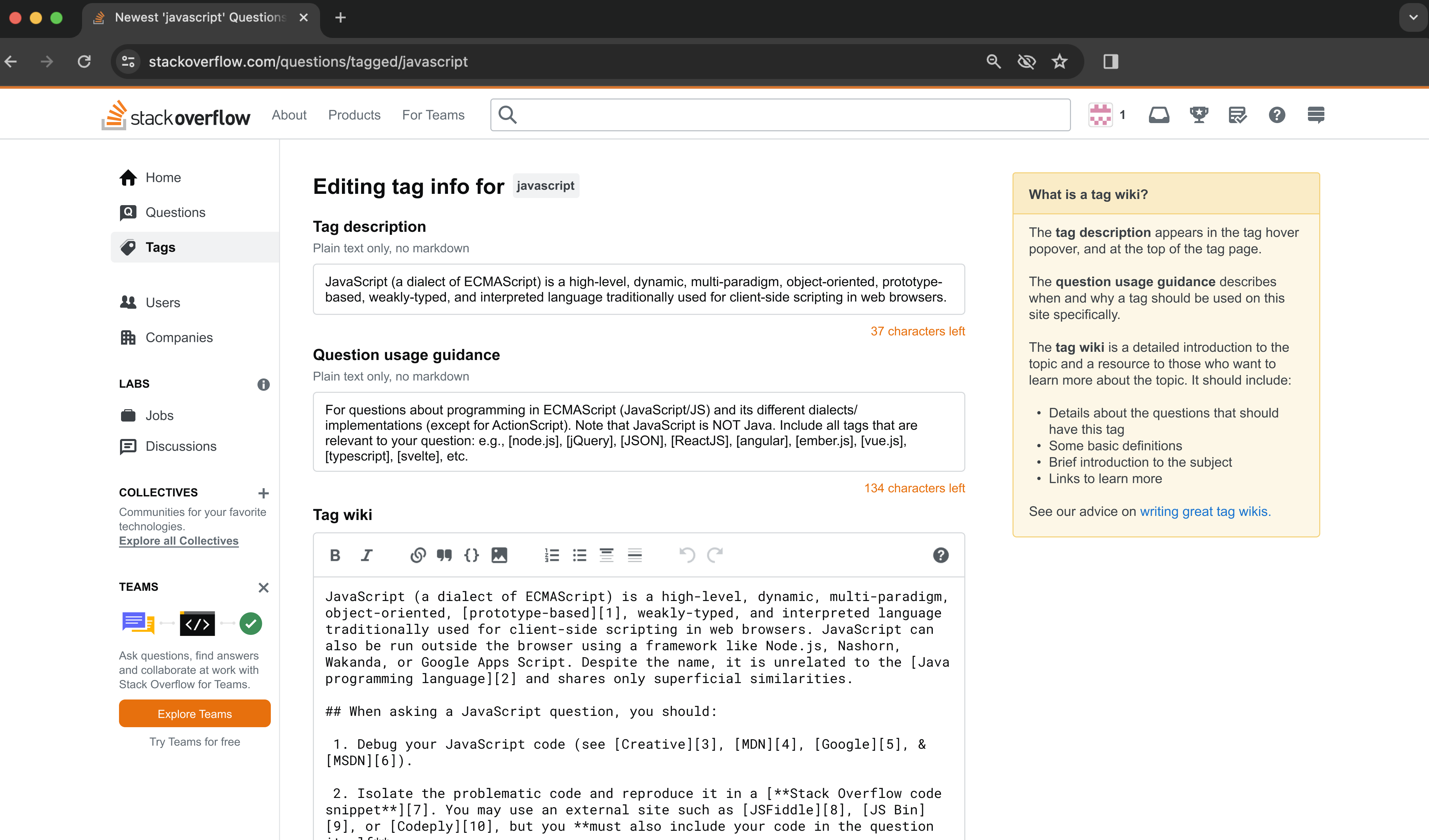
Graduating variant B means it’s time to think about a long-term solution for those hover descriptions. The current behavior is that the usage guidance is shown on all instances of tag hover, regardless of context. However, most wiki excerpts have tag usage guidance, which is not necessarily what users look for when they hover over a tag on a question they’re browsing. With that in mind, we’re proposing creating a new third field for tags, which should be an abridged version of the full tag wiki, but that is not meant to convey tag usage guidance — this new field would be shown when hovering over tags in contexts that are not asking or editing questions; in those instances, the usage guidance would still be used. See a mockup of what this looks like below note we also will be cleaning up the field names so it's a bit clearer what they are for. They will be as follows:

  • Tag Description(new field)
  • Usage Guidance -> Question Usage Guidance
  • Full tag wiki -> Tag Wiki

mockup of the new tag description field on the tag wiki page when editing

As with the currently existing fields for tags, these would be community-curated. To start we will create the tag description from the first sentence of the existing tag wiki. Then curators in the community can edit and improve these as they see fit.

We believe this change will effectively address most of the use cases in terms of tag information throughout the product. However, if you have thoughts on any additional use cases that aren’t covered by the existing two fields and the additional proposed one, please let us know, and we’ll consider whether to include it while we’re working on what has been described in this post.


We will be monitoring this post for feedback til August 21, 2024

24
  • 16
    Is this reversed? It seems to disagree with itself. - "Current stats show us that the “watch tag” button gets a lot more clicks than the “ignore tag” button. We found around 15,000 anonymous users selected 'ignore' compared to 7,000 who chose 'watch.'" or maybe it's supposed to be 70k instead of 7k?
    – Catija
    Commented Aug 7 at 15:24
  • 32
    I mean... shouldn't tag usage guidance show up in the popup to... guide users on how a given tag should be used, at the place where they're likely about to use it? :facepalm:
    – Kevin B
    Commented Aug 7 at 15:25
  • 23
    This is a net negative for the part of onboarding that actually matters for the goal of the site - that being informing users about different features of the site. This is only a positive if you [SE] want engagement numbers to go brrr to please shareholders, and make users more confidently incorrect when engaging with the site to achieve those numbers. Commented Aug 7 at 15:39
  • 21
    This is also especially annoying for burninations - the tag wiki excerpt, though inefficiently, is used as a warning to askers not to use the tag. Users ignore that warning because both the tag wiki and tag wiki excerpt are hidden by all parts of the UI - including the tag popup in the editor (wizard and otherwise). Congratulations, you [SE] just made burninations even harder to execute. Commented Aug 7 at 15:41
  • 13
    @SpencerG "Yes and that is what will happen. If you're writing a question, you will get the usage guidance" - you mean these? That users have been and continue to ignore because it's badly designed? Nearly no one (especially among users who didn't get any onboarding) actually reads the tag wiki excerpts because the UI does not indicate that it's necessary. This has been a recurring problem for over a decade, and continues to be ignored in favour of AI features and changes that make statistics go brrr - like the changes made here Commented Aug 7 at 15:46
  • 9
    @SpencerG I want to see the tag guidance when I look at a question. Not when I'm writing it. Because I'm not familiar with how every single tag should be used. Therefore, if I open a question I verify this by hovering over the tag.
    – VLAZ
    Commented Aug 7 at 15:46
  • 25
    Clicking "Ignore" does the same thing as "watch" - opens an account creation modal. I've got to agree with Kevin's answer on this - y'all are using the buttons as a honeypot to push people into the account creation flow while giving them no obvious way to close the modal other than the two buttons. That seems like more of an argument for removing the buttons for logged out users or replacing them with a more forthright option - "Create an account to watch or ignore tags!" along with a close button. A 2 to 1 ratio is a pretty fair argument for keeping both buttons.
    – Catija
    Commented Aug 7 at 16:28
  • 9
    @Catija "y'all are using the buttons as a honeypot to push people into the account creation" also, variant B and C lack the RSS feed button. Using RSS feed does not require an account, so an anonymous user could have used it to monitor content. Now that's no longer easily accessible. Yes, you can still get to it. If you go to a tag page. Then scroll all the way down. It's at the end of the right sidebar. Essentially hidden unless you either know about it, or you have a plugin that uncovers RSS feeds on a page.
    – VLAZ
    Commented Aug 7 at 16:34
  • 5
    @VLAZ It's unclear to me whether the RSS being MIA is intentional or not. I haven't seen anything that indicates it's purposefully being removed. While people have mentioned it, no staff member has stated anything. It's possible that it could be reinstated. That said, it's unclear how frequently people create RSS feeds and I don't know they have data about it - I'd recommend asking for more info or requesting it be retained or for an explanation of why it's being removed. Your points are valid and fair - it's reasonable to ask for the button to be more findable.
    – Catija
    Commented Aug 7 at 16:41
  • 8
    @Catija given that a lot of decision have been made that specifically negatively target anonymous users. Trying to get them to sign up seems to be the focus. I find it hard to believe the RSS isn't another one. But sure, I'll ask. I'll get a political answer as always. Maybe a "oops, we missed it". I don't expect a "Yes, we don't want anonymous users to have data feeds from us" even though SE seem to be heading towards that exact future with deliberately trying to introduce friction for the dump.
    – VLAZ
    Commented Aug 7 at 16:49
  • 5
    "To start we will create the tag description from the first sentence of the existing tag wiki. Then curators in the community can edit and improve these as they see fit." -- As in "we'll break it all, and the community can clean it up afterwards". Interesting thinking, given how persistent the company has been with alienating us. Shouldn't it be you who is cleaning up the mess you've made?
    – Dan Mašek
    Commented Aug 7 at 18:06
  • 5
    From user training to user wrecking. You gotta call that progress.
    – tripleee
    Commented Aug 7 at 19:03
  • 5
    "variant B outperformed the others." Where can I find the data about this ? Commented Aug 8 at 7:29
  • 8
    What does "Outperform" even mean here? Were there less questions where the tag was removed due to inappropriate tag use in variant B?
    – Erik A
    Commented Aug 8 at 12:52
  • 3
    Did you consider AI to summarize the existing guidance and wiki text to the new "Tag Description"? Because then the model can learn from actual curators. I would bring it up in a meeting with senior leadership.
    – rene
    Commented Aug 8 at 21:01

8 Answers 8

119

Everything about this is backwards.

  1. Removing the ignore button because some subset of users are using it as a close button

    If people are looking for a close button, why not give them one? Currently the location where a close button would exist is taken up by an rss feed icon. Is repositioning this icon so difficult that we can't give users the close button they're looking for?

  2. The ignore button gets far more clicks than the watch button for anonymous users

    Why do anonymous users even get these buttons? They only serve as a method to trick the user into triggering a login box. It's clear from the remaining stats that authenticated users use both buttons.

  3. Tag hover descriptions

    Creating a new field or swapping which field is used for this purpose when we've been filling out the existing fields with this direct usage in mind is madness. Shouldn't we first discuss what messaging should be on these fields instead of just assuming what we've been doing for 15+ years is wrong?

4
  • 10
    For the record... I'm not against changing what descriptions we show where, I could certainly see some pathway to having context-aware tag popups that show one description for this purpose vs that purpose, but just steamrolling ahead, undoing the work of of the community over more than a decade without a clear path forward for filling out a potentially new field on 50k+ tags is frustrating, to put it mildly.
    – Kevin B
    Commented Aug 7 at 15:56
  • 5
    Changes like this speak to a clear and complete lack of understanding as to how the tag system works/is used by the community, including people who are new and who ask/answer questions.
    – TylerH
    Commented Aug 7 at 16:01
  • 3
    I'm guessing there's far fewer tag excerpts that make for poor popup text than there are wikis that make for good popup text, given we've been using the excerpt to create popup text directly. It would have probably been a good community project to identify these problem areas and fix them.
    – Kevin B
    Commented Aug 7 at 16:09
  • 4
    Also... i had no idea we lost the rss feed icon, so now there's not even anything there in the way of adding the button people are looking for.
    – Kevin B
    Commented Aug 7 at 16:30
89

I have to admit that I'm a bit confused about this decision but I'll talk through it a bit here to cover why I'm confused.

Watch / Ignore buttons for logged out users

If y'all want to use these buttons as a way to get people to create an account, I'd personally recommend being more forthright with users about that rather than using these buttons. While it avoids needing to have two designs for logged in vs logged out users, you're already having to special case the behavior on click. I think you'd be better served with a call to action that doesn't surprise users - "Create an account to watch or ignore tags".

Why are people using "ignore" to close the hover?

User feedback indicates that logged out users are just trying to get the hover to go away, which is fair, since there's no close button. Furthermore, you might ask yourself - "Why are so many people doing this... all they have to do is move their mouse off the box?" Let's always remember this great example, but maybe there's also some other issues.

That the box will close isn't always clear. For example, if you scroll down the page while it's open, it stays open while the page is scrolling (Chrome and FF for Mac), so someone who scrolls down and back up (and ends up with their pointer back in the hover box) might think it doesn't close automatically.

There also may be some cases where the box doesn't close. While I can't reproduce it, there are cases where the info box for tags doesn't actually close when I move the mouse away. Then I start randomly clicking all over the place to make it go away so I can go back to reading the content on the page. Sometimes I just give up and refresh the page. I don't know what causes this, but it's frustrating.

That's a 2:1 ratio, right?

Current stats show us that the “watch tag” button gets a lot more clicks than the “ignore tag” button. [...] Among registered users, the ratio of watching to ignoring is 7,755 to 3,663.

So, out of 11418 clicks, 68% were "Watch" and 32% were "Ignore". I guess in my mind, that's clear indication that both are used pretty widely. I could understand removing the button if it were 90%/10% or something but... not for this distribution.

Additionally, we’re trying to reduce the number of options available on some of these places to favor the most used actions or the actions we want to drive users towards in order to have them engage with the product earlier on before they move on to deeper engagement with other areas of the product.

I think it might be helpful for you to understand that allowing people to omit stuff can actually increase engagement. By filtering out content they don't want to see, users see more of the things they do want to see.

A personal example - in my job hunt, while I feel stuck with LinkedIn, I far prefer the options Indeed has to block specific employers from being shown in search results. It allows me to easily avoid job postings from companies I do not want to work for. I wish LI had that sort of feature but it doesn't. All I can do is ask LI to stop showing me specific job postings... which doesn't actually work.

I'm all for reducing clutter but a button that gets 1/3 of the clicks in a UI element from logged in users doesn't seem like clutter.

Creating more work for a dwindling user base

You all seem really aware that you need more activity on the site and yet, your solution in this case is to add a new field that has to be manually edited by a teeny number of people, on a site that frequently struggles with an overcrowded suggested edit review queue. While I fully believe that the amazing users here will rise to the occasion if they have no choice - again...

I feel like y'all are leaning more and more on stuff that a very small number of highly engaged users have to do while simultaneously making changes that make using the site more difficult for those users without making it easier for new users to gain access to those tools by showing a history of responsible use.

What about this change makes things better for engaged users?

Look at the count of tags with Wiki excerpts vs Wiki content - the difference between them is how many tags users would now have to create content for, and that doesn't include cases where the Wiki content isn't actually useful.

"Question usage guidance"

No, it's "Tag usage guidance". You aren't using a question. You're using a tag on a question.

57

I’m here to tell you how [the tag hover experiment] fared

We already know--it was awful. Variant A is the only one that provided useful information because that's how all tags have been curated for 15 years. So naturally users thrust into Variants B and C groups were shown no information at all in many cases.

Graduating variant B means it’s time to think about a long-term solution for those hover descriptions.

No, it was time to think about hover descriptions, the main purpose of hovering over a tag, before you started this experiment in the first place.

This experiment was flawed; if you wanted to test the change of buttons in isolation (all good experiments test one thing at a time), you should have kept the tag wiki excerpt in the field rather than changing that, too.

With that in mind, we’re proposing creating a new third field for tags, which should be an abridged version of the full tag wiki, but that is not meant to convey tag usage guidance

It seems like you really don't want users to know how/when to use tags; you just want them to follow as many as possible regardless of whether there's any utility or relevance. How are users supposed to know when a tag should be used? The feature or workflow for that should be thought up, tested, and implemented before you make this change.

The proposed changes here directly reduce the level of which a site feature educates/informs users/readers. Are you aware this is a data point objectively countering any future claims Stack Overflow can make about being a high quality repository of knowledge? Is your team and company leadership OK with that? By proceeding as you plan to here, you're tacitly acknowledging this point.

8
  • 25
    Tag curation has sucked on many levels for literally over a decade. It's a shame to see that an "onboarding" attempt (this is even the wrong category of onboarding, users don't desperately need to watch tags, they desperately need to understand how the site works) is a net negative for tag curation efforts. Further hiding tag information is a fantastic way to undermine tag curation. Commented Aug 7 at 15:36
  • 1
    Do people still want high quality content, that's what I wonder about. The fact that people were so eager to jump on the ChatGPT and Copilot bandwagons was kind of a shocker to me.
    – Gimby
    Commented Aug 7 at 16:01
  • 3
    @Gimby Of course people want high quality content, they simply don't want to have to be bothered with creating/finding it. This was evident long before chatgpt.
    – Kevin B
    Commented Aug 7 at 16:02
  • 2
    @Gimby I think they do; most people who are highly enthusiastic about using genAI for code simply don't fully appreciate or realize how horribly bad blindly trusting the generated output could be.
    – TylerH
    Commented Aug 7 at 16:02
  • 3
    @Gimby some people have always wanted low-quality content. Very evident for years. Garbage one-liner answers get a lot of votes just because they seem cool. In some cases they didn't even work but still may have 50 upvotes. I've been posting comments about severe limitations of solutions and in some cases answers borderline misunderstood the question. But I've been told, essentially, "Well, some people aren't looking for a proper answer. Just something that half-works but barely covers their use-case" and that I should f-off (well, more politely) with my analysis of solutions.
    – VLAZ
    Commented Aug 7 at 16:04
  • 17
    I ended up in the C variant during this experiment. There are no words to express how bad is description for B and C variants. It is completely useless in most cases and does not give proper information. It should have been variant A description in all variants.
    – Dalija Prasnikar Mod
    Commented Aug 7 at 16:35
  • 4
    @DalijaPrasnikar This is fine /s. What possible reason would you have to read the following on hover? "PVLIB Python is a community supported tool that provides a set of functions and classes for simulating the performance of photovoltaic energy systems. PVLIB Python was originally ported from the PVLIB MATLAB toolbox developed at Sandia National Laboratories and it implements many of the models and methods developed at the Labs." BTW, that's not cherry-picked. I just stumbled upon it few minutes ago. I didn't go out of my way to find it.
    – VLAZ
    Commented Aug 7 at 16:37
  • @VLAZ that is what I see as well... I only have to look as far as my own very young coworkers to be honest. They want copilot to do all the work for them. Stack Overflow is designed to serve the many. So we all need to keep in the back of our heads that what the many want may someday soon or already right now be very different from what we want, as veteran salty sea dogs.
    – Gimby
    Commented Aug 8 at 14:42
41

Would the unannounced removal of the ignore button on the tags page be reversed?

Variant B:

Tag page on the main Stack Overflow in variant B of the experiment ("Watch tag" button). Missing: "Ignore tag" button.

Variant C:

Tag page on the main Stack Overflow in variant C of the experiment ("Follow tag" button). Missing: "Ignore tag" button.

Meta:

Tag page on Meta Stack Overflow. Existent: "Ignore tag" button.

2
  • 18
    But, but, engagement numbers must go brrrrr Commented Aug 7 at 15:36
  • 1
    I wonder if they’ll change the watched icon on question lists to match the new follow icon
    – Kevin B
    Commented Aug 7 at 18:31
28

The option B was the worst of the options, so much so that I started typing out a bug report after I had been unexpectedly served it. Naturally, I remain skeptical about your claim that it did the best, especially in the absence of any methodology to back it up.

I have to focus on this quote specifically:

However, most wiki excerpts have tag usage guidance, which is not necessarily what users look for when they hover over a tag on a question they’re browsing. With that in mind, we’re proposing creating a new third field for tags, which should be an abridged version of the full tag wiki, but that is not meant to convey tag usage guidance — this new field would be shown when hovering over tags in contexts that are not asking or editing questions; in those instances, the usage guidance would still be used.

This optimizes Stack Overflow for passive consumers of content, at the same time making it harder for those who routinely take care of this place.

When hovering over a tag in a non-editing context, we specifically want to see the guidance on the tag usage, because we want to know if the tag was used appropriately. And if it was not, only then we would enter the Edit mode to remove it. Where we would also like to see the guidance on the tag usage, to correctly pick a replacement tag.

With the proposed new field change, we would need to start editing a question at all times in order to learn if we needed to start editing it to begin with. Which will deter even more active users from doing this job.

2
  • 5
    Exactly...!, and this is even more true in the Staging Ground where as Reviewers, we need to check every single Tag selected by Askers...
    – chivracq
    Commented Aug 8 at 12:13
  • 11
    It feels kind of weird to give tags multiple target audiences. The usage guidance is relevant to everyone... because the "passive consumers" also need to know when not to use tags - so the dwindling group of curators don't get added work load having to clean up tags which more and more becomes the act of bringing water to the sea. I don't get it... if I keep pretending that this site isn't completely changing it's purpose and target audience one tiny change at a time.
    – Gimby
    Commented Aug 8 at 13:39
20

Would the RSS feed button also be gone forever from the pop-up?

Why was it even removed in the first place?

The concept for the A, B, and C pop-ups. Only A (original one) has an RSS feed button in the top right, B and C do not.

2
  • 4
    When we discussed it internally, we found this was rarely used. But as demonstrated by your answer and elsewhere, it seems we misjudged its importance to those who do. When we reconvene on the feedback here, we will discuss the RSS feed button again.
    – SpencerG StaffMod
    Commented Aug 9 at 17:17
  • 1
    as a fairly avid RSS user - there's absolutely no easier way to keep track of something. I do realise that its one of those technologies that big tech wishes would die, and tries their best to kill, but when you need it, you need it. Commented Aug 15 at 1:43
6

Maybe try actually fixing the problem rather than creating another one. Maybe try changing "Ignore" to "Ignore this tag". Or add a special close button. Or say "Create an account to Watch or Ignore tags". Even if it isn't as much as the watch button, the ignore button does get a lot of useful use.

In addition if you think that the reason ignore is clicked for the wrong reason is because users see 2 buttons and want to close it, then did you consider that a popup with 1 button, users might think is how to close it?

3

My own ratio is 100:1 in favor of the ignore tag.

I'm looking for three technologies especially, but I like to look at the other questions of the question list. Except those I know that they will never concern me.

Therefore, I have 3 watched tags for 300+ ignored tags, and I'm happy like that. I add an ignore tag from two to five time a month, I think.

Being a registered user for a long time, I would like to continue using the ignore tag my way.
Removing the ignore tag button involve doing a lot more actions to ignore one.

You must log in to answer this question.

Not the answer you're looking for? Browse other questions tagged .