8

All links in the page are underlined when using high contrast mode - it does not matter whether it is light or dark.

Here are examples:

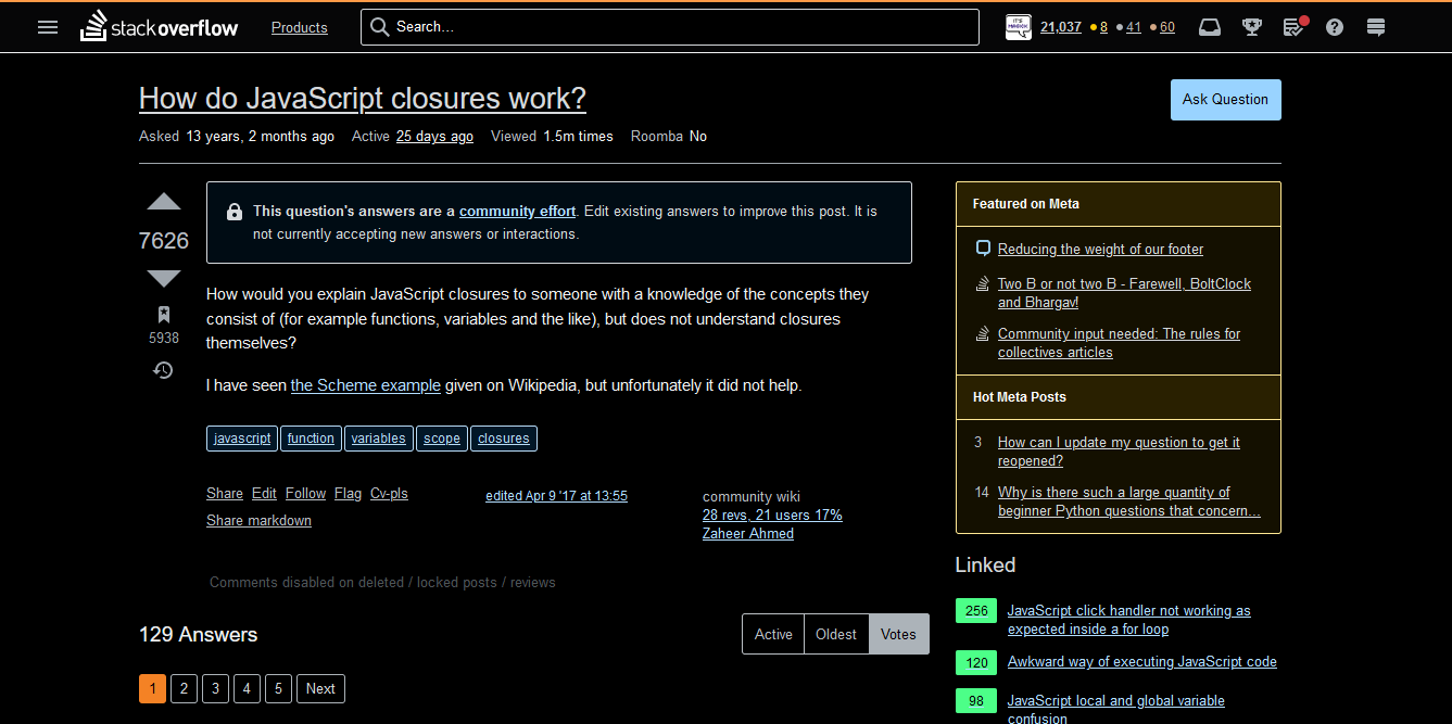
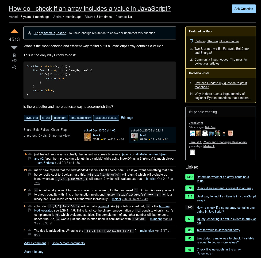
A question - notice how the reputation and badges at the top are also underlined:

Screenshot of a question where every link is underlined - title, tags, as well as linked questions on the side, and the user statistics in the top right.

Another question - this one also has the comments:

Another screenshot of a question where every link is underlined - this time comments are visible and the user who posted them as well as the timestamp is underlined.

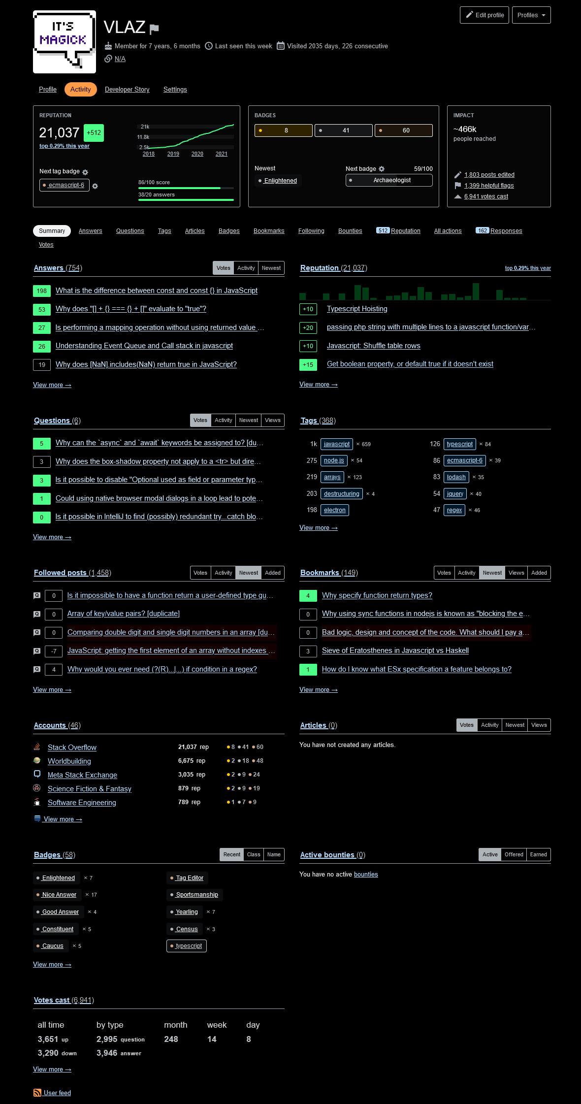
User profile:

Screenshot of a user profile - all section headings, all tags, all links to posts are underlined.

From what I have seen so far only the footer of the page does not have underlined links.

It is normal convention for links to be underlined on websites. However, this seems excessive. It makes reading things like usernames and tags very hard, which is counter to the idea of high contrast mode.

9
  • Can confirm, only started in the last idk, recently :p Commented Nov 30, 2021 at 17:51
  • @Nick within the last hour, perhaps. I'm not sure exactly. Might be a bit longer if my browser was using cached styles. It's definitely very new. From today. The CSS has an explicit rule to add underlines: body.theme-highcontrast a, body.theme-highcontrast .s-link { text-decoration:underline } so it's not random.
    – VLAZ
    Commented Nov 30, 2021 at 17:53
  • 6
    This was an intentional change for high-contrast mode in Stacks 0.72.0 but I'll leave it to the design team to explain why the change was made (I don't actually know why, only that the change was intentional).
    – animuson StaffMod
    Commented Nov 30, 2021 at 17:57
  • 1
    @animuson Appreciate that animuson... unfortunately while it's high contrast it massively hinders readability, will wait to see what design team say. Commented Nov 30, 2021 at 17:58
  • It seems quite broken. Look at the "typescript" tag (user profile image, towards the bottom). In general it's the tags, some titles, and usernames that are very hard to read. The user stats at the top also don't seem OK when underlined. Might be intentional but I don't think it's useful right now. I'm debating disabling high contrast mode at the moment. I would definitely do if this is actually what it's supposed to look like.
    – VLAZ
    Commented Nov 30, 2021 at 18:03
  • 3
    This seems more accessible to me. I can't even see the outline around badges in your screenshot. And in fact, it can be confusing if a username is a link because it's almost the same color as text in some places. (Just remember, these features are mostly for people with worse vision than mine.)
    – Laurel
    Commented Nov 30, 2021 at 18:06
  • @Laurel I'm using high contrast mode because it lets me see better. It currently does not in several areas. I'm also surprised you cannot see the outline - I can. Even in the smaller screenshots.
    – VLAZ
    Commented Nov 30, 2021 at 18:08
  • 1
    @Laurel That's a fair assessment, unfortunately they then fall down on the consistency, Edit Profile and Profiles in the top right should then also be underlined to differentiate them from the not underlined currently tracked Archaeologist badge. The selected Summary and Activity tabs should be underlined. Nothing in the drop down menus (inbox, achievements, queues, etc.) is underlined... Really they should consider all the links individually and putting underlines on the appropriate ones, not just blindly put them on all of them. Commented Nov 30, 2021 at 18:09
  • Sorry, I mean badges not tags. (The tag badges are fine too)
    – Laurel
    Commented Nov 30, 2021 at 18:11

2 Answers 2

9

As @animuson states, this was an intentional change. We initially hesitated on underlining links in high contrast mode because it was initially technically difficult to implement, but revisited recently and shipped this change.

W3C suggests adding underlines to links as to not rely on color to distinguish links from other content. It is a tricky compromise because adding anything to text could make it less legible, plus it tends to hurt aesthetics by making the design feel a bit busier. With all that said, I think it's a worthwhile compromise since it achieves the goal of making links extremely obvious.

It seems quite broken. Look at the "typescript" tag[…]

The typescript tag has a very visible border because of distinct styling between "badge tags" and plain old "badges". I've found the underline particularly useful on these elements because we can't always rely on a border to visually indicate that you're looking at a link.

[…]only the footer of the page does not have underlined links.

Footer links should be underlined but aren't because of a legacy rule that overrides footer anchor text-decoration: underline. You found a mistake on our part!

[…]this seems excessive.

We have a couple of exceptions for this underlining (I believe pagination elements are an example), so we could swing the pendulum away from nearly every link being underlined. There probably are elements where an underline could be removed, but only on elements where some visual differentiator beyond hue can be used to indicate interactivity. Over time, I anticipate this will be finessed and increased adoption of our design system will help us make these sorts of changes with a little more nuance.
6
  • "The typescript tag has a very visible border because of distinct styling between "badge tags" and plain old "badges"." this is not at all what I mean by "broken" - the text looks broken the lower part of y* and the *p break up the line. And the underline kind of makes p resemble an R with the extra line there. Or maybe an o. The tags in general have smaller font and adding an underline just makes for *a lot of visual information to process.
    – VLAZ
    Commented Nov 30, 2021 at 21:25
  • 1
    Ah, thank you for the clarification! Can I ask what browser/OS combination you're using? I'm curious to reproduce the issue locally and find some similar instances where the text descenders get muddied with the underlines.
    – Dan Cormier StaffMod
    Commented Nov 30, 2021 at 21:30
  • Firefox 94 on Windows 10. The font family the browser reports is "Inter, sans-serif"
    – VLAZ
    Commented Nov 30, 2021 at 21:34
  • 2
    "Tonight we're gonna format like it's 1999."
    – philipxy
    Commented Dec 1, 2021 at 3:44
  • 2
    Hi @DanCormier, can this be revisited? Specifically for the case of underscores, which in programming are relatively... common? The underline makes them hard to identify: i.sstatic.net/NQMFI.png Commented Feb 1, 2022 at 7:48
  • I would say it's excessive for the question tags, because they're already styled to look like buttons (and there are other buttons in the UI, like "Ask Question", which don't have that underline). But otherwise I think it's perfectly reasonable to have that much underlining. Commented Feb 17 at 0:52
0

Since the underlining makes reading pages very visually taxing, I made a userstyle for myself that drops underlines from the places that you should not need them.

You can find it on Stack Apps: Fix excessive underlines in high contrast mode


The idea is that an underline should identify a link unambiguously, however, if there is a list of only links, it becomes noise. So, I have removed the underlines from palces you would reasonably expect a clickable item, such as:

  • Tags
  • Questions in the sidebar (linked and related)
  • Various buttons that already offer comparable affordance, and an underline only serves to distract from them being buttons.

At the same time, I have tried to preserve underlines where they would be very much needed. For example, the modified date in the header of a question is clickable but not obvious it is. I have preserved the high contrast underline which makes it evident:

Non-high contrast mode:

Header section of a question. The title, "asked" timestamp, "modification" timestamp, and view count, are all shown as normal text without underlines.

High contrast mode: Header section of a question. The title, and "modification" timestamp are underlines, the "asked" timestamp and view count are not.

Similarly, on the profile page, some of the stats in the "impact" widget are actual links. High contrast does introduce useful display of which is which and the underlines have been preserved:

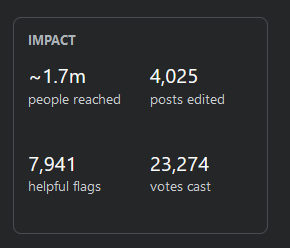
Non-high contrast mode:

The "impact" widget in the user profile. Shows four statistics: people reached, posts edited, helpful tags, and votes cast. All are normal text.

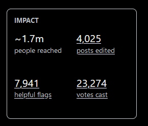
High contrast mode:

The "impact" widget in the user profile. Three of the four statistics are underlined: posts edited, helpful tags, and votes cast. Only people reached is normal text.

You must log in to answer this question.

Not the answer you're looking for? Browse other questions tagged .