8

TL;DR: If mobile font-sizes in text inputs are at least 16px, browsers on iOS devices won't zoom into the element when the user selects the input.


When navigating the Stack Overflow mobile website, selecting (or "focusing" on) some form elements such as inputs and text areas makes the browser zoom into the element.

The browser will zoom if the font-size is less than 16px

Mobile font sizes in form elements should have at least 16px font-size. This applies to input[type='text'], input[type='number'], and textarea HTML elements.

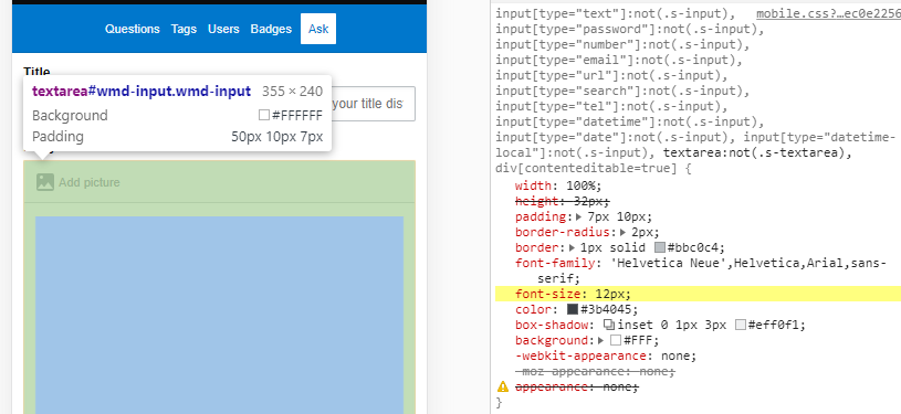
Here is what I have found on stackoverflow.com with corresponding descriptions under the image:

screenshot of stack overflow's Ask Question form on mobile view with Chrome DevTools

Stack Overflow text inputs have font-size 13px.

screenshot of stack overflow's Ask Question multiline input on mobile view with Chrome DevTools

There is a font-size of 14px in textareas.

enter image description here

In some communities I examined, the font size is as low as 12px.

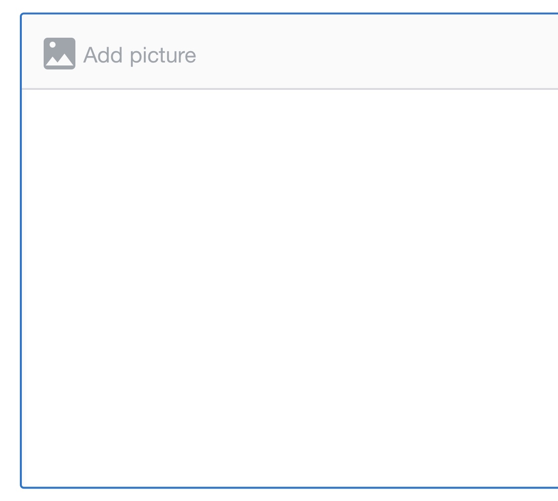
enter image description here

The above image is a mobile screenshot of the aforementioned 'zoom' that occurs after focusing on a Stack Overflow textarea. Notice that the screen is justified left, with the right side out of view.

From what I have found, browsers that behave this way are Safari, Chrome, and Firefox. I have only been able to test this on iOS.

This is an exceptionally disruptive behavior that renders the Stack Exchange forms very difficult to work with on an otherwise mobile-friendly website.

7
  • Interesting! I haven't seen this on Android, curious if anyone else has.
    – Shog9 Mod
    Commented Sep 18, 2019 at 23:23
  • This is an OS-level choice that the Safari team made on iOS, so you won't see it on Android. You won't see it on Chrome for iOS either.
    – Aaron Shekey StaffMod
    Commented Sep 19, 2019 at 5:28
  • It appears that this topic has been debated before with Android, however I can't personally speak to this. stackoverflow.com/questions/7073396/… Commented Sep 19, 2019 at 13:37
  • @AaronShekey I do indeed experience this issue on Chrome for iOS (iPhone X, latest iOS). Commented Sep 19, 2019 at 13:38
  • Why is this question marked as off-topic? Commented Sep 5 at 16:36
  • @brettinternet this might potentially be a wrong closure due to people closing questions tagged "mobile-web", can you confirm that you can still reproduce this problem? If so I'll cast a reopen vote. Commented Sep 5 at 16:46
  • Sorry, this issue is resolved now. I am always concerned about the reasons that questions are marked as closed. If this is the procedure for completed issues then I understand. Commented Sep 6 at 5:51

1 Answer 1

8

Thanks for bringing this up! I work on our design system called Stacks. A ton of Stack Overflow inherits the CSS and markup from Stacks, though not as much as I’d like.

We want to fix this, but the problem with simply switching to 16px is that compared to the rest of our interfaces, the input text is huge.

We’re tracking this issue on our repo and I’ve explored some technical solutions in a pull request. You can take the 16px inputs for a spin in a test branch.

To simply switch to 16px and do it right, we’d want to change all the font sizes outside of the inputs as well, something we aren't gonna do to fix Safari’s intended behavior.

There might be a workaround that we haven’t found yet. For example, I found a solution that allows us to maintain zoom level on iOS, but it disabled pinch & zoom on Android. Shoot!

4
  • You could use some css trickery to make the 16px only apply to iOS devices.
    – Cerbrus
    Commented Sep 19, 2019 at 5:54
  • Not too familiar with CSS, but aren't media queries limited to screen metrics? If there's an OS check, wouldn't that involve JS? Commented Sep 19, 2019 at 7:00
  • Amazing! Thanks for the reply and for sharing your progress. I realize this fix requires orchestrating much of the mobile experience with all of the spacing and text sizes. I do feel like the Stack Exchange mobile site is otherwise very functional. Commented Sep 19, 2019 at 13:36
  • 1
    @Zoe There are hacks available: CSS media query to target only iOS devices
    – Makyen Mod
    Commented Sep 22, 2019 at 0:59

Not the answer you're looking for? Browse other questions tagged .