Question:
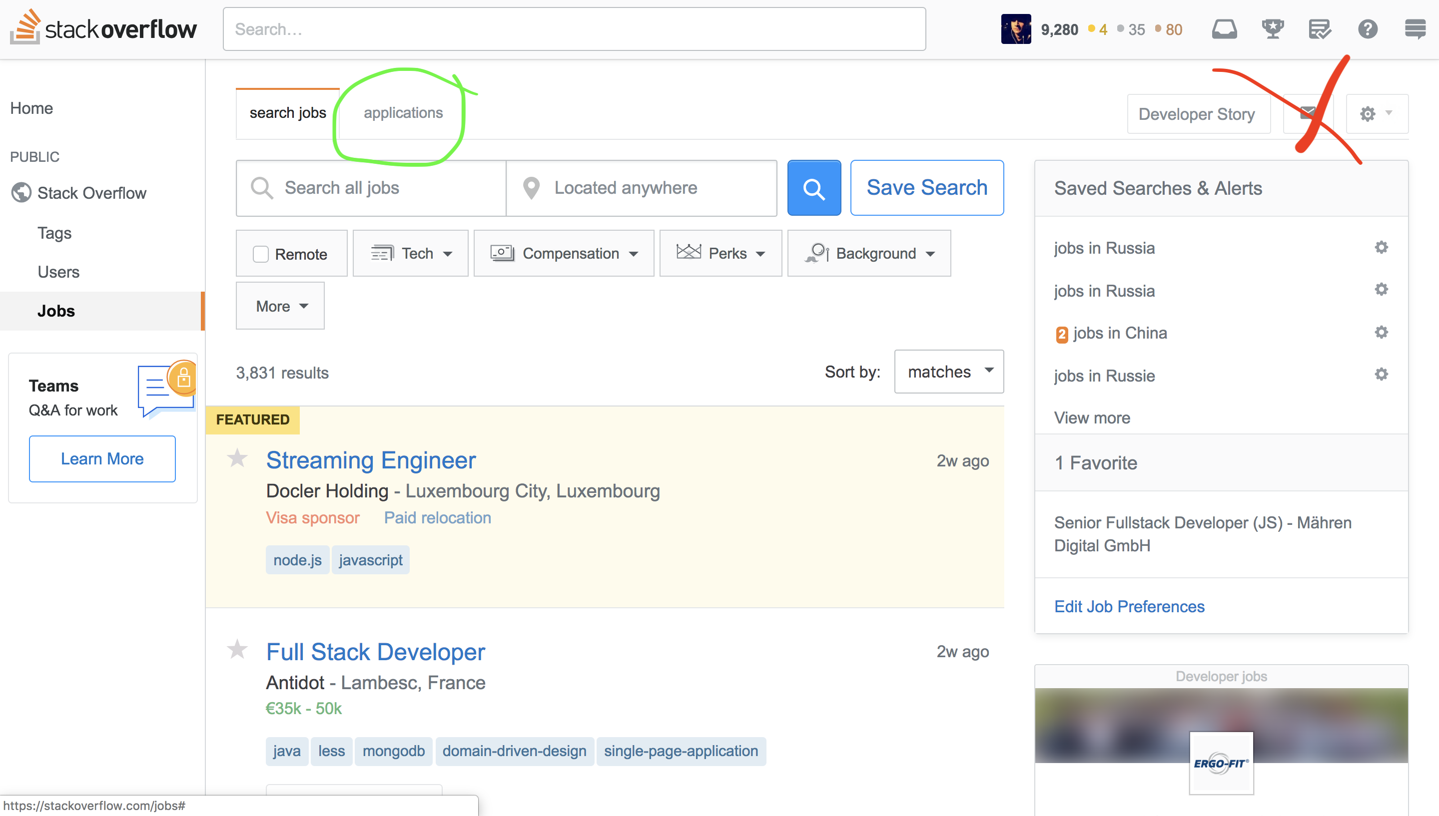
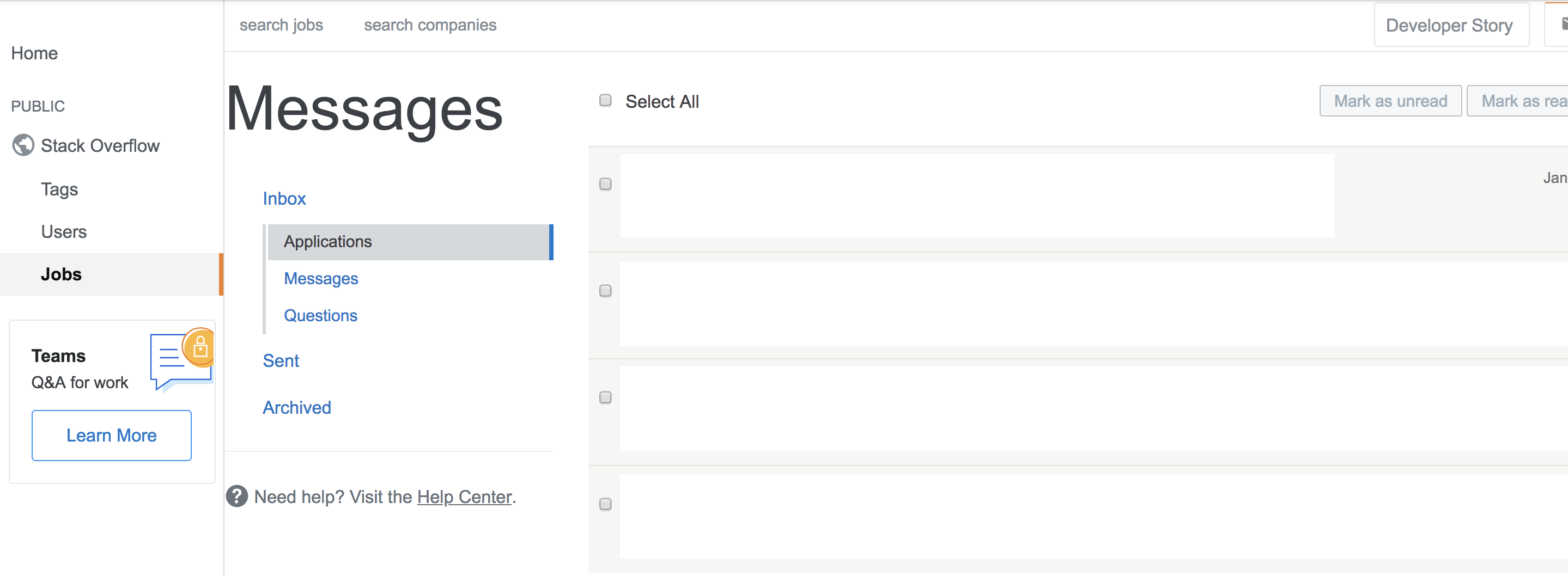
Can the user experience on finding the job applications/messages be made more clear?
Also, would it be possible to fix some of the design bugs:
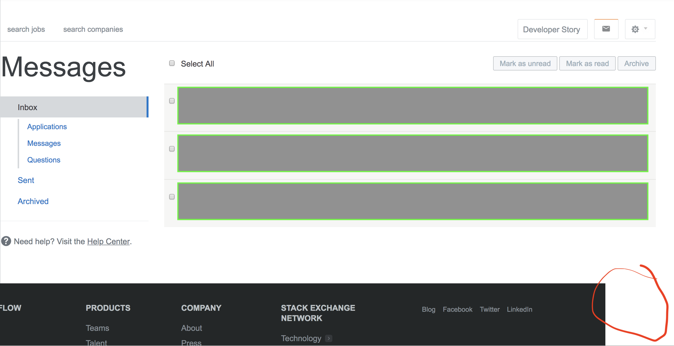
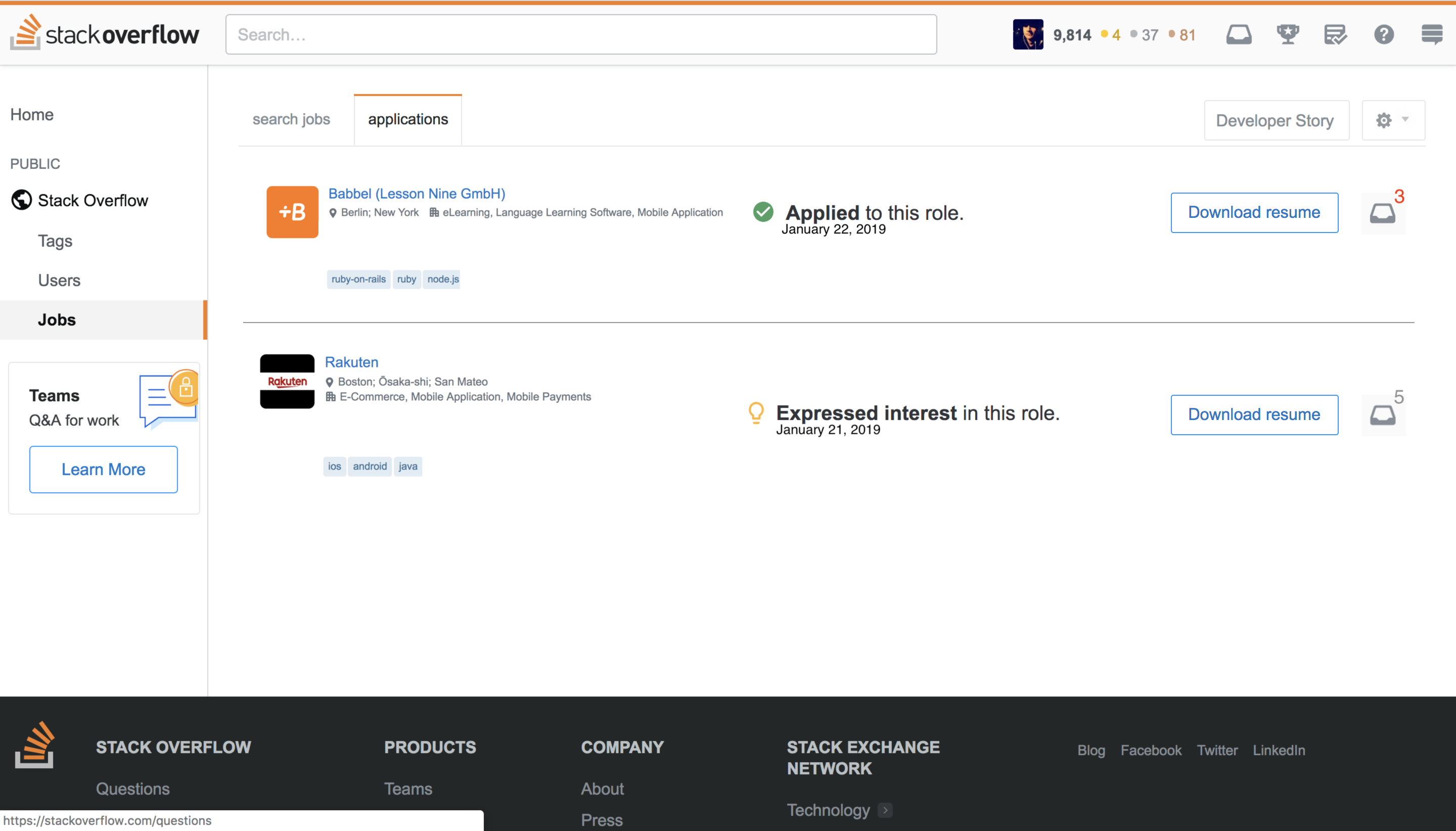
- Footer doesn't take full width on the jobs messages page
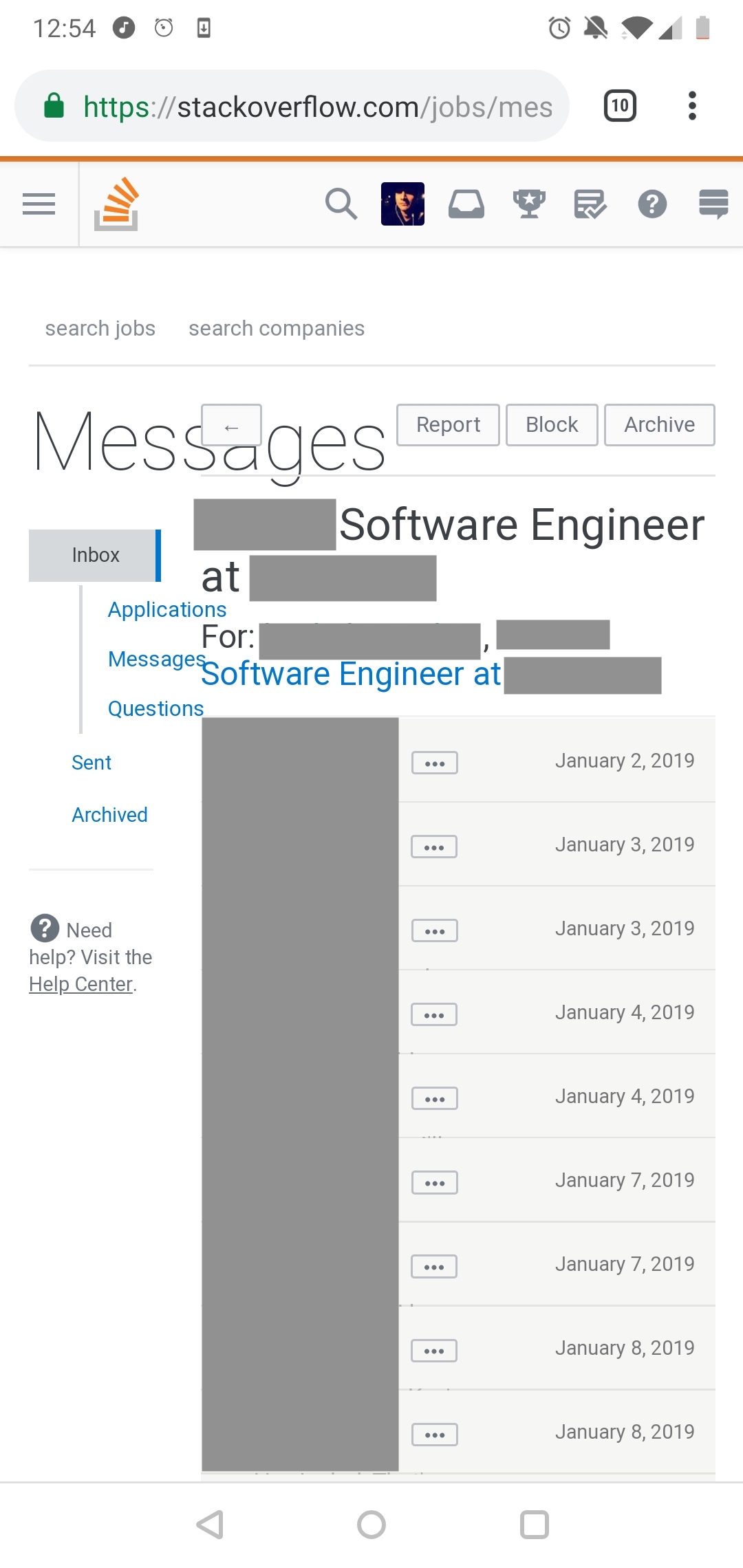
- Jobs messages page is not responsive on mobile?
Problem:
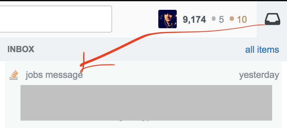
I've currently been scrolling through my inbox to get to my job messages and job applications page because I couldn't find my way there via the jobs interface.
Without this meta post I probably wouldn't have found it.
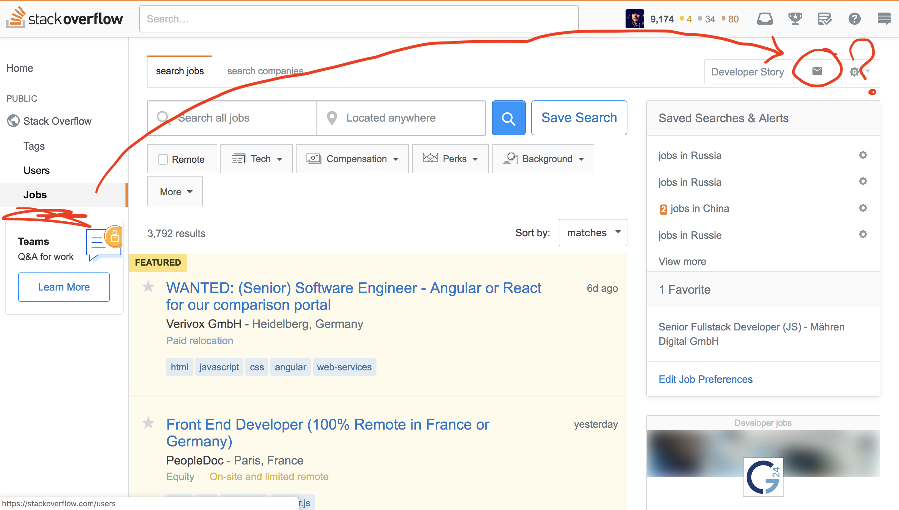
When I'm under the jobs tab, I'd expect job applications and job messages to be a really important aspect to it. I expected it to be visually obvious. However, it's just a small email icon almost "invisible" (completely subjective) to me.
I get how "messages" can make one think of an email icon, but what about applications? I find it hard to understand the logic of putting it under the "email" icon.
Design problem (Chrome):
On a side note, I feel like the job applications page is unfinished (the main jobs page feels really polished while this messaging system doesn't), also a spacing bug at the footer.
Upon clicking job messages via the inbox on Stack Overflow mobile application will open the job messages page in Chrome. And I have to navigate through this:
