8

On the rejection form for an edit the label is shown below the radio button instead of along side.

OS: Windows 10
Browser: Google Chrome Version 61.0.3163.100 (Official Build) (64-bit)

Steps to reproduce:

  1. Be on a question.
  2. Question has a pending edit.
  3. Reject the pending edit.
  4. When the dialog loads the labels are not aligned as in the picture below.
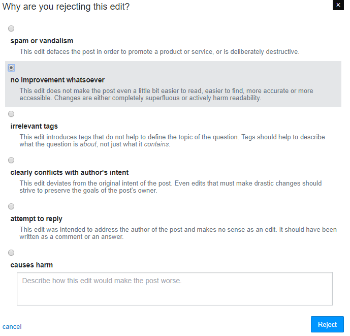
labels below radio button

5
  • 2
    The label has display: block;. It probably shouldn't have that.
    – ivarni
    Commented Sep 29, 2017 at 9:26
  • strongly related: LQP Delete reason radios misaligned; possibly this is yet another side effect of this recent change
    – gnat
    Commented Sep 29, 2017 at 9:29
  • 2
    Please don't close these reports as dupes unless they're referring to exactly the same popup.
    – balpha StaffMod
    Commented Sep 29, 2017 at 10:17
  • 1
    @balpha did they not have the same root cause?
    – user247702
    Commented Sep 29, 2017 at 10:18
  • 3
    @Stijn Yeah, and I'm not blaming anyone for voting to close -- but technically each popup is an issue that needs to be fixed separately.
    – balpha StaffMod
    Commented Sep 29, 2017 at 10:19

1 Answer 1

6

Fixed now, see Misalignment with radio buttons in add comment dialog in LQP queue.

2

You must log in to answer this question.

Not the answer you're looking for? Browse other questions tagged .