The new developer story is pretty cool. I like that you can see my progression through different technologies and how they relate to the work I was doing professionally.
I do have a couple suggestions, though.
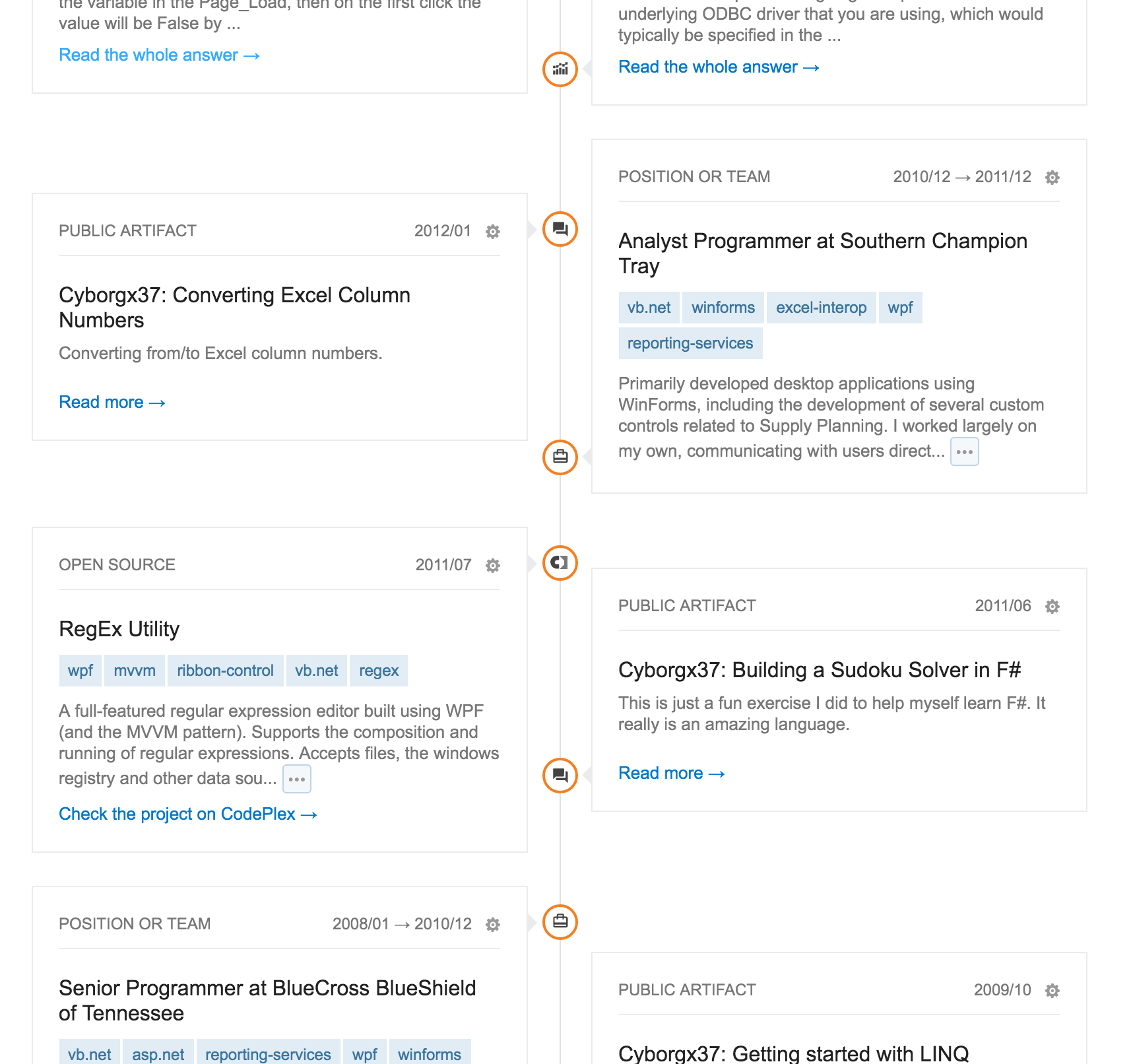
With the current design, everything in my timeline looks the same. It's very hard to tell the difference between a job, a top answer, education, etc. I've tried to include images on all of these to help differentiate them, but it'd be nice if they had some style differences to enable viewers to quickly find the kind of information they are looking for.
For example, I wanted to add a logo to one of my job experiences, and I had to scroll up and down several times before I finally spotted it. (At first, I thought it must not have imported from my CV.) I doubt an employer would be willing to exert the same level of effort. (While the "traditional view" link partly solves this, it's not exactly prominent... I discovered it only after scrolling up and down a lot.)
Try to quickly find my Position/Team entries:
It's also a little difficult to tell what the order of items is. The back and forth between two columns is difficult to read and comprehend. For example, my experience at "Southern Champion Tray" came before my "Converting Excel Column Numbers" article, but you have to find the barely visible triangles pointing at tiny orange circles to know that. It's minor, but it makes the timeline feature confusing.
It'd be nice if I could choose to view my history as a single column and filter by event type.
In summary:

