96

I find it kind of frustrating that high traffic posts collapse the comments to only view high rated comments. Either:

  1. I immediately click view all so I don't miss anything
  2. I get to the end of the comments and realize they were collapsed and have to go back and read them over again.

My suggestion would be to:

  1. Make it more clear that a comment section is collapsed by putting the "expand" (or whatever it's called) button at the top.
  2. Improve the logic behind what shows up in a collapsed comment section. Instead of just showing the highest comments, if popular comments are all responding to a particular user, show that users comments or something of that sort. This would make is so that you can get more value out of a collapsed comment section if you don't want to read the full thing.

I've just found that the collapsing comment feature is pretty useless, and often wastes time.

7
  • Or 3. Have less comments.
    – gunr2171
    Commented Jun 10, 2015 at 16:27
  • 31
    I think it's useful to not have scroll past 25+ comments to get to the real content but I think it'd also be useful to have an expand link at the start of the comments.
    – BSMP
    Commented Jun 10, 2015 at 16:33
  • 4
  • 10
    @gunr2171: fewer* Commented Jun 10, 2015 at 20:47
  • @gunr2171 - I completely agree. It would be so nice if people would just post answers instead of comments when they want to represent a position.
    – Travis J
    Commented Jun 10, 2015 at 21:22
  • 2
    Would be nice if it showed the most RECENT and Voted comments. I am always expanding this just to see what the current information is. Commented Jun 10, 2015 at 21:33
  • 1
    @gnat Curse you for tricking me into answering that MSE question thinking it was recent!
    – TylerH
    Commented Jun 11, 2015 at 6:42

6 Answers 6

35

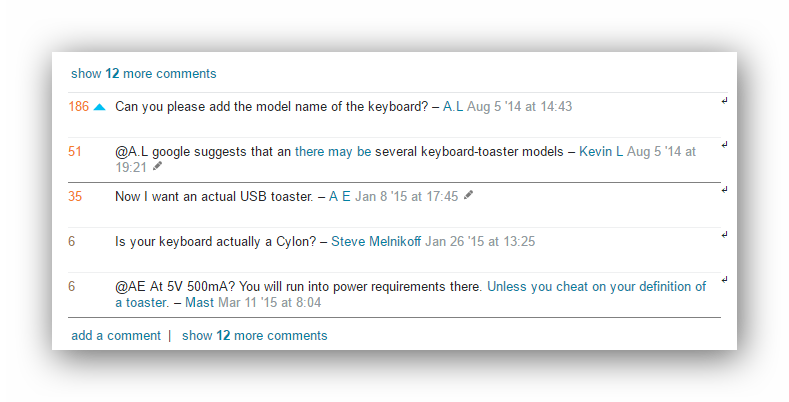
I think it would be better to change the line style between comments to be thicker when a comment is hidden between the two comments on either side of the line. The bottom line would also be thicker if there were hidden comments after the last one shown.

I agree that the exposed comment system sometimes makes it hard to understand what is going on, especially if it is hiding comments prior to comments showing.

9
  • 1
    How about also replacing all the upvote and flag links with a single tall "expand"-link? I mean, if I consider either action, I should know the context, and that would be a good place for an obvious and actionable hint. Commented Jun 11, 2015 at 20:01
  • @Deduplicator That is a good idea, though I prefer to think that a comment should not always need context for an up-vote or flag. Also, these links are only visible when hovering over the comment, so it would still not be clear that comments had been hidden and where they were. Personally I am more concerned where comments have been hidden so I know if I can read the 5 comments I can see or if I need to expand everything first.
    – Trisped
    Commented Jun 11, 2015 at 21:44
  • 4
    Good suggestion. Implementation wise I suggest we borrow "axis break lines" visualization.
    – Jeroen
    Commented Jun 12, 2015 at 7:39
  • Seeing as this seems to be the most popular solution, I'm accepting it as the best answer. I think making it clearer where comments are hidden by putting some kind of visual cue between comments would be good. Also I think an "expand comments" at the start of the comment section would help per @BSMP suggestion. Commented Jun 12, 2015 at 18:09
  • @Jeroen do you mind me asking how you did that break line in the image? is it photoshopped? or did you do it with html/css? I was trying to do it with an svg and border-image, but failed miserably :P Commented May 20, 2016 at 20:31
  • @ᔕᖺᘎᕊ I don't mind. It's paint.netted if I recall correctly, sorry. Been a while. - If you do not mind me asking: how did you get to that image from an obscure comment to an old meta answer several months after? :)
    – Jeroen
    Commented May 20, 2016 at 20:59
  • 1
    @Jeroen lol, I found this post after being annoyed at a hidden comment, so I'm building a userscript that does this and I loved your idea! I really wanted to do that, but seems like I'll have to stick with thicker lines instead :(. Thanks anyway! :) Commented May 20, 2016 at 21:04
  • @ᔕᖺᘎᕊ Once you complete the script, feel free to add a link in the comments and I will update my answer to include it.
    – Trisped
    Commented May 20, 2016 at 21:30
  • I actually posted it as a separate answer: meta.stackoverflow.com/a/323505/3541881 :) cc/ @Jeroen Commented May 20, 2016 at 21:35
6

I don't think that collapsed comments are a waste of time. I think they are useful because I often go past a series of a zillion comments. Especially on high traffic posts. That said, I think that there could be room for improvement.

Your first two points ring home and I do both those things quite often. If I see "35 hidden comments" I will often not look at the set of current ones regardless of their upvotes and click on show all. This is because I have been burned so many times just reading the upvoted comments and missing the context for half of what was written.

Comments do not have downvotes. Thanks, captain obvious. I know, but to me I think is a major concern because if a controversial comment is placed there is no way to tell. It just looks like it was wildly popular. +20, -200? Just looks like +20, and all of a sudden it is featured in the list of "highlighted" comments.

The subset of comments shown is supposed to give an indication of the overall conversation in comments by showing the "popular" comments. However, as there is no context for many of these comments and because the post most often becomes expanded in comments (and not in the post unfortunately) reading only the popular set is not very useful.

Showing just the first set of comments regardless of votes before the cutoff would show an overall indication of what the comment conversation was going to include. I am not sure what the statistics are, but just like quick answers, quick comments often also generate the most upvotes. Mostly because a position is stated which everyone was thinking and instead of restating it they just upvote the comment.

tl;dr; I would assert that showing the first set will still include several highly voted comments from the subset that is shown now, and also that it will give a better indication of the overall comment discussion because it will contain no gaps.
12
  • 7
    I really think comment down votes should be a thing. Commented Jun 11, 2015 at 15:39
  • 2
    @FreshWaterTaffy The best comment down vote is a comment flag. If the reason you don't like it is not a valid flag reason, that serves as a reminder that your opinions are different from everyone else's opinions :-)
    – TylerH
    Commented Jun 11, 2015 at 17:53
  • 7
    @TylerH Then why are there downvotes on posts? The same reason there should be on comments. To help users looking for answers find useful information. Also, your comment makes no sense... If my opinions are the same as someone elses I can vote, but not if they're different? What? Commented Jun 11, 2015 at 18:20
  • @FreshWaterTaffy Because comments are transient
    – TylerH
    Commented Jun 11, 2015 at 18:43
  • 2
    @TylerH: If comments are transient, and transient things should not be voted on, why do they have upvotes available? (And if they're transient, why are there so many thousands of comments from five or more years ago?) Commented Jun 12, 2015 at 1:04
  • @NathanTuggy because the team's UX interaction designs are not very ordered and because comment removal requires willful community interaction and/or substantive edits to questions/answers that other people "own".
    – TylerH
    Commented Jun 12, 2015 at 1:59
  • 1
    @TylerH: I can agree with both, but I'd suggest it's best to resolve the UX incoherence in favor of general consistency and utility and allow comment downvoting. Commented Jun 12, 2015 at 2:00
  • @TylerH: In particular, comments are such that they currently implement the much-maligned idea to require comments with downvotes. Given that one of the main objections to that scheme has always been how unwieldy it is, surely you can see how that objection is made much worse with comments that are supposed to be lighter-weight? Commented Jun 12, 2015 at 2:03
  • @NathanTuggy I agree it needs overhauling. My comments above are just descriptive of the system as it is, not necessarily my opinion of how it should be. That was unclear, I admit.
    – TylerH
    Commented Jun 12, 2015 at 2:04
  • @TylerH: Ah, fair enough. I do sometimes get in the same mode myself. Cheers! Commented Jun 12, 2015 at 2:05
  • Comment down votes can cause more drama. We already get a lot of drama on question/answer down votes. So let's keep down votes only where they are really necessary. You can always put a comment saying the other comment is wrong with an explanation et al which other people can upvote :) Commented Jun 13, 2015 at 8:37
  • 1
    Collapsing comments is a waste of time. Commented Dec 21, 2015 at 19:46
6

There are actually three cases:

  • You don't care about the answer much and then you don't care about the comments either. In this case showing only a part is fine and it could be even fewer.
  • You care partly and want to know if someone said something important about it. Then showing the most upvoted comment is fine in theory, except that you often can't understand them because of lacking context (yet another problem is lack of comment downvotes as already said by Travis J). So it's usually a fail as you waste time on reading some gibberish.
  • You're really interested and then you want to read it all. Now, you're wasting even more time trying to understand what can't be understood.

So I'd say, it's plain wrong. In case of collapsed comments, the most important information is the fact that they're collapsed. This is the very first thing I want to know before starting reading any reply to anything hidden.

A thicker separator line as proposed by Trisped would help, but I'd like to see something rather more visible and ideally clickable. As text usually doesn't fill all lines, adding a + or more button would often cost no place.


Actually, the way comments get displayed should be the user's choice. If someone means, they're just garbage, they should see them always collapsed (or not at all). Other (including me) value comments and should see them somehow. As this can be implemented in the client, it should be pretty easy.

3
  • How about replacing the upvote and flag links with one tall "expand"-link? Commented Jun 11, 2015 at 19:55
  • 1
    quoting self, the right way would be to always show comments fully condensed: "comments: 42 | comments upvotes: 122 | last posted: yesterday | expand"
    – gnat
    Commented Jun 11, 2015 at 22:24
  • 1
    @gnat I guess, I wouldn't like it. It may be good for you, so let's the user choose. But I'd prefer your idea to the current state as letting the user read an incomplete thread without notice is plain wrong.
    – maaartinus
    Commented Jun 11, 2015 at 23:27
1

I've made a userscript to do this. It adds a darker border line underneath comments where there is at least one hidden after it:

enter image description here

You can install it from GitHub Gist.


This will also be added to SOX in v2.0.0 (the next version), a userscript which adds a bunch of optional features to all the SE sites. For example, you can use SOX to add a feature that adds the 'show x more comments' link to the top of comments as well (as seen in the above screenshot).

0

I too have similar experiences and issues with the comments and not seeing all of them initially. My inclination, though, is to go the opposite direction: hide all comments initially. Put a little triangle UI widget and a message to the effect of "13 comments hidden", and you can expand them all if you want, or you can get on to the dang answers already.

Possible issues I see with this approach are that new users might not even realize there are comments, and would go put comments as "answers". I'm not convinced this would happen more than already happens, though, since you have to get some reputation to even post comments and by then I'd hope they have it figured out.

I might also make exceptions for this in some circumstances--for example, I might want all comments on my own posts to always show up for me. Or my own comments and @replies could always show up for me. The specifics of this proposal can be worked out in the comments. :)

But in general, I say let's try cutting down the chatter except for those who want and like it.

2
  • 7
    In theory, showing at least the most upvoted comments is important: They might be crucial to properly evaluating the post. Commented Jun 10, 2015 at 19:54
  • 7
    @Deduplicator: Which, while true, is really sad. People are supposed to take advice/warnings from comments and use them to improve the question/answer. But they don't. Sigh. Commented Jun 10, 2015 at 20:47
0

This seems like an area where it would be perfectly reasonable to apply a user preference for the display options - there is a whole spectrum of people with differing styles and approaches, from those who want to see all comments without hiding (so context is clear, even at the expense of additional lines to plough through) to those who aren't interested in comments at all (hide the noise).

It wouldn't be technically challenging to apply a preference and it need have little bearing on others (ie if I like to see no comments, that hardly affects others)

1
  • 1
    If one wants to visit a question and do a PrintToPdf or SingleFile save to HTML for archive/future reference purposes, then having ALL the comments expanded at that points is crucial.....having a "preference" is the sensible way. Commented May 14, 2022 at 17:27

You must log in to answer this question.

Not the answer you're looking for? Browse other questions tagged .