33

Summary: New Navigation has been removed so we can build similar functionality (plus other improvements) for everyone. I summarized the feedback below to incorporate into the replacement design. (If I missed anything, feel free to add another answer.)

A primary duty of a Q&A system is matching questions with people who can (and are willing) to answer. Stack Exchange sites use an eclectic mix of tagging, filters, search, sorts and feed algorithms. We also lean heavily on Google (and other search engines) indexing the content. For sites of a certain size, this system works fairly well. But on Stack Overflow it’s been less than ideal for years now. Sklivvz rationalized those elements and honed the UI so that people can customize their view into the site’s questions. We’re building on that work so that more people can find questions to answer.

As you might have gathered from the title, the paradoxical first step will be to disable the beta setting December 4, 2017. That way we’ll avoid having to maintain two separate code paths as we build better navigation tools. (For those keeping score, this is part of the “Information Architecture investigation” Joe mentioned in the November update.) Flexible and customizable navigation is not only critical to Stack Overflow, but also to Enterprise, Channels. So we’re going to make something that works for all of those users. As David Fullerton recently told us, “When working in a shared feature area, rather than developing it only for one area and then ‘porting’ it to another, we must design for all cases.”

Most common uses of New Nav

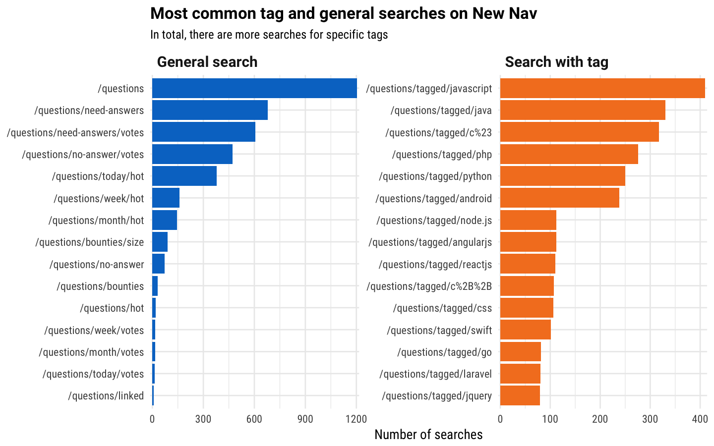
As you can see, many of the saved tabs are available via classic navigation. Many people used the option to “restore old tabs” to get the default tabs back. Anecdotally, I’ve heard some people turned the feature on for the UI convenience and never customized it at all. The other common usage is to create a tab for tags they are particularly interested in. It’s nice to have easy access to all the tags you want to look at right on the page. We probably won’t use the tab interface again (it gets crowded quickly), but we do want to make it easy for you to jump to the tags you care about.

For those of you who rely on saved tabs to find questions, it must be frustrating that we are taking them away even temporarily. Of registered users who have used Stack Overflow recently, 1% have opted in. Roughly 0.6% have saved a search and just over 0.1% have saved a search with a custom name, sort, or filter. The median reputation of New Nav users is 535. Given how little we did to promote the feature and that it was hidden behind a user preference, that’s amazing conversion. Clearly there’s something useful going on that we need to build into 3.0.

In order to suss out the key functionality, what saved tabs do you regularly use that can’t be simulated with bookmarked searches? For instance, a fairly common saved tab lists a tag’s bountied questions, which is the same as https://stackoverflow.com/questions/tagged/python?sort=featured. But some sorts aren’t available, such as sorting by the size of the bounty or when they end. 265 users have saved sorts specific to bounties, but it’s not clear whether they need those sorts to help find questions to answer or if it’s just something they are curious about.

Obviously it’s better if useful views are built into the site so everyone can access them. That’s the primary reason we are asking. However, we are also asking in case there’s some way we can provide a workaround in the meantime.

84
  • 61
    What do upvotes mean here? Glad it is gone, I didn't use it anyway?
    – rene
    Commented Nov 21, 2017 at 18:31
  • 151
    @rene: I assume people appreciate my brilliant prose. But thanks for bursting my bubble. :-/
    – Jon Ericson StaffMod
    Commented Nov 21, 2017 at 18:33
  • 48
    Well, I'm a long standing user of new-nav, so I expressed my feelings of retiring it with a down vote. I will revisit if Navigation 3.0 is the next best thing.
    – rene
    Commented Nov 21, 2017 at 18:36
  • 17
    I'm not even sure which one I'm using, but +1 for your brilliant prose. Commented Nov 21, 2017 at 19:17
  • 45
    As a long term “new nav (beta)” user who barely remembers the original nav, will the “new new nav” be there at the same moment when the “new nav (beta)” will be turned off? Or will I get reverted to v1 first, and then I have to wait for v3? If yes, can’t you turn off v2 when you enable the v3 test (and grandfather all v2 test users over to v3)?
    – poke
    Commented Nov 21, 2017 at 21:10
  • 22
    @JonEricson I’m just afraid that this will cause two UI changes for current beta nav users. Once when they will be reverted back to v1, and then when v3 comes out to test. And we all know, that UI changes are difficult to digest… (also, what Shog mentioned below; if people are used to the v2 capabilities and a v3 isn’t there in time to catch that need, this will just cause more frustration)
    – poke
    Commented Nov 21, 2017 at 21:38
  • 20
    @JonEricson I rely on new-nav's ability to group the questions by tags, to find the interesting questions. I had reverted back to old nav for a while, when I was verifying a bug, and it felt like those "rotary dial phones". I fear there might be a dip in percentage of questions answered (or quality) during the time everyone is switched back to the old-nav. Commented Nov 22, 2017 at 4:24
  • 62
    Well this blows. I really liked the tabs, and well... the whole 2.0 nav. Now you're saying that you're going to be removing the tabs and some other things from the 3.0 nav, and you're going to remove the nav I've come to know and love, leaving me with the rickety old 1.0 nav. All of this, and I don't even have any confidence that you guys are actually going to build 3.0. Hell, you didn't even finish building 2.0 before you just abandoned it. Will 3.0 be abandoned before entering beta this time? Very disappointing decision.
    – user4639281
    Commented Nov 22, 2017 at 16:40
  • 19
    @JonEricson "Sklivvz took the project entirely on his own" is entirely incorrect. New nav was built by Kurtis Beavers and I - I did the research, Kurtis did the UI/UX. Design was by Kurtis, frontend code by me and m0sa, backend by me, m0sa and marcgravell. I led the project under many respects, but it was certainly a team effort. Also, Jaydles and dfullerton had a very heavy hand in deciding the direction of the project.
    – Sklivvz
    Commented Nov 25, 2017 at 11:30
  • 16
    Seems like everyone who used the new nav is frustrated that SO is now going to once again be significantly more laborious to navigate to answer questions. Now that I am going back and trying out the old nav, I realize I completely forgot how awful it was compared to the awesome new nav beta. Maybe time to stop using SO altogether? Commented Dec 4, 2017 at 18:45
  • 40
    I can't stand this ancient nav. HELP!! HELP!
    – revo
    Commented Dec 4, 2017 at 19:01
  • 19
    Do the people that make this erratic changes actually listen to the users' demands? I don't think so. Everytime they change something 1) it was unnecessary 2) it is a regression. Now just remove the ability to ask/answer questions.
    – samayo
    Commented Dec 4, 2017 at 19:13
  • 33
    I already miss my custom tabs; with a single click I could jump to the ones I use frequently and see new/updated questions at a glance... Seems a lot harder to accomplish the same thing now. Also, the page title has changed, and for some reason that is tripping me out... Side effect of having the same tab open in the same spot for the last few years I guess.
    – Tim Lewis
    Commented Dec 4, 2017 at 20:26
  • 20
    Oh boy, without the "new" nav bar and my custom tabs I've almost forgotten how to navigate SO. The new NAV system cannot come fast enough.
    – sorifiend
    Commented Dec 5, 2017 at 1:43
  • 22
    Complete regression for no good reason, this has made using Stack Overflow a chore!
    – user692942
    Commented Dec 5, 2017 at 16:07

23 Answers 23

155

I just posted this as a comment on an internal research document, but I'm gonna post it here too because I think it's something critical to keep in mind as we venture yet again into redesigning navigation:

For the vast, vast majority of our users, Google is their navigation. That's true even for logged-in users. Use of search and tag-based navigation accounts for somewhere in the range of 1 to 5% of all question views; the homepage maybe another 1%.

...However, the handful of people who do use the navigation have a disproportionate influence on the site, particularly those who actively seek out questions to answer. Answerers are already a small portion of users (around 10% of active users), but something like 50% of answers are posted by about 5% of authors - this makes us very reliant on both the continued efforts of a very small sliver of users and on our ability to attract new users into that group.

It also makes them very easy to overlook; a small random sample can easily have none. Even in a large and/or carefully chosen sample, they'll likely be in the minority: a large chunk of casual authors find questions to answer the same way they find questions to read: Google.

In order to design an effective navigation system, we'll need to make sure we've not overlooked this critical minority.

Now, those are at best some pretty rough estimates - you can figure up more accurate numbers using public data if you care to, but I think I'm close enough to draw an accurate picture. Stack Overflow has a lot of users, and trying to extrapolate their needs or behavior from your own experience tends to go awry because of that: you and a few hundred of your closest friends can all use the site in one particular way and still be a tiny fraction of a percent of the folks using the site. That makes it extremely important to exercise care in the feedback you listen to... And the feedback you ignore.

The primary goal for the soon-to-be-defunct New Nav was to make it easier for folks to find questions to answer. That goal may not yet have come to fruition, but it's no less important now than it was 3 years ago - and we're not going to have the same visibility into nor feedback from users in Channels if the current shortcomings aren't adequately addressed. As we've seen in our internal dogfooding, questions go unanswered just as easily in a small private group as they do in a large public one - but unlike the public Q&A, there's no hope that some good samaritan will stumble upon your internal question via Google and provide an answer; short of tracking down someone within the company and badgering them face-to-face, a navigation system that continually exposes those with information to the questions that need it is your only option.

Now more than ever, we need to get this right. Let's rise to the challenge...

18
  • 40
    "For the vast, vast majority of our users, Google is their navigation. That's true even for logged-in users." -- Indeed. Unless I specifically need the SE-specific search parameters (usually tags, the rest ist pretty much mod-only), the onboard search so much weaker than Google with site:x.stackexchange.com that it borders on useless.
    – Raphael
    Commented Nov 24, 2017 at 14:54
  • 28
    It's getting harder and harder to answer old questions with updated answers. For example; I needed help with a PHP library but Google kept bring me to outdated stackoverflow answers. I knew, that I wanted to come back and update those answers with what has changed in new version. Click the "star" is my only hope of finding that question later. Keep in mind that finding the answer could be several days later. I hope in your new UI updates you can please address this issue. Make it easier to come back to questions later.
    – Reactgular
    Commented Nov 24, 2017 at 17:10
  • 16
    I use google when I'm looking for answers, I use two saved tabs to monitor tag searches for finding questions to answer. Commented Nov 24, 2017 at 18:28
  • 4
    I think this is important and where many projects go off the rails. You need to make navigation that works for answerers and you need to think about the process by which someone becomes an answerer and how your navigation might nurture or inhibit that or potentially have no impact. For example, I had totally forgotten that I had opted in and when I read this post I went and made a custom search. I take a long time to write answers and I don't usually like to feel like I'm in a race with a bunch of other people to answer so I'll look at slightly older unanswered questions that have up votes.
    – Elin
    Commented Nov 26, 2017 at 5:06
  • 9
    "For the vast, vast majority of our users, Google is their navigation." The vast majority of passive, non-contributing users. What about people who actually write answers? Commented Nov 27, 2017 at 3:07
  • 9
    Same for them, by and large @Steve - though not necessarily when looking for questions to answer. That seems to vary quite a bit between people.
    – Shog9 Mod
    Commented Nov 28, 2017 at 3:09
  • 10
    "a large chunk of casual authors find questions to answer the same way they find questions to read: Google" - I don't know whether I count as a casual author or not, but let me chuck my anecdote into the ring and note that the majority of the questions I answer are ones I've arrived at through Google (usually when first trying to solve the problem myself). I write answers to help the person who follows after me; I understand their needs, and know that I can help them. Sifting through other people's problems looking for ones to solve holds comparatively little interest to me.
    – Mark Amery
    Commented Nov 28, 2017 at 14:19
  • 3
    Some way to mark a question as one I don't want to answer would be wonderful. I will, from time to time, go looking for questions to answer. I'd rather answer interesting questions that have been overlooked than questions that just got asked. But looking by tag brings up the same questions time & time again. It's hard to find the interesting questions amongst all the questions I've already looked at and taken a pass on.
    – Leonard
    Commented Nov 30, 2017 at 19:59
  • I think the reason most people use the Google search is because their expertise becomes more apparent in the search results, where they seem to know better what it is you're looking for. Whereas most search functions on websites just do a text match to provide some results (which is fine, but not useful in most cases).
    – xorinzor
    Commented Nov 30, 2017 at 23:54
  • Sure, I probably come from search engines when looking for answers. Just because I get a larger search than from here (and the search here usually won't find what I want with the same search). I also comment a lot, answer when I can and help moderate by flagging etc. Now that the "new" navigation is gone I won't be doing as much of that since it's more difficult. If that was what's wanted, glad to reduce my actions. I'm sure we'll see stagnation. Commented Dec 5, 2017 at 9:14
  • 2
    As I said above, @andras... 1% at SO's scale is a lot of people. And they'll tend to be among the more engaged people.
    – Shog9 Mod
    Commented Dec 5, 2017 at 14:43
  • 2
    When you’re embracing the fact that Stackoverflow’s search is so broken, that all users prefer Google anyway, then, of course, it’s only consistent to also turn back to the old awful navigation and hope for 3rd party sites (or perhaps Google’s result page) to provide the rest of the navigation too and allow to enter questions and answer directly there. Just continue optimizing the navigation for their crawlers rather than usability. You only have to live with the fact that it will be Google or the other 3rd party sites getting the advertising money then.
    – Holger
    Commented Dec 6, 2017 at 8:41
  • 2
    Not really embracing it, @Holger; just being honest. It's important to set realistic expectations for the folks who are gonna be researching and testing new-nav ideas before they go in, or the results will be crap. I've seen this before: people new to the sites or new to the company taking a look at usage metrics and making some really unfortunate assumptions as to which features are important; I very much want to avoid that here. If you look at (say) Google Analytics, pages like review, mod tools and question filters appear essentially unused - but remove them and things fall apart!
    – Shog9 Mod
    Commented Dec 6, 2017 at 19:50
  • 1
    how about, if you have two distinct populations, build two distinct interfaces to use.
    – Will Ness
    Commented Dec 7, 2017 at 9:49
  • 2
    That was my own use as well, @holger - and I think hits on a crucial aspect of a good nav system: it must be discoverable. The search operators are powerful, but even among folks at the company there are people who've been using the site for years and never read the advance search help page.
    – Shog9 Mod
    Commented Dec 7, 2017 at 17:16
118

The most valuable thing to me is the option to see if there are (and how many) new questions in certain "tag clouds" (not single tags), summarized on a single page.

I keep the homepage always open in the background and check regularly whether some tabs have got new questions. Without tabs I'd have to manually check bookmarked search queries? That would cost much more time than just to change the tab in my browser.

tabs

I agree that a tab bar is not the best thing to implement this, especially since its size is limited and thus the number of tabs (if it's overcrowded the UX is horrible).

11
  • 11
    Interesting. Seems like a report page with a custom list of tags and tag clouds would serve the same purpose. You didn't really use it as a navigation so much as an overview, it sounds like.
    – Jon Ericson StaffMod
    Commented Nov 21, 2017 at 19:16
  • 10
    I use in the same way
    – dippas
    Commented Nov 21, 2017 at 21:37
  • 23
    @JonEricson no, that wouldn't be as convenient. With this view, if 1. I move to one tab to see what's new and then 2. move to another tab, 3. tab 1 gets a new post, I don't need to go back to some report page to find out. That information is right there. (I'm probably not a heavy user of the UI, only 3 tabs in addition to the defaults, not a big user of SO, but I'd love to have those tabs on my home sites of AU and U&L).
    – muru
    Commented Nov 22, 2017 at 7:18
  • 1
    I also use them to detect misstaggings of questions, for example java and javascript, as they are confused very often.
    – Filnor
    Commented Nov 22, 2017 at 8:09
  • 1
    You don't need to poll the site manually. Get a decent RSS reader like Vienna and subscribe to the tag RSS's you like. It will show you when something new came in. Commented Nov 22, 2017 at 16:40
  • 25
    @MikeLischke some of us don't like using a separate application to see when an already-live-updating website has activity; being on the website should be enough.
    – TylerH
    Commented Nov 22, 2017 at 19:33
  • 13
    Honestly if this was removed (and not replaced with something equal) I would stop looking at new questions, moderating them, commenting or even answering them. This is the only form of navigation I use.
    – luk2302
    Commented Nov 22, 2017 at 20:21
  • how do one can enable new nav ? Commented Nov 23, 2017 at 12:11
  • 3
    @JonEricson already have tag clouds in "Favorite tags" on right side bar. Adding those new post counts to those tags the same as in the tabs would be nice too and more flexible from display perspective
    – charlietfl
    Commented Nov 23, 2017 at 18:56
  • 9
    AAAAND they removed the feature ffs.
    – luk2302
    Commented Dec 4, 2017 at 18:31
  • 3
    This was a nice feature, now it's gone. Now i'm a bit puzzled where to find questions related to my interests. Commented Dec 5, 2017 at 7:10
74

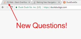
The question count update on the page title is important.

Enter image description here

Currently the count in the page title changes whenever there are new questions in a particular tab. This indicates that there are some new questions that I can look into.

If this is not there, the question seekers might have to resort to some sort of polling to check periodically whether there are new questions or not.

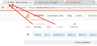
Currently this count only shows the current tag's new questions. (The "Web" tag on my nav in the screenshot.) An improvement to the current feature would be to have this count take into account all the tabs (or whatever the new feature is going to be) I have created. It would help ensure that if there is any new question in my interest areas, I will get a visual indication for it.

Something like this:

Enter image description here

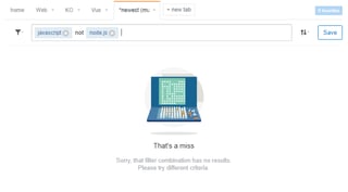
Ability to create '[tag 1] [tag 2] not [tag 3] not [tag 4]' groups.

It would be particularly helpful to have the ability to exclude certain tags from tag groups.

For instance, even if I can generally understand a question about JavaScript, I would probably not be able to answer the question if it involves the [angular] or [reactjs] tags - because I have never worked with those two or 40 other JavaScript frameworks.(1)

So if I can somehow ignore those tags completely,

  1. I have to read fewer questions before I can find one of them that I can answer.

  2. I do not get the page title update for irrelevant questions. Or, I get distracted by the page title update only when there are new questions that I can answer.(2)

From the earlier post about the announcement of the new navigation, I do remember reading that this feature was supported, but it never worked for me.

Enter image description here

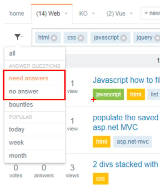
Filtering by "Need answers" or "No answer" is quite helpful.

The ability to filter the unanswered questions is quite useful. This means that I have to read lesser questions before I can find a question that I can answer.

Enter image description here


(1) Examples: '[Javascript] not [node.js] not [angular] not [reactjs]' or '[c#] not [wpf] not [xamarin]' or '[html] not [php]'

(2) The correct phrasing would be, "...the probability of having questions I can answer, when the count in page title updates, increases when I can exclude the tags that I will definitely not be able to answer."

4
  • 6
    For tag groups and excluding tags, you can use the advanced search features. For instance to get unanswered JavaScript questions without the various frameworks, try [javascript] -[nopdejs] -[angular] -[reactjs] isanswered:0. Obviously, this isn't as convenient and it doesn't put the count in the title. But you can find those posts. This is helpful feedback.
    – Jon Ericson StaffMod
    Commented Nov 22, 2017 at 8:34
  • 3
    Personally I've been more than annoyed with the question count in the title than anything else. It's not a useful metric since I can't physically act on more than two or three questions at a time. It's also more daunting if you're in a more active tab, say Java.
    – Makoto
    Commented Nov 22, 2017 at 15:50
  • @Makoto Yup that does happen with Javascript too. In fact, that is one of the motivators behind the second point about excluding certain tags. I'm not sure about Java, but in case of Javascript ignoring certain tags makes it quite easier to read the much smaller fraction of relevant questions. I have been working on a small userscript that hides questions from those irrelevant tags - so I don't have to read such questions - but the count in title still gets updated. Hence it is best if SO can support it through nav. Commented Nov 22, 2017 at 16:13
  • 3
    @JonEricson Should be isanswered:0 hasaccepted:0 since isanswered only checks the presence of a positively scored answer, ignoring acceptances.
    – user6655984
    Commented Nov 22, 2017 at 16:16
62

As one of the power users, I'm very sad to see this gone. The feature was vastly superior to my previous method.

I basically have a single view on all the tags that are interesting to me, so I can find new questions as they come in. So if the new UI has a "match all these tags and show live updates" option, that'd match my usecase.

For bounties I still use my RSS reader, although I occasionally use the new nav to see what bounties are new or close to expiring, both for answering and moderation purposes.

1
  • 2
    I desperately miss custom tabs already :(
    – user736893
    Commented Dec 18, 2017 at 14:05
29

265 users have saved sorts specific to bounties, but it’s not clear whether they need those sorts to help find questions to answer or if it’s just something they are curious about.

I'm one of these, and it's not just about curiosity.

I use this tab to find the potentially good questions: if a question goes unanswered and gets a bounty, the author must have put some effort into it (and into SO itself in the first place by gathering enough rep for a bounty), no one was able/wiling to answer it right away, and therefore the question has a higher probability of being interesting.

Yes, I'm getting tired of crappy questions, and I don't post nearly as much answers today as I have in the past, mainly because I can't find enough questions that are really worth answering, and which haven't been answered by the time I get to see them.

I sort on bounty end date mainly to be aware of newly offered bounties in the tags I'm interested in.

Other than that, I use new nav exactly in the same way as described by Floern, and grouping related tags into tabs is a great feature for me.

I hope this feedback is useful for v3.


On a side note, I'm disappointed to be forced back into the stone age. I didn't even realize new nav was still in beta. It has become an integral part of my experience with the site so much I was somehow convinced it went out of beta a long time ago.

Can't you really just ditch v1 and migrate everyone to v2 while you're working on v3?

2
  • It is possible to find all the bountied questions in a tag or group of tags using the featured sort. I believe this defaults to putting the next bounty to expire on the top of the list. I don't think you can do this with a search that includes a term other than tags or sort by something other than when expiration date. Does that help your use case?
    – Jon Ericson StaffMod
    Commented Dec 5, 2017 at 20:49
  • 3
    @JonEricson yes, that's actually how I did it before v2 ;) This is a matter of convenience, as in v2 all I had to do was to click on a tab. And it didn't require me to sync my bookmarks between my work and home computers. Tag groups is the more important use case for me though. Commented Dec 5, 2017 at 20:52
28

Summary of feedback (so far)

I'm going through comments and answers to look for common themes to pass on to the designers and developers of Navigation 3.0. If I missed something, it's probably because we've gotten a lot of excellent responses. I'm genuinely thrilled to see so much constructive feedback.

Tag groups

Lots of people have noticed that the search interface defaults to and logic, but when looking for questions to answer it really helps to use or logic instead. In other words, people tend to be interested in a variety of seemingly unrelated tags that they happen to know something about. Even if you had a bookmark saved to a New Navigation URL, it's now redirected to the intersection of tags rather than the union of tags.

Workaround #1: The or operator

It's not immediately clear in the UI that search supports an or operator. (There's also a bug in the UI with excluding more than one tag.) It's not hard to construct searches manually and bookmark them, but this is clearly a use case we'll need to support in the interface itself.

Workaround #2: Favorite tags.

For a long time users have been able to set up favorite and ignored tags. There are some obvious interface effects of these settings, but you can also use your favorite and ignored tags to narrow a search with intags:mine:

My tag combinations

Workaround #3: Stack Exchange tag filters

Again we have a feature tucked away on a remote portion of the network that might help: network tag filters. If you happen to be interested in answering questions on other sites, this is the tool you need. But you can also just limit results to an individual site, so it might help if you only care about Stack Overflow.

Question counts in the tab name

This was a complete surprise to me, but answerers want to be able to see at a glance how many new questions there are in a group of tags:

Tag counts

While you can sorta simulate the effect by opening up tabs in your browser, it's not a great solution. It's better to have those counts available right on the page so that you can see at a glance what tag (or tag set) might need some attention.

"Needs answers" and "no answer" filters

Again, we have advanced search options that cover these cases, but it requires some digging in the help center to find them. To filter questions that need answers, use the isanswered:false search term. (Add hasaccepted:0 if you want to count an accept vote as having answered the question.) To find questions that have no extant answers, use answers:0. These options need to be obvious in the UI and not buried where they are hard to discover.

Just recent questions

New Nav lets you look at only the last week or month when on a particular tag. ("Classic Nav" has this for all questions.) As you've probably guessed, there's an advanced search option for this too: created:7d...

Bounty sorts

Obviously questions that someone has invested a bounty in are more likely to be interesting than the average question. If you are just looking at a group of tags, you can get a featured tab for just bountied questions. The list is sorted by bounty expiration date. When he was specifying New Nav, Sklivvz noted that whether a question has a bounty logically should be a filter, not a sort. Ideally, we'd have a hasbounty: search option.

Compact question layout

Several people noted that questions have different layouts depending on what tab you are looking at. In particular, the Questions tab uses more vertical space. Ideally, we'll standardize on one style or build a more responsive page. From the limited sample of people who have answered on this meta question, it seems the preference is to maximize the number of questions per page and in the viewport.

State preservation

Since named tabs were tied to your Stack Overflow account, they carried across devices. (It's possible to share bookmarks across machines with modern web browsers, but I get the impression there are security-related concerns that block this for some people. Also, it's not as convenient.) Folks have commented that they would prefer even more state preservation. For instance, using the back button can reset to page #1 of a question list. There was also a bug that changed from showing 50 results to 15 when going to the next page.

I'm going to extrapolate from these data points to suggest that people really want to keep track of where they are in a list of questions they might be interested in answering.

Regression

Many people have lamented having to go back to the default question tab system. Some have noted that they aren't willing and able to answer questions until we fix the interface. I'd love to say Navigation 3.0 will come to save the day soon, but all we have right now is some rough mockups. To borrow Kurtis' remodelling analogy, it's like taking a well-organized drawer and dropping the contents into a cardboard box while we wait for new cabinets to be installed. Eventually, we'll have a better system for organizing, but I can understand being annoyed by the whole thing.

If it's any solace, the feedback has been incredibly helpful in pinning down what parts of New Nav we need to carry forward. Iterative development can take a long time as each bit needs to be validated as it's built. We can take a few shortcuts now that we know more accurately what people are looking for in question navigation.


A natural experiment

Removing New Navigation without immediately replacing it gave us a natural experiment. (This was not planned, but rather something I noticed last week.) Given that we know who was opted into the feature before we removed it, we can track the decrease in questions this group asked in the week following the change compared to the week before. This will give us an idea of how effective the items I list above were in terms of helping people find questions to answer.

Caveats: There are factors outside of our control that might alter the results. For instance, there's an adjustment period to adapting to new ways of doing things. Many comments have pointed out that it's been difficult to revert to default navigation. It's possible people will become adept at using the old system (just in time for us to take it away in favor of 3.0) if the experiment window were longer than a week. In addition, the traditional December lull in activity is upon us. Finally, a few comments indicate that some users don't plan on answering questions at all. Generally the extraneous factors tend to bias the experiment toward fewer questions being answered regardless of the efficacy of New Nav, so my guess is that the results I share below represent an upper bound.
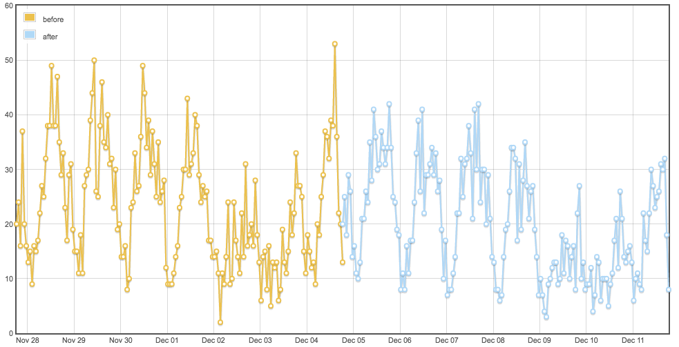
Before and after New Nav was shut off.

This graph shows just the number of questions answered each hour by users who were opted into New Navigation when we turned it off last week. Eyeballing it, there's a noticeable drop in maximum answers per hour each weekday (~50 to ~42) and similarly shaped day/night and weekday/weekend cycles. So a ~15% decrease in answering productivity seems a reasonable guess. The totals show a similar (14%) drop:

Epoch  Answers
------ -------
before    3930
after     3364

Again, there's now way to know for certain how many of the 566 or so answers would have been produced if we hadn't shut off the feature or if Navigation 3.0 will be able to reclaim that level of efficiency. That said, the value of a question and answer site is directly tied to how many (useful) answers are provided (and how quickly). So fixing question navigation for all potential answerers could noticeably increase the value of a site.
13
  • At least hasaccepted: and answers: are covered in the "Advanced Search Tips" if you try searching for something and fail. That is probably not so bad as far as documentation is concerned. Commented Dec 6, 2017 at 20:12
  • @AndrasDeak: The good bits were probably written before I got hired. ;-)
    – Jon Ericson StaffMod
    Commented Dec 6, 2017 at 20:16
  • 1
    Wish I could double vote up just for the "not php" filter.
    – DavidG
    Commented Dec 7, 2017 at 10:11
  • 5
    "it's like taking a well-organized drawer and dropping the contents into a cardboard box while we wait for new cabinets to be installed" - who does that? That is a really bad analogy imho. I would first get the new drawers and then move/migrate the data across, dropping it all in between will take significantly longer, makes the move error prone and a lot of people will get rightfully annoyed because in the meantime there is no working system to search for anything.
    – luk2302
    Commented Dec 7, 2017 at 11:17
  • 1
    I am very curious to see wether this change will have an impact on posted answers and votes cast, will keep an eye on the stats, I hope they will drop significantly so that the decision makers get the point.
    – luk2302
    Commented Dec 7, 2017 at 11:20
  • Keeping bookmarks doesn't work if they keep breaking, most bookmarks got broken for me when the new nav was turned off, because the old nav assumed different defaults (active questions/latest questions, and maybe more things too)
    – Ferrybig
    Commented Dec 7, 2017 at 18:53
  • @Ferrybig: Yes, that's a problem. I'd hoped that the URLs would redirect to the equivalent view. On the other hand, we aren't going to break URLs for searches, so if you can work out a view you like, it's safe to bookmark it. Still, bookmarks are a poor substitute for an actual UI.
    – Jon Ericson StaffMod
    Commented Dec 7, 2017 at 19:08
  • 3
    @JonEricson Could you please explain the reasoning behind removing the "new" version long before having even decided on 3.0? Commented Dec 7, 2017 at 21:36
  • @CamiloTerevinto: Well, there is work being done on 3.0. You can get an idea of how things are shaping up in the "Information Architecture" section of this blog post. I'm not sure when we'll be ready to show something, however.
    – Jon Ericson StaffMod
    Commented Dec 7, 2017 at 23:17
  • @JonEricson why don't you add this post to your question? I just found it now and reading it has alleviated a lot of my worries. This todo list should be more visible.
    – Steve
    Commented Dec 8, 2017 at 10:58
  • 2
    @Steve: I added a link to the answer at the top of the question. I'm glad it helped!
    – Jon Ericson StaffMod
    Commented Dec 8, 2017 at 17:15
  • 1
    @luk2302 : In the real world, you usually have no choice. The cabinets the old drawer was in have got to be removed before the new cabinets can be inserted. You can sometimes keep the old drawer stacked up somewhere - but usually there isn't the space, and everything has to go into cardboard boxes. Commented Dec 20, 2017 at 12:15
  • Any update? We really need the hasbounty filter... I've been watching the featured posts and haven't seen anything new about this.
    – NH.
    Commented Jan 5, 2018 at 0:15
23

I turned on the new nav system when it was released.

The only tab I really liked from the new nav system was the voted this week result because it was informative to read and helped give hope that new questions were still high quality.

That said, the new nav system had a really annoying bug in it where if you were paginating by 50, and clicked next on the results, it went back to paginating to 15. If this system is integrated into the main navigation system, please ensure that this bug does not carry over.

22

I'll just second Shog's main point, if I need to solve a problem, I'm using Google to search Stack Overflow. But that's not the only use case for SE, and navigation is mostly useful if I want to browse questions.

There are two main reasons to browse questions instead of doing specific searches: looking for questions to answer and looking for interesting topics to read. Favorite tags are one way to do this, but they're very limited and I'm sure there should be better ways to browse SE sites.

My main resource to try an browse SE sites are stackexchange.com tag filters. Those are pretty much an abandoned feature that hasn't seen any real improvement in years, but they're still the only way to follow topics across multiple sites. I'm not sure if it's technically feasible, but I would like to have any new navigation concept that is more powerful than the current one to also be available across the entire network. This is essential for SE power users, and might also be a way to make other SE sites discoverable for users that might not know there's a bigger SE network.

One huge problem I've had when setting up tag filters is that some sites or tags have vastly larger volume than most that I follow. I can't reasonably combine a high volume tag with a bunch of low volume tags, the high volume tag would simply overwhelm everything else. If that problem didn't exist, a tab that would show all questions in my favorite tags would be very useful. This is something that probably needs a solution if you want to give users a powerful way to find questions that need an answer.

One problematic aspect is that the criteria I'd use to find questions that are interesting to read, or questions that I want to answer would generally exclude questions where I'd perform any kind of community moderation. Making it too easy to filter out bad questions could potentially reduce the amount of moderation the community performs. I'm not sure how significant the danger is here, but at least the defaults for users that are able to close or edit questions probably shouldn't do anything that hides bad questions.

2
  • 2
    The advanced search terms can help a bit if you know how to use them. In particular, you can filter by number of answers, score, whether a question has an accepted answer, whether it has at least one positive scored answer, and so on. Trouble is, of course, you have to get familiar with the search options and save the URL in a bookmark or something rather than just use a flexible interface. Hopefully we won't be without that for long. This is something especially important for Channels where Google will not help us.
    – Jon Ericson StaffMod
    Commented Nov 22, 2017 at 8:39
  • I fully agree with cross-community filters. However, I can also see that being a huge technical challenge to deal with similar tags that mean very different things or unlike tags that really mean the same thing. But I do think that supporting experts to find questions they can answer across the entire network is incredibly important. Commented Nov 23, 2017 at 16:00
15

More flexible and customizable tag filters

Allow users to choose a list of tags to include as well as a list of tags to exclude

What I liked about the new nav is that it gave the ability to create more complex tag filters. Instead of just filtering questions by a single tag, I was able to get all questions that had any tag in a selected list of tags. (I also liked that I was able to add to these lists filters like "no answer" or "need answers".)

For example: [java] or [c#]

I used the new nav until I realize I couldn't add a list of tags to exclude for all tags listed to include. To continue with the above example, although I wanted to see most of the [java] and [c#] questions, I wanted to exclude all questions with tags like [array] and [generics] for both [java] and [c#] questions.

What I basically wanted to enter was: ([java] or [c#]) not ([generics] or [array])

Currently, however, you can only exclude tags for a single included tag, and not all included tags.

I posted this problem here:
Filter Questions that have one of multiple tags and don't have all of multiple tags

When I realized this wasn't possible, I didn't find the ability to create multi-tag filters as useful, since when I selected multiple tags, the tab usually got flooded questions I wasn't interested in. This (along with some other annoying bugs) was the main reason I mostly stopped using the new nav.

With the redesign, can there be a way to customize a list of tags to include together with a list of tags to exclude for all included tags?

4
  • You could already get questions from multiple tags in one page by searching on [x86] or [x86-64] or [assembly] or [sse] or [sse2] or [avx] or [avx2] [avx512] (... more tags). You get can sort by "active" to see recently-modified questions in the tags you want to patrol. If it gets too long for the search box to let you enter it, you can still manually edit the URL to include all the tags you want (but then new activity won't update the page title and show up when you're not tabbed there). I use the "ignored tags" feature to exclude some, but that does globally hide them. Commented Nov 22, 2017 at 8:55
  • 4
    It looks like there's a bug/limitation combining or and -. I can get [java] or [c#] -[genetics], but it won't let me add -[array] via the search box or URL construction. I'll see if I can get someone to look at that.
    – Jon Ericson StaffMod
    Commented Nov 22, 2017 at 8:58
  • 1
    @JonEricson The problem isn't just with adding multiple - tags. The main limitation is that -[generics] only gets applied to [c#] and not also to [java]. The linked questions has more details on this.
    – Tot Zam
    Commented Nov 22, 2017 at 15:16
  • A simple example (similar to the original idea, more details at meta.stackoverflow.com/a/359942/3787376): [css] ([html] or [javascript]) -[node.js] -[jquery] - this search query text would find questions that have the CSS tag and are about HTML or JavaScript but don't include Node.JS or jQuery code.
    – Edward
    Commented Nov 28, 2017 at 15:28
15

Well, I didn't think much of this until I logged in this morning and found it was gone. My very first thought was "oh, dangit, where is all my stuff?" Now I have to have multiple browser tabs open and have to click multiple links just to get all of the information I had before. This really sucks. I really hope Nav 3.0 is coming out soon because this is really going to affect my SO productivity.

0
14

disable the beta setting December 4, 2017

So it will be coming out of beta and everyone will be using it? Or everyone will be going back to the old way?

I used the new UI and love the flexibility it provides me. I can search for questions that need answers or that have recent activity or were recently posted, while at the same time filtering by css and not javascript and not jquery and not angularjs and not php, etc. I will greatly miss this feature, which is also very easy to update whenever I want to add or remove a tag, and the new tab created automatically works very nicely.

I also used simpler tags like css or css and html and not javascript or edge and not java and not javafx.

However, there's one important thing that you never got working with the beta UI:

Whatever new UI you implement, make sure it has live updating like the default question page before you release it to users, even in beta.

This was the single most frustrating thing about custom filtered question lists - you had to refresh the page to see new questions.

2
  • 1
    I'm afraid the question title clarifies: the beta will end and everyone will go back to the old method. You can search tags while excluding others, but there's currently a bug with the UI. I'm looking to get that fixed soon. I suspect the live updating thing will come for free since the code will start from the default navigation and not new navigation.
    – Jon Ericson StaffMod
    Commented Nov 22, 2017 at 20:45
  • 1
    @JonEricson I used to get live updating, now it's stopped. I'm using the URL https://stackoverflow.com/unanswered/
    – Barmar
    Commented Dec 6, 2017 at 23:11
12

I turned on the Beta nav with the intention of making tabs for grouping questions. I could have my "Java" tab that focuses on tags like java, jaxb, junit, a "Ruby" tag that has ruby, rails, rspec. But this wasn't that useful to me. First of all, it didn't carry across computers - I would need to reset my tabs on every computer. I generally use at least 2 or 3 different computers for browsing Stack Exchange sites (minimally my home and work computers).

With this limitation, I've been doing the same thing on Stack Overflow as I do on other sites - favorite tags that correspond to everything on the site I am interested in and then refreshing the home page from time to time. Unfortunately, there's no notification of new questions and the volume of questions on SO makes it very difficult to find questions I'm able to answer. Also, the sheer number of people on SO leads to FGITW type problems where I don't feel like competing with earlier answers that may have been upvoted (even if I may have a better one).

To be honest, the favorite (and ignored) tags seems to do everything I need to do. My concern isn't finding questions to answer on one site, but to find questions across every site. I currently monitor Stack Overflow, Software Engineering, and Project Management for professional questions, but there may be other sites that have questions that I can answer that I don't monitor (yet).

10

Perhaps not particular related, but could the navigation back "error" not be fixed, once and for all? It is a little bit frustrating that we have a paginated setup which actually works counter productive. I think everybody know what I am referring to, but here is the scenario :

  1. Go to a /questions/tagged/something
  2. Nothing to see here, move along, go to page 2, go to page 3 etc
  3. At some point you see an interesting question and opens it
  4. You do something, and then clicks back
  5. You are at the starting point, back at page #1

We must go from page 1 over and over and over. I think it is annoying, and I certainly think it has the side effect that many questions stay unanswered, simply because it takes too long to navigate between questions there are just 2,3 or 4 days old.

9

One thing that was useful to me is the compact layout of the New Nav tabs. Comparing this search with the equivalent nav tab, on average the nav tab shows me double the number of questions (on my current screen).

This is useful because it allows me to quickly scan the question titles, and decide which to take action on from there.

8

Just a thought for the nav 3.0: Have the ability to click a button and remove questions from the list.

So as I'm scrolling through the question list I can remove questions I'm not interested in answering, and those questions will no longer be shown to me in that list.

This would turn the list pages into more of an answering queue, and allow me to better keep track of recently active questions that interest me, without having all the in between noise.


I'm working on a userscript to accomplish this.

2
  • 2
    I reallly like this idea. It's almost like an un-favorite question vote that's only visible to the voter. It's not a downvote, which indicates something is broken in the question, but more like a meh vote, which indicates the voter doesn't care about this question for some reason.
    – Jon Ericson StaffMod
    Commented Dec 20, 2017 at 16:10
  • 1
    There is Hide unwanted questions (Greasemonkey Script) on Stack Apps; I haven't tried it. If this is feasible at all, I think it's important that such "swipe left" action be available from question lists, without opening the question.
    – user6655984
    Commented Dec 20, 2017 at 17:56
7

I was participating in the beta because, since it was a different workflow than the old nav, I wanted to get used to working with it. But I was never very happy with it, for basically the reasons you listed: I didn't have any particular use for the tabs. It's good to hear you're rethinking it again, because there's probably a better solution waiting to be created.

My normal method of getting to questions I want to answer is to click on the relevant tag from my favorites in the sidebar, which didn't change with new nav. The only tabs I created were Python and Flask, the two tags I visit the most, so that I wouldn't constantly be bugged by the UI to save the automatic tabs it would create.

1
  • I do exactly the same. I never learned to use the tabs, or they did not work for me. Commented Dec 4, 2017 at 18:16
6

The vast majority of page views (and ad impressions) comes from askers. So the interface naturally leans toward the main source of the revenue.

When we want to improve the interface for answerers, we have a bit of a conflict of interests. If you look at the votes on Meta, you'll see that the most important thing for the answerers is to reduce the flood of the low-quality questions. But that's not what SO wants to happen. Those low-quality questions provide the traffic SO need. SO wants "to make it easier for folks to find questions to answer". That is a very different goal. In simple words, I'd like to get rid of 50 to 60% of the questions I see on the front page, while SO wants to match me with those questions in ever more correct and refined way.

The above conflict of interest is the reason I expect very little from this new initiative. It will likely be oriented to ward Channels, where finding just the right answerer is indeed extremely important. But the Channels will likely not have the tutoring and debugging questions we have here. Replacing "tracking down someone within the company and badgering them face-to-face" with electronic version of it will work very well in Channels, but on SO it will likely be intolerable.

4
  • Maybe 1% of traffic comes from askers. Quality heuristics (which could be improved) block about 47% of the attempts to ask. We'd like to reduce bad questions (and ideally increase good ones) even more. Our plans for improving the questions asked begin with this experiment. Bad questions hurt the quality of the site and therefore hurt our revenue. We plan to keep chipping away at the problem.
    – Jon Ericson StaffMod
    Commented Dec 2, 2017 at 0:11
  • 1
    @JonEricson, I am sorry I was unclear: "asker" to me means "a person who needs an answer", as opposed to "a person who is willing to provide an answer". By that definition, 96% of the visits are askers.
    – user3458
    Commented Dec 2, 2017 at 0:15
  • 4
    @JonEricson, I wish I could agree with your statement: "Bad questions hurt the quality of the site and therefore hurt our revenue". Unfortunately, I was told, in no uncertain terms, that the questions that are extremely narrow and are nothing more than debugging/coding/tutoring requests are indeed welcome here. SO consistently refuses to add any way to close or separate such questions. So looks like your definition of "bad" is very different from mine.
    – user3458
    Commented Dec 2, 2017 at 0:19
  • Extremely narrow questions are indeed welcome here and have been since the private beta. However, our definition of good, bad and neutral does not consider the content of the question directly. We rely on users such as yourself to vote up or down. In the absence of voting, we can only guess based on whether someone else answered. In my experience, Stack Overflow answers tend to be useful and worth reading even when the question is not. But you can vote on answers too, if you find a bad one.
    – Jon Ericson StaffMod
    Commented Dec 2, 2017 at 0:25
6

I was using the "new nav" almost only to quickly access questions with one tag. The same can be done now by clicking on the tag in my favourite tags. I think I can get used to that. It is hard to get used to the fact that once I click on the tag, the question listing format is significantly different.

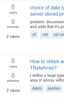
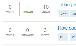
In the main navigation interface, 11 questions fit on my screen vertically. With the tab filter interface (same as with any search) it is less than half - 5 only.

The difference can be most quickly illustrated by clicking on the Stack Overflow logo and on the questions button next to it.

Is there any reason why the questions listing is using a so much different format? The most striking difference is the question header layout.

A visual example - the left side is the "questions", and the right side is the "main page":

Questions listing Main page listing

1

When searching for answers I use Google, because this includes answers from other sites (e.g. MSDN and The Code Project).

When searching for questions to answer, I search through Stack Exchange (not Stack Overflow), since this includes the other Stack Exchange sites I am member of and because there is already a (although limited) possibility to create a permanent filter there.

Ever more foreign language questions that are not useful to me (Portuguese, Russian) are cluttering the question list. It would be helpful to be able to include filters for opting in/out of these sub-sites.

1
  • 2
    One of the goals of Navigation 3.0 is to help people find content across the Stack Exchange ecosystem. For the moment, our focus is on Stack Overflow and Channels, but we're looking ahead to navigating all sites that a user has an account on. We're also looking to pull in the SE.com filter feature so that it's more likely to get used. It seems like it would be useful to have an option to exclude sites from a filter or filter by (non-programming) language.
    – Jon Ericson StaffMod
    Commented Dec 4, 2017 at 19:38
1

This is really frustrating as other users already mentioned. How is it possible to list only questions containing our favorite tags?

9
  • 5
    Yes, this is a terrible decision for power users. For now, the best workaround I've found is to use the tags like Martijn explains in his answer.
    – Eric Aya
    Commented Dec 5, 2017 at 10:13
  • 1
    thank you, this workaround shoud be mentionned in this post and not burried in the comments ... Commented Dec 5, 2017 at 10:28
  • Search for intags:mine does that.
    – user6655984
    Commented Dec 5, 2017 at 15:34
  • @CrazyIvan Yes, but now I have a huge ugly block at the top of the page telling me what all my tags are. :(
    – DavidG
    Commented Dec 5, 2017 at 15:42
  • @DavidG: I kinda find it handy to see exactly what it is I'm looking at in the search. I suspect it's ugly mostly because it wasn't designed for a large number of tags.
    – Jon Ericson StaffMod
    Commented Dec 6, 2017 at 19:26
  • @Jon That's exactly the problem, I have quite a few tags, and it's taking up a third of my screen. Even shows the ones I'm excluding. I mean, who even wants to see PHP questions?!
    – DavidG
    Commented Dec 6, 2017 at 19:29
  • 1
    @DavidG: Absolutely agreed.
    – Jon Ericson StaffMod
    Commented Dec 6, 2017 at 19:31
  • @DavidG Client-side CSS fix: .displaying-results {display: none;}
    – user6655984
    Commented Dec 6, 2017 at 20:33
  • @CrazyIvan I'm well aware how to do that, but I'd rather it gets fixed by the SO devs.
    – DavidG
    Commented Dec 6, 2017 at 23:43
-7

My opinion is that creating a dynamic tab structure inside Stack Overflow does not make sense in the broader ecology, where web browsers are the right place to address (pun noted) that problem. I have enough trouble with too many open tabs on my browser at the top level.

Why are you are making tabs within my tabs with a "+" menu to add more? Jeez, that's terrifying. How much worse do you want this web-browser-Inception to get?

Where does this end. Is Stack Overflow a virtual machine in a window, or is it something where at any point I can grab a URL and send it to someone so they can see what I'm seeing? I'd prefer the latter--strongly. All Stack Overflow needs is Cool URI-based saved searches, and that's it. Any other problems, the power users should address with browser extensions.

Chrome has features where I can group the tabs into a top-level Window, drag them around in some kind of workflow with links from other sites. I don't need Stack Overflow to be bothering their UI designers with such problems, or embedding other sites in IFRAMEs in an attempt to become my "one stop groupware solution". Deciding how wide to make a tab button, how to draw the + sign, how to reorder, whether (at all) to allow link to state for that tab...we don't need more of that.

If UI designers at Stack Overflow don't like their job and want to work on browsers, they should quit and go work on browsers. Or just start writing browser extensions. I know more than one feature request I've asked for has been responded to with "well, just use greasemonkey"...and it was more plausible stuff than this.

2
-10

I think one of the big challenges Stack Overflow has is the sheer volume. I used to answer many more questions than I do know, partly down to the fact I was always learning.

Questions that were highly voted used to bubble up to the top of the question stack, and I'd go read them and learn something new, or if the answers could be improved on provide something better (hopefully).

Additionally I'd answer unanswered questions, knowing that others answers would also come in and they might improve on my answer - teaching me new stuff again.

Now I find that the sheer volume of questions means no "interesting" questions ever bubble up, most have one or two upvotes at most, so I'm less engaged with really interesting nuggets of information now and again.

1
  • 1
    How is this related to the navigation system?
    – Mike Cluck
    Commented Dec 7, 2017 at 14:04
-20

I frequently search for UserID + string. It would be great if I could have more flexibility with user-based searches such as:

  • Posts upvoted by __
  • Posts Favorited by ___
  • Starred Chats by ___
  • Mix and match above
  • etc

It would be great if some form of the navigation included these features, since it would likely increase the "community" aspect of this site...

Feature Request

I've seen many posts asking for the ability to "favorite an answer", and is one of the most disappointing omissions from this site IMHO.

If this were implemented, I would love to search for answers that a particular user flagged as "most correct".. which is an extension of the original idea.

2
  • 7
    But when you have "Posts upvoted by __" filter, doesn't it inherently undermine anonymity? Or do you think that upvotes don't require anonymity? Commented Nov 26, 2017 at 4:34
  • 6
    there is another question about doing just this, and it was resounding pushed back against, because they do not want SO to become a social networking thing and it would make voter fraud/serial downvoting much easier accomplish in some ways. It was a while ago and I can not find it right now.
    – user177800
    Commented Nov 27, 2017 at 20:59

You must log in to answer this question.

Not the answer you're looking for? Browse other questions tagged .