I'm reading through the 2016 Developer Survey, and I'm curious about the details on the most popular OS. While looking through the previous years, I can see it's always been this way. Here are 2013's results, for example:
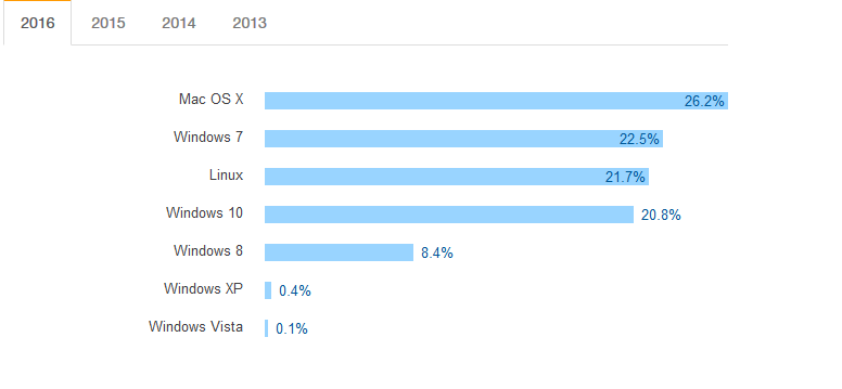
As you can see, Mac OSX is listed once, even though there are 12 major versions of it, from 10.0 (Cheetah) to 10.11 (El Capitan). Meanwhile each major version of Windows (because of how Windows handles its updates, understandably) is listed separately. Because of this, in 2016 we can see the results look like Mac (using the general term) is the most popular operating system:
In reality, 52.2% of users are on Windows and only 26.2% (about half as many) are on Mac.
I know it could be said that it doesn't matter because OS X updates are made available for free to all OS X users via the App Store and Windows OSes up to 10 have all been separate purchases, but I think there are a great many people on different versions of OS X still, like there are a great many iPhone users out there still on any number of models older than the 6s.
Considering that OS X (10.0) and Windows XP both came out in 2001, and Windows 10 and El Capitan both came out in 2015, I think it's a little misleading to split the question into these categories. Shouldn't either all Windows OSes be grouped, or all OS X users be asked what version of OS X they're on? (Heck, my dad still keeps an OS 9 VM around so he can play Caesar III)
In a perfect world, I suppose we would be presented with four proportionally-sized pie charts instead of bar graphs, one each for Mac, Windows, and Linux distros, and a fourth for "other". Each slice of each pie would be either a major version or a distro in the case of Linux.
I am also aware that it will become less of an issue over time as Windows 10 moved the Windows environment to the same kind of "free updates pushed over the internet" model that OS X uses.

