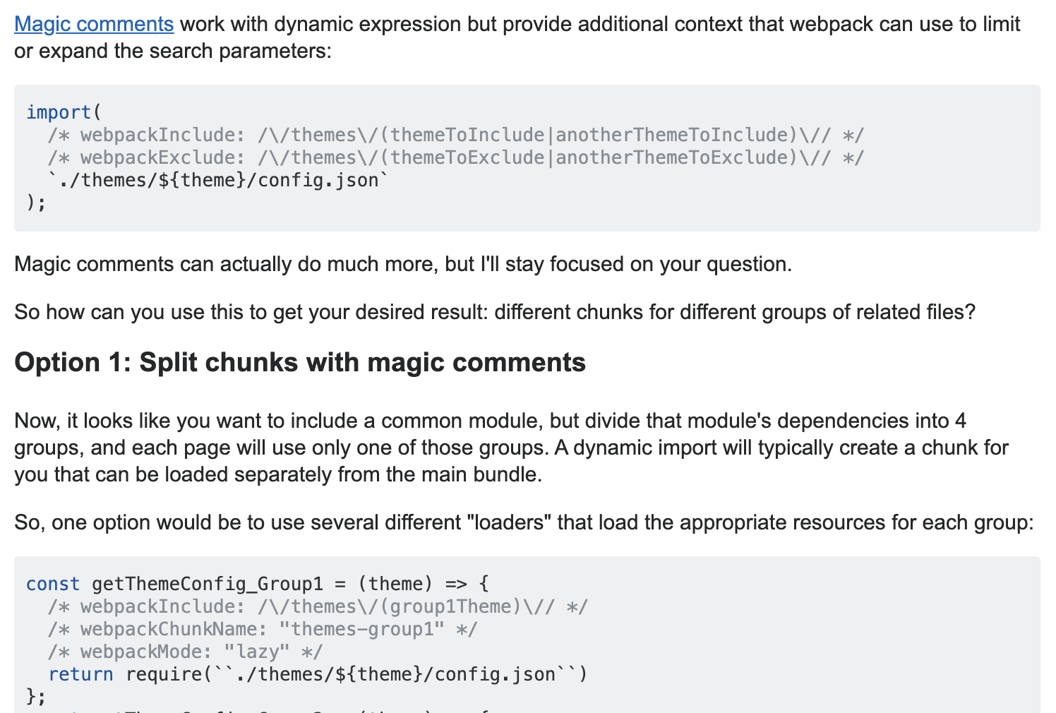
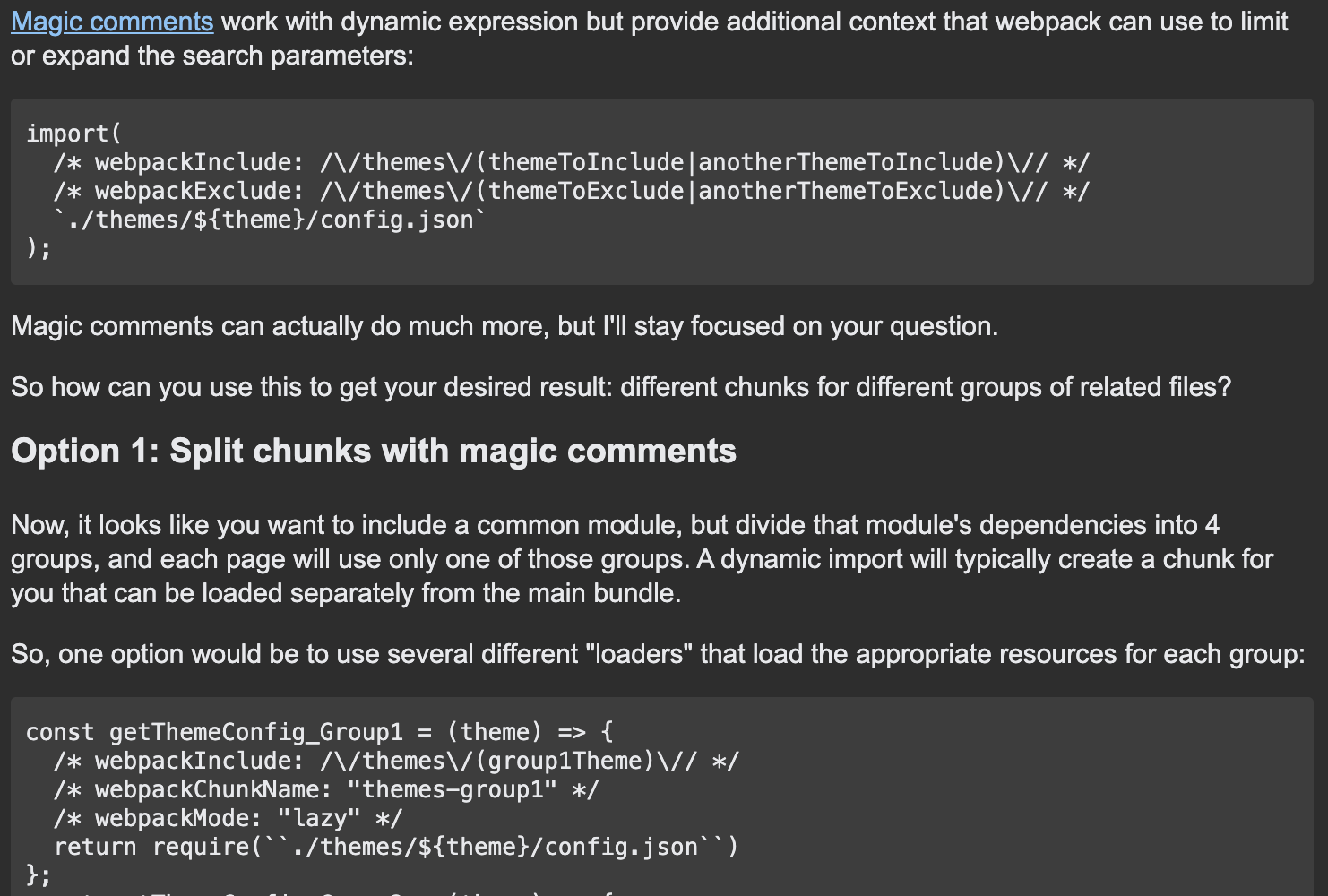
Headers in posts don't stand out very well in dark mode.
In light mode, the bold black text really pops out and helps to visually "break up" a long post. But in dark mode, the brightness of the regular body text seems to match the headers and they get drowned out, making it harder to distinguish sections.
This might just be my eyes, but on long posts I have to search a lot harder for the headings.
I have screenshots below, but you can try it for yourself on this post:
Regular expression for floating point numbers
Light Mode
Dark Mode
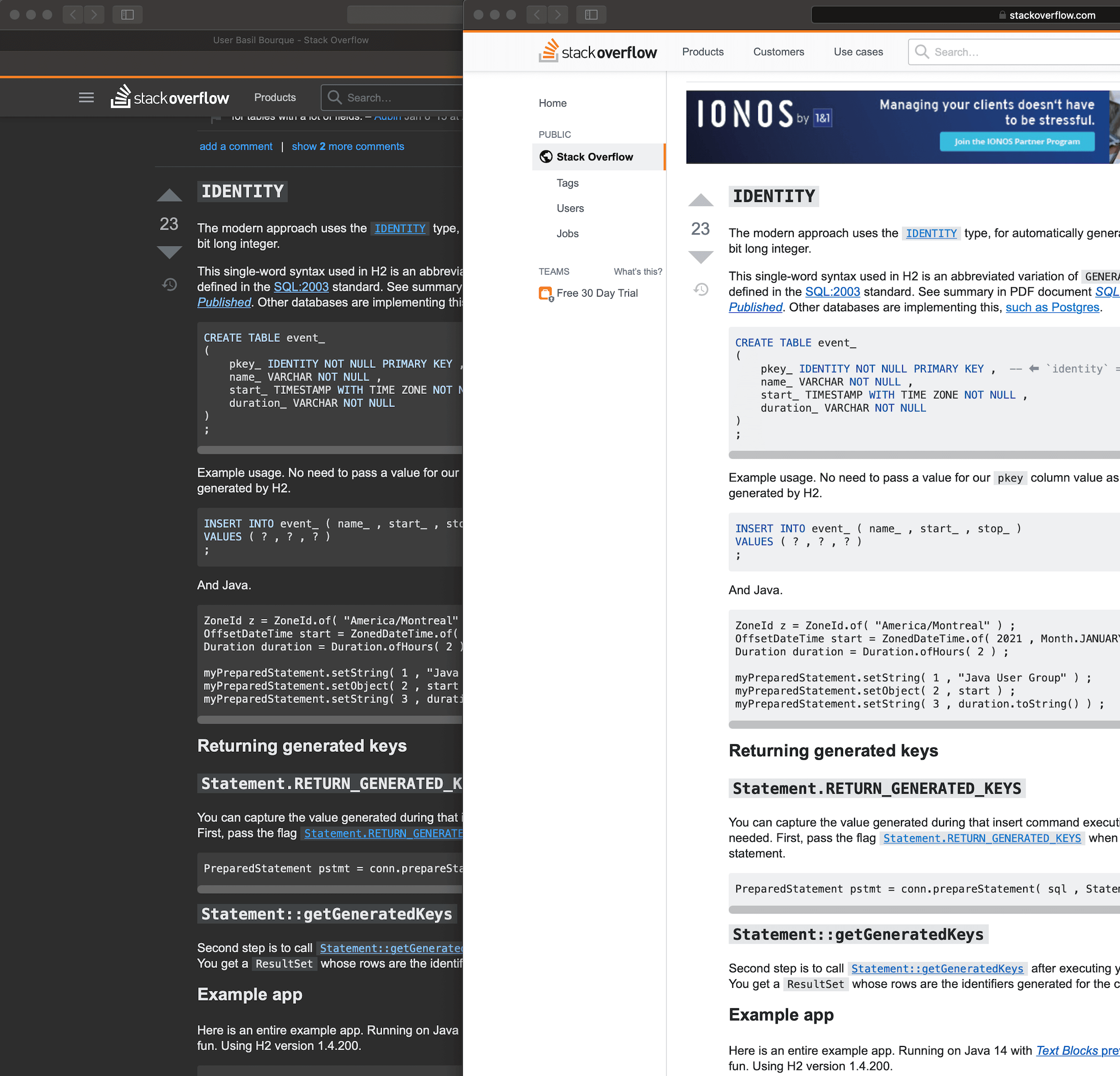
Here is another screenshot of this page shown side-by-side, in dark and light modes. Scanning for the headings is easier in light mode.


