deleted 70 characters in body
Source Link
Luis Mendo
  • 112.4k
  • 1
  • 22
  • 27

The annoying whitespace at MSO's top has been already discussed. In SO, when viewing a tags's questions, that space appears filled with text that is, in most cases, useless.

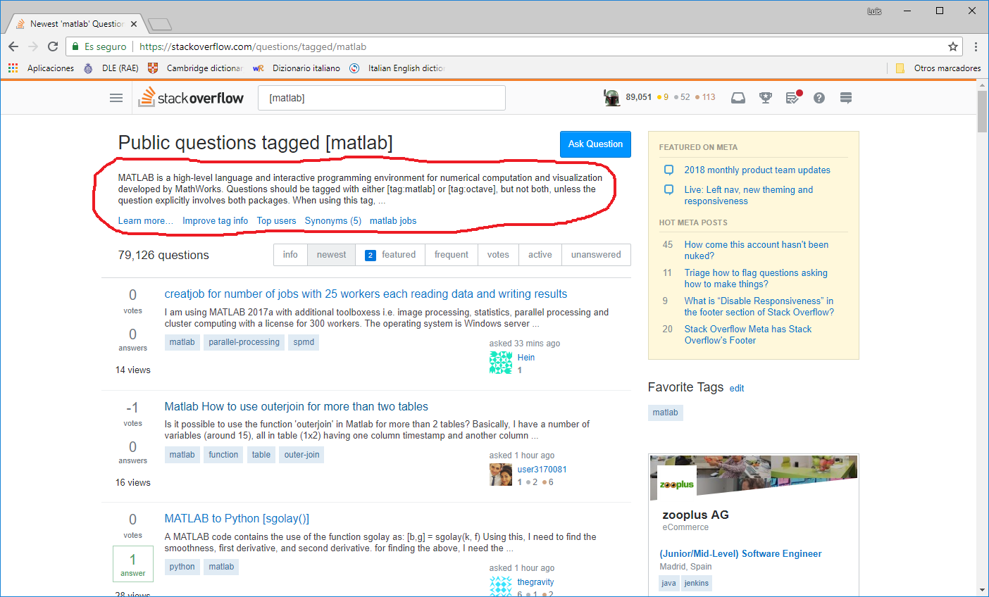
As an example, I'm a regular participant in the tag. I visit that often. I don't need such a large amount of precious vertical space to tell me what MATLAB is, how questions should be tagged etc. See image below.

Granted, that information could be useful to some people (the few first times they see it, anyway). But for most people, most of the time, it's a waste, and it's annoying.

So:

  • Is there an option to remove it, with the current design?
  • Failing that, wouldn't it be a better design idea to have that text hidden by default, and show it only ifafter the user clicks somewhere?
enter image description here

The annoying whitespace at MSO's top has been already discussed. In SO, when viewing a tags's questions, that space appears filled with text that is, in most cases, useless.

As an example, I'm a regular participant in the tag. I visit that often. I don't need such a large amount of precious vertical space to tell me what MATLAB is, how questions should be tagged etc. See image below.

Granted, that information could be useful to some people (the few first times they see it, anyway). But for most people, most of the time, it's a waste, and it's annoying.

So:

  • Is there an option to remove it, with the current design?
  • Failing that, wouldn't it be a better design idea to have that text hidden by default, and show it only if the user clicks somewhere?

enter image description here

The annoying whitespace at MSO's top has been already discussed. In SO, when viewing a tags's questions, that space appears filled with text that is, in most cases, useless.

As an example, I'm a regular participant in the tag. I don't need such large amount of precious vertical space to tell me what MATLAB is, how questions should be tagged etc. See image below.

Granted, that information could be useful to some people (the few first times they see it, anyway). But for most people, most of the time, it's a waste, and it's annoying.

So:

  • Is there an option to remove it, with the current design?
  • Failing that, wouldn't it be a better design idea to have that text hidden by default, and show it only after the user clicks somewhere?

enter image description here

deleted 11 characters in body
Source Link
Luis Mendo
  • 112.4k
  • 1
  • 22
  • 27

The annoying whitespace at MSO's top has been already discussed. In SO, when viewing a tags's questions, that space appears filled with text that is, in most cases, useless.

As an example, I'm a regular participant in the tag. I visit that often. I don't need such a large amount of precious vertical space to tell me what MATLAB is, how questions should be tagged etc. See image below.

Granted, that information could be useful to some people (the few first times they see it, anyway). But for most people, most of the time, it's a waste, and it's annoying.

So:

  • Is there an option to remove it, with the current design?
  • Failing that, wouldn't it be a better design idea to have that text hidden by default, and show it only if the user clicks somewhere?


enter image description here

The annoying whitespace at MSO's top has been already discussed. In SO, when viewing a tags's questions, that space appears filled with text that is, in most cases, useless.

As an example, I'm a regular participant in the tag. I visit that often. I don't need such a large amount of precious vertical space to tell me what MATLAB is, how questions should be tagged etc. See image below.

Granted, that information could be useful to some people (the few first times they see it, anyway). But for most people, most of the time, it's a waste, and it's annoying.

So:

  • Is there an option to remove it, with the current design?
  • Failing that, wouldn't it be a better design idea to have that text hidden by default, and show it only if the user clicks somewhere?
 

enter image description here

Source Link
Luis Mendo
  • 112.4k
  • 1
  • 22
  • 27

Too much non-whitespace at SO's top

The annoying whitespace at MSO's top has been already discussed. In SO, when viewing a tags's questions, that space appears filled with text that is, in most cases, useless.

As an example, I'm a regular participant in the tag. I visit that often. I don't need such a large amount of precious vertical space to tell me what MATLAB is, how questions should be tagged etc. See image below.

Granted, that information could be useful to some people (the few first times they see it, anyway). But for most people, most of the time, it's a waste, and it's annoying.

So:

  • Is there an option to remove it, with the current design?
  • Failing that, wouldn't it be a better design idea to have that text hidden by default, and show it only if the user clicks somewhere?


enter image description here