There's already a meta post on Contrast and HighlightingContrast and Highlighting with reference to the site redesign, but it doesn't present anything concrete.
There is also a Darker Color for Favorite TagsDarker Color for Favorite Tags post, but this is just saying that the pink background for favorites posts is too close to the white background on non-favorites posts (and it has since been made slightly darker).
In the comments section for this answerthis answer to another Meta question, the matter of highlighting on favorites in the question list came up and we were directed to open a new case about it.
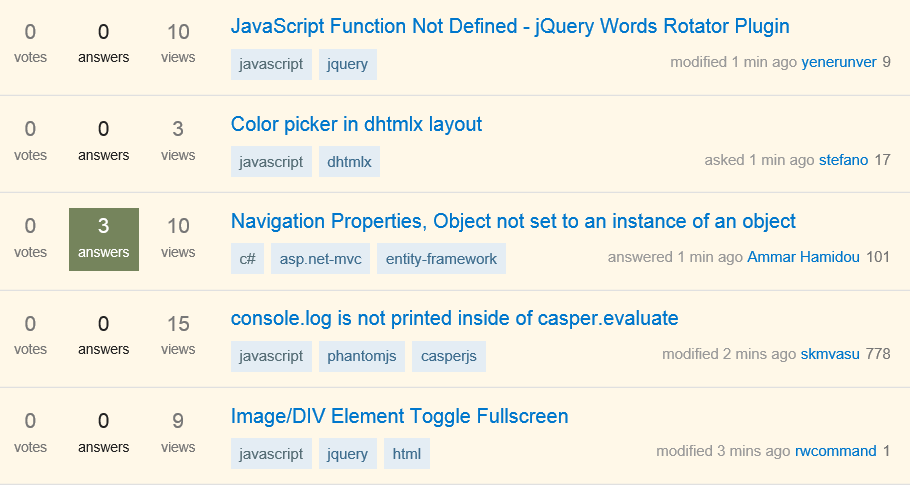
After the redesign, highlighted favorites now look like this:


This mixture of blue and pink is jarring on the eyes, and it is objectively bad.
The problematic colors here are:
Pink background: rgb(255, 248, 232)
Question title and author name: rgb(0, 119, 204)
Tag background: rgb(228, 237, 244)
Answered ___ ago: rgb(153, 153, 153)
Plugging these into this contrast calculator, we get:
Background vs. question title/author handle:
Brightness difference = 154 (Pass)
Hue difference = 409 (Fail)
Background vs. tag background:
Brightness difference = 12 (Fail)
Hue difference = 47 (Fail)
Background vs. answered ___ ago text:
Brightness difference = 94 (Fail)
Hue difference = 273 (Fail)
Can we please improve this?
On a more subjective note, I find the new style choices really bizarre. This mixture of light pink and electric blue (the blue is not just in the question titles, but on all the buttons as well) and the use of slender sans-serif fonts for the titles seems really out of place on a professional website.