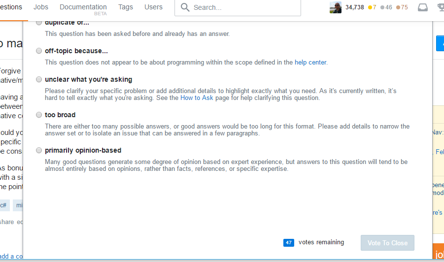
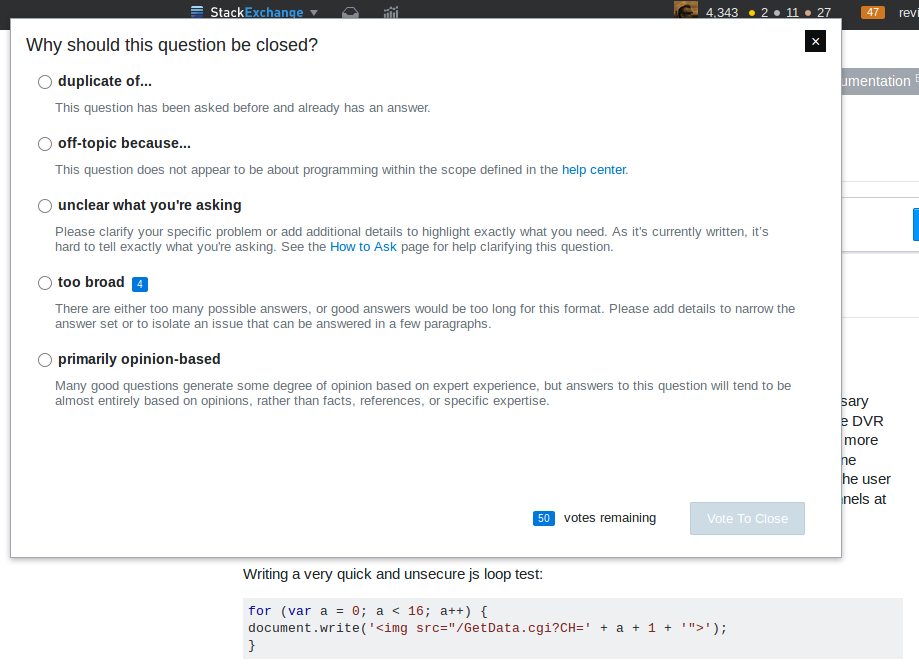
This post is my initial feelings on the new bar. I'm going to use it for a few hours, based on Shog's advice, but I want to document my first impressions/issues with the new bar.
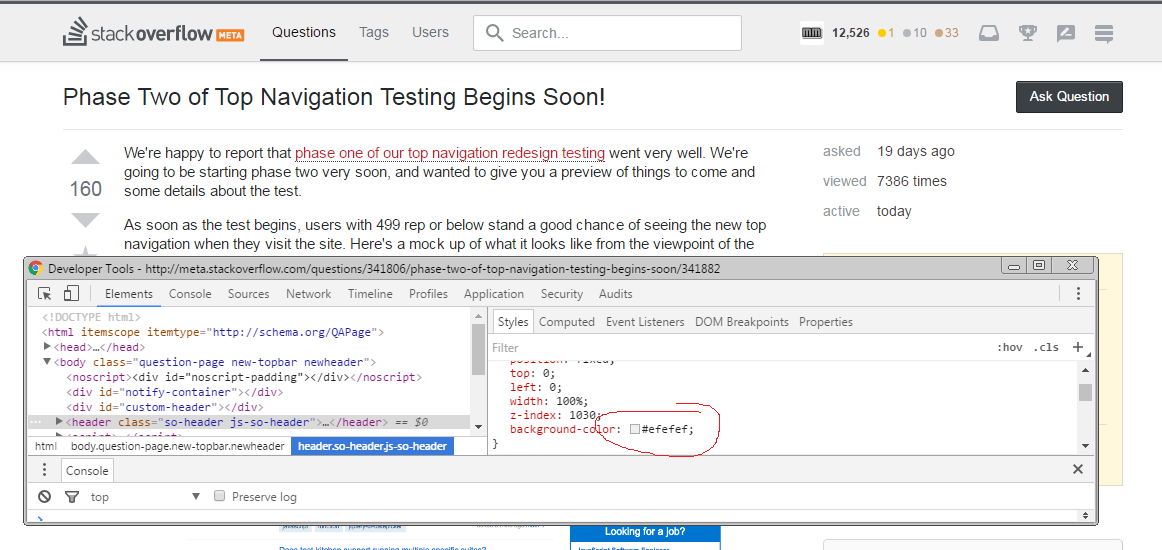
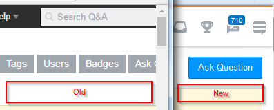
The new bar is thicker than the current black top bar, but the "Ask Question" button seems to start at the same location. This makes the page feel more "squished". This is a minor detail. Related to that "squished" feeling, is the lack of contrast between the navigation and the page content.

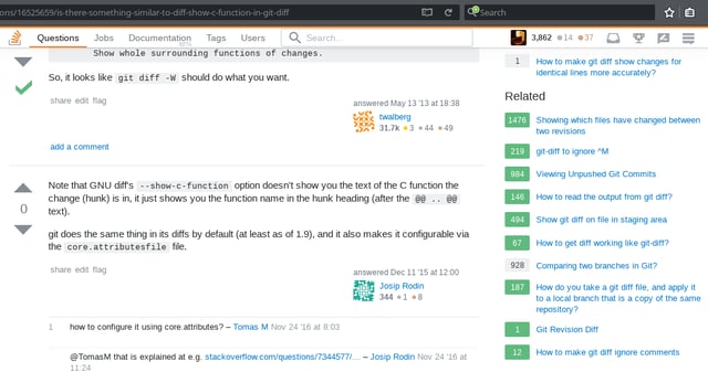
I've navigated around the main and meta sites for a little while now and I can safely say that I am not a fan of the sticky navigation bar. It is distracting and contains links to things that I don't need immediate access to. I click on "Questions" 1-2 times a day. Usually, I spend my time watching specific tags, not watching the newest questions. I click on "Jobs" a handful of times a week. I don't use the documentation button on the navigation bar. Instead, I use the documentation link inside of the ways I am watching. This gets me directly where I want to be, instead of requiring me to navigation the documentation main page.

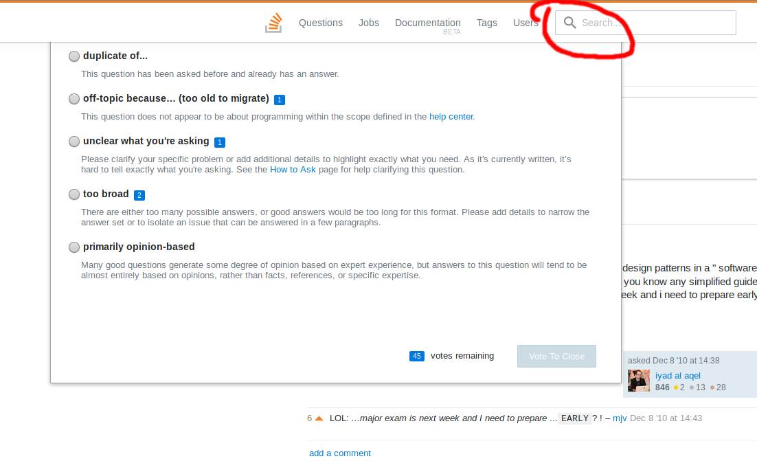
I can't remember the last time I needed the "users" or "tags" links. The search on Stack Overflow leaves a lot to be desired, so most of my searching occurs through Google.
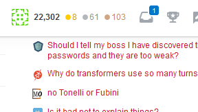
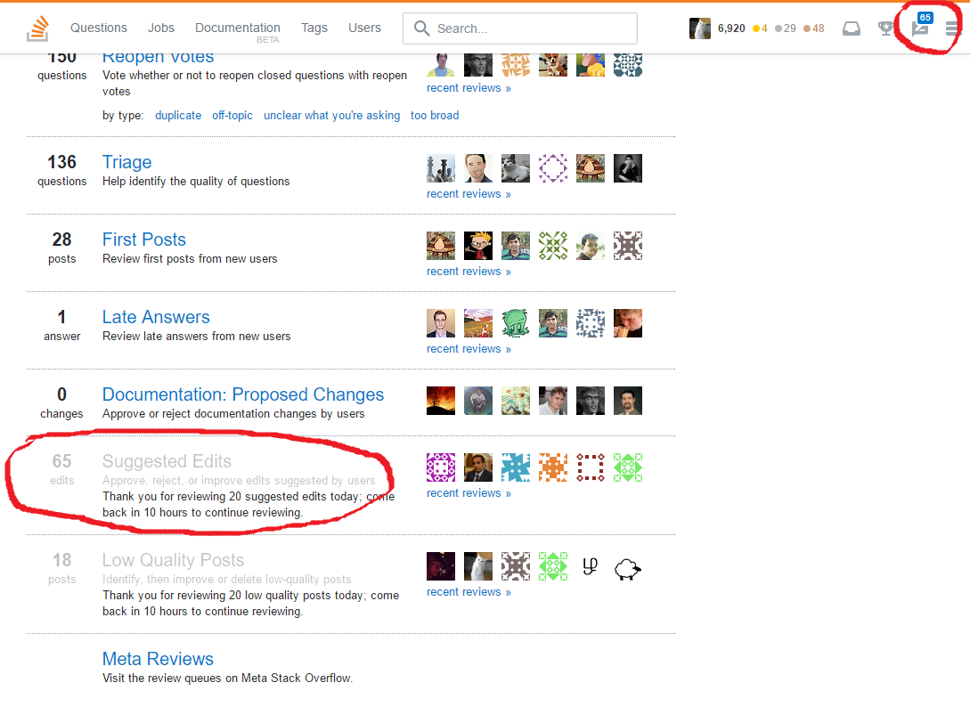
The other indicators are a great way to interrupt what I'm doing. With the black navigation bar, I can answer a question, work on reviews, etc. with the bar out of sight. If I get a notification, I don't see it immediately. Now, as soon as I get a notice, I am distracted by the new indicator.

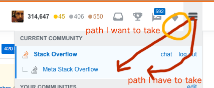
Moving the mouse down into the site selector is tedious. It's already been mentioned, but I think it's important to mention again. The easiest path to take once the menu is open is a straight line, not down then left. Unfortunately, the straight line causes the box to close (because I hit the review queue "menu"). Worse, it doesn't close completely, so in my confusion to reopen it, if I mouse over any of the other menus, there are multiple popup menus.
I haven't used the new bar on my phone or tablet yet. I will document those when I do.
Summary of first impressions: I am trying to find things I like, but that stickiness is really making me hate it. I can get used to the new icons and the links being moved around, but I don't think the navigation bar being stuck there constantly is actually helping me navigate around the site.
I don't use any of those links consistently enough to need immediate access. The indicators on the right are more of a distraction. That makes it feel like wasted space to me.


