31

Collectives seem to create a lot of clutter (4, maybe 5, elements on the screenshot below). This affects UX.

Please consider reducing the clutter. If collectives don't serve any real purpose, please consider removing them altogether (perhaps they serve some purpose or create value for other users; but they've gotten in the way numerous times for me).

Regarding the company behind the collective in the screenshot, I use Google Cloud heavily every day, so the clutter doesn't really seem relevant if its goal is raise brand awareness.

Please consider reducing clutter if possible. Thank you.
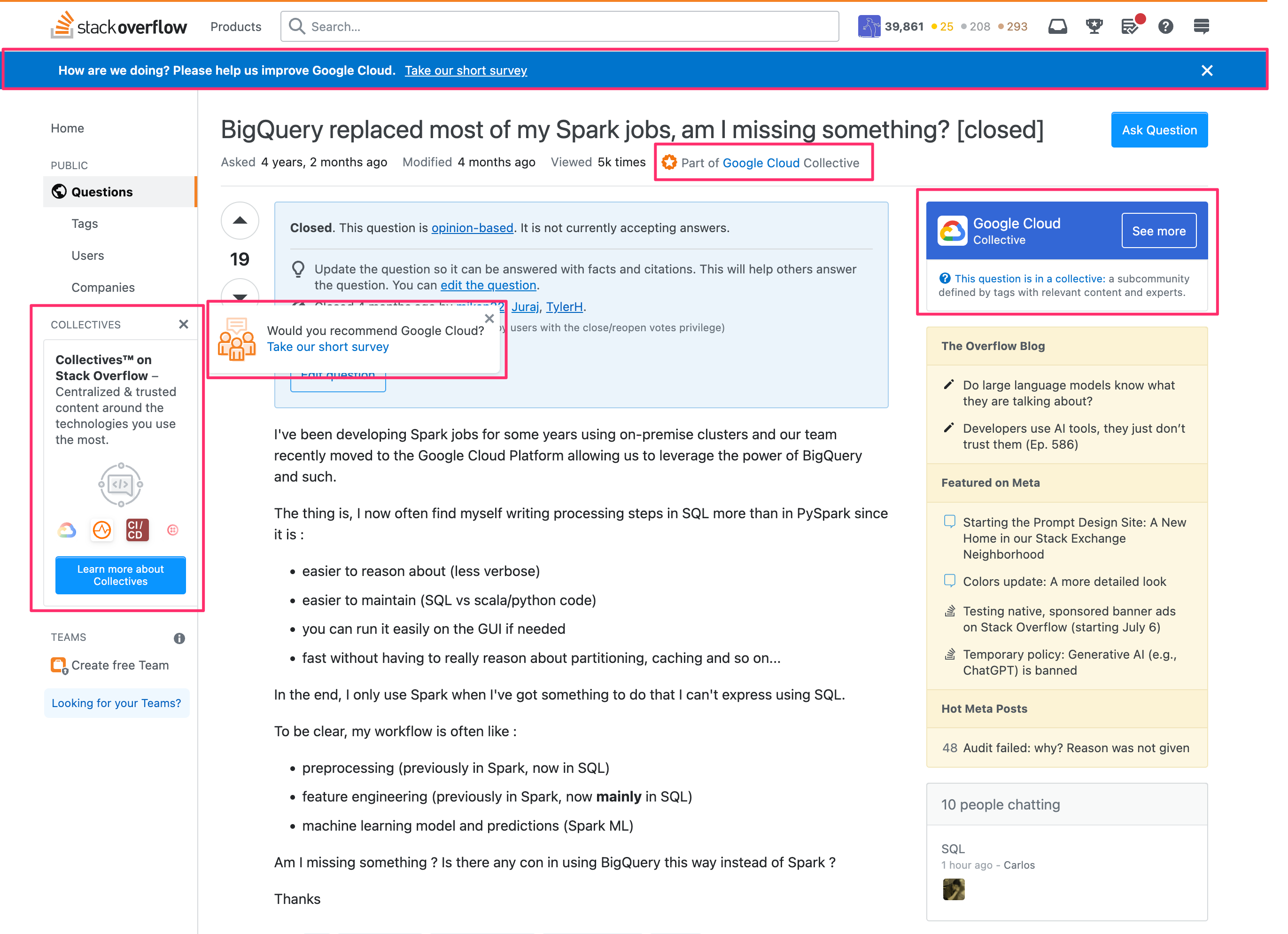
enter image description here

3
  • 9
    Just in case the company cannot respond positively to this request in time, there are browser add-ons that could be used to remove the clutter on a per user basis. Commented Jul 6, 2023 at 7:40
  • 3
    @NoDataDumpNoContribution Such a feature is also built into Brave. I had forgotten about some of those elements because I've blocked them. Commented Jul 7, 2023 at 16:36
  • 4
    There's an option in the Settings Tab of your profile "Hide left navigation". This will hide the large Collectives box on the left along with the useless (IMO) links above it and the Teams link below it. This also, at least on my laptop, makes the main question/answer area somewhat wider (maybe 5-10%). The browser plugin uBlock Origin (and likely others) allow you to select and block elements, as well.
    – MattDMo
    Commented Jul 7, 2023 at 18:26

0

You must log in to answer this question.

Browse other questions tagged .