Update
I think I've changed my mind. It is not that bad.
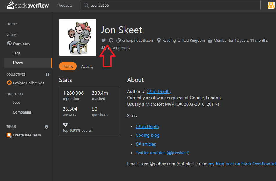
With the new layout of the profile page, the GitHub and Twitter icons are so small and occupy just a tiny space which makes them hard to find and click.
I think they should be accompanied with a text or have a little more margin from each other.

Settings->Edit profilebody.user-page #mainbar-full .list-reset.s-anchors.s-anchors__inherit.d-flex.fc-light.gs8.mln4.fw-wrap > .flex--item > a[title]:after { content: attr(title); }was sufficient to have the content of the tooltips be displayed after the icon for these. The selector can almost certainly be optimized, but I haven't taken the time to look through the user pages to see what, if anything, has something close that might be impacted by using a less verbose selector.