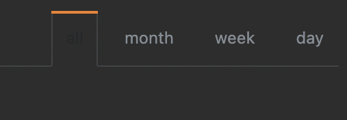
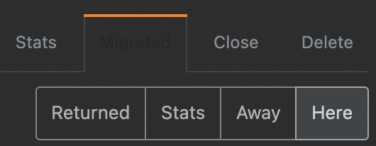
The label of the active tab on the navbar in darkmode in some of the moderator tools has very low contrast and is difficult to read. While the hover active is quite bright compared to other darkmode hovers.
This appears to be the same styling mentioned in Unable to read "User" tab on tag info page when using dark mode, however, that question appears to have been marked resolved on June 2nd, 2021 and I noticed the styles below today July 25th, 2021.
The css selectors seem to be:
#tabs a.youarehere, .tabs a.youarehere#tabs a.youarehere:hover, .tabs a.youarehere:hover
For completeness, this appears on the navbars of the following tools:
- Protected Questions https://stackoverflow.com/tools/protected-questions
- Suggested Edits https://stackoverflow.com/tools/suggested-edits
- Question Close Stats https://stackoverflow.com/tools/question-close-stats
Active Tab:
Hover Active Tab:
- Only the Migrated tab in tools (https://stackoverflow.com/tools?tab=migrated&daterange=today) has this styling:
While all others (Stats, Close, and Delete) appear as:
- Can the contrast be increased so the text is more easily readable?
- Is it the expected behaviour that the Migrated Tab use a different navbar than Stats, Close and Delete?


