10

Depending on the context, previously visited links on Stack Overflow Meta can be quite tricky to spot.

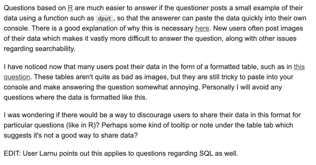
Example - there are four in the image below - they're somewhat tricky to spot (for me, at least):

enter image description here

(image from here)

Is it possible to make them a little darker so they stand out more?
1
  • 2
    There are only 3 links in the image. Part of the problem is the anti-pattern of linking the word "here" instead of the text describing what is at the link. For example, the second link should be written as "Here is a good explanation of why this is necessary" which naturally makes it much more visible.
    – Ben Voigt
    Commented Apr 5, 2021 at 22:38

0

You must log in to answer this question.

Browse other questions tagged .