6

Is the following the correct behaviour or an error?

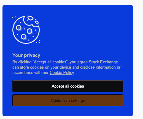
Stack Overflow is dark themed, but the cookie settings is white White on Dark
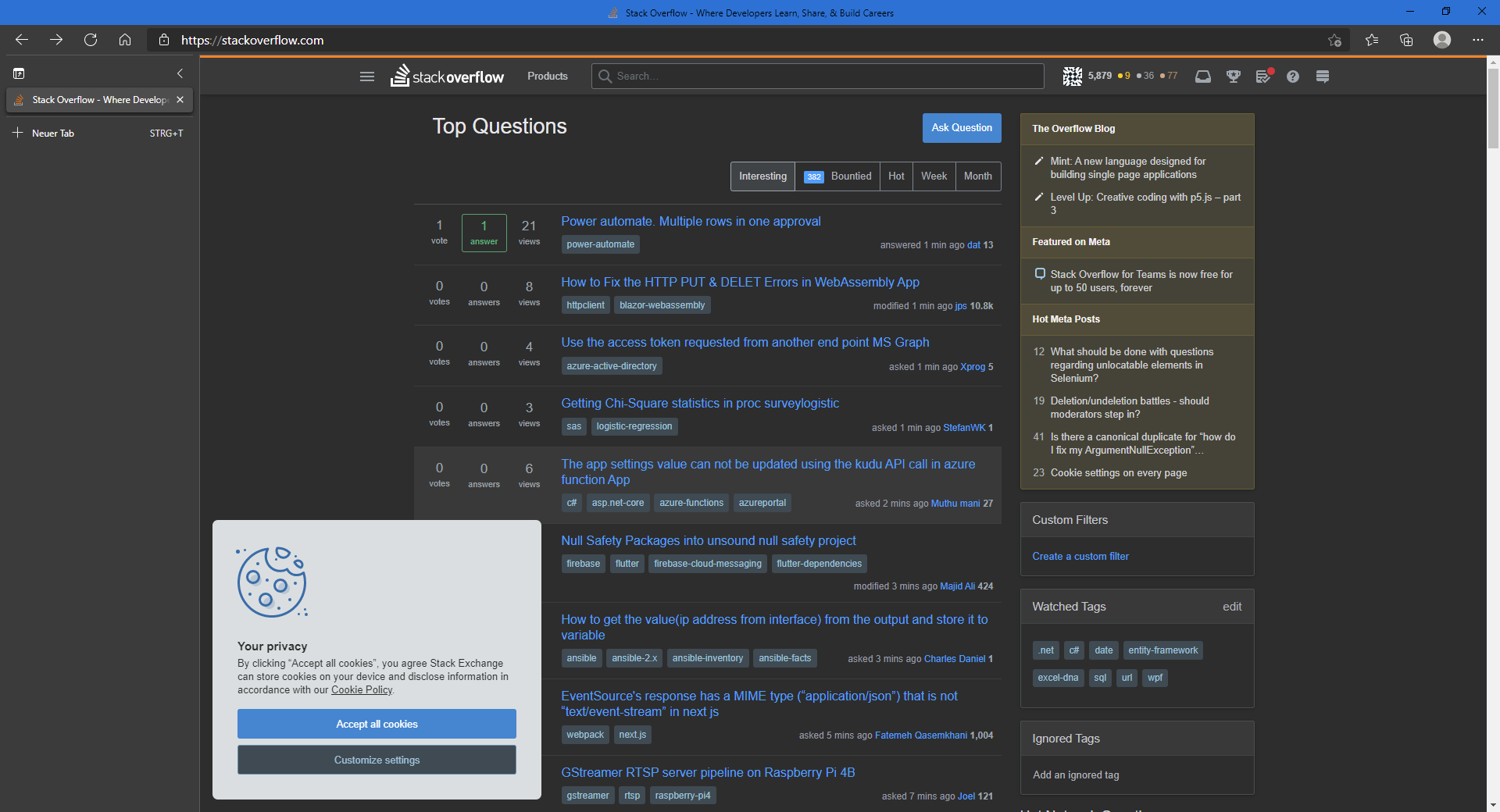
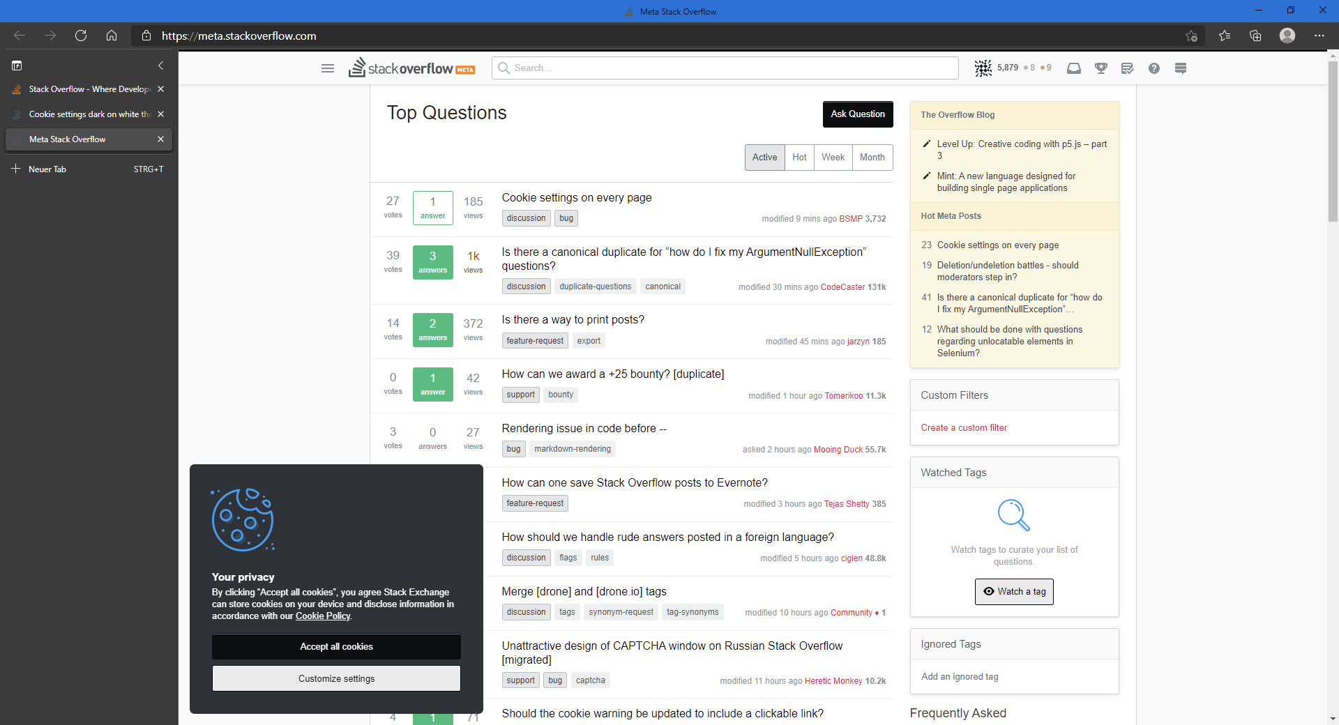
on Meta StackOverflow it is white theme and dark cookie settings Dark on White
3
  • 3
    If the floating dialog was always dark, it would have no contrast at all against the background in dark mode. Would be pretty sucky to use.
    – yivi
    Commented Mar 31, 2021 at 7:55
  • @yivi - had the same thought, that this may be the reasoning, but thought a border or dropshadow would have been enough to "confine" it from the underlying same color background, but in the end I simply wasn't sure if it is as desired or not Commented Mar 31, 2021 at 8:10
  • Even if it had a border to show contrast, it would look really bad.
    – 10 Rep
    Commented May 2, 2021 at 20:51

2 Answers 2

-3

Actually, By my experience the inverse color for alert dialog boxes have better UX.

It is exactly correct.

3
  • 2
    It is exactly correct. are you assuming or stating a fact? Commented Mar 31, 2021 at 14:16
  • 1
    @RandRandom, It is a fact, see, I'm Frontend developer and I saw many designs, for better UX some critical alert dialog boxes should be very shiny. in fact, your question is very nice, because of this I upvoted it.
    – AmerllicA
    Commented Mar 31, 2021 at 14:17
  • 3
    @AmerllicA It's really just an opinion, not a fact :-)
    – TylerH
    Commented Mar 31, 2021 at 15:14
-3

Actually its is bugging me to..

I see why its done this way, but there so much other ways to make it dark on dark mode without having the same color as background.
There are enough colors to pick. Make it an other shade of gray or a dark shade of orange or blue or violet

Its a flaw in my opinion

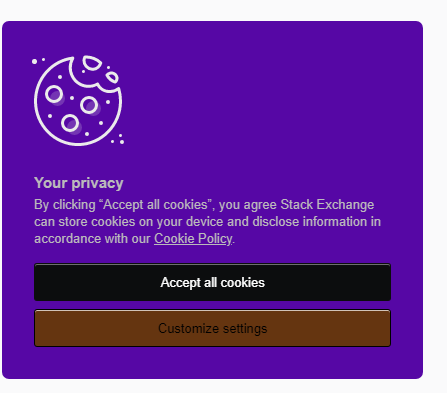
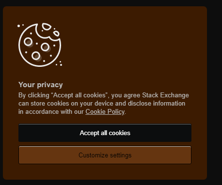
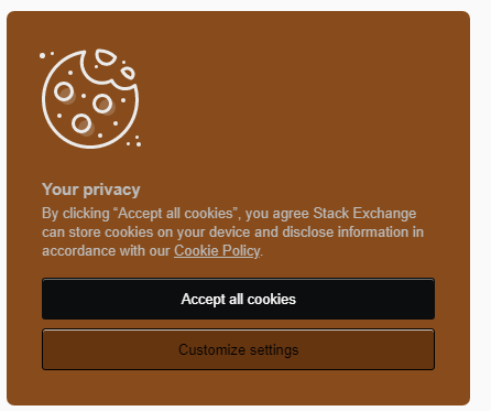
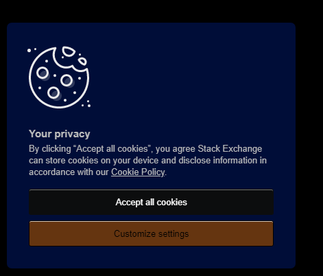
Here some examples:
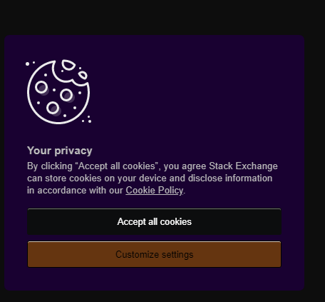
Dark-Mode - Violet CockieLight-Mode - Violet Cockie

Dark-Mode - Orange CockieLight-Mode - Orange Cockie

Dark-Mode - Blue CockieLight-Mode - Blue Cockie

3
  • 1
    Could you show an example? I cannot see the cookie dialog being violet or blue, because that just isn't enough contrast IMO.
    – 10 Rep
    Commented May 2, 2021 at 20:52
  • Just to bring some objective numbers here, all of the dark-mode examples you've provided have really poor contrast ratios: #1: 1:1, #3: 1.24:1, #5: 1.11:1. Any alternative color suggestions really need to contrast from the dark background better than these do.
    – zcoop98
    Commented Jun 1, 2021 at 23:25
  • (By comparison, the ratios of the current colors are 12.2:1 in light mode and 10.16:1 in dark)
    – zcoop98
    Commented Jun 1, 2021 at 23:28

You must log in to answer this question.

Not the answer you're looking for? Browse other questions tagged .