3

I expect unvisited hyperlinks to be more prominent than visited hyperlinks. This has been the convention for many tens of years.

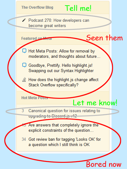
The hyperlinks in the "sidebarwidget" (the responsible people will know the path) do not follow the principle of least surprise.

enter image description here

Please could the visited links be less prominent than the unvisited links: it is necessary to take into account the background colour. Maybe it's just an inverse carry-over from the dark themes.

This is not a duplicate of Dark Mode Beta - help us root out low-contrast and un-converted bits because that is the opposite way, but may be related.
3
  • @SurajRao I just thought it was polite to let you know why your edit got overriden by "the system". It's happened to me a few times before. But as I now have your interest, do you too see the visited links (nearly black, high contrast) being more prominent than the new links (mid-grey, do not stand out)? Commented Sep 14, 2020 at 18:57
  • Am using dark mode and I get something like the sidebar image here
    – Suraj Rao
    Commented Sep 14, 2020 at 19:07
  • @SurajRao So dark mode and normal mode would seem to be similarly wrong. Please feel free to add an upvote to this question if you feel it deserves attention from SO. Commented Sep 14, 2020 at 19:14

0

You must log in to answer this question.

Browse other questions tagged .