-199

Final Update (2020-4-22): This experiment has concluded and is now turned off. Thanks for your feedback.


We have just made live an observational experiment on Stack Overflow that is designed to test different ways of showing content from or links to other Technical Stack Exchange sites. This experiment will be live for two weeks (through April 22) and will then be turned off.

Depending on which cohort of users you are in, you may see one of three variants (or none at all, as the sample of users picked for this experiment is very small), each of which will introduce links to other technical SE sites or content (which will be shown in either the left sidebar or on the homepage).

To learn more about the details of this experiment, please see this post on MSE. Even though the experiment is only going up on Stack Overflow, we made the main post on MSE since it also relates to Technical Stack Exchange sites. We would prefer general questions about the experiment to be asked on the MSE post (as the general experiment extends beyond Stack Overflow). If you would like to report bugs and issues, please feel free to do so here.

Mid-experiment updates:

  • Functionality has been added that will allow users in variant C (the home page content module) to be able to collapse the module. When collapsed, this state will be observed on subsequent page loads (in the same browser).
  • An additional button has been added that will appear in the Collapsed state which will allow you to [hide] the section completely for the duration of the experiment (in the same browser). hide and collapse buttons

(If you have downvoted this post only because of the lack of an opt-out, I'd appreciate it if you let me know by removing your downvote).

50
  • 118
    You're likely going to get a lot of negative feedback here. I just wanted to say thanks for letting us know about the test occurring and what it's all about, so at least we're not caught flat-footed. Commented Apr 7, 2020 at 12:36
  • 7
    I appreciate your thoughts and words @HereticMonkey. Thanks!
    – Yaakov Ellis StaffMod
    Commented Apr 7, 2020 at 13:41
  • 52
    It is too much in your face.... Takes up prime real estate for why I am here..... So now I have to scroll down for the reason I am on the site. Commented Apr 7, 2020 at 13:55
  • 12
    My gut reaction is that Stack Overflow has something against the homepage the way it is. First, they hide it for anonymous users, now they're hiding it for logged in users. What is so wrong with the current home page that it needs to be changed drastically?
    – Davy M
    Commented Apr 7, 2020 at 18:00
  • 25
    Please don't implement this. You've been on such a good roll (with an exception).
    – S.S. Anne
    Commented Apr 7, 2020 at 18:45
  • 9
    It's good to announce experiments and it's really good to experiment, but this particular experiment hopefully fails, although I'm not sure how a fail would be measured here. How does one measure if people get kind of annoyed by something? Commented Apr 7, 2020 at 20:28
  • 66
    None of that is even remotely "interesting", @YaakovEllis, any more than the spam I get daily in my inbox is "interesting". If I wanted to see content from other sites, I'd go visit other sites. I came here for a reason. Please respect it. Driving people away from this site seems to be the exact opposite of the user retention/stickiness that Stack Exchange is looking for.
    – Cody Gray Mod
    Commented Apr 8, 2020 at 8:09
  • 19
    This really should be a user-configured feature, not a SO, Inc. forced one. What good is collapsing this if it's only good for a week? As for user retention? Wow... I fail to see how this helps. Follow your own creed - be nice. This sure doesn't feel nice to me.
    – user7014451
    Commented Apr 8, 2020 at 12:40
  • 14
    I and at least some other users are using custom adblock rules to hide these. Will you see that in your data?
    – Alex
    Commented Apr 8, 2020 at 15:09
  • 24
    We care about community feedback and engagement so here it is: out of the blue, poorly considered guinea pig experiment without prior community discussion! Never seen that happen before.
    – Lundin
    Commented Apr 8, 2020 at 18:21
  • 25
    Collapsing it doesn't remove it. Please just add a little x and we can all go back to never seeing it again
    – Phil
    Commented Apr 8, 2020 at 22:49
  • 12
    Also, the HTML you've introduced is invalid as you've duplicated the qlist-wrapper ID. Please give it a unique ID, at least then we can target it better with Ad Blockers
    – Phil
    Commented Apr 8, 2020 at 22:52
  • 40
    You invented a feature that nobody needs, or at least a minority. Ask first, then build would be wiser.
    – devops
    Commented Apr 9, 2020 at 10:37
  • 19
    I usually have my ad-blocker disabled on SO, but this made me activate it again and create a rule to hide that stupidity.
    – user330315
    Commented Apr 11, 2020 at 15:32
  • 12
    I want to remember you that people with some type of visual impairment have their browsers zoomed in on a magnification factor. Now with this change there are no specific questions immediately visible on the site and we have to scroll one or more pages down to see the first question that really interests us. Customization should be essential here unless you want to drive these people away from your home page. To be honest, I personally have a custom set of tags as my home page, so I'm not really influenced by your decision, however I think that, given how it's implemented now, this won't work.
    – Steve
    Commented Apr 15, 2020 at 6:52

29 Answers 29

300

Simply put, if I wanted to view questions on the other sites. I'd be on there. Not on SO.

Further to this, we're closing questions as offtopic, now we're presenting off topic questions at the top of the SO list. Seems counterintuitive to me.

Not a fan.

4
  • 164
    Hot Network Questions is more than enough to make people aware. Any extra = annoying.
    – Sinatr
    Commented Apr 7, 2020 at 12:30
  • 9
    To be quite fair, not everybody is aware. "we're closing questions as offtopic" that's true. And we very often close questions as off-topic because they belong on other stacks, not SO. "now we're presenting off topic questions" and hopefully people will learn of these other stacks and ask questions appropriately. At least, I believe this is the idea. I don't not sure if this is the best way to implement awareness is needed. Questions more appropriate for Code Review or Software Engineering or Database Administrators or Super User and so on should be asked there.
    – VLAZ
    Commented Apr 7, 2020 at 13:47
  • 3
    @VLAZ Agreed. In fact, Over at Arqade, we actually created several meta posts where people can find better places to go with their off-topic questions, that are also linked to in the close reasons.
    – Nzall
    Commented Apr 7, 2020 at 13:55
  • 1
    @Sinatr hot network whatever thingies should be able to be hidden forever
    – user5306470
    Commented Apr 20, 2020 at 22:53
113

This just makes my experience measurably worse. If you're part of a Team you get those questions top, now I have "Technical Communities" questions too it means when I visit the landing page of Stack Overflow, I have to scroll about 1.5 screen heights before I get to see the questions I actually came to see.

I've complained previously about having to control over the teams questions being shown first, this is now 2x as bad.

6
  • 1
    You could maybe not visit the landing page of Stack Overflow anymore. What do you use it for? Maybe an alternative would be limiting to google searches for information retrieval and tag filtered searches for seeking unanswered questions worth to be answered. Is stackoverflow.com really needed for anything? Commented Apr 7, 2020 at 20:31
  • 6
    You can now collapse the variant C content module. See update in the question above for more details
    – Yaakov Ellis StaffMod
    Commented Apr 7, 2020 at 23:12
  • 1
    @YaakovEllis is there any way to track how many people just collapse it and don't look at it again? I'm in group C and I wondered, because that's what I've done.
    – hat
    Commented Apr 11, 2020 at 8:52
  • 1
    @hat yes, we are recording collapse and expand clicks, and will include that in our analysis (if someone collapses and never expands, is a clear indicator that they were not interested, similar to never clicking through)
    – Yaakov Ellis StaffMod
    Commented Apr 11, 2020 at 17:12
  • 1
    Please see Update 2 above. A hide button has been added (only shown in the collapsed state).
    – Yaakov Ellis StaffMod
    Commented Apr 13, 2020 at 21:01
  • 1
    @YaakovEllis thank you Yaakov for the update. Yet, for newcomers, it's still a clutter similar to an extra advertising banner before you hide it. Actually, it is exactly an advertising banner with a hide button. Oh well, could have been worse ; at least it's not on top of each question.
    – Cœur
    Commented Apr 14, 2020 at 11:12
104

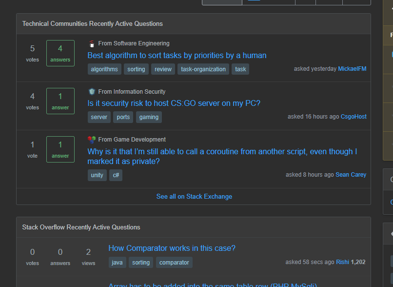
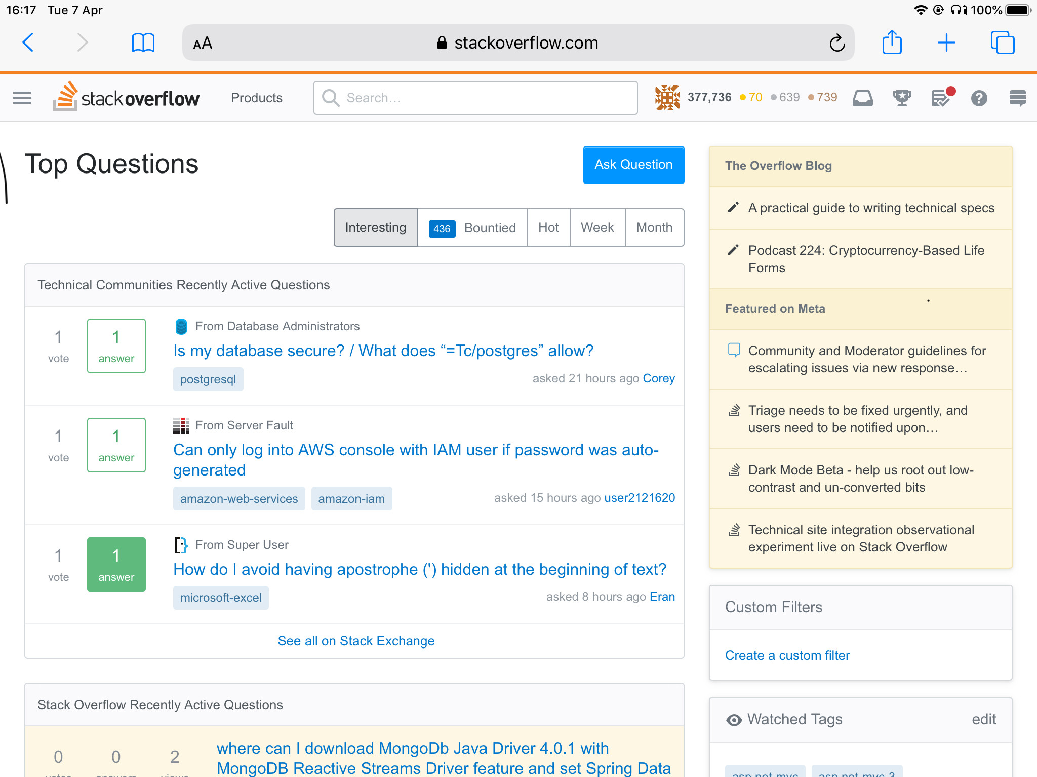
I very much do not like this feature. It forces me to view stuff I have no interest in and puts friction in the way of me viewing the stuff I do want to see.

On Ipad the home page currently looks like this for me. There is nothing in my 11 year history with StackExchange which would indicate that I have any interest in any of those three questions (that I now need to scroll past to get to the potentially interesting content)

enter image description here

9
  • 2
    Maybe if you don't scroll the experiment will result in the change not becoming permanent. Commented Apr 7, 2020 at 20:34
  • 4
    You can now collapse the variant C content module. See update in the question above for more details
    – Yaakov Ellis StaffMod
    Commented Apr 7, 2020 at 23:13
  • 1
    To play devil's advocate you do have an account of nearly a decade and nearly 80k rep on DBA.SE... that is a signal that you are interested in content from DBA. It's not necessarily an accurate signal... but it is definitely a strong one.
    – TylerH
    Commented Apr 8, 2020 at 21:17
  • 11
    Yep, I'm interested in some content from that site and I see that content anyway when I visit that site and have my "watched" tags applied. I don't work with Postgres though and have no interest whatsoever in the specific Postgres administration question in that screenshot. So at best it is just going to show me content I would already have seen anyway and at worst it is going to show me something irrelevant to my interests Commented Apr 8, 2020 at 21:27
  • 4
    Please see Update 2 above. A hide button has been added (only shown in the collapsed state).
    – Yaakov Ellis StaffMod
    Commented Apr 13, 2020 at 21:01
  • @YaakovEllis thanks, that approach works for me. Commented Apr 13, 2020 at 21:24
  • 2
    "The Overflow Blog" and "Featured on Meta" sidepanel could (optionally||sometimes) include "Popular Technical Questions"
    – Reed
    Commented Apr 14, 2020 at 18:32
  • @Reed Exactly. That's much better than showing questions from other sites above questions from the site you are on.
    – Maximouse
    Commented Apr 21, 2020 at 14:26
  • The latest (yesterday's?) "update" totally broke all Stack Exchange sites on my iPad. Can't vote, can't comment, can't answer, can't use the dropdown menu to select other SE sites. It's an expensive, read-only mode, glass brick now.
    – Jongware
    Commented Jun 17, 2020 at 12:06
63

It does not make sense for SO's main content be "go somewhere else". The HNQ is at the ideal level of visibility. If you are really bent on promoting technical SEs separately, separate the HNQ in technical vs non-technical.

I also believe it would be more useful to promote technological communities in SO. There are plenty of topics that are highly technical in the network, but the "average programmer" might not be interested in.

5
  • 7
    Some of us would prefer the HNQ permanently hidden. Commented Apr 8, 2020 at 4:00
  • 6
    @KevinKrumwiede fortunately, there's a setting for that... unfortunately... said setting doesn't hide this new content.
    – Kevin B
    Commented Apr 8, 2020 at 5:55
  • 9
    @KevinKrumwiede You know there’s a site setting for that? :)
    – Catija Staff
    Commented Apr 8, 2020 at 14:17
  • 7
    @Catija .... what !? There is a setting other than ad-block the HNQ frame? Didn't know. wow my productivity will raise significanctly soon!
    – Pac0
    Commented Apr 8, 2020 at 21:11
  • 5
    @Pac0 My productivity definitely increased when I turned off HNQ. For some reason, I turned it back on a while ago. I'll have to look into why after I finish browsing HNQ...
    – TylerH
    Commented Apr 8, 2020 at 21:18
60

How do I hide it?

I checked site preferences but there's no option there. I don't care for these other communities unless I visit them. For now I've used the uBlock line below to hide it, but I'd prefer a site setting.

 ##.qlist-wrapper--boxed:if(div:first-child:has-text(Technical Communities Recently Active Questions))

technical

10
  • 4
    Same answer-question on MSE: meta.stackexchange.com/a/346138/194720 Commented Apr 7, 2020 at 12:38
  • 2
    You don't. As stated on MSE: "How can I see the variants if I'm not selected or if I want to see the other versions? We've included the screenshots of the three variants here for you to see but, you can't have it turned on (or off) or change groups. The experiment will only be shown to a small percentage of users for a limited time."
    – Luuklag
    Commented Apr 7, 2020 at 12:39
  • 13
    I hate being a small percentage @Luuklag thanks for ublock. Commented Apr 7, 2020 at 12:43
  • 1
    Yeah, use ad blockers and target these specifically.
    – Alex
    Commented Apr 7, 2020 at 13:05
  • 7
    Adblock Pus: stackoverflow.com##.qlist-wrapper--boxed.s-card.p0.mb24
    – lalo
    Commented Apr 7, 2020 at 13:17
  • 1
    @lalo I considered using the mb24 class too, but I found it too risky in case they also add it to the main nav list. Hence my text search Commented Apr 7, 2020 at 13:20
  • 5
    It's a bit as if HNQ is taking over the site. Commented Apr 7, 2020 at 20:32
  • 1
    I do not see the changes anymore :)
    – lalo
    Commented Apr 7, 2020 at 20:37
  • 5
    You can now collapse the variant C content module. See update in the question above for more details
    – Yaakov Ellis StaffMod
    Commented Apr 7, 2020 at 23:13
  • 4
    Please see Update 2 above. A hide button has been added (only shown in the collapsed state).
    – Yaakov Ellis StaffMod
    Commented Apr 13, 2020 at 21:02
55

This is far less information-dense than HNQ, and it's right in the way of the content I'm here to see. Moreover, it seems to be rotated less-frequently, so I'm seeing the same content I'm not interested over, and over, and over.

I don't have a problem with being shown content from other sites -- if that content is both information-dense and unobtrusive. Putting it in front of what I'm here to see, having only a small number of questions (reducing the likelihood that any of them will be interesting), and not having any way to turn it off is very much the Wrong Thing.


One final note: I'm here to answer questions, not to read answers.

Anything that has bubbled up to HNQ, or any equivalent thereto, probably doesn't need answering anymore; it will have already gotten adequate attention. (This is part of why I find that tolerable only when out-of-the-way, as HNQ already is).

This really needs to be optional.

2
  • 5
    The logic on question selections from HNQ to display in the Variant C module has been modified to allow more of a variety (and fewer repeats) to display on subsequent page loads.
    – Yaakov Ellis StaffMod
    Commented Apr 7, 2020 at 23:14
  • Yeah, good comment about being here to answer questions. Highlighting well-answered questions makes the site feel more like a Reddit or something. Commented Apr 16, 2020 at 11:48
45

What could possibly have motivated the thought process of "how do we drive traffic away from our prime real estate"?

This project was not on any roadmap, and was never discussed anywhere. While it may seem "minor", introducing a section at the TOP CENTER OF THE PAGE WHICH CONTAINS IRRELEVANT INFORMATION TO WHAT I AM CURRENTLY DOING IS AKIN TO ME ONLY TYPING IN CAPS FOR EVERY ANSWER JUST TO SEE IF IT HELPS MY MESSAGE GET ACROSS.

Why wasn't someone at the table who knew this was a bad idea when this idea was formed? No one has ever in the entire history of the exchange asked for this. While it is true you shouldn't just let the community dictate your every move, actively introducing features which literally no one wanted isn't exactly smart business either. It wastes money, it wastes everyone's time, and it looks amateurish.

6
  • 3
    "This project was not on any roadmap, and was never discussed anywhere." Maybe not this particular project but the subject was. See management gobbledygook Scripting the Future of Stack Overflow: "We are experimenting to improve in areas we know need work: encouraging more question asking ... and creating a more integrated experience between Stack Overflow and other technical sites on Stack Exchange. The results of all of this work is being shared publicly through our new Loop series...". Commented Apr 8, 2020 at 21:36
  • 8
    @Trilarion - That is quite a stretch. There was supposed to be transparency.
    – Travis J
    Commented Apr 8, 2020 at 23:16
  • 2
    Please see Update 2 above. A hide button has been added (only shown in the collapsed state).
    – Yaakov Ellis StaffMod
    Commented Apr 13, 2020 at 21:04
  • 3
    @TravisJ In response to what was written in this answer - this is not introducing a new feature. It is one variant in a temporary (2 week) experiment that is shown to a small percentage of users, exploring different ways of showing content and links to other sites. The way in which it is implemented here is due in a large part to HNQ being available as the only performant way of getting good quality content from other sites that could be done in the scope of this experiment. This is not actually something that we would implement this way for an actual integration feature.
    – Yaakov Ellis StaffMod
    Commented Apr 13, 2020 at 21:05
  • 2
    @YaakovEllis - I appreciate the response to my rather curt answer here, but look, this was rolled out all wrong, and the title stating this was live along with the prominence of the content, made this very much feel like a new feature. "This is not actually something that we would implement this way for an actual integration feature." If you had simply started with this, and a notice of the feature going live soon, you would have created a much more constructive atmosphere here. Instead, 99% of the response you got was design related, as opposed to network linking related.
    – Travis J
    Commented Apr 14, 2020 at 17:38
  • 4
    @YaakovEllis - If you are really looking for a way to integrate the other tech related exchanges, then add a tab to each one, right after bounties, that says "Related tech", and add it to each exchange on the entire network, and have them pull from a pool of exchanges. Allow the pool to be customizable by user. You already have the infrastructure built for custom searches from the nav tool that one time, so this would be rather trivial to introduce.
    – Travis J
    Commented Apr 14, 2020 at 17:38
41

This is horrible design. I'm looking at the "Top Questions" of Stack Overflow, but all I see are "Top Questions" of other sites.

"Technical Communities Recently Active Questions

I'm here to see Stack Overflow questions, don't move them down the page. All I want are SO questions. If it's not an SO question, don't show it in the central place.

Some people complain about your HNQ box being broken, with this you broke it way further.

Oh, and please, please, get me out of this experiment. It's horrible, I don't want to experiment, I don't want to be your lab rat. I don't want to press "Collapse" every week. Put me in the A or B group if you must put me in a group because I'm active on several of your websites, just don't leave me in the C group. I already have issues focusing when you put too many colored icons and stuff and had to adapt your CSS several times, you're just making my life more miserable here.

5
  • 6
    Thank you for having removed me from the experiment! I didn't expect to be this fast, but it's done. Thank you very much! Commented Apr 9, 2020 at 7:57
  • 2
    Apparently, I'm back in the experiment, still in the "C" group. Well, I don't thank you for that. You don't want to remove me anymore so I removed myself by hiding the box. Commented Apr 11, 2020 at 8:16
  • 3
    Please remove me from the experiment too, I hate this regression. Thank you.
    – Cœur
    Commented Apr 12, 2020 at 6:08
  • 1
    Please see Update 2 above. A hide button has been added (only shown in the collapsed state)
    – Yaakov Ellis StaffMod
    Commented Apr 13, 2020 at 21:06
  • @YaakovEllis My script for hiding the box works fine, but thanks! Commented Apr 14, 2020 at 9:14
22

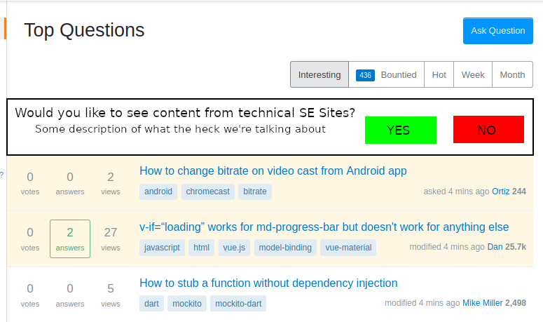
I think it's neat, but clearly not everybody likes it. I think a simple "Do you want to enable this feature"... feature would go a long way to stop folks from feeling that their Code-site is being invaded by unrelated content.

Something like this (but made by your professional designers lol) Feature QA Suggestion

And then when you DO show the Tech-SE Content (because user clicked YES), have a 'configure' icon (to pick which sites & tags to show) & an 'I hate this' icon (aka, an 'X').

5
  • 5
    seems eminently sensible. People that like it can see it and everyone else just go about their day, Commented Apr 8, 2020 at 19:24
  • 3
    Good idea. When we get around to the more advanced forms of integration candidates, we will definitely be looking into ways of making this customizable/optional for users.
    – Yaakov Ellis StaffMod
    Commented Apr 13, 2020 at 21:07
  • 6
    I am fed of constant messageboxes in many websites, which ask me to enable something. If I use website, then I'd check its options and maybe I'll be happy to enable something... but NOT on the first run. Please no messageboxes like this ever.
    – Sinatr
    Commented Apr 14, 2020 at 9:39
  • 4
    @Sinatr, what about a notification in the 'Recent Inbox Messages' dropdown that says "We made this cool new feature! Wanna enable it?"
    – Reed
    Commented Apr 14, 2020 at 18:25
  • 1
    A banner / messagebox is too intrusive, and there have been far too many of those already. An inbox notification is a much better idea.
    – Zev Spitz
    Commented Apr 19, 2020 at 11:41
21

I'm a member of a number of SE sites, so it would make sense to have a joint view. But that's something entirely different from what I get now: random questions from sites I don't subscribe to, at the top of StackOverflow. The idea isn't horrible, the implementation is.

17

Code Golf is very much recreational. In particular, the loss of seeing anything there not tagged is going to be greater than the gain of seeing some obscure language "feature" (real or otherwise).

6
  • 1
    ..or learn to scroll fast :)
    – Scratte
    Commented Apr 7, 2020 at 21:25
  • 5
    You can now collapse the variant C content module. See update in the question above for more details.
    – Yaakov Ellis StaffMod
    Commented Apr 7, 2020 at 23:14
  • @YaakovEllis Thank you. I'll go ahead and remove the filter, then.
    – S.S. Anne
    Commented Apr 7, 2020 at 23:25
  • I don't really agree with this assessment fwiw. I learnt quite a lot of useful stuff about JavaScript on that site a while back. Lots of weird language features that are mostly useful in a code golf context, but occasionally useful (or at least, occasionally witnessed) outside that. Commented Apr 8, 2020 at 3:56
  • 3
    @SteveBennett The loss outweighs the benefit. I don't particularly want people to write C like this: main(){main(puts(&main));
    – S.S. Anne
    Commented Apr 8, 2020 at 12:45
  • 2
    I don't think anybody does. That's not the point of the site, nor the point I was making. Commented Apr 8, 2020 at 12:49
14

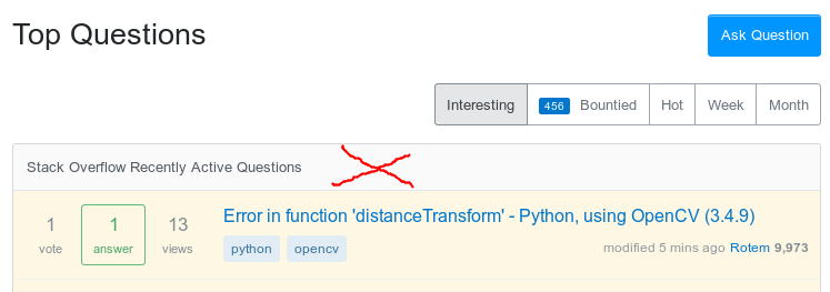
I chose to Hide the Technical Communities Recently Active Questions section.

In this case, the Stack Overflow Recently Active Questions heading should be removed, too. It does not provide any distinction if it is the only section and only takes up space.

enter image description here

11

The thing that really annoys me is the following: When collapsed, this state will be observed on subsequent page loads in the same browser for one week

Thanks but I don't need a constant "opportunity" to switch to the new design. There's few things more annoying than programs second guessing the user to force their cool new feature on them.

Also the cynic in me thinks that not implementing an obvious "hide this feature" option, forcing people to instead disable it in a way that's not visible to the metrics is a pretty nice way to skew the results in the preferred direction.

1
  • 2
    Please see Update 2 above. A hide button has been added (only shown in the collapsed state)
    – Yaakov Ellis StaffMod
    Commented Apr 13, 2020 at 21:07
10

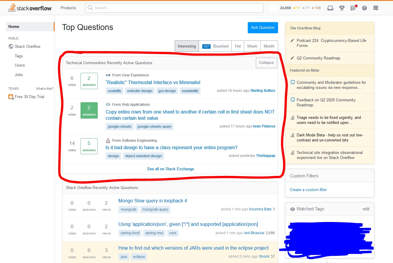
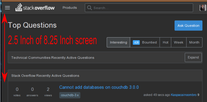
Another big issue with displaying additional banners is it reduces the screen real-estate on the first screen. The Name, Ask Question button, the categories, and now multiple community banners takes up 2.5 inches of vertical screen real-estate on the page. This is almost 1/3 of the page on a laptop stuck at 1600x900 display:

enter image description here

Giving community members new features is fine, and a good way to move forward. But, never forget, a new feature to one is a bug to another if you fail to provide a way to turn it off. Nobody want to "collapse" a grouping like the Technical Community Questions and have the collapsed header still taking up 3/4 of inch of vertical space. That space is simply wasted.

1
  • 2
    Please see Update 2 above. A hide button has been added (only shown in the collapsed state)
    – Yaakov Ellis StaffMod
    Commented Apr 13, 2020 at 21:08
9

Is there any sort of logic that is being used to have these display? it currently reads:

Technical Communities Recently Active Questions

I'm more focused on the recently active part. As of writing this, I see a SuperUser post that is not really about coding at all. Does not really interest me whatsoever. While I mostly agree with webnoob's sentiment, as a python user in the datascience world - there are some posts on cross-validated or data science that are borderline on-topic here that I wouldn't mind seeing. Can we have some sort of logic that says: if haz coding then display?

4
  • 3
    All of the posts appearing in the content variant on the homepage are pulled from HNQ, and filtered to be from Technical SE sites. Yes, we know that not all of them are about coding. Part of the experiment is to see how much of an interest overlap exists for SO users to topics covered on other Tech SE sites.
    – Yaakov Ellis StaffMod
    Commented Apr 7, 2020 at 12:45
  • 8
    Could another part of the test just be to sort the techinical SE sites to the top of HNQ? That might be less intrusive than this one
    – MattR
    Commented Apr 7, 2020 at 12:47
  • @YaakovEllis There might be a lot of user-specific overlaps. For instance, I'm mostly interested in mapping/coding questions, primarily on StackOverflow, but also on GIS a bit. But most coders won't want to see anything from GIS. (And I don't want to see anything data science, maths, etc) Commented Apr 12, 2020 at 11:52
  • 3
    @stevebennett yes, I definitely agree. Custom tailoring the technical content per user was beyond the scope of time that we had available for this experiment, but is something that we will consider for the future.
    – Yaakov Ellis StaffMod
    Commented Apr 12, 2020 at 15:01
9

That can produce some amusing results:

enter image description here

However my first intuition was to look for an [x] to remove the pane, I'm really not sure what kind of value I would get from it. If they were at least questions relevant to my tags. Just because it's active doesn't mean that it's interesting to me.

9

I use SO mainly during work, using it to find information related to my work. While I'm at work, the least thing I need and want is distractions. There's a lot of interesting stuff going on across the network, but I have a job to focus on and that's why I'm using adblock to hide hot network questions, and now this experiment.

If I'm at home or on the bus from or to work, I can for sure appreciate some hot network questions though.

8

Here's the css to hide this 'experiment' to be used with stylish etc.

#mainbar > .s-card.mb24 {
    display: none !important;
}
2
  • Can't you just target #qlist-wrapper? Commented Apr 18, 2020 at 6:21
  • 1
    @Pikamander2 sure, if you don't want to see any questions. The fine folks at SO are using duplicated ids in their code... An element with #qlist-wrapper is also a wrapper for the normal question list... :-)
    – baao
    Commented Apr 18, 2020 at 8:22
8

Broadly, this is a continuation of the cultural problems that caused last year's kerfuffles, and a clear sign that despite repeated assurances, nothing has really changed.

How to present new ideas: Test them in front of a small number of users on an opt-in basis. Incorporate their feedback into the design. If that feedback is "throw it out", throw it out.

How not to present new ideas: Force them on the community without discussion because you're so confident they're great that you can't fathom anyone not liking them. Downplay the immediate feedback. Desperately backpedal when people riot.

The latter is apparently still official company procedure. Garbage on the landing page may seem insignificant, but it's part of a larger pattern. How long do you expect users to stick around before they decide you, as a company, are simply incapable of learning from these kinds of mistakes?

1
  • 3
    The presentation of this new idea is something of an improvement -- it's clearly labelled as an experiment, and is explicitly for a limited time -- as opposed to putting in a new feature without any previous discussion and expecting everyone to just live with it. Also, quoting from the post the sample of users picked for this experiment is very small.
    – Zev Spitz
    Commented Apr 19, 2020 at 11:37
7

This doesn't appear to be on the roadmap, or called out as an element in either Q1 or Q2's roadmaps.

Why is this a focus?

4
  • Are you referring to the Q1/Q2 Community Roadmaps? If so, that'll be why; not everything is targeted at 'the community' and thus won't be part of that roadmap. I also recall reading (I think it was Teresa or Yaakov who stated it, but it may have been a CM) that not everything will appear on roadmaps
    – Rob
    Commented Apr 13, 2020 at 7:00
  • @Rob: Do you mean to tell me that the community isn't impacted by the showcasing of other technical communities?
    – Makoto
    Commented Apr 13, 2020 at 14:59
  • That's... Not what I said, or even close. It's showcasing other technical Q&A, not 'technical communities', sticking the word 'community' in everywhere is grossly overdone. Luckily I seem to not be in group A, B or C so have avoided this "feature",
    – Rob
    Commented Apr 13, 2020 at 15:04
  • 1
    The items that appear on the Community Roadmaps comprise a subset of all of the different initiatives and projects that we are working on. These are the things that we feel that we can commit to publicly in advance to releasing on a specific timeframe. This overall project will surely make its way onto a future roadmap when/if it reaches a more mature state.
    – Yaakov Ellis StaffMod
    Commented Apr 13, 2020 at 21:09
6

Contrary to what other people think, I like this idea. I'm interested in technical questions on the other sites too, and honestly the main reason I don't visit Software Engineering SE or Code Review SE is they're not in my list of top 5 sites, so I simply don't think of it ("out of sight, out of mind" - or, maybe I should say, "out of site, out of mind"). I'm actually really interested in seeing how this works out.

The one thing I'd like to see, though, is if there was some way of customizing a little more what I see. I was actually really interested in the feature when I first saw it, but many of the questions were things I wouldn't normally read even if I were to "directly" visit the target site. (Several of them were about technologies I don't really use and know very little about, for example, and I generally don't bother reading those kinds of questions because I'm unlikely to be able to help the OP or to benefit personally from reading them).

1
  • 2
    I like the general idea too to some extent. I was never only focused on one SE and I like the idea of making it easier to me to switch and also mix maybe, but I think that this particular variant is not a good idea. HNQ is a waste of time and I mostly either need to find useful answered questions or promising unanswered questions. The feature would need to be much more subtle to be useful. A combined search perhaps or tag filters across SEs or a completely customizable landing page. Commented Apr 8, 2020 at 21:43
4

It would be better if

  • I was able to select what communities where shown.
  • It only showed unanswered questions.
  • It was a user setting that was opt-in instead of opt-out

But even then, there would need to be an additional combined reputation score of all of the technical sites shown on my profile page for this feature to not go against the gamifaction of the site, and I don't know if having a combined reputation score would be a good thing or not.

4

Now that experiment appears to fail quite spectacularly, it is maybe a good time to look around and ask, if there could be a different way to achieve what you wanted?

No need to dig deep here - at least six answers right here and multiple comments point that hot network questions are expected to support the kind of integration you're looking for. This kind of hints that experimenting with HNQ may be more productive than messing with primary site UX.

After all, this seems fit the primary purpose of this feature which was recently explained as follows:

encourage movement around the Network and visibility of Network sites

- One thing that looks particularly promising in this regard is a setting that favors questions with multiple answers. Currently this parameter counts up to 10 answers and since technology sites tend to have less answers, this may penalise such sites and make them appear in hot list less frequently than desired.

You can try changing this parameter to smaller value and see if that helps. Luckily, at this point system has enough features allowing to track and estimate impact of various changes to hot questions.


- Another direction worth pursuing is, paradoxically, getting more Stack Overflow questions in the hot list. Per stats data recently posted at MSE site is currently #9 by the amount of questions and only #29 by amount of spots ("spots" in this data reflect how often users see site questions in the hot list and #29 indicates that SO questions tend to drop off the list much faster compared to other sites).

At a first sight, fewer SO questions in HNQ may appear harmless and even beneficial - since purpose of hot list is to encourage visibility of network sites, Stack Overflow hardly needs that because it is very well visible already. But if you think of it, this may have some undesired side effects which in turn could lead to complaints about difficulties in discovery of other sites in the network.

Thing is, hot list without SO questions may feel like it is totally "foreign" and this may prevent users realising that other sites are just the same Q&A like SO and that they could indeed use these other sites just the same way as they use SO.

To counter this, you can try mixing a bit more SO questions in the list and see if this helps less experienced users find out that there are other sites in the network that can be used to find answers and ask questions the same way as they use Stack Overflow.

In a sense, above mirrors the (failed) experiment - you tried to bring some of the hot questions into SO, now you would try to bring some of SO into hot list. Purpose is the same, to increase sense of integration, but mixing it the other way round would feel less intrusive (less intrusive in particular because SO - just like any other site - can't have more than 5 questions in HNQ, this is an important limit).

- And yet another point worth paying attention to are close-worthy questions in the hot list. These probably weren't big deal in the past when this feature was supposed to primarily entertain, but from perspective of using it to educate folks about where they can ask questions and get answers on particular topics, it would probably make sense to abstain of advertising questions that have a good chance to be out of scope at the target site


Note to those readers who may wonder how come that SO is so poorly represented in hot list, this is because of a particular tweak in the system. This tweak was made many years ago with the purpose to prevent SO questions dominating hot list. Now the system works differently and any site has a hard limit of no more than 5 hot questions, so this tweak makes no sense anymore - it was probably kept because it is considered harmless (or even beneficial, see above).

3

This is a terrible set up it blocks a large chunk of the main SO content. I think there's a place for something like this but maybe in more of a search context? i.e. your search on SO includes some relevant results over on the Linux SE page.

To put a real world spin on this it's like visiting the butcher and before you say anything he offers you a selection of fruit that he thinks is great. Why? Why would he do that?

Now if he waits for you to order some particular cuts and then says "Oh grilling are we? I would recommend some pineapple since that goes good on the grill too." Perfect, that's how this should play out.

So in summary, the concept is good; you're just implementing it on the wrong page.

3

This is really a bad idea. It disrupts all users, newbies and experienced from actually viewing the SO questions. First thing, you hide questions for not-logged-in users and now you hide them for US. What are you doing now here?

1
  • 1
    "It disrupts all users, newbies and experienced from actually viewing the SO questions." I dislike absolute statements usually. No exception here - I'm not even part of the test but I guarantee you, neither of the three version would bring any measurable impact on how I do things here. I have the side bar collapsed since I don't like it. Furthermore, I only look at my custom filter, not at the "front page", since I also dislike how it shows rather disparate content, most of which I find irrelevant. So I'd see none of those and thus I'd not be at all disrupted.
    – VLAZ
    Commented Apr 22, 2020 at 9:15
2

When I visit StackOverflow. I would want to see questions related to it. Why would I want to see other site questions? There are already Hot Network questions. I could not understand why this is shown as the main focus area on StackOverflow.

As soon as I open StackOverflow if my focus goes to some other place, you are decreasing our productivity. To the best of my knowledge, Bbt StackOverflow is known for other way around.

I hope you guys realize your mistake soon and revert back to what it was. Its already messed up in the home page, when a new user opens StackOverflow. Don't do the same here.

-3

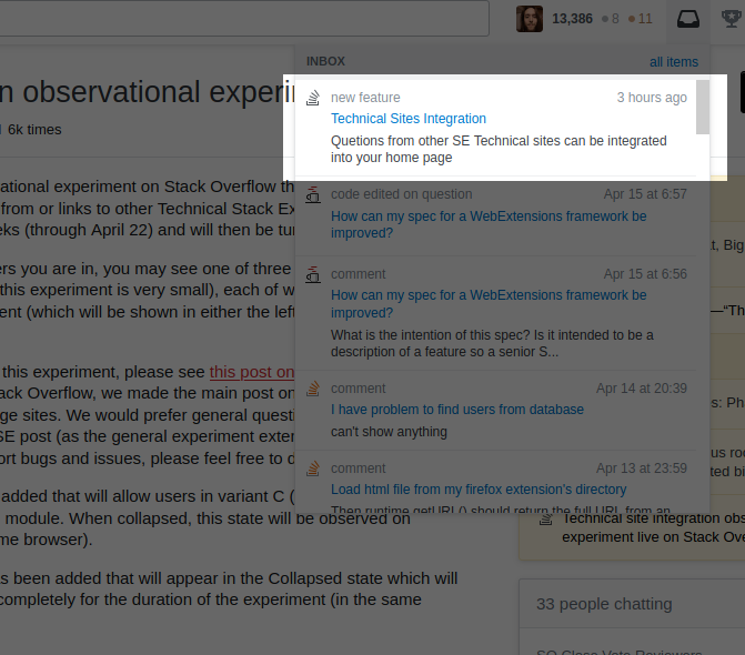
Some folks still felt the inserted question to enable the feature on the home page would be too intrusive, so what about simply showing a notification about the new feature, which would take you to a configuration page to enable/disable & configure the feature?

Something like: enter image description here

-4

I must say I quite like the concept (C) in principle. It appeals for 3 reasons

  • Focus on technical content; I use AdBlock to hide HNQ because I find it too distracting, but this seems much more focused and I can allow myself to browse

  • I only ever visit the SO homepage when I feel like browsing stuff (normally I get to SO questions directly via Google), so it's an appropriate place to show me content I might find interesting - serving links technical or otherwise on a question page will likely be a distraction, another reason I blocked HNQ

  • Diverting traffic from the flagship site to other related ones will surely help them grow (not to mention getting my question seen if I've correctly posted it on the appropriate but obscure site)


So in principle, I like that it's showing me relevant stuff that's not too distracting, and only showing it to me when I'm browsing technical questions on SO anyway.

I understand the implementation may not be to everyone's taste and may need tweaking (better tailoring of content, better use of screen real-estate etc.)

1
  • 3
    Thanks. Also please note: the implementation here (to take from hnq) is not something that we were ever considering (in this form) for the final feature(s). It is the only easy way that we can get content from other technical sites (that we are pretty sure are good/high quality) within the time that we had allotted to this round of testing (without running into perf issues). Any future integration would almost certainly included more customization options and/or ways to try to automatically show relevant content per user. Thanks for your feedback.
    – Yaakov Ellis StaffMod
    Commented Apr 12, 2020 at 17:00
-43

It is a very nice idea, you are on the right track!

I believe, the ultimate solution would be that you unify the databases of your sites, and the induvidual SE sites would be from that point different views to the same underlying database.

The cause of the visible rejection of the meta community has imho two reasons:

  1. Their general resistance against any changes or improvements.
  2. They fear their privileges they acquired on the SO, they do not want to work for them on other sites again.

What please never do: please never merge the communities. Make the sites linkable, use the potential of their cross-advertising, (I never understood why you did not do this long ago) but never merge privileges and reputation!

Having your SO user base to become more active on other sites would be an option to find alternatives of the overly hostile SO/MSO community, without leaving your network.

Never merge the IT-related sites into a yet more chaotic mess than the SO currently is! Instead, create diversity, make them linkable, make them well-integrated, do the exact opposite of sinking them into the SO.

Maybe you could also split the SO into many, smaller sites, with partially overlapping topics. So you could create an internal race between the communities for the user base, "helping" them to become more friendly and inclusive.

The majority of the MSO community won't ever like this way, but they do not represent the SO, and particularly not the hundreds of thousands of users who are already lost due to their unwelcomingness. Thus, the dislike of some avid MSO users should not be a problem for you, you are in the power position and not they. Of course use all your options to make your changes lesser unwelcomed. But you are the owner of the system, you pay for the servers and your employee, and you need to make your investors satisfied. You need the growth and the welcomeness. They do not.

18
  • 8
    I don't think people here are against change - a large proportion of us work in an industry which is constantly changing. What I'm personally against is content getting in the way of what I came for. The constant nagging popup in VS asking for my feedback is along the same lines.
    – Jamiec
    Commented Apr 9, 2020 at 12:31
  • 16
    Sorry, but your assumptions on why we reject this experiment are waaaayyyy off! My first thought, when I saw it, was neither "oh, I hate change", nor "oh, that endangers my privileges". It was instead a plain and simple "oh, that really gets in the way of what I came here to do". I enjoy looking over the hot network questions, irrespective of whether technical or not. Those are excellently placed for their purpose. The current experiment is not. And that's why it's being rejected. Commented Apr 9, 2020 at 12:50
  • 1
    @Jamiec My many years experience on the MSO is that people constantly disfavor anything what would be even close to question the leading role of the SO inside the network. Example. But the SO is hostile and probably beyond repair, so the right thing to do would be to better integrate it with smaller, friendlier sites, giving an alternative to the currently expelled users.
    – peterh
    Commented Apr 9, 2020 at 13:07
  • @cmaster-reinstatemonica (My previous comment is also for you) That is no problem, if they have already started it (and stopped the "we do not divide the SO" crap), they could also fix/improve it. My focus is here on the concept (better site integration, incl. the advertisement of the small, friendlier sites), not the details of the version0 test implementation.
    – peterh
    Commented Apr 9, 2020 at 13:12
  • 13
    So your single data point of people disliking your idea to fragment StackOverflow leads you to believe that everyone is against change. Got it!
    – Jamiec
    Commented Apr 9, 2020 at 13:27
  • 10
    I would never think of SO as the leader of the network. Each site has its own area, and if you are interested in, say, chess, rockets, and physics, well, SO is not the site for you. Your sites then are Chess, Space Exploration, and Physics. SO happened to start the thing, but that's about it as far as I am concerned. What I do not buy, though, is the talk about SO being unfriendly: Any site that aims to be helpful to professionals needs to weed out the tons of badly presented newbie questions. If it does not do that, it may feel more friendly to you, but it looses its best contributors. Commented Apr 9, 2020 at 13:28
  • @Jamiec It is only an example to show, that the problem existed already in 2015. Note also the recent deletion, which happened by rule violation (the question did not qualify for a delete candidate, and its existence was not a problem until I did not use it as a reference in another MSO post).
    – peterh
    Commented Apr 9, 2020 at 13:31
  • @cmaster-reinstatemonica The sites are built on communities. If a community becomes more and more closed, ruled by a closed, inner circle of avid users, it stops its growth. I believe, the site network should have an "internal race" for the content and for the (good) users, so the "good old boy" problem could be solved by an evolutionary model, network-wide. I hope you already understand my reason to post this answer, and that why will also this post deeply downvoted, and then deleted. By another rule violation, what will be overlooked by the site mods, just like the previous ones.
    – peterh
    Commented Apr 9, 2020 at 13:34
  • 5
    Sorry but it seems like you're caught in a circular reference on yourself. Your post you linked to is about breaking SO up. That was ill-received but now you're suggesting the same thing here and it's still ill-received but you suggest that these are two examples of how SO is hostile. Could it be that you're idea just isn't what the community wants? Commented Apr 10, 2020 at 20:56
  • 3
    Also, you make some claims that should be substantiated. 1) "The majority of the MSO community won't ever like this way, but they do not represent the SO." No? If that's true whose fault is it? If the "real" community that does represent SO wanted to engage on this level, they could. 2) "...the hundreds of thousands of users who are already lost due to their unwelcomingness [sic]." Please link to data backing up the "hundreds of thousands" claim. Commented Apr 10, 2020 at 20:59
  • @ChiefTwoPencils Yes, "the community" does not like it (group of avid, antagonist MSO users having a high rep, but near-zero SO representation), despite that this is the right way. So, I encouraged to company to do this, even in the downwind. That you can disagree but imho you can't say that it is not logical.
    – peterh
    Commented Apr 10, 2020 at 21:22
  • @ChiefTwoPencils Your second question leads further. I don't believe that it would be the fault of induvidual users. It is the result of a social mechanism (I suggest to google for articles about the typical behavior of aging internet communities). However, most of the real SO community won't ever participate on the MSO: most of them simply have no urge, and the majority of the rest was long expelled by your opinion terror. So, they are here silent. But the company needs them, at least if it wants to preserve its role in the top100 global sites of the internet.
    – peterh
    Commented Apr 10, 2020 at 21:29
  • 4
    Again, you're making claims without evidence. "(group of avid, antagonist MSO users having a high rep, but near-zero SO representation" It seems you're convinced "this is the right way" despite having 0 agreeing with you so why is it "right?" IMHO, I can say it's not logical. While it may please you in some way, it isn't logical for the way the site works as has been pointed out in some of your posts. Commented Apr 10, 2020 at 21:29
  • 9
    You have a boatload of preconceived notions about people and the world. You don't know me and therefore cannot claim to know what I will/won't do. But I'm glad you made it clear you're just saying stuff without any desire to add credibility to your claims. I won't bother reading the rest of your last two comments. Have a nice day; good luck. Commented Apr 10, 2020 at 21:40
  • 2
    I think it's a very aggressive post you wrote there targeting the users of the community and brushing them all up in one little box. How neat of you to do...
    – Icepickle
    Commented Apr 18, 2020 at 10:03

You must log in to answer this question.

Not the answer you're looking for? Browse other questions tagged .