101

Yes, it's already July — which means the time to refresh the Free Vote-Based Advertising for Open Source Projects for Stack Overflow has come!

Here is your chance to create a Free Vote-Based Advertisement for an Open Source Project. Create a graphical ad for an open source programming project and post it as an answer to this question (in the right format), and it will feed live remnant ads on Stack Overflow.

Ad Requirements

It must be an advertisement soliciting the participation and contribution of programmers writing actual source code. This is not intended as a general purpose ad for consumer products which just happen to be open source. It's for finding programmers who will help contribute code or other programmery things (documentation, code review, bug fixes, etc.).

Your ad should be an original creation which has not previously appeared on Stack Overflow. Please do not resubmit entries that have appeared as ads on Stack Overflow in previous periods.

In order to work, the answers you post to this question must conform to the following rules.

Answer Template

[![Alternative text if image is not displayed.][1]][2]
    
  [1]: http://image-url
  [2]: http://clickthrough-url 

Please do not add anything else to the body of the post. If you want to add any commentary, keep it in the comments.

Image requirements

  • The image that you create must be 300 pixels by 250 pixels, or twice that if high DPI.
  • Must be hosted through our standard image uploader (imgur)
  • Must be GIF or PNG
  • No animated GIFs
  • Absolute limit on file size of 150 KB
  • Must have a 1px border if (part of) the background is white, 2px if the image is high DPI.

The output, which ultimately will be served in an ad slot on Stack Overflow, can be previewed by clicking through to this URL:

https://rads.stackoverflow.com/ossads/300x250

Score Threshold

There is a minimum score threshold an answer must meet (currently 6) before it will be served up by that URL and shown on Stack Overflow. You can see all the ads that currently make the threshold and meet our criteria on this page:

https://meta.stackoverflow.com/ads/display/386746

Note: As with previous iterations of this program, if the exact ad image has already appeared in a previous cycle, it is not eligible to be run in this cycle. However, if you design a new ad, it will be able to appear if it gets enough votes.

16
  • 3
    Just out of curiosity, is this also a part of the "We're testing ads across the network" campaign?
    – cs95
    Commented Jul 1, 2019 at 14:42
  • 31
    No, this is an ongoing thing, that's been happening for years :) See all the previous iterations here. The first link in the post also provides some more background context ;)
    – JNat StaffMod
    Commented Jul 1, 2019 at 14:43
  • 10
    Finally, some good news ;D
    – cs95
    Commented Jul 1, 2019 at 14:54
  • 2
    What does "if high DPI" mean? Should the png uploaded have 300 x 250 pixels or 600 x 500? Commented Jul 1, 2019 at 21:29
  • 1
    This is so cool. How have I never seen this before?
    – Clonkex
    Commented Jul 1, 2019 at 22:48
  • 2
    It is possible to define tags which are related? I have something in mind which is only relevant for a minority of users.
    – rekire
    Commented Jul 2, 2019 at 5:58
  • First point in the image requirements says "The image that you create must be 300 pixels by 250 pixels, or twice that if high DPI," @ImportanceOfBeingErnest ;)
    – JNat StaffMod
    Commented Jul 2, 2019 at 8:03
  • 1
    Unfortunately, @rekire,that's not possible.
    – JNat StaffMod
    Commented Jul 2, 2019 at 8:03
  • 11
    Sorry, if my question wasn't clear. DPI is a device property, not an image property. So I find "if hight DPI" highly confusing, because it's not clear what exactly "high DPI" relates to. Maybe asked differently: In which case should one upload a 300 x 200 pixel image and in which case a 600 x 500 pixel image? Commented Jul 2, 2019 at 10:53
  • @ImportanceOfBeingErnest I believe that's more of a relic from the days when High DPI screens weren't the norm, and when creating an image to suit high DPI screens was (presumably) a harder task than a normal-sized image (don't quote me on this). These days, nearly every advertisement is 'High DPI' (i.e. created at twice the specified size), as there is almost no reason why it would be harder to do so, and more people are likely to benefit from the higher resolution image. Commented Jul 2, 2019 at 12:49
  • What's the deadline and does the ad run until the end of 2019? Commented Jul 3, 2019 at 7:54
  • There's no deadline, @PauloMatos, and the ads will run until the next cycle (Jan. '20).
    – JNat StaffMod
    Commented Jul 3, 2019 at 7:59
  • From what I can tell, @ImportanceOfBeingErnest, it's just a matter of preference. I'm told most of our advertisers, for example, just send us 300x250. Might be that there's something to angussidney's comment.
    – JNat StaffMod
    Commented Jul 3, 2019 at 11:52
  • @JNat image alt text does not "show upon mouseover" as you anticipate. See meta.stackexchange.com/questions/271135/… Commented Jul 7, 2019 at 2:39
  • @ivan_pozdeev Nothing in the post talks about a mouseover. Deleted comment?
    – BSMP
    Commented Jul 13, 2019 at 15:44

17 Answers 17

110

Help keep Stack Exchange free of spam - Charcoal-SE on GitHub.

1
  • I'll post this on Travel Meta too.
    – JoErNanO
    Commented Jul 16, 2019 at 16:49
80

Help us develop bots to monitor and improve moderation efforts on Stack Overflow.

3
  • 6
    Why the cat? Does it have some special meaning? Are cats known anti-plagiarists?
    – Cody Gray Mod
    Commented Jul 3, 2019 at 3:43
  • 24
    @CodyGray, we catch copy cats ... The real reason is that Guttenberg, our plagiarism detector's logo is the cat. Most of our bots/dashes have an associated logo. Like a dog for the NAA detection bot, A hippo for the vandalism detection dash and so on. The dashboard for plagiarism detection posts, also has a slogan of "Whatever you do, our cat will always be watching you."
    – Bhargav Rao Mod
    Commented Jul 3, 2019 at 3:50
  • 14
    @CodyGray yes they are, you should see my cat's reaction when I quote him openly..
    – Kaddath
    Commented Jul 3, 2019 at 12:20
18

Mathematica++ A C++ library that speaks Mathematica.

10
  • 1
    I didn't downvote, but it might be because of the border, uneven and oddly colored as it is.
    – Nic
    Commented Jul 7, 2019 at 14:44
  • Hm I see. I overlooked the border size. Updated.
    – Neel Basu
    Commented Jul 7, 2019 at 15:16
  • 1
    To be fair, you don't even need the border, if you don't want one -- it's only required for ads which have a white background.
    – Nic
    Commented Jul 7, 2019 at 15:19
  • 3
    Downvotes might happen because your add doesn't seem to invite programmers to write code but is just an add for the project. Also the site you link to doesn't give any hint how to participate.
    – BDL
    Commented Jul 7, 2019 at 16:44
  • 1
    @BDL Thanks. Corrected that. Inviting contributors is the primary objective.
    – Neel Basu
    Commented Jul 7, 2019 at 19:17
  • Is the GitLab icon allowed to be transparent? Companies dont usually like their logo modified... Also, the central shape might be better as a circle.
    – daycaster
    Commented Jul 9, 2019 at 16:46
  • Yes they do allow "PNG downloads have a transparent background, JPGs will have a white background." They even let you download SVG image of their logo. about.gitlab.com/press/press-kit
    – Neel Basu
    Commented Jul 9, 2019 at 16:49
  • Well, it’s not the surrounding white background I was worried about (which they’re referring to), but the actual icon itself. But no worries. :)
    – daycaster
    Commented Jul 10, 2019 at 7:39
  • 3
    With the edits, this turned into a very nice-looking and perfectly suitable ad. If I were to make a suggestion, it would be to try moving the lower red bar upwards, equalizing the spacing between the logo on the top and bottom. Not only would that bring a balance to the design, but it would also give the “contribute” part a bit more room to “breathe”. Not sure how it will look, but I’d say worth a try.
    – Cody Gray Mod
    Commented Jul 10, 2019 at 20:20
  • 2
    imgur.com/8aIcgt2 Looking better ?
    – Neel Basu
    Commented Jul 11, 2019 at 17:03
17

Painterro - JavaScript painting plugin

3
  • 1
    That logo argh, it is not the best. I know they aren't going to change it for us, and no, I am not part of the political correctness brigade that is ruining Stack Exchange and SO, but I hate seeing that stupid moustache thing. Yes, I am female, and no, I am not oppressed by men!
    – Ellie K
    Commented Jan 30, 2020 at 11:47
  • Upon further consideration, I have removed my downvote. It is useful to have paint plugins for web browsers, not to need to go to MS Paint on PC locally everytime. Also, there aren't tons of web apps out there that provide that. Just because I hate the logo doesn't mean this service/web app isn't worthy. I'm sorry for my prior comment.
    – Ellie K
    Commented Jan 30, 2020 at 11:50
  • Hi @EllieKesselman whoops, I am sorry to hear you did not like a logo, I really did not think moustache might be so annoying:) I was just a developer and I was looking for a logo, sometimes it is not easy to get a nice idea;) And what came to my mind, if you push brush to the table it might become like a moustache, and it might be associated with a good Mexican boy, which might be good association with Mexican "painterro" name. I am from Eastern Europe so do not know a lot about Mexic a lot but from here is like something atmospheric and unusual. Let me know if you have another logo ideas =) Commented Jan 30, 2020 at 23:43
16

October is a Content Management System (CMS) and web platform whose sole purpose is to make your development workflow simple again. Help us make October better than it already is!

9
  • 10
    How do you pronounce this name, is the leaf involved and that and I or a t
    – TheGeneral
    Commented Jul 3, 2019 at 10:43
  • @TheGeneral October, like the month. The full name is OctoberCMS. It's a very flexible framework based on laravel, which imho adds a lot more punch to laravel. Commented Jul 3, 2019 at 10:55
  • 10
    Oh I see :) it was kind of obvious now. I was thinking ociobert. Or another incarnation
    – TheGeneral
    Commented Jul 3, 2019 at 11:10
  • 3
    Ociober? Ochober? Rebo \vdash Co written in reverse for some reason? Commented Jul 3, 2019 at 12:16
  • @GiacomoAlzetta You should ask the designer of the logo for that reason. I'm only a github contributor and loosely affiliated with the project, but they've had this logo for a long time. What I do know is that internally in the code a lot of october references in javascript or translations start with oc.specific.specific Commented Jul 3, 2019 at 12:32
  • 1
    The Contribute on GitHub at the bottom there looks okay at its current 2x size, but when it's downsized to 50% for display, it'll be pretty small - you might want to consider making it a bit larger.
    – ArtOfCode
    Commented Jul 3, 2019 at 22:41
  • @ArtOfCode good point, will do that tomorrow morning. Commented Jul 3, 2019 at 22:43
  • 2
    @Tschallacka Please file an issue pointing them to our feedback here. That logo is illegible. =/ "October" is certainly not what I would think without any accompanying text.
    – jpmc26
    Commented Jul 4, 2019 at 0:40
  • @jpmc26 that has been their logo for years. I doubt they'll change their opinion. And after all, it's a logo. I've seen worse, more incompatible logos. Commented Jul 4, 2019 at 5:10
16

ppcg-leaderboard: A versatile leaderboard script for Code Golf Stack Exchange.

1
  • Does this still require a border? I technically used gray for the banner but I'm not sure. I think it would look fine without a border.
    – moltarze
    Commented Jul 4, 2019 at 15:18
14

CONNECTIVE: large-scale reactive programming

13

Help us accelerate genome research! Contribute to MMseqs2 on GitHub.

8

Make offline backups of your cloud hosted source code repositories - Contribute to SCM Backup on GitHub.

0
2

With DocPHT you can take notes and quickly document anything and without the use of any database.

-1

Shuttle

-3

gantt-schedule-timeline-calendar

javascript / typescript gantt-schedule-timeline-calendar component

-4

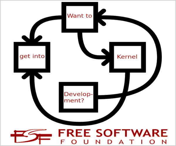
We've been at it since 1990 and we're still nowhere! Desperately seeking help! -RMS-

6
  • 6
    We've been at it since 1990 and we're still nowhere! Desperately seeking help! -RMS-
    – Fabby
    Commented Jul 10, 2019 at 8:39
  • You might want to add a border, since your post is not in compliance with the contest rules.
    – B.Letz
    Commented Jul 10, 2019 at 11:54
  • @B.Letz Just did that. You're the second one telling me... ;-)
    – Fabby
    Commented Jul 10, 2019 at 17:50
  • 1
    It'd be better if at least one path through the arrows led to the order in which you want the text read. As it is, the eye wants to follow both the arrows and the top-down, left-right reading order, which are in conflict. That adds cognitive dissonance. In addition, when displayed at the 300x250 resolution, which is the default at which this will be served on non-high-DPI displays, the text used in the boxes is a bit small. It's still readable, but its height is a pixel or two shorter than most of the text on the page.
    – Makyen Mod
    Commented Aug 16, 2019 at 15:00
  • @Makyen Thank you for the kind words. This was posted as a joke and GNU Hurd will probably never see the light of day so the cognitive dissonance was a feature, not a flaw. Too bad there are more people that do not have a sense or humour compared to people that do... ;-) (Or maybe they have a sense of humour, but not a sense for the absurd) >:-)
    – Fabby
    Commented Aug 16, 2019 at 15:38
  • 1
    @Fabby That's impressive! Still being nowhere after three decades of trying, I'm in awe ;) Commented Feb 8, 2020 at 16:34
-5

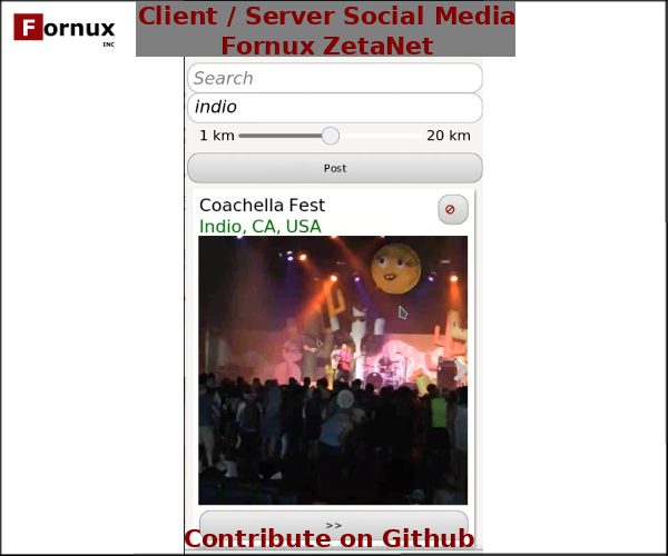
Fornux ZetaNet - Portable Social Media Platform

0
-6

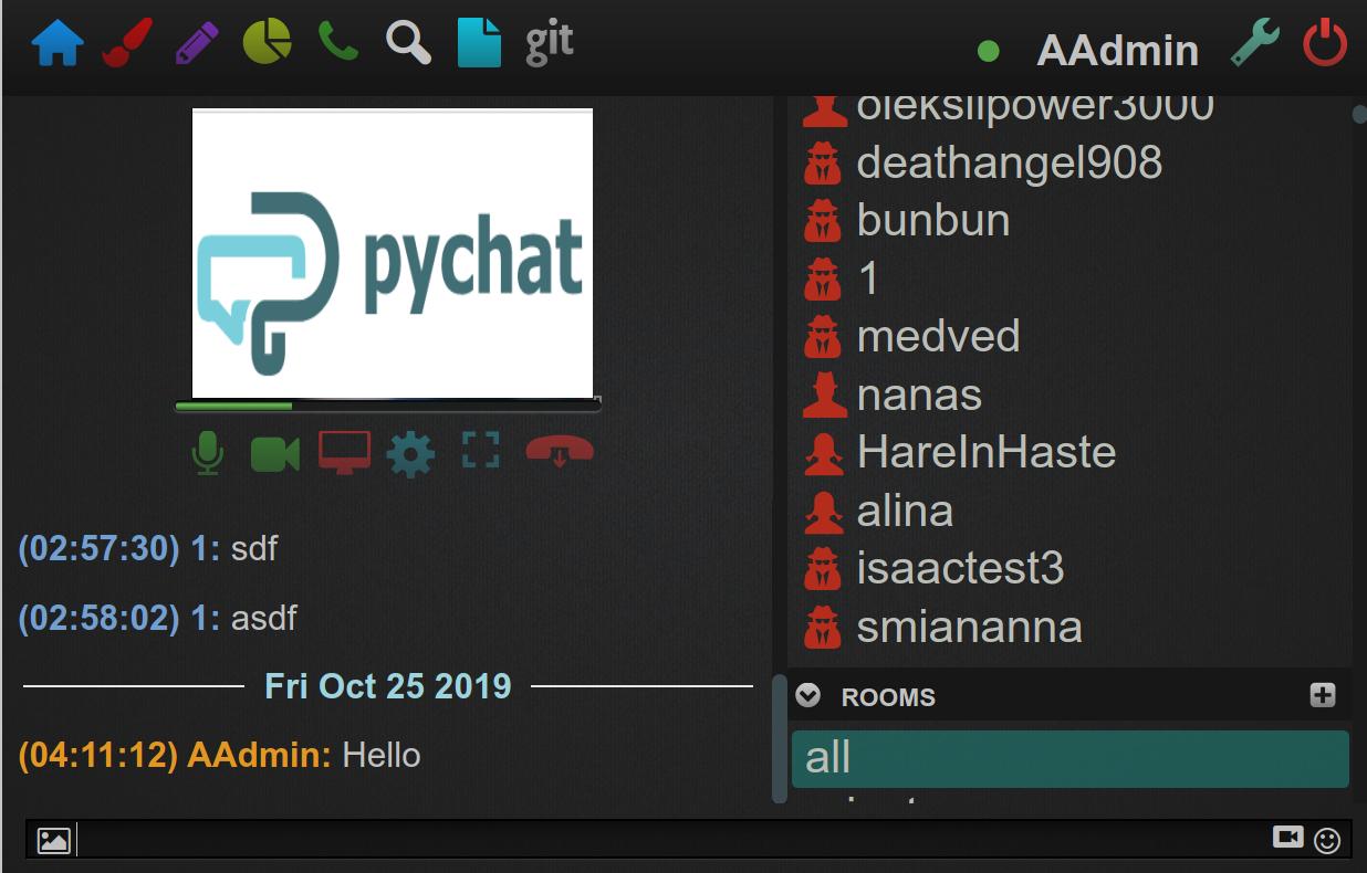
Pychat - Self-hosted video chat like slack

-14

RaptorJIT. Fast, powerful, simple: choose all three.

1
  • 8
    This is a nice-looking ad; very clean and elegant. It is perhaps too clean. Consider adding a bit more description about what the project is and/or what it’s goals are (I can’t tell anything meaningful without clicking through), and an explicit call for contributions (which is the point of these ads).
    – Cody Gray Mod
    Commented Jul 10, 2019 at 20:16
-22

sled is the champagne of alpha embedded databases

14
  • 12
    This would probably be better if it didn't have text overlapping the images or other text.
    – TylerH
    Commented Jul 3, 2019 at 13:41
  • 1
    @TylerNeely I'm no designer, but I kinda fiddled around with your concept. Maybe something more like this? i.sstatic.net/yfj4s.png Commented Jul 3, 2019 at 14:59
  • 1
    @Tschallacka I love it, nice work :D Commented Jul 3, 2019 at 15:12
  • @TylerNeely Feel free to use it as the advertisement concept. Just switch out the urls, it's already on the i.stack.imgur uploaded Commented Jul 3, 2019 at 15:14
  • @Tschallacka I think if we add our points together we will win. Maybe we should combine the sled and october ads to improve our chances? Commented Jul 3, 2019 at 15:21
  • the october mountain is really good - especially for sledding Commented Jul 3, 2019 at 15:22
  • 7
    @TylerNeely Combining won't work. The ads that are circulated are directly pulled from these individual posts, if they reach more than 6 points. At the moment you have an ad that's in wrong dimensions and uses the faux pas comic sans ms. The image I made resembles the "sledding down the mountain" and is a bit cleaner without trying to lose the whimsical nature, which might inspire people to click and look, and might help you reach the treshold of 6 votes. Commented Jul 3, 2019 at 15:25
  • 1
    @Tschallacka We can win this thing! Commented Jul 3, 2019 at 15:35
  • 4
    @TylerNeely If you really want to win you might want to edit in that image I made, or make a better one yourself, in either 300 x 250 or 600 x 500 Commented Jul 3, 2019 at 16:05
  • 6
    I'm not even mad that tree on a sled is legitimately cute.
    – Magisch
    Commented Jul 4, 2019 at 12:17
  • This ad is terrible and I hate it. +1, please go into marketing and revolutionize the ad industry with this trash. I'd probably turn off my adblocker, fingerprinting be damned.
    – Nic
    Commented Jul 9, 2019 at 1:52
  • Thanks for your kind words, @NicHartley :D I'm confident that the sled advertisement is the only one submitted so far that would actually appeal to the demographic with enough time to collaborate on an open source project in the first place: students! (they love fun, and being cool, which is why I was sure to mention those important project qualities on my ad) Commented Jul 10, 2019 at 7:20
  • 1
    @tyler I think you’re both overestimating the amount of spare time students have, and their love towards Comic Sans. Unless by students you mean middle schoolers, in a we, good job?
    – Tim
    Commented Jul 20, 2019 at 1:47
  • @Tim thank you for your kind words <3 Commented Jul 20, 2019 at 16:41

Not the answer you're looking for? Browse other questions tagged .