2

Why does the design (not the content1) of the modal for flagging a question look different from that for a comment?

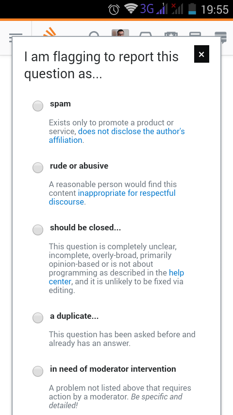
Flag modal for question:

  • This has hooked borders.
  • The background color of the close button is black.
  • It has a margin on the left and the right.
  • Outside the modal is 100% transparant.
  • It has gray radiobuttons

flag modal for question

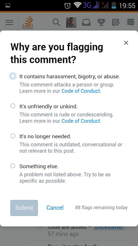
Flag modal for comment:

  • This has rounded borders.
  • The background color of the close button is white.
  • It has no margin on the left and the right.
  • Outside the modal is semi-transparant.
  • It has white radiobuttons.

flag modal for comment

1 My question goes not about the content of the modal! It's just the look and feel of the modal.
2
  • 2
    probably because they are still mid-flight going from the "junk" they currently have to the new responsive Stacks. Some bits are done, some not yet. Give it 6 to 8 weeks.
    – rene
    Commented Jan 4, 2019 at 20:21
  • I am developer & there is no strong reason except choice of designer/developer. It does not denote anything remarkable.
    – ray
    Commented Jan 5, 2019 at 12:09

1 Answer 1

4

When we updated the comment flag reasons back in July/August, the modal was moved over to the Stacks design (as rene guessed). We haven't needed to update the content of the post flags - or close modal on questions, or ... well, lots of other site elements - so they're still using the old styling.

It's probably just as well that we didn't update them all, since the initial implementation was missing at least one popular feature - which we've now added back in.

We'll be updating these modals before long, sometime in the next 6-8. Thanks for your patience while we work through this transition!

You must log in to answer this question.

Not the answer you're looking for? Browse other questions tagged .