50

Right now, when a new user goes to ask a question for the first time on Stack Overflow, they are shown the exact same thing that new users asking on Server Fault are shown (except Server Fault's actually explains what their site is about, however briefly).

New users need to tick off the "thanks, I will keep these tips in mind when asking" checkbox before they can proceed.

You can see the pages I'm talking about here:
Stack Overflow advice; Server Fault advice


Why is this? Why isn't there any mention of a MCVE on this page? Or anything else Stack Overflow specific? I think that some of the generic stuff should be consolidated into a single section or even removed (something shorter is more likely to be read, probably). I'm also not a fan of calling everything on the page "tips" as if it's all optional.

This page has the potential to help. It's shown before the user can even access the "ask question" page. The people who you want using Stack Overflow will read it and improve their question before it's asked, which will make everyone happy. Anyways, nobody wants to be told the rules after they put in the effort.

I know some people won't read it no matter what it says. But they're not the people we should be optimizing for.

What I want is for the page to be edited so that it gives the advice that new users need. I'd be interested in seeing answers that come up with some good wording. And also people's thoughts on this.

Ideally this page should be able to be customized on each site by moderators (since the page can be enabled anywhere on the network via CM request). This will make it easy to edit in case it needs to be changed. If you support this, you should check out this request I posted a little while ago on the main meta: Can the advice page be customizable on each site?
10
  • 5
    Yes, explain about MCVE, but in a way that makes it clear for which types of questions it is required, and for which type of question it is not. Commented Dec 18, 2018 at 3:00
  • 5
    Honestly, the single most important part of that page on Stack Overflow is the search box. Something like 20-30% of folks hitting that interstitial never make it to the Ask page because of that search box. Server Fault doesn't have / doesn't close near as many duplicates as Stack Overflow does.
    – Shog9
    Commented Dec 18, 2018 at 3:26
  • 1
    The search tends to be worse than just writing the question and looking at the suggestions in the sidebar though
    – lucidbrot
    Commented Dec 18, 2018 at 9:41
  • 15
    add "no code as images" for chrissake!, preferably in big, flashing letters. Commented Dec 18, 2018 at 9:43
  • 5
    @Jean-FrançoisFabre This. And also: Raise / Remove reputation limit for showing “Do not upload code screenshots” message Commented Dec 18, 2018 at 9:55
  • or a very performant OCR plugin for SO Commented Dec 18, 2018 at 10:04
  • @Jean-FrançoisFabre I work for an OCR company, point me in the direction of an SE employee and a lucrative contract... Commented Dec 18, 2018 at 10:12
  • It might be helpful if it had a very short list of the conventions on SO. Where is the conventions help page? Commented Dec 19, 2018 at 12:02
  • This has been a problem on sister sites for years: The “How To Ask” page is misleading
    – AShelly
    Commented Dec 20, 2018 at 23:33
  • @AShelly Actually, “how to ask” is a different page. On SO it contains useful site specific information. On other sites it appears to just have the same information as the generic advice page I’m talking about, but it doesn’t have the search bar. Confusing, I know.
    – Laurel
    Commented Dec 21, 2018 at 1:09

2 Answers 2

17

I agree, this page could use some improvement. The grand irony here is the first header of the page states "How to Ask", yet the page is titled "Advice" even though there is already a help page for "How to Ask" here: https://stackoverflow.com/help/how-to-ask, which is quite useful.

In fact, how about we just replace this "Advice" page with the actual "How to Ask" page and be done with it. Yes? Done.

No? Fixing it is problematic.

Stack Overflow has some spectacular authors in employment (Shog, Jon, Jay, Tim, etc.), this should be something that they can handle rather easily since it doesn't require any actual development.

This page appears to essentially be a landing page for getting users to go somewhere else without actually offering any guidance itself. Shog9 states that 20-30% of the users hitting the page leave for the search box and never progress, which ties into the theme of going somewhere else, but I wonder... did the search box really solve their problem? Or did they just end up hitting the Ask Question button again in that new tab?

From my experience in the mentorship program here, many questions posed suffer from misunderstanding the proper approach to use at Stack Overflow. This page seems like a place where we could help some of those users, and there is certainly a lack of useful information on the page.

Let's go through some of it.

Search, and research

There is an implication that Stack Overflow simply knows that you have searched by using the tool here, and no instruction whatsoever on including any of what you actually tried to research in the post itself. In the mentorship program, not once did I see an explanation of what research was attempted.

Be on-topic

This one is pretty bad. For a page which is supposed to be direct and specific, it definitely lets the user down here because on topic isn't even described aside from by tautology. "Be on-topic: Our community is defined by a specific set of topics". This page should have links to our other support material in the help center, but it is supposed to be an executive summary, not a table of contents.

Be specific

This is perhaps the worst advice on the page, in fact, I am astonished to even see the suggestion "If you ask a vague question, you’ll get a vague answer." This is terrible advice. If you ask a vague question on Stack Overflow, you will end up posting a passive aggressive tweet and writing a rant on medium.com. But seriously, we shouldn't be suggesting people will even get answers to vague questions.

Make it relevant to others and Keep an open mind seem like good advice, I like those sections. However, they are mostly irrelevant as they are towards the end of an already lengthy read for someone wanting to ask a question, as well as not really addressing the critical 99% of post composition.


So, overall, I think that the first 3 sections should definitely be improved. The general headings and overall approach of the page seems well done. It is the content in these 3 sections which needs to be more reflective of what the community actually expects of users. If this is going to be the one page that they see, it should at least be chock-full of useful information (like the actual How to Ask page).

1
  • Re: "hitting the Ask Question button again in that new tab" - until a user reaches 10 rep, they'll get that advice page every time they hit Ask Question; the only way to get to /questions/ask is via that "proceed" link, which gets logged. So while some number of folks probably do hit Ask->back->Ask->back... They're not asking questions either. I gave a pretty broad range for how many search, because we have numbers for both the folks who visit the advice page without asking and numbers for folks who search - they're both around 25%, so the actual number is probably in that ballpark.
    – Shog9
    Commented Dec 21, 2018 at 6:49
7

Personally, I think one problem with the idea of a "read all this before asking a question" page is that new users are expected to remember all that information (I'd say there are more than 7 salient pieces of information in there), and once a user clicks "proceed", there's no obvious way to go back to that advice page.

I think when programmers get started on a new code base, they wouldn't normally read the entirety of the README all in one shot, and then set up, configure, and compile everything from memory. No, they would briefly scan over the README, then get started right away, and look back at it whenever they're uncertain about something.

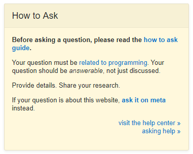
There should be an obvious, prominent link on the "Ask Question" page that links back to the "How to Ask" question page so that users can easily re-reference it; one that says in bold, "read this before asking your question". For example, here's a mock-up of how it could look:

example improved how to ask box

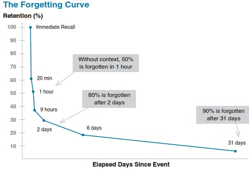
Keep in mind the forgetting curve. Information is forgotten quickly:

forgetting curve

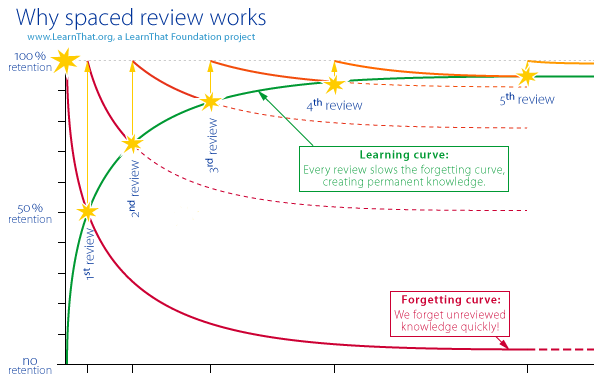
However, if users can freely revisit that information, then the repetition can greatly reinforce that knowledge:

spaced repetitions

7
  • I wouldn't exactly say it's fair to compare a one page summary of how to ask a question with an entire language's documentation, which will be hundreds of pages long.
    – Servy
    Commented Dec 19, 2018 at 22:01
  • "There should be an obvious, prominent link on the "Ask Question" page that links back to the "How to Ask" question page" But...there is...you even screenshotted it. That whole section confuses me. What do you think needs to be changed about it?
    – Servy
    Commented Dec 19, 2018 at 22:02
  • 2
    @Servy that was a mock-up created by me, it doesn't actually currently look like that.
    – ahiijny
    Commented Dec 19, 2018 at 22:03
  • Also, fair enough about the documentation comparison. I suppose a closer equivalent would be the README.md of a repository that explains how to set up and compile the code.
    – ahiijny
    Commented Dec 19, 2018 at 22:05
  • We don't need to tell people they need to read how to ask before every question they ask, we just need to link to it so that they're free to reference it if they have questions or want a refresher, which is what the current one does, by linking to the page and informing them that they can look at it for reference.
    – Servy
    Commented Dec 19, 2018 at 22:05
  • 1
    @Servy - It does contain the link to how to ask, but you have to agree that it is a little buried at the bottom of the dialogue area. Perhaps with more prominence, users would actually use the link.
    – Travis J
    Commented Dec 19, 2018 at 22:09
  • @TravisJ Given the colloration of the link, and the nonstandard allignment, it stands out more to me than the text. But I'm not opposed to considering moving the link to the top. But saying everyone should read it before asking every question isn't appropriate.
    – Servy
    Commented Dec 19, 2018 at 22:12

You must log in to answer this question.

Not the answer you're looking for? Browse other questions tagged .