31

Can we please remove the newly added underlines on links? It doesn't look easy on the eyes to say the least. Or maybe I am not following the latest CSS trends.

I don't see other major sites adopting this design rule either. What's the rationale behind rolling out this feature?

25
  • 20
    How am I supposed to know it doesn't look nice when you don't provide a screen shot with a free hand red circle drawn around the offending link? ;) Commented Aug 17, 2018 at 21:08
  • 3
    Let hope they remove at least some of them : meta.stackoverflow.com/questions/372719/… Commented Aug 17, 2018 at 21:11
  • 2
    It makes this easier to solve.
    – user202729
    Commented Aug 18, 2018 at 9:02
  • 8
    WOW, why the downvotes? I was about posting a [bug] until I saw this [feature-request]. Imho the red text is enough (and perfect) to indicate hyperlinks. Underlined hyperlinks feels like the 90s. Commented Aug 18, 2018 at 15:52
  • 1
    More importantly, this "feature" breaks code in links, as discussed here.
    – Lundin
    Commented Aug 20, 2018 at 10:59
  • 2
    @ChristianGollhardt: 8% of the world's male population suffers from some form of color blindness. Underlined hyperlinks may feel "90s" to you, but for us it's a really useful feature. Suggesting outright removal, without attempting to understand why they appeared, is like suggesting removing that ramp over the stairs which is in the way. A more constructive approach would be asking for (1) customization or (2) another visual cue. Commented Aug 20, 2018 at 12:11
  • 3
    @MatthieuM. I can only wonder, if this change is really necessary, why it took nearly 10 years to do so. I've never seen people complain about it before.
    – user247702
    Commented Aug 20, 2018 at 12:18
  • 1
    @Stijn: Apathy? I've gotten used to having no underlines too. On some sites the difference in color is sufficient for me (though it may not be for others); on other sites, it may take me a while to realize that there are links at all. Sometimes I stumble upon them by accident, when the mouse cursor changes while passing over text. On SO, I think it took me a few years to learn that "edited X days ago" was actually a link. Didn't look link-y to me (still doesn't, really). Commented Aug 20, 2018 at 12:22
  • Not sure about this, but couldn't we use better contrast colors instead of underlines? @MatthieuM. Commented Aug 20, 2018 at 12:34
  • 1
    @ChristianGollhardt: I don't think it would be easy to find a sufficiently contrasting color. At the extreme, completely color blind people only see shades of gray. I am not sure how easy it would be to have a "middle-ground" grey that is contrasting enough on the white to be easily visible yet sufficiently different from the black as to be easily distinguishable. This is why, for color-blindness, the recommendation for accessibility is to use shapes (on top of colors). Possibilities here would include (1) a different underline, (2) a "sign" after the text, ... Commented Aug 20, 2018 at 12:42
  • 4
    @ChristianGollhardt: You can read the W3C guideline here. In particular, notice 1.4.1: Color is not used as the only visual means of conveying information, indicating an action, prompting a response, or distinguishing a visual element. Commented Aug 20, 2018 at 12:47
  • Ok, point taken. Clearly my horizon was not open enough. Still I think we need a better aproach then underlines. Commented Aug 20, 2018 at 12:50
  • 3
    @ChristianGollhardt: To be honest, despite being affected I have no idea how people more affected feel. I once had a colleague who did not see red at all... as in, red on black was just all black for him. Took him 6 months to complain about our internal test tool distinguishing failed tests by using a red name, instead of a black one. I knew he had the issue, used the tool daily, and never realized what it was like for him... he simply assumed that there was no clue at all and people just checked each test one by one \o/ Commented Aug 20, 2018 at 12:57
  • 2
    Obligatory "you can fix this with a user style" comment - just apply a { text-decoration: none !important; } to stackoverflow.com and stackexchange.com domains in your favorite user style browser addon.
    – TylerH
    Commented Aug 20, 2018 at 14:13
  • 2
    Let the flamewars begin :-) Maybe we could back to the time when undelines appeared only when hovering the links ?
    – Marco13
    Commented Aug 20, 2018 at 22:13

3 Answers 3

17

I support changing it back to only the red/blue indicator without an underline style.

I think, underlined hyperlinks are an fragment of old times of the internet, where CSS wasn't the standard.

By looking at the most popular Web Frontend Framework (Bootstrap), we see the default Typography for hyperlinks is without underlines. That's how most of the Websites are build today, and therefore it is, what a user would expect these days.

Bootstrap Example, through I wasn't able to find the specific documentation for <a>:
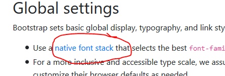
BS

I don't want to argue, everything which is popular is perfect, but it could be a indicator that it is the state of the art.

There are some themes, which override this behaviour, but all I know of want to imitate the 90s
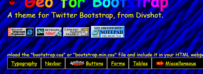
90s

9
  • 8
    the underline destroys visual appearance of links with code inside, like logical OR || for example. Commented Aug 19, 2018 at 17:42
  • 29
    Oh man, I would love to see Stack Overflow wearing the 90s theme!
    – Turnip
    Commented Aug 20, 2018 at 10:08
  • 11
    @Turnip Maybe you just gave SE an idea for next year's April Fools.
    – Filnor
    Commented Aug 20, 2018 at 11:35
  • 5
    Fingers crossed 🤞
    – Turnip
    Commented Aug 20, 2018 at 11:40
  • That theme is great, makes me take back all of my internal grumbling about "generic bootstrap themes". I wonder if I can use clientside hacks to override every bootstrap site's theme with that one just for laughs.
    – jrh
    Commented Aug 20, 2018 at 18:52
  • 2
    "You changed my cheese to add an allergy warning to it! I don't have allergies! I find the warning distracting! Please remove it!". Fortunately, WCAG exists to address issues of access free from anecdote.
    – zzzzBov
    Commented Aug 20, 2018 at 20:03
  • 2
    Note that for almost any example of sites without underlines, one can find examples with underlines. Microsoft Docs for instance (that being a link to the C# Language Reference) underlines their links, as does the React documentation... Commented Aug 20, 2018 at 21:47
  • Also FWIW I have a bit of trouble finding links in some sites so I'd appreciate a bit more emphasis; I think using underlines might be a bit problematic but it would be nice if they were a bit less subtle. I think the ones I found hardest to read are using underlines now, but IIRC there was at least one site that used navy blue links and I honestly could not tell them apart from the black text.
    – jrh
    Commented Aug 21, 2018 at 13:30
  • just another link, where it's necessary to see the original underscore not covered by link underscore: _.groupBy Commented Aug 22, 2018 at 17:22
6

"Or maybe I am not following the latest CSS trends."

Using color + underline for links is (and was) the default in the Web. It’s specified like this in the CSS user style sheet recommended by HTML, and it’s what most browsers actually use in their default user style sheets, too.

Using something in addition to color is one of the most basic accessibility requirements. See for example in WCAG 2.1: 1.4.1 Use of Color:

Color is not used as the only visual means of conveying information, indicating an action, prompting a response, or distinguishing a visual element.

While a high enough contrast ratio could be an indicator to be used in addition to color (G183), it’s not a recommended solution:

[…] it is not the preferred technique to differentiate link text. This is because links that use the relative luminance of color alone may not be obvious to people with black/white color blindness. If there are not a large number of links in the block of text, underlines are recommended for links.

"What's the rationale behind rolling out this feature?"

From the answer by Aaron Shekey ♦ (on MSE):

We've intentionally added underlines to links in posts and comments for contrast and accessibility reasons. Many of our themes' primary colors don't deviate much from the text color itself, so we went with the classic way of showing a link's a link.

2
  • 3
    Just a point: Underline is the standard default, but the specification do not require underlines - only that they be visually distinct (italics, bold, change the sizes, add border, box, etc). +1 because this answer is correct, and it does help usability, but the use of the theme's text colors was/is worse than the choice of underline vs. not-underlined in that regard (somewhere between a 3:1 to 5:1 contrast ratio would be nice). Commented Aug 20, 2018 at 2:02
  • 2
    @JGreenwell: Good point, the way I expressed it could have implied it. Edited.
    – unor
    Commented Aug 20, 2018 at 11:49
3

This is not an answer to the question, and perhaps doesn't belong here... but if those underlines annoy you (and you find yourself here like I did), and you don't want to install any plugins for such a basic issue, there's this option.

Firefox:

  1. Read this answer: How to override the CSS of a site in Firefox...?
  2. Use (or add) this CSS inside your userContent.css file:

    @-moz-document 
      domain(stackoverflow.com), 
      domain(stackexchange.com), 
      domain(superuser.com) 
    {
      /* Remove underlines from links */
        .post-text a          /* in Q/A body */
      , .comment-copy a       /* in comments */
        /*, .wmd-preview a*/  /* in posting previews */
      {
        text-decoration: unset !important;
      }
    }
    
    1. Make sure to restart Firefox.

Chrome:

  1. Create a directory with the following 2 files:

    manifest.json

    {
      "name": "Remove Link Underlines on Stack Exchange Sites",
      "version": "1",
      "content_scripts": [
        {
          "matches": [
            "*://*.stackoverflow.com/*",
            "*://*.stackexchange.com/*",
            "*://*.superuser.com/*"
          ],
          "css": ["userContent.css"]
        }
      ],
      "manifest_version": 2
    }
    

    userContent.css

    /* Remove underlines from links */
      .post-text a          /* in Q/A body */
    , .comment-copy a       /* in comments */
      /*, .wmd-preview a*/  /* in posting previews */
    {
      text-decoration: unset !important;
    }
    
  2. Go to chrome://extensions (or Menu -> More Tools -> Extensions)

  3. Select "Developer Mode".

  4. Click on "Load unpacked extension".

  5. Select the directory you just created.

    (Curated in parts from this answer and this answer.)

Others? Feel free to add...

Note that in both examples I commented out the preview style selector because IMHO it's important to know what most others will see... it being a preview 'n all (like code in links, blech). But just remove the comments if you prefer.

1
  • 4
    Posting a workaround where someone's suggesting a change to the site is a legitimate answer.
    – BSMP
    Commented Apr 3, 2019 at 17:33

You must log in to answer this question.

Not the answer you're looking for? Browse other questions tagged .