66

I always knew review queues existed, and have dabbled with them here and there, but I have since decided my contributions on the site will not be that. The new review queue UX disagrees with me with this big red dot that appears randomly when I'm looking at a page for too long. It's in the notification section that I thought only has things I care about when they're nice and colorful.

Is there a way I can disable the review queue red dot? I'm afraid my Greasemonkey skills are lacking and I'd end up removing the review queue entirely.

15
  • 22
    If you're not interested in contributing there, why would it matter to you if you removed the icon entirely? Just curious. Commented Oct 19, 2017 at 14:42
  • 10
    The dot doesn't "appears randomly when I'm looking at a page for too long". It appears on page load based on the number of active review tasks in relation to the thresholds set by the community management team. I would throw together a userscript for you but I haven't seen the red dot in a while, looks like it is doing its job.
    – user4639281
    Commented Oct 19, 2017 at 16:06
  • 8
    This is one of the greatest improvements SE has been slow-rolling as of late. Please, leave it there. Commented Oct 19, 2017 at 16:07
  • 2
    @TinyGiant It also takes into account how many clicks/page views on the site you've had since you last clicked the review queue icon.
    – TylerH
    Commented Oct 19, 2017 at 16:08
  • 1
    @dont-panic how can I remove the icon entirely?
    – aarkerio
    Commented Oct 19, 2017 at 19:12
  • @aarkerio I don't know. It's not something I've looked into at all. I only commented because I was wondering why the OP would care if it was gone since they don't want to do any review anyway. Commented Oct 19, 2017 at 19:18
  • 7
    adblocking it is pretty easy. stackoverflow.com##.top-bar .secondary-nav .-item:nth-child(3)
    – Kevin B
    Commented Oct 19, 2017 at 19:22
  • 25
    I agree with Spork. The red dot is distracting. I keep thinking I have a notification, when I don't.
    – kockburn
    Commented Oct 19, 2017 at 21:37
  • 1
    Well, there's always the chance something I care about is implemented on the third nav item and I'd miss it, for one. And I never minded it before it started notifying me of something, so deletion seemed harsh.
    – Spork
    Commented Oct 19, 2017 at 23:38
  • 12
    I also find this dot very distracting especially its unpredictable quality. A browser extension to remove the dot it is I suppose
    – aaaaaa
    Commented Oct 21, 2017 at 19:23
  • 15
    For site meant to help programmers, the red dot is not gonna help them be productive.
    – Rahul
    Commented Oct 25, 2017 at 23:34
  • 2
    This adblock filter just removes the indicator of the review button- instead of removing the 3rd item or all red notification icons: stackoverflow.com###review-button._danger-indicator:after
    – Kade
    Commented Jun 23, 2021 at 12:52
  • 3
    The latest UI update made the red dot even more glowing and obtrusive.
    – qwr
    Commented Mar 31, 2022 at 1:55
  • 1
    Agreed @qwr - I used Ad Blocker to block it Commented Mar 31, 2022 at 13:35
  • It is pink now (at least in Dark Mode). Due to the latest changes? An intro. A longer intro. Commented Oct 23, 2023 at 17:13

4 Answers 4

53

The site does not provide any option to disable the red review indicator. Your only option is therefore client-side modifications.

You can disable the red review indicator by inserting the following CSS as a custom stylesheet in your browser:

.top-bar .-secondary .-link._danger-indicator:after {
    display: none;
}

or, if you have an Adblock Plus compatible ad blocker (e.g. uBlock Origin), add the following filter:

stackoverflow.com##.top-bar .-secondary .-link._danger-indicator:after

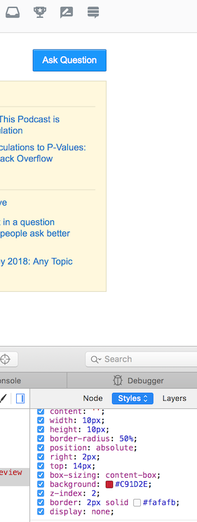
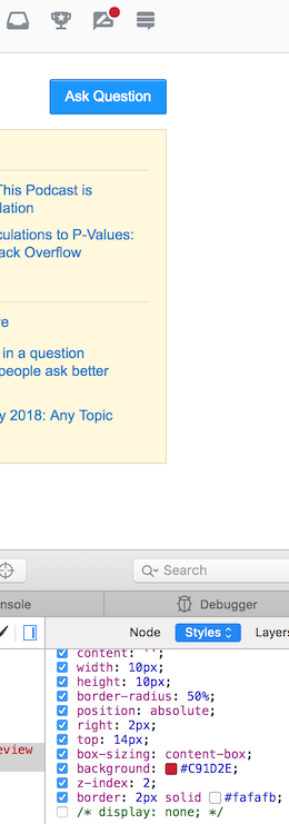
Compare these two screenshots: the normal site view is on the left, while the right view is after the custom CSS rule or ad block filter is applied:


User @Wenfang discovered that one of the various subsequent updates to the Stack Overflow design broke the CSS. This has now been fixed, thanks!

7
  • The Inbox has the feature to clear notifications. Why does the queue not have the same feature? This feels like a non-answer. Commented Apr 1, 2020 at 16:04
  • 5
    This is a hack rather than a real option to fix it. This feels like a very user hostile feature. Commented Jun 6, 2020 at 16:47
  • 1
    @RoboticRenaissance I'm a bit late, but according to answerer (and confirmed) there is no way to remove the dot. A userscript is the only way to do it as of november 2020.
    – 10 Rep
    Commented Nov 19, 2020 at 4:01
  • Tbh, I think content: none; is better than display: none; since the former wouldn't be in the DOM at all.
    – Wenfang Du
    Commented Dec 13, 2020 at 10:48
  • @Wenfang you're probably right, but I tend to use CSS to manipulate styles only, not content.
    – Glorfindel
    Commented Dec 13, 2020 at 11:02
  • If you are using ad block on Chrome, the setting is here: chrome-extension://gighmmpiobklfepjocnamgkkbiglidom/options.html#customize
    – Jack
    Commented Aug 5, 2021 at 0:23
  • If you are using Brave browser you can add css from this answer here: support.brave.com/hc/en-us/articles/…
    – P D
    Commented Nov 9, 2021 at 13:12
21

Glorfindel's solution stopped working for me, so I've modified the code as follows:

.top-bar .-secondary .-link._danger-indicator::after {
  content: none;
}
1
  • 9
    One of the recent design updates broke my script. Thanks for spotting this, I hope you don't mind I've edited it into my answer.
    – Glorfindel
    Commented Nov 19, 2020 at 14:57
13

The latest UI update made the red dot even more glowing and obtrusive. Drastic times call for drastic measures:

You can also remove the red dot entirely with EasyList-compatible filter (such as uBlock Origin)

stackoverflow.com###review-button > .s-activity-indicator__danger.s-activity-indicator

I found this using uBO's element picker feature. The filter may change due to Stack Exchange's UI updates.

3
  • 2
    Surely, it would make more sense to just remove the red dot? Changing to ##.js-review-button > .s-activity-indicator__danger should do that, I believe.
    – Cody Gray Mod
    Commented Mar 31, 2022 at 23:12
  • Well I don't intend on using the review queues any time in the future. Maybe I should get rid of the question mark button because I only ever click it by mistake.
    – qwr
    Commented Apr 1, 2022 at 0:17
  • 2
    ##review-button > .s-activity-indicator is what I'm using in UBO to hide just the red dot
    – tdy
    Commented Apr 1, 2022 at 0:32
4

Now that more UX changes have been made to the top bar (which probably break all "current" solutions), reducing the noise becomes even more critical.

A bit like qwr's answer, and I like the "Drastic times call for drastic measures!", => I also got a bit "fed up" at the "new" Inbox Indicators (March/April 2022) (Several Links: 1 2), especially the huge and ugly 'Review Queues' one that never disappears and is always calling for "attention"... :grrrrrr...!:

=> Currently on FF98 (only using this Browser (Version) because SO doesn't work otherwise in any of my "Prod" Browsers (Specialist in Web-Automation)), I went to (re-)install the 'uBlock Origin' Add-on (on top of Ghostery I already had, ... which couldn't do the job, and even did "its best" to (try to) prevent me from installing 'uBlock' :shocking: , but OK, a simple "Element Pick-up" in 'uBlock' does the job...! :happy:

And the Filter I used is:

stackoverflow.com###review-button > .s-activity-indicator__danger.s-activity-indicator

Filter adding/importing can be "a bit tricky", for 'uBlock', can be "reached" from the 'uBlock (Origin)' Icon => 'Settings' => 'My filters'.


EDIT [2022-04-05]:
And yet another UX Change, the Top Bar (containing all Activity Indicators) is now Sticky (again). (Links: 1 + 2)

=> If want to make the Top Bar Unsticky (back), => can also add the following Line to the 'uBlock (Origine)' Filters:

superuser.com,serverfault.com,stackoverflow.com,askubuntu.com,mathoverflow.net,stackexchange.com##.js-top-bar:style(position: absolute!important;)

(Taken from this Answer by User @douira in the 1st Link...)
4
  • stackoverflow.com###review-button > .s-activity-indicator should be enough
    – tdy
    Commented Apr 1, 2022 at 0:33
  • @tdy, yep sure, but maybe some "later" Indicator might be implemented that I might not want to block, can always make a Filter more generic "later" if new HTML Elements "appear", that I/we "also" want to block...
    – chivracq
    Commented Apr 1, 2022 at 0:39
  • 1
    I was being melodramatic. But I haven't used the review queues or the help center buttons in a while so I might as well just remove them and save some clutter.
    – qwr
    Commented Apr 1, 2022 at 3:08
  • @qwr, "melodramatic", boah..., I just had the same Feeling like you, I even had to (re-)install some Ad-Blocking Add-on, and even (just) wrote a Review, ah-ah...!
    – chivracq
    Commented Apr 1, 2022 at 4:29

You must log in to answer this question.

Not the answer you're looking for? Browse other questions tagged .