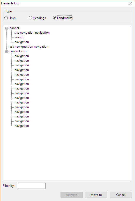
The current markup on Stack Overflow is not very helpful for screen readers using landmarks to navigate the page. There are currently 19 different navigation items, only two of which have a label. There is also no main section.
According to the W3C, Stack Overflow is going against three of their guidelines:
This is what I see when I bring up landmark navigation on NVDA:
The current landmarks look something like this:
banner:
  - site navigation navigation
  - search
  - navigation
ask new question navigation:
content info:
  - navigation
  - navigation
  - navigation
  - navigation
  - navigation
  - navigation
  - navigation
  - navigation
  - navigation
  - navigation
  - navigation
  - navigation
  - navigation
  - navigation
  - navigation
  - navigation
I would recommend something more like this:
banner:
  - site navigation           # Remove 'navigation' from the label
  - search
  - secondary navigation      # Add a label to the secondary nav
main:                         # Add a main landmark
  - ask new question form     # Change the landmark from 'navigation' to 'form'
content info:
  - Stack overflow navigation # Add a label to each section
  - Stack overflow business navigation
  - Company navigation
  - Stack exchange network navigation
  # Remove all of the other nav elements from this list (you could probably add a few others but this is too long)
