When reviewing the suggested edit the first thing you should be doing is reading the editor's comment, like "Improve formatting", "Correct spelling", "Make title more relevant", "Make question clearer" etc, to understand editor's original intention, then you should start looking at other things like green and red spots of the diff, added/removed tags, etc. Natural flow seems to be the opposite, your eye will catch "the interesting parts", especially the green/red corrections, this must be how our mind works, we want visuals before the meaning. But reviewing is an intellectual process, that should encourage the reviewer to think and pay attention to the idea not only to the looks. The problem is that the comment is the HARDEST thing to spot on the whole page, after hundreds of reviews I still need extra moments each time to find it's location. So I suggest to redesign the outlook of this page with the emphasis on the comment being as obvious and easy to spot as possible.
Although I do not know what would be the best way to highlight it, I'd think of putting it above or below the Approve/Reject buttons inside the frame made of thin gray lines, to make sure every reviewer reads every comment before pressing the big blue button. Maybe I personally would want to rename "comment" to "intention", to shift the perception of this field as something that could be neglected to something that matters most. Another idea is that our minds and eyes are used to spot the title of the question when we browse through the Stack Overflow question lists or search results, so maybe the comment of the edit could utilize this feature of our brains and look similar to the title to get the first and the foremost attention of the reviewer.
This picture is hard to understand without the comment.
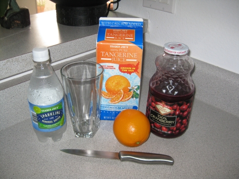
Tools and ingredients needed to make the famous tangerine-cranberry-orange drink.
