170

I use Stack Overflow on the desktop when coding, but in the evenings I use the mobile version. I noticed the branding doesn't match between these and at first glance they look like different sites / brands.

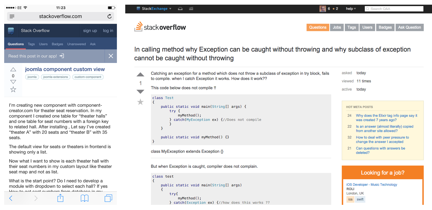
Here are a couple of screenshots:

Mobile vs. desktop branding

Mobile is blue; desktop is black and orange. Maybe you will consider adjusting these in a future update?
22
  • 18
    stackexchange.com Commented Feb 20, 2016 at 11:33
  • 15
    I agree, consistency throughout entrypoints for each SE site is important.
    – scrowler
    Commented Feb 20, 2016 at 21:29
  • 75
    I agree, mobile experience (browser and native) is so much different (and poor) from the main site that the site identity is totally lost.
    – Zanon
    Commented Feb 20, 2016 at 22:20
  • 15
    It's nice having one app and a unified experience for the different SE sites. But a dash of colour would help to understand what site I'm browsing right now.
    – Kieran
    Commented Feb 21, 2016 at 0:17
  • 6
    The top links navbar (Questions, Tags, Users, etc.) in the app could easily be themed with the site's colors, without losing the Stack Exchange branding. Alternatively, the site's logo and logotype could be used at the very top.
    – Cody Gray Mod
    Commented Feb 21, 2016 at 7:39
  • 22
    I think this question should be migrated to Meta.SE, since it's not only SO-related. Commented Feb 21, 2016 at 21:20
  • 2
    This question will be looks weird on meta.SE, since SE already had blue theme Commented Feb 22, 2016 at 4:10
  • 25
    I usually use the full site on my mobile devices... because the mobile site sucks, plain and simple.
    – user4639281
    Commented Feb 22, 2016 at 8:52
  • 1
    This is annoying enough that I turn my phone sideways and put firefox in "PC site mode" so that I can see what I'm used to -- and not get a completely crippled interface. Its not just a different interface, its a totally crap interface.
    – zxq9
    Commented Feb 22, 2016 at 14:00
  • 1
    @zxq9 The mobile interface is mostly fine; I use it all the time. There are some completely bogus "features" like the unusable close-as-duplicate dialog though. (I presume this hasn't been fixed; I haven't actually tried lately.)
    – IMSoP
    Commented Feb 22, 2016 at 14:36
  • 1
    @TinyGiant Don't use the mobile site, install the app instead. The app is great. Commented Feb 22, 2016 at 17:26
  • 3
    @Kieran There are like 150 different SE sites. We'd need 150 different dashes of color. It's way harder to have 150 different mobile app designs (within a single app) than 150 different websites layouts. I'd rather have a single unified experience within the app. Commented Feb 22, 2016 at 17:30
  • 2
    @Thiago, if it isn't the full site, I don't want it.
    – user4639281
    Commented Feb 22, 2016 at 17:33
  • 14
    @Thiago The vast majority of my activity on this site is moderation activity. If the app is lacking any of the features of the full site, it isn't worth my time.
    – user4639281
    Commented Feb 22, 2016 at 18:16
  • 3
    @ThiagoPorciúncula Just what I want -- to install another app on several mobile devices so that I can almost do what I can already do through the web interface. While native applications are critical for deep functionality, typing and tapping "up/down" isn't exactly deep... and I'm still not sure why the app needs access to my device storage (not that I'm suspicious of SE, I just don't know why it would need that). That mobile ff works the same as the desktop ff is a huge relief.
    – zxq9
    Commented Feb 23, 2016 at 3:53

1 Answer 1

5

We've just slightly updated branding of our mobile skin for Stack Overflow. Other sites also have updated skin but it's unified across whole network for now. In simple words: only Stack Overflow got branded skin (at least for now). It's still not perfectly the same as desktop but in our opinion it is now more recognizable as Stack Overflow.

Not the answer you're looking for? Browse other questions tagged .