29

So I saw this question earlier today:
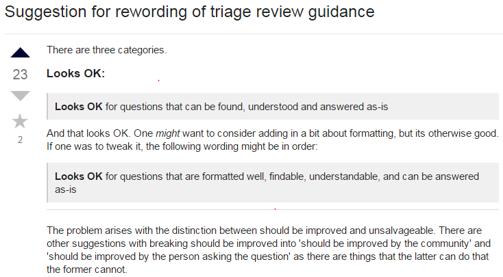
enter image description here

As you can see, it was a well recieved question asking for the Triage categories to be reworded.

My proposal, however, involves the flowchart that was in the question. It was made by Shog9♦ about 4 months ago: enter image description here
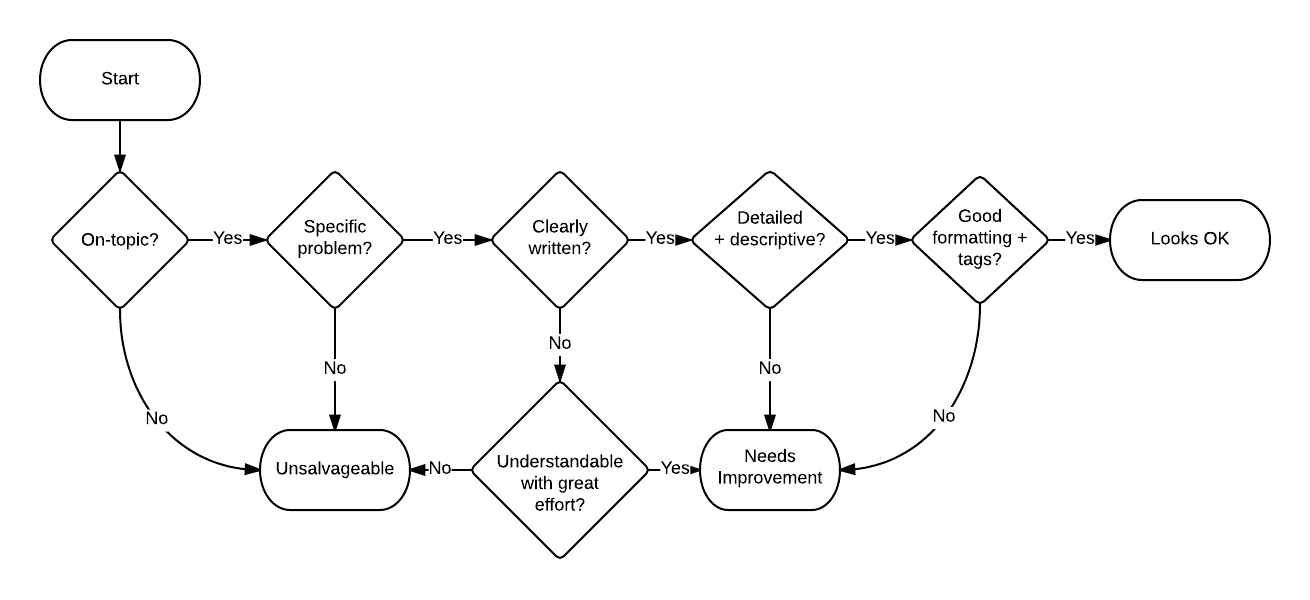
It gives some great pointers for anyone who is reviewing questions in the Triage queue and I think it would be quite beneficial if a flowchart (preferrably a more detailed version) was added in the Triage section itself, just as a guide, to help achieve better reviews.

When Shog9♦ made this flowchart he warned this:

"...Just don't take this too seriously - you're better off using your own experience coupled with the guidelines given on the review page. If you're ever unsure, Skip and let someone else decide."

However I commented the following on the question I linked: enter image description here

Evidently, at least 6 people were interested in my proposal (Otherwise I wouldn't have bothered asking this). I just wanted to know, who else thinks it would be a good idea to add a detailed flowchart in the Triage review just as a guide when reviewing?

Could we discuss why this would be a good or bad idea? What are the pros, what are the cons?

EDIT:

This is the way it would look (incorporating suggestions by @ryanyuyu and @JoshCaswell):
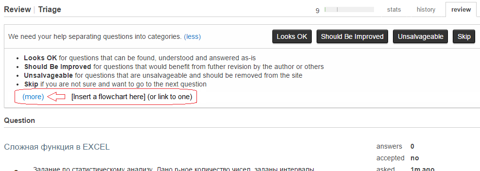
enter image description here

Also, as @MikeMcCaughan pointed out, the flowchart in my question doesn't include the Skip option. That's why I was proposing a "more detailed flowchart" to be added. I didn't really want to take it upon myself to create a better version because I'm still fairly new to this community and I don't feel like I have the required level of experience with reviewing posts in Triage.

With that said, if someone has a flowchart that they made, or use, already, it would be great if you could share it here, just as a guide for future readers or in the event that this feature-request actually gets completed.

10
  • 3
    What are the odds that someone will read that flowchart? What are the odds that someone who's doing these reviews diligently doesn't already have something similar already floating in their head? I'm not entirely sure that I see this working out as well, but maybe I'm being pessimistic.
    – Makoto
    Commented Apr 9, 2015 at 19:22
  • @Makoto Thats why I suggested we add this disclaimer with the suggested flowchart: "This is for guideline purposes only, make your own detailed judgement" (I should have use the word "assessment" instead of "judgement", but I can't edit that comment, it was posted 6 hours ago
    – logic
    Commented Apr 9, 2015 at 19:25
  • I'm not so sure I see it helping to that extent. Maybe I'm pessimistic, but adding yet another thing for users to read and gloss over before they get to the queue...I don't entirely see helping. Maybe this could be shown when they fail too many reviews?
    – Makoto
    Commented Apr 9, 2015 at 19:28
  • 11
    Alternatively, there could be a link to this flow chart on some other help page from within the help box. Maybe the link could even end up as a meta faq
    – ryanyuyu
    Commented Apr 9, 2015 at 19:29
  • Something like it wouldn't be too obtrusive in the "more" help box within review, especially if it was itself stuffed inside another click-to-reveal box. The only question would be how officially the flowchart should be taken. The quote you've included from Shog suggests that the answer is "not very".
    – jscs
    Commented Apr 9, 2015 at 19:33
  • 4
    @JoshCaswell See, the thing is, contrary to what Shog9 said, there aren't really that many "guidelines" given in the review page. Also, some people are just better visual learners, and a flowchart is a really nice tool.
    – logic
    Commented Apr 9, 2015 at 19:36
  • I'd support have a flowchart, maybe not that one. The problem with this is that it doesn't have the Skip button on there anywhere, which limits its utility. Also, I'm not sure about the question "Understandable with great effort?" having its Yes arrow pointing to Needs Improvement. That is missing the nuance that if the effort requires the author of the question, "Needs Improvement" is probably the wrong place to put them. See the various discussions on the original Triage announcement Commented Apr 10, 2015 at 15:59
  • 2
    @MikeMcCaughan given copious free time later (and don't let this deter anyone else from doing so), I'll see about draw.io'ing up an alternate view of this flow chart that might be a better fit for the process.
    – user289086
    Commented Apr 10, 2015 at 16:57
  • 1
    @MikeMcCaughan well, thats something down there... its harder to think out the 5 or 6 word at most things to fit in a box than I thought it would be. So its quite similar to the one that Shog had. I did do some rewording pointing out the fixing needs to be be done by the community rather than a 'great effort' wording.
    – user289086
    Commented Apr 11, 2015 at 0:54
  • @MichaelT I like it, and appreciate the effort you went through to make it! I'll comment more on the answer. Commented Apr 11, 2015 at 18:01

2 Answers 2

3

The problem for me is that the triage page describes what the buttons are for, but not what they do. If my action is going to result in the post being flagged or closed, I want to know that, as it will help me make my decision. What I would like to see is this:

  • Looks OK send to the homepage, where it can be answered

  • Should Be Improved send to “Help and Improvement” queue where it can be edited

  • Unsalvageable send to the close or moderator flag queue where it can be reviewed and eventually deleted

  • Skip if you are not sure and want to go to the next question

What happens to "Should be improved" questions in the Triage queue?

2

Unfortunately, it appears that imgur strips out the xml from 'png with xml' from a draw.io export. That makes me sad - it would have been too easy. So, its in a gist. You can import into draw.io with the raw content.

A first pass

Yes, this is vertical rather than horizontal or other formats. And things overlap and aren't exactly centered. Those are minor details. I've reworded some of the decisions and added a skip... not sure where to make that more useful.

Thinking about it, might also have a duplicate check in there, but that might be a bit much for triage (a good duplicate close vote can take time and triage shouldn't take too much time).

This is a first pass and I would welcome comments and suggestions on how to modify and improve it (and as noted, the xml is available for people to grab and modify for more direct suggestions). This doesn't likely need to be perfect as Stack Exchange has graphic designers on staff, the likes of which make my feeble attempts at drawing look like a kindergartner's scrawling. If they can get the information, I'm sure they can do better... but I'll still try to make it something reasonable.

5
  • 3
    Better use tri-state logic: 1. Is it on-topic? no->unsalvageable(off-topic) unsure->replace all but unsalvageable with skip 2. Can the problem be identified? no->unsalvageable(unclear) unsure->skip 3. Is it clearly written, is it formatted correctly, is properly tagged and has a good title? yes->Looks Ok unsure->skip 4. Everything there neccessary for fixing it? Yes->Needs improvement No->Unsalvageable(unclear) Unsure->Skip Commented Apr 11, 2015 at 1:18
  • Generally you can't be sure until you consider everything else at least briefly, so Skip as you've worded it should be at the end. (There are some early Skip reasons, such as if the consideration of whether the question is answerable relies on knowing a language you don't, and those should be added.) Also, asking if "you" can fix a question is slightly misplaced; the real test is whether J Random H&I-Queuer can. Commented Apr 11, 2015 at 2:11
  • 1
    That said, while I'd have no objections to adding something like this as a linked FAQ or whatever, there is no chance that this will fit on the review queue screen in the instructions box in anything resembling its current layout. Probably not even horizontal and re-compacted will do the job, but I'm willing to be surprised. Commented Apr 11, 2015 at 2:12
  • I agree with @Deduplicator about the logic of always pointing back to Skip when unsure about any one decision, and NathanTuggy's suggestion of "all roads lead to Skip" is not a bad idea. Commented Apr 11, 2015 at 18:24
  • Aside, Imgur seems to have stopped stripping out the embedded XML from PNGs. You can now publish to imgur directly within draw.io, including the XML in the PNG (File->Publish). Commented Mar 17, 2016 at 12:24

You must log in to answer this question.

Not the answer you're looking for? Browse other questions tagged .