96

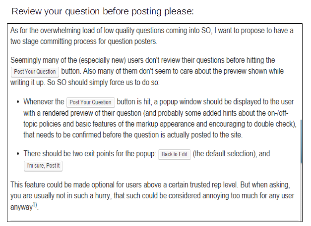
As for the overwhelming load of low quality questions coming into SO (here's a related question about why it's the current situation, and how to handle this properly), I want to propose to have a two stage committing process for question posters.

Seemingly many of the (especially new) users don't review their questions before hitting the Post Your Question button. Also many of them don't seem to care about the preview shown while writing it up (also there's the option to hide preview just above the rendered preview). So SO should simply force us to do so:

  • Whenever the Post Your Question button is hit, a popup window should be displayed to the user with a rendered preview of their question (and probably some added hints about the on-/off- topic policies and basic features of the markup appearance and encouraging to double check), that need to be confirmed before the question is actually posted to the site.

  • There should be two exit points for the popup: Back to Edit (the default selection), and I'm sure, Post it

This feature could be made optional for users above a certain trusted rep level. But when asking, you are usually not in such a hurry, that such could be considered annoying too much for any user anyway1).


I'm actually thinking of having a popup like follows:


<div> Perfectly rendered question within a stylish frame
Please be sure to confirm all of the following requirements before posting your question:

  • The question markdown is rendered as intended, code is formatted properly.
  • The question is on-topic regarding the policies stated in What topics can I ask about here?
  • My research found no duplicate on SO that particularly solved my problem.

    pull possible duplicates in from a Mechanic Turk as proposed here

  • The posted code was already debugged with all of the tools I have at hand, and the gained information doesn't help to solve my programming problem

    ... Aso, I'm open for better/more canonical proposals with these hints ...

Back to Edit I'm sure, Post it

</div>


There's surely potential on improving the hints, but I think all of the users here, who are actually are annoyed with LQ questions will find the right sentences, the OP should confirm.

It's kind of a contract an OP needs to sign, when posting a question to the SO site. And we can simply point them back to it, if the question actually violates this contract, they've been signing before.
People rarely do such wrong, at least not more than once. So I think this improves seriousness of the policies that have been setup for the SO site


1) I often found myself in the situation, I should better have reviewed completely what I'm posting, and immediately going back to the edit link to do some corrections.

50
  • 33
    If they don't care about the quality how will the popup change this? All it will do is mean they hit submit now. If there wasn't already a preview of what you are posting in the same screen you might have a point.
    – Joe W
    Commented Apr 1, 2015 at 18:10
  • 7
    They're not going to read anything you give them. The only thing that would remotely work would be to give them a quiz that they must pass before the question gets posted. But of course that idea has other problems and has been rejected.
    – Mysticial
    Commented Apr 1, 2015 at 18:14
  • 10
    @JoeW It will at least prevent those users who care, to hit Post Your Question unintentionally. Other's will be throttled an can't complain they are new users, and don't know how to use the site (see a recent sample: stackoverflow.com/questions/29397067/…) Commented Apr 1, 2015 at 18:20
  • 32
    I actually like this, as I almost always miss something after I posted (even though I do look at the preview) and need to immediately edit. Having you double check your work is a good idea. Also, the preview sometimes differs slightly from the final product. Commented Apr 1, 2015 at 18:22
  • 6
    @JoeW "There is a preview of your question ..." I well know, and mentioned it. But there's seemingly a wast number of users, that apparently don't care a lot (or even notice) it. Those need to be "stumped with their nose in the pee they'll leave". I'm pretty sure, for the sake of improvement none of the aware users asking a question would be really annoyed about taking the extra step (even better those who really care would appreciate it, as mentioned earlier and from other commenters). Commented Apr 1, 2015 at 18:47
  • 6
    @JoeW It would be interesting if someone could run a SEDE query on edits made within the initial grace period, that would tell us how many users already could benefit from such a feature. Commented Apr 1, 2015 at 19:03
  • 8
    In the review queues, the buttons are grayed out for a few seconds. Maybe the "I'm sure, Post it" button could work the same way. Would discourage hitting the button without reading the preview. Commented Apr 1, 2015 at 19:09
  • 6
    @JoeW "... just slow down the new post." That's an effect that should be appreciated, shouldn't it? Commented Apr 1, 2015 at 19:25
  • 7
    These new users you talk about are numpties - what they wrote looks perfect to them. Showing it to them again before posting is unlikely to improve the overall quality.
    – slugster
    Commented Apr 1, 2015 at 19:49
  • 5
    How about a series of checkboxes that must be correctly checked before a question can be posted..."There are no spelling/grammar mistakes", "I used tags relevant to my question", and "I have researched this by myself already", for example. Make them stop and think about their post.
    – Andrew
    Commented Apr 1, 2015 at 19:49
  • 6
    I like this. It's unobtrusive enough for established users, and also may help all users that care about quality. The comments certainly indicate that it's not only brand new users that don't get everything just perfect before the first post .... I know I catch typos and spelling in those first few minutes fairly frequently. What an effect it might have on the worst of the worst I'm not sure, but it sounds like it could only help.
    – Ajean
    Commented Apr 1, 2015 at 20:32
  • 7
    This isn't a bad idea. Of course nothing will change for people who don't care, but those that do might pause and fix a problem or two. I see a net gain, even if it's small, for this kind of forced proofreading.
    – jscs
    Commented Apr 1, 2015 at 20:47
  • 15
    Despite my annoyance with it elsewhere, I do think that the two stage commit with boxes to have some additional "yes" and maybe give pause to someone who can search for a duplicate again, realize that all of the post is one blob of text without line breaks or code formatting or open up a debugger is a good thing. It is too easy to post a question on Stack Overflow now. Raising the bar just a little bit (you have to look at what you are about to post and click five more times) may give us one better question out of a hundred but at 8k questions per day, that's 80 that don't make my eyes bleed.
    – user289086
    Commented Apr 1, 2015 at 21:20
  • 4
    @SantaClaus The problem with that is it's only going to hinder users that actually want to improve their post. The ones that will skip will skip, regardless of how many times they have to click. It should be built to focus on the users it will benefit, not the ones that will skip it. Those can't be helped.
    – Kevin B
    Commented Apr 1, 2015 at 21:53
  • 3
    @deW1 I think some of the more experienced users would appreciate this change. Perhaps the ability for users to choose whether to have this enabled when they reach a certain rep.
    – Yule
    Commented Apr 2, 2015 at 8:16

13 Answers 13

35

My understanding is that ability to quickly post a question has been considered one of key features a while ago, when Stack Overflow was created.

Podcast #23 is fairly straightforward about this (italic font in below quotes is mine):

the way we built the site, the really low friction nature of it...

I think every programmer should want this system to exist, again, for their own reasons, right? Like, they just want answers to their freakin' programming questions. They don't want to deal with a lot of stupid overhead, a lot of form logins, or searching a bunch of stuff. They just want a quick and dirty way to put in a question and get a reasonable answer...

On the other hand, I learned that above is not an absolute requirement.

For example, it has been compromised about two years after podcast when registration was introduced at SO, forcing users to pass through "form logins" prior to asking their first question:

I know SO's policy is "you don't have to register to ask questions,"

I have decided this policy no longer makes sense...

Given above, I would think that one-stage approach to ask question is not really a critically important feature and it's okay to compromise it to a degree.


While we're at it, I'd like to also address concern frequently raised in answers and comments over here, that askers of most troublesome questions would likely ignore suggested extra screen and click through it without reading.

While this assumption looks correct, I think that it is more productive to embrace idea that some cases simply can't be saved by any automatic system. Helping these users should involve human, for example Triage review, so we better ignore them in the context of this feature request.

3
  • 1
    ...for what it's worth, my personal experience with just dump what you typed system has been rather negative but I can't tell, maybe it's just me and maybe things typically tend to go better than that
    – gnat
    Commented Apr 1, 2015 at 22:31
  • 4
    " I would think that one-stage approach to ask question is not really a critically important feature and it's okay to compromise it to a degree." THX a lot for backing up! Commented Apr 1, 2015 at 22:33
  • 2
    @πάνταῥεῖ yeah. I think a lot of reluctance towards features like you suggested comes from these ancient times when SO just started. Things changed a lot since then (registration requirement being most prominent example)
    – gnat
    Commented Apr 1, 2015 at 22:36
18

My concern is that the people most in need of reading your excellent points will be the people least likely to do so.

2
  • 6
    But at least we can certainly nail them having missed it. Commented Apr 2, 2015 at 8:06
  • 4
    there seem to be a typo here, "most in need of reading..." should probably read "askers of the questions that should be deleted via triage..."
    – gnat
    Commented Apr 2, 2015 at 8:21
11

While I think this is a fantastic idea in principle, it wouldn't stem the tide of garbage that gets vomited on SO, for the simple reason, that 90% of the garbage comes from users (new and existing) so lazy, that they aren't even going to bother to read the text of your pop-up. When these users are confronted with this screen a few things could happen:

  1. They will immediately click the button on the left without reading the text or the button label, taking them back to their question to edit it, upon which they will reclick the 'Post Your Question' button, and then (again) without reading the text in the popup will click the right hand button and thus garbage will be born. I estimate this will happen roughly 40% of the time for new users.

  2. They will immediately click the button on the right without reading the text in the popup and thus garbage will be born. I estimate this will happen roughly 30% of the time.

  3. They will immediately click the button on the left without reading the text or the button label, taking them back to their question to edit it, at which point they will click the 'Post my Question' button again, and this time they may glance over the gist of your popup without actually absorbing what it means, and click the right hand button, and thus garbage is born (although with slightly more consideration than last time). I estimate that this will happen roughly 20% of the time.
  4. They follow the above scenario, and actually absorb the message of the popup, and work to improve their question so that when it is posted it actually might be answerable.1. I estimate this will happen the remaining 20% of the time.

The main problem as I see it, is that the barrier of entry for asking questions is too low. It's simply 'copy-paste my stacktrace and away I go'. They don't actually care if they get an answer or not, they just post on the off-chance that some sucker will do their work for them. To stem the tide of awfulness isn't easy, because it relies on the user to read and understand the site's standards, adhere to them, and most of all, to attempt to solve their problem on their own first.

When a new user who has a short term problem they need to solve quickly, they could do one of two things:

  1. Post a vaugely worded, misspelled, unpunctuated, unformatted question with a code dump of their entire application and the error message they are getting in 2 minutes and let those rep-seeking suckers do the googling for them while they make coffee.
  2. They could spend 5 minutes searching for their problem on Google and then find the answer to their problem (most likely on another StackOverflow question).

Which do you think that lazy people who haven't been trained to do debugging or proper coding technique or even basic rules of grammar are going to do?

Now, on the other hand if once they clicked the 'Post my Question' button on the pop-up and you were taken to a page with a big timer that counted down X number of minutes until their question was actually posted with a list of similar questions next to it and tips on how to debug coding issues, that is something I can see making a real impact on question quality.

TL;DR: Unless you put an actual concrete barrier in front of asking questions, rather than something you can get round in one button click, this won't solve anything.

1. However it is rapidly closed as a duplicate because they were asking how to handle a null pointer exception or similar.

To prove my point, how many people noticed that my percentages added up to 110%?

8
  • 2
    "To prove my point, how many people noticed that my percentages added up to 110%?" At least I didn't until I read this ;-) ... Commented Apr 2, 2015 at 8:30
  • 11
    A solution to people not reading the popup and simply clicking buttons until their question is submitted would IMO be to add checkboxes to the list in OPs post that a user has to click ("I did my research", "I checked the markdown", etc). Of course some people will not read that and just click all checkboxes, but there's an easy solution to this - simply include one box somewhere in the middle that says "I did not read any of this, please immediately suspend my account". And of course, the checkboxes should only be presented to users under a certain rep threshold.
    – l4mpi
    Commented Apr 2, 2015 at 9:03
  • 2
    Interesting point by l4mpi, and in addition of that, randomize the location of the checkboxes each time they are prompted.
    – Andrew T.
    Commented Apr 2, 2015 at 9:36
  • 11
    @l4mpi simply include one box somewhere in the middle that says "I did not read any of this, please immediately suspend my account". I love this <3<3<3 Commented Apr 2, 2015 at 9:45
  • 2
    Or disable the button for a few seconds, and the user will hopefully read what the popup says. Commented Apr 2, 2015 at 11:02
  • 2
    Randomized UI elements are an abominable UX practice that kill muscle memory. Furthermore, if all it takes is one mis-click to get an account suspended, we're going to have a lot of legitimate first-time askers getting suspended for no good reason. Which just adds to the already-considerable moderation burden.
    – Ian Kemp
    Commented Apr 2, 2015 at 12:01
  • 2
    @IanKemp it could easily be changed to something less lethal while keeping most of the impact, e.g. "block me from asking questions for an hour". And not increasing the mod burden would be simple - just ignore complaints from people who shoot themselves in the foot by failing to read.
    – l4mpi
    Commented Apr 2, 2015 at 12:16
  • 2
    If it helps that 20% of new users who care, is it not an overall benefit? The ones that are going to skip can't be helped, so I don't consider that a loss. They'll get cleaned up and shipped out by the new user posting thresholds.
    – Kevin B
    Commented Apr 2, 2015 at 14:55
10

A quality improvement proposal that actually has upvotes! There's been a growing trend over the past 6 months, they used to get voted into the ground but that's not been happening as strongly anymore. Some evidence that SO users are actually seeing the flood as a threat.

I'll try to crystallize the idea a bit, SO would stand a great chance to improve if it were not the first place where users look for help. But the second. Or preferably, third place. With the first place so often covered by copy/pasting the title of the intended question into the Google query box and reading the top 10 hits. And the second place so often covered by following up on what you read in those hits. Still need help? Then ask.

My imagined solution, matches your proposal, is to make asking a question at SO similar to the real world experience of having to step on your bicycle and peddle for a mile to get what you want. Say, doing the groceries so you can eat. Before you step on that bicycle, you're probably going to spend 5 minutes making a shopping list. And if you have to debug the avocado or the cheap beef cut you'll take 10.

Yes, slowing users down. In fact the intended approach by SE to solve the crappy front page problem back in June of last year, 6 to 8 weeks hiccuped at a "triage queue", stretched into 10 months without getting remotely close to a solution. They can't find the solution.

Are there other ways to slow users down? Well, yes. Wouldn't it be nice if users were rate-limited at asking questions proportional to their reputation? Strongly fair, the more positively you contribute the more you can expect from others. Say, a user with 1 rep can ask only one question per day. This requires solving the identity problem, also rather essential to actually being able to identify banned users that just create a new account to bypass the ban. Very hard to solve, other than banning IP addresses wholesale. But with a possible trivial solution: when you create a new account then you have to wait a day before you can ask.

None of this can actually be implemented by us. The only thing that seems to motivate SE these days are things that reduce the number of complaints they get in their email inbox. Coming up with a way to slow users down and reduce complaints is a pretty tall order, I doubt that it is possible. Only thing we can really do to compensate is complain more about the current state of affairs :)

4
4

The best argument in favor that I've come up with so far is that, once we have the full text of the question, we can do the "related" search and ask whether any of those past questions solves their problem. It's fairly common, in the web view, to be able to simply say "look under Related at the right" and close the question as duplicate. Encouraging users to check that themselves before hitting Send might be helpful.

(The app, as far as I can tell, doesn't display the Related list. That should be fixed. Also, it should be easier to pick from Related when voting duplicate, without having to cut-and-paste uri's.)

1

The big problem with this suggestion is that most users don't read. And the users that are posting rubbish on SO are exactly those kind of users.

So the only thing that this proposal achieves is annoying users like us who already make the effort to post good questions. Hence my downvote.

1
  • I agree. The users who play by the rules see one more barrier to posting, while the ones who mindlessly dump their code will only see another button to click. Commented Apr 2, 2015 at 12:07
1

I don't think that the popup, by itself, is going to deter many bad questions, because we already give advice to new people on how to ask questions. Repeating this advice will annoy those users who have already read it, and likely be ignored by those users who have ignored it the first time.

For a better cost benefit ratio, stackoverflow must try to distinguish between good and bad users, and only annoy the bad ones. Reputation is one such metric, but rather imperfect, because new users are not all bad, but easily scared off. Time spent authoring a question may be another.

I therefore propose that a question can only be posted after it has been in edit for at least 10 minutes (5 for experienced users, because they already know the FAQ). That is, from the time a user presses "Ask Question", he must interact with the site for 10 more minutes before he can post the question.

1

Seemingly many of the (especially new) users don't review their questions before hitting the Post Your Question button.

Before we go about optimizing a process, we should double-check our assumptions, or at the very least, we should establish a baseline for later comparison.

What is that ratio? Or another question could be, how many new users still post bad questions despite having previewed it multiple times?

Also many of them don't seem to care about the preview shown while writing it up (also there's the option to hide preview just above the rendered preview).

How many people use that feature? Do people even use it? Why was that feature even introduced in the first place? It could just be a leftover legacy artifact that makes no longer any sense to have any more?

If we can confirm that's the case, I'm all for deleting that "hide preview" option.

1

Users who post great questions already would rightfully be peeved by this feature ( and I just noticed you talked to this with " feature could be made optional for users above a certain trusted rep level." ).

But I do see potential in this feature being implemented conditionally.

It would be a great probationary tool for users with a history of asking sub-par questions. Sort of a "Hey you! Do you really think this is an acceptable and well-prepared question? Because you have been submitted alot of low-quality questions.

Even if we quell only 2% of the garbage-tossers, that adds up immensely in the long run.


Let's do some Math:

StackOverflow gets 5000 questions a day.

Suppose 1000 of these are garbage

Editing time on these 1000 Low-Quality-Questions(LQQ), by other users is 5 hours (we assume a janitorial edit takes 18 seconds here).

We cut this down to 2.5 hours with the popup box.

2.5 hours * 365 = 38 days saved!

Could easily be months-worth of editing time on the LQQ.

And once the user finally improves their questions, remove the popup preview box.

All in all, we need to at least push back against the tide of lousy questions.

1

What about, until a user has asked 5 "good" questions, or got 200 rep.

When they ask a question.

  • it get saved to the database
  • they get a email that
    • lists the top results from google for the title
    • shows the contents of the "related question panel"
    • links to the more frequent questions for the chosen tags
    • tell them that they will get anther email in 10 minutes time that has a code (to type in, not a link to click) they can use to make their question public, if they have not found the solution by then.
1
-3

There is one thing you must consider here: people do not read.

Hell, I don't and I am an active high reputation user. I just click around to close any popups or hints that are shown to me.

Why would you expect a person who cannot speak, read or write proper English (which many low quality posters cannot) read anything you show them in English?

(Edit: This post is proof, after posting I realised that pretty much every other answer says the same, but did I read even the first line of each, which is what it took to understand? Nope)

13
  • 4
    Seems like you didn't realize that there are suggestions on how to deal with users that should read but don't...
    – l4mpi
    Commented Apr 2, 2015 at 11:41
  • @l4mpi in the question? I don't see it, if in the comments then what irony...I didn't read it...
    – Sammaye
    Commented Apr 2, 2015 at 12:50
  • 1
    In the comments to the question and to other answers. See e.g. my comment here. And before you respond to that one, please read the following comments as well.
    – l4mpi
    Commented Apr 2, 2015 at 12:55
  • @l4mpi whatever you do people will find a way. I have to tick boxes on many other sites and whatever, I even do the new Google captcha without ever reading it and that is supposed to require reading. There is no solution to this problem so long as you cannot get them to recite it over Skype or something. Not only that but those who do read normally only read 2 words from the start, middle and end and then assume the definition and meaning of the sentence...
    – Sammaye
    Commented Apr 2, 2015 at 14:42
  • I'm not sure you did read the linked comment thread; it's also suggesting to add boxes you explicity don't have to tick or you'll face a penalty (being unable to ask for an hour or worse; and only enabled up to a rep threshold of course). Anyways, of course people will always find a way around anything, but the goal is to raise the bar so that the worst offenders get filtered out.
    – l4mpi
    Commented Apr 2, 2015 at 15:09
  • @l4mpi "A solution to people not reading the popup and simply clicking buttons until their question is submitted would IMO be to add checkboxes to the list in OPs post that a user has to click" was the only realy thing that stood out as having any chance after 7 comments. I have tried many of these things, I know they don't work. And then randomising it is just even worse
    – Sammaye
    Commented Apr 2, 2015 at 15:15
  • @l4mpi I will also stand by that even a minimal ban will rsult in a bad effect. As I said I wouldn't read it, does that mean I should be banned/suspended for an hour?
    – Sammaye
    Commented Apr 2, 2015 at 15:19
  • 1
    You personally shouldn't because you have demonstrated you're a valuable contributor by getting 24k rep. 1-rep users or users with a history of bad questions totally should.
    – l4mpi
    Commented Apr 2, 2015 at 15:23
  • @l4mpi but then imagine I was a new user, considering what I could be now, should I have got suspended for not reading?
    – Sammaye
    Commented Apr 2, 2015 at 16:16
  • Yes, of course - that's a big indication they didn't read anything else, like the tour, the related question list, etc. What would be the problem with a simple message like "You're obviously not paying attention, please take a one hour break, review those resources that might help you [links to related questions, a google search of the title, etc], and carefully read the tour and our rules"?
    – l4mpi
    Commented Apr 2, 2015 at 16:22
  • @l4mpi the thing is when I came here I was desperate, I was tired and fed up with a bug. I wasn't really in the mood for reading, as such if you had done that to me when I first joined I would probably have just walked off and joined Quora or Daniweb or something. My value as a contributor would have been lost. That is the problem with this, do you manually filter out bad users and massage the good ones that might be failing at the site rules or do you block everyone and lose value new members who could add real value?
    – Sammaye
    Commented Apr 2, 2015 at 19:21
  • 1
    @l4mpi I should also mention that I have actually written bad questions myself, ones that actually seemed ok to me but when put to the community were really bad
    – Sammaye
    Commented Apr 2, 2015 at 19:23
  • Well, according to your profile you joined SO almost five years ago when the site was much smaller and less known than today. Back then it was also way more important for SE to attract new members to acquire critical mass. But currently every dev worth a damn knows and uses SO (at least passively via google), meaning they won't/can't just turn away; and it's far less important for the site to grow in pure volume. Thus I don't see a problem with throwing a few sticks into the path of users who don't carefully study the site before asking; if that makes them go to quora instead, it's their loss.
    – l4mpi
    Commented Apr 2, 2015 at 22:27
-6

No.

Please, just, no. You really want to discourage new users by introducing an annoying modal window? If they're not proof reading their questions now, what makes you think they will with a "2 stage questions commit process"?

Did a modal window or alert ever helped you? Personally, I find solutions like that obnoxious.

I do, however, agree that we should help new users, or users that aren't fluid in English. Not only for them (i.e. they would get less downvotes) but also for the overall quality of SE sites.

My alternative proposition is to show the preview next to the answer box for larger screen resolutions. We don't have to get exotic here, the post editor is set to a fixed width of 660px.

4
  • 11
    "You really want to discourage new users by introducing an annoying modal window?" A thousand times yes. I want to discourage the users that are unable to write a decent question and/or unwilling to read through the help center or otherwise attempt to improve. Sadly, those make up a huge percentage of new users.
    – l4mpi
    Commented Apr 2, 2015 at 12:08
  • That's a very sad point of view IMO, you should guide your users rather than write them off as unable. If the current system are not working, maybe try and fix the system rather than the users?
    – thomaux
    Commented Apr 2, 2015 at 14:00
  • 5
    "you should guide your users rather than write them off as unable" - how would you propose to do that in case of people who copypaste their homework assignment as a "question"? Or users who have any kind of error and ask a SO question before even googling? Or users who are so new to programming that they don't have the slightest idea what they're doing and could only ever hope to copypaste an answer, or get a tutorial-length explanation? Fact is, SO is not for everybody as we do have quality requirements, and many people are unable to meet them - which is no reason to lower the SO standards.
    – l4mpi
    Commented Apr 2, 2015 at 14:44
  • 1
    @l4mpi your note reminded me of a guy who "was warned 15 times..." Fifteen friggin' warnings, shoot straight into their face from Ask Question page, go figure. "...Didn't stop him from banging his head against the wall though..." The only way to "help" folks like that is probably to bury their questions in Triage and delete right in this queue
    – gnat
    Commented Apr 2, 2015 at 17:19
-8

There's already a preview button in the app. There's a preview box in the web page. How many who think forced preview is a good idea are actually using that now -- and if not, why not? (I tend to use it mostly to check formatting; I count on edit to correct typos. )

1
  • 1
    The preview button in the app is right next to the 'post your question' button, and guess which one people are going to press ? Commented Apr 2, 2015 at 9:03

You must log in to answer this question.

Not the answer you're looking for? Browse other questions tagged .