17

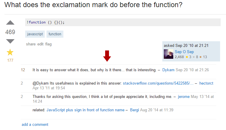
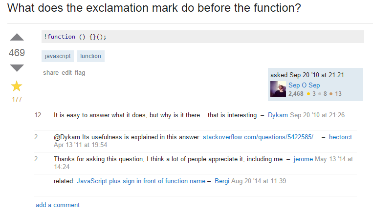
Since the new design update I found myself reading the first comment as being part of the question a few times. A divider would be a better indication that you're at the comment section.

Current situation
enter image description here


Proposed situation

enter image description here

It's also more consistent with the look and feel of the other comments, the current situation makes the first comment stand out.

3
  • Meh. It's pretty clear to me, what with the tags and the user card being in between. Commented Jan 17, 2015 at 15:15
  • 6
    It's not so clear when you're tired or the post contains other images.
    – Jonathan
    Commented Jan 17, 2015 at 15:18
  • 1
    Don't SO while tired perhaps? Really, its just a question of getting used to the design. The user card and tags are much clearer visual indicators where a question ends and the comments start than a thin grey line. Commented Jan 17, 2015 at 15:23

1 Answer 1

6

I have added a divider line per your suggestion. It will be on live after the next production build.

You must log in to answer this question.

Not the answer you're looking for? Browse other questions tagged .