347

As you can see, Meta.SO looks a bit different today. Over the years I've gotten a lot of requests to "redesign" Stack Overflow. I've always felt SO's site design had good usability and was very functional. However, I did and do agree, aesthetically, it could use some polish.

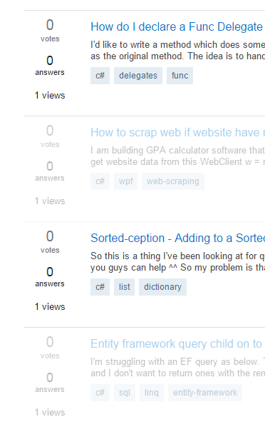
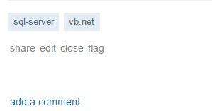
Today's new Meta theme release is a preview of what the new SO main site theme will be. As you can see, it still feels like Stack Overflow. Most changes are for typographical consistency, white spacing and layout. It may take a little getting used to but hopefully if you give it a few days you'll like it better.

We've also refined the Stack Overflow logo slightly for better kerning and a more relaxed curve on the mark. We've updated site icons to svg (with png fallback) to finally get scalable retina support. I feel this is a better approach than using x2, x3..xN pngs since it's more maintainable.

Underneath the skin, I've been reworking our LESS/CSS structure as well. The newly refactored set up would allow us to fix SE Q&A sites' CSS bugs more efficiently and be a lot more bug free when we launch a new site.

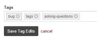
We want your feedback. This is still a work in progress. There are going to be styling or CSS bugs, so if you find any please tag them with and so we can fix them as soon as possible.
77
  • 161
    Can we have the ugly meta logo back? Commented Nov 19, 2014 at 1:21
  • 83
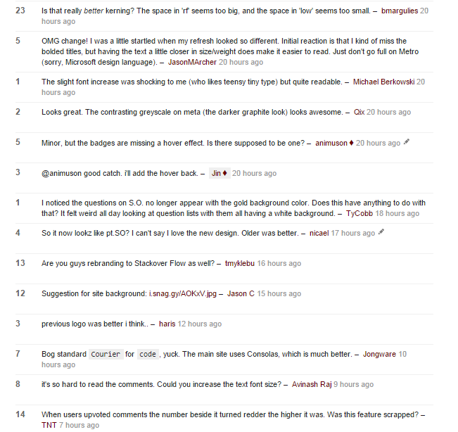
    Is that really better kerning? The space in 'rf' seems too big, and the space in 'low' seems too small.
    – bmargulies
    Commented Nov 19, 2014 at 1:25
  • 18
    OMG change! I was a little startled when my refresh looked so different. Initial reaction is that I kind of miss the bolded titles, but having the text a little closer in size/weight does make it easier to read. Just don't go full on Metro (sorry, Microsoft design language). Commented Nov 19, 2014 at 1:28
  • 12
    Minor, but the badges are missing a hover effect. Is there supposed to be one?
    – animuson StaffMod
    Commented Nov 19, 2014 at 1:38
  • 11
    So it now lookz like pt.SO? I can't say I love the new design. Older was better.
    – nicael
    Commented Nov 19, 2014 at 4:23
  • 34
    Are you guys rebranding to Stackover Flow as well?
    – tmyklebu
    Commented Nov 19, 2014 at 4:53
  • 53
    Suggestion for site background: i.snag.gy/AOKxV.jpg
    – Jason C
    Commented Nov 19, 2014 at 6:37
  • 14
    previous logo was better i think..
    – Haris
    Commented Nov 19, 2014 at 8:59
  • 37
    Bog standard Courier for code, yuck. The main site uses Consolas, which is much better.
    – Jongware
    Commented Nov 19, 2014 at 11:29
  • 26
    it's so hard to read the comments. Could you increase the text font size? Commented Nov 19, 2014 at 12:03
  • 44
    When users upvoted comments the number beside it turned redder the higher it was. Was this feature scrapped?
    – TNT
    Commented Nov 19, 2014 at 13:55
  • 13
    Maybe my eyes are tired after a long day at the keyboard, or maybe it's just psychosomatic but... The comment font seems worse, maybe it's a different size or font or the anti-aliasing is different, but it definitely seems less readable.
    – Klors
    Commented Nov 19, 2014 at 18:31
  • 13
    Can I assume this just went live on SO? Commented Jan 16, 2015 at 2:59
  • 16
    Why did this go live on SO when there were apparently still so many issues (which didn’t get fixed on SO)? Also, can we get a new question to discuss this since this one is old and so overused already? It’s hard to navigate.
    – poke
    Commented Jan 16, 2015 at 7:06
  • 16
    I'll let my eyes speak: Pre update they didn't hurt, now they hurt when trying to read through the front page. Yes I am serious and I think it's a big issue.
    – Jite
    Commented Jan 16, 2015 at 13:54

85 Answers 85

15

Now I'm barely able to see the difference between read and unread questions in the list, especially with my crappy monitor, unless I move the mouse over them.

This is the most annoying thing with the update, and Jakob Nielsen would probably have a couple of things to say about it.

1
15

Me gusta.

Couple of things (note: I'm not a designer, this is just the stuff that I found slightly quirky):

  • Perhaps the buttons (add comment / post answer) should be made flat? They look different from the rest of the site, which was the case in the previous design as well and a bit strange. Now that tags are flat too, I think the buttons should follow suit.
  • Community bulletin might need some shifting downwards. Maybe.
  • Margins on the text area make it feel like there's additional space which I need to remove, but I suspect that's just me being used to the old design

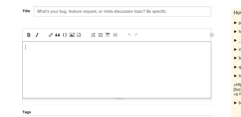
Also, the ask question page has two issues:

enter image description here

Firstly, the help question mark is floating in the wrong place (Firefox, Ubuntu).

Secondly, the "Title: <textbox>" part looks a tad off — it might be better if the title part was above the textbox, rather than next to it (like the layout of the tags box)


Edit:

The markdown help box is still off a couple months later on Firefox (35.0.1). Here's a couple pics to demonstrate the problem and a quick fix suggestion:

Markdown help opened up

Changing the pixels on inline styles from:

<li class="wmd-button wmd-help-button active-help" id="wmd-help-button" style="right: 0px; left: 639px;" title="Markdown Editing Help">
  [...]
</li>
<div class="mdhelp" id="mdhelp" style="right: 0px; width: 672px; top: 41px;">
  [...]
</div>

to:

<li class="wmd-button wmd-help-button active-help" id="wmd-help-button" style="right: 0px; left: 626px;" title="Markdown Editing Help">
  [...]
</li>
<div class="mdhelp" id="mdhelp" style="right: -13px; width: 660px; top: 41px;">
  [...]
</div>

Helps fix the position, but the border on the right and left side of the Markdown help box are still lighter than the input box as a whole.

Markdown help quick fix

5
  • What OS/Browser/ver are you using? I noticed the (?) icon is off.
    – Jin Mod
    Commented Nov 19, 2014 at 1:32
  • @Jin Firefox 32.0.3 on Ubuntu. It's also off on my trunk build of Firefox. Commented Nov 19, 2014 at 1:35
  • 3
    Weird, but I always have a problem finding flat buttons on SO, of course it's just a second or two a delay but 3Dish buttons are much more obvious for me.
    – exebook
    Commented Nov 19, 2014 at 4:17
  • @Jin Added some more details in the answer about the markdown help issue.
    – t0mppa
    Commented Feb 1, 2015 at 19:22
  • This still hasn't been fixed...
    – apaul
    Commented May 6, 2015 at 18:09
13

Can this please be a little more grayscale -- or at least a different color than Stack Overflow? Switching sites, each has a different design. Metas are usually grayscale. But when going from Stack Overflow to Meta Stack Overflow... there isn't too much of a difference, color scheme wise. It looks the same.

Can we get at least some visual indicator (other than the logo) that we changed sites and went to meta?

8
  • 2
    I just notice the icons in the sprite are not gray scale. I'll be updating that tomorrow.
    – Jin Mod
    Commented Nov 19, 2014 at 2:24
  • @Jin nice. Out of curiousity: which icons are we talking about?
    – hichris123
    Commented Nov 19, 2014 at 2:26
  • 2
    No! Grey makes it seem evil and horrible.
    – bjb568
    Commented Nov 19, 2014 at 2:28
  • @hichris123 for example, the active state of the up vote arrow, favorite star, comment upvote, (x)close icons.
    – Jin Mod
    Commented Nov 19, 2014 at 2:29
  • I will state, that setting the background color for posts and the main body to #F5F5F5 actually looks pretty good...
    – Makoto
    Commented Nov 19, 2014 at 2:31
  • 15
    Yeah! Evil and horrible. Like meta. @bjb568
    – Shog9
    Commented Nov 19, 2014 at 2:31
  • @Makoto That does look nice. Might userscript it if it stays white.
    – hichris123
    Commented Nov 19, 2014 at 2:33
  • Meh, colors help people process information better. Fine, make it a different color, but not greyscale.
    – bjb568
    Commented Nov 19, 2014 at 21:18
13

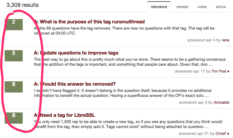
When using search, accepted answer highlighting truncates the score box:

Truncated score box

It particularly stands out as odd when mixed with results that include questions and unaccepted answers.

1
  • Oh. Linked images (such as the one in the answer) need to be underlined and/or clearly indicated. There's a link in the final paragraph that's not obvious as well. (I'm guessing there are other answers that provide that feedback.)
    – Jon Ericson Staff
    Commented Nov 19, 2014 at 17:03
13

Why are comments so tiny? No offense, but I don't really want to up the zoom in my browser just to read the comments. (chrome ver. 38.0.2125.111)

enter image description here

13

Comment vote count colors seem off (I know this was mentioned in a comment on the question, not 100% confident that it hasn't already been mentioned in an answer; sorry if so):

enter image description here

Notice they fade to red in the 20s-30s but then head back to black. The fading back to black doesn't seem right. I expected redder (and possibly bold) for higher vote counts.

This seems to have changed, by the way, since the time this feedback post was originally created. Right after the announcement was made I didn't see any red in there at all. I might be mis-remembering. It looks like some red was added back in, but only in the middle range (shown above) and not the upper range.

12

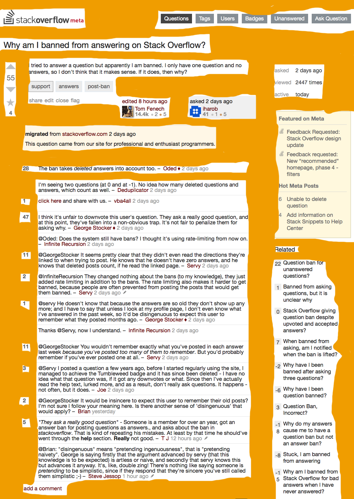
Too much whitespace

Decrease margin:

  • Around voting/starring controls, between arrow and number too
  • Around the migrated banner
  • On the left of the page
  • Between editor and OP
  • Between "asked", "viewed", and "active"
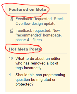
  • Between the right edge of text and the container of the featured/hot meta posts and related questions
  • On the right of the comments

Not sure what to do with the nav, it looks weird. Maybe a border-radius on the links.

2
  • 13
    Very ugly screenshot Commented Nov 20, 2014 at 3:27
  • 1
    The “asked”, “viewed” and “active” margins seem ridiculously big to me. I cannot see the whole featured and hot posts box from initial viewport anymore.
    – Palec
    Commented Nov 22, 2014 at 12:28
12

From this post, you can see that stacking margins are a little ridiculous:

There's actually another <p> wrapping the <sub> but that's not part of the issue.

To reduce this gap, we could add the following rule:

.post-text img:last-child, .wmd-preview img:last-child {
    margin-bottom: 0;
}

I'm not sure what (if anything) to do about <sub>.

12

One bothersome problem with the changes you put in place overnight. The contrast between questions you've viewed and those you've not viewed is virtually nonexistent. This significantly hinders usability. (As does the new fonts, etc.)

1
12

The web icon is smaller and fuzzier, I presume that has to do with the conversion to SVG. I happened to have an old tab next to a new one so I could do a direct comparison, new on the left and old on the right:

tab icon comparison

This is with Chrome on Windows 7.

2
  • 1
    I didn't notice it, but you're right. Right now one wouldn't recognize what does webicon represent if didn't know the original SO icon.
    – Yoda
    Commented Jan 16, 2015 at 22:48
  • I agree, the new favicon is very blurry and small.
    – Cyral
    Commented Jan 16, 2015 at 23:24
12

I stumbled upon another bug which I've looked for already in the answers here, but not found. When viewing the upvotes/downvotes, if the up or downvote number is too large the plus sign/minus sign disappears.

What happened to the minus sign?And the plus sign...

That looks like 59 upvotes and ... 110 red upvotes?

IN ADDITION: Having recently asked a question with the new style on the main site, I was quite discomfited by the difference in font size and line wrapping between the editor window and the resulting post - I like to format my code so that horizontal scroll bars aren't necessary, but the editor wraps before that:

enter image description here

For simple code like this it was okay, but more complicated code would start to look awful in the editor window.... (Firefox 35.0.1)

11

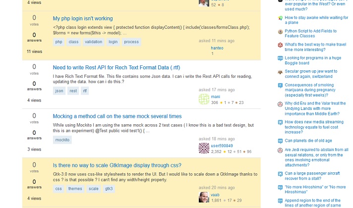
Please change the interesting/favorite tags question background to rgba(255, 235, 162, 0.7) instead of rgba(255, 245, 222, 0.7)

This orangeish color is way better.

  • it's way easier to read
  • it's more exciting color (hence favorite tag question!!)
  • the pinkish current color is just awful too be honest, hard to read, favorite tag questions should be easier to read then normal questions, not harder!
  • when I think of SO, I think of the color orange, orange is in the logo!

See how much better this looks below with rgba(255,235,162,0.7)! :

enter image description here

11

Is it just me, or did MSO get fatter?

The entire UI looks wider than it does on SO. This is especially noticeable if you toggle tabs between MSO and SO, looking at the top bar.

This gets quite annoying when toggling between SE tabs, as every other site (to my knowledge) is 990px, and now SO is 1030px.

6
  • It's fatter for me too Commented Nov 19, 2014 at 10:21
  • I think the UI should be still wider. Current design was made when majority monitors were 4:3. Now almost everyone has 16:9. Ratios must change too. Otherwise we are wasting precious screen real estate. Commented Nov 19, 2014 at 13:58
  • @Krumia I'm not saying it's bad. I'm just notifying them of the difference, in case it wasn't intentional.
    – Scimonster
    Commented Nov 19, 2014 at 14:40
  • 7
    It's not fatter, it's just the new pants ;) Commented Nov 19, 2014 at 15:57
  • @Krumia: Better still, not wider, but fluid. Commented Nov 20, 2014 at 8:42
  • 3
    The width of <div id="content"> was increased from 980 to 1000px.
    – user3717023
    Commented Nov 20, 2014 at 17:00
10

Apologies if this has already been brought up, but the lack of monospace font when composing something really annoys me. Using italics (like this or this) just doesn't look right:

enter image description here

It actually kind of brings back memories of phpBB forums:

enter image description here

Which is not a good thing to make me remember. So please bring back the monospace font in composing areas. I really like most of the other changes, nice work!

1
10

On the answer editor clicking on the "Markdown Editing Help" button, the spacing between the yellow bar and the text box is incorrect, cutting the text on the first line.

Chrome 38.0.2125.122, OSX 10.10.1

enter image description here

10

My 4 cents.

  • Lack of- or too dull hover effects on interactive elements.
  • Links are hard to distinguish or even indistinguishable from normal text. It was already an issue with old SO - design change should be made in opposite direction.
  • Fonts of elements indicating important actions (e.g. Post Answer, Ask Question buttons) should be bold, like they were before. Current look highlights less important things with bold font (like "Send me new responses to my posts via email" under this box).
  • New logo looks sad and hesitant.

    New logo

    Brave old one as posted by @msrd0.

    Old logo

1
  • 7
    Really dislike the changed logo. Such a petty thing, but just wanted to register my complaint. It's too small, suffers from bad aliasing, and now has a stack that wanders off at some quirky angle and looks unfinished.
    – PaulG
    Commented Jan 16, 2015 at 16:38
10

The buttons are too bright

The buttons in the reivew queues are too bright. You can hardly read the text. If the button is greyed out (more like "blued out" in this case) it's nearly impossible to tell, what the text is supposed to say without squinting.

10

Why does editing a comment look so different from the actual comment. I'd like it to at least use the same font (incl. size).

edit

comment

0
9

It's too easy to mis-click the upvote arrow. If you click just slightly above the actual arrow you're hitting some white space...

enter image description here

Although I am not sure this is something new but I have never really noticed that before.

9

Am I the only one who has difficulty reading Helvetica Neue at font size 15?

This is the 50th answer, but the first one (that I've found having read through the other 49) bringing up the current main question/answer font (which has been the same for a while I assume). If you are going to do a redesign, my main concern would be to replace this as the first font (obviously I can do things on my end to make sure I never see it, but this isn't just about me).

I feel like maybe I am going insane because nobody else has brought this up, at least here in this question. To explain, let me repost some sentences that gave me headaches from the first few answers here. In the second sentence of each example listed below, I've typed lowercase L instead of I:

MSO's got its business suit and tie on

MSO's got lts buslness sult and tle on

It looks like normal text unless you've visited it.

lt looks llke normal text unless you've vlslted lt.

(There are some screenshots further down if you have a different screen/browser than mine.)

I can barely tell the difference between these sentences if I look close - lowercase i looks just like lowercase l.

(On top of this the font in general looks like everything is written in bold, but that's not a big issue for me).

I've had this problem before with uppercase I and lowercase l before, like reading Kim Jong Il as Kim Jong the 2nd (as a U.S. president once read it, I'm assuming they printed his script in Arial or something). But never with lowercase i. I can't see the dot.

I wondered if maybe it was Google Chrome, but it is even worse in Firefox. I'll post some actual screenshots here in case other people aren't seeing this like I am on their screens:

Chrome Helvetica Neue Screenshot 1: Chrome Helvetica Neue Screenshot 1

Chrome Helvetica Neue Screenshot 2: Chrome Helvetica Neue Screenshot 2

Firefox Helvetica Neue Screenshot 1: Firefox Helvetica Neue Screenshot 1

Granted, I have problems in general with the entire Internet being obsessed with whitespace!!! when I have 30ish eye floaters swimming across my vision, but this is the worst readability issue I've come across in a long time.

To delve into this a bit deeper, I looked at what is actually being rendered by blowing up the 2nd Chrome screenshot:

Chrome Screenshot Enlarged

There's a pixel (or a few pixels maybe) almost as black as the dot in the i connecting the dot and the main portion of the i, so I guess it isn't just my eyes.

Anyway, if nobody else has this problem it does at least make for hilarious reading on my end.

1
  • 1
    I think the font looks alright on the main page, but the font size used for questions makes it unreadable.
    – Slapout
    Commented Nov 24, 2014 at 14:10
8

It's nice, though I feel that the border on the required and moderator tags should be wider. And, the text area really needs to be monospace again.

Current tag appearances:

<head>
  <link href="http://meta.stackoverflow.com/content/stackoverflowmeta/all.css?v=807be6a0d832" rel="stylesheet" type="text/css">
  <script src="http://meta.stackoverflow.com/content/Js/full.en.js?v=a587329010b1" async=""></script>
</head>

<body>
  <div id="tags-legend">

    <b>Legend</b>
    <span>
      <a title="this is a moderator tag; it can only be added to a question by a ♦ moderator" class="post-tag moderator-tag">moderator-only-tag</a>
    </span>
    <span>
       <a title="this is a required tag; every new question must have at least one required tag" class="post-tag required-tag">required-tag</a>
    </span>
    <span>
      <a title="this is a standard tag; every question must have at least one tag" class="post-tag">tag</a>
    </span>
    <span>
      <a title="show all tag synonyms" class="tag-synonym-link" href="/tags/synonyms">tag synonyms</a>
    </span>
  </div>
</body>

Actual tag borders: Currently width of 1px

With border size increased to 2 pixels:

.moderator-tag {
  border-width: 2px !important;
}
.required-tag {
  border-width: 2px !important;
}
<head>
  <link href="http://meta.stackoverflow.com/content/stackoverflowmeta/all.css?v=807be6a0d832" rel="stylesheet" type="text/css">
  <script src="http://meta.stackoverflow.com/content/Js/full.en.js?v=a587329010b1" async=""></script>
</head>

<body>
  <div id="tags-legend">

    <b>Legend</b>
    <span>
      <a title="this is a moderator tag; it can only be added to a question by a ♦ moderator" class="post-tag moderator-tag">moderator-only-tag</a>
    </span>
    <span>
       <a title="this is a required tag; every new question must have at least one required tag" class="post-tag required-tag">required-tag</a>
    </span>
    <span>
      <a title="this is a standard tag; every question must have at least one tag" class="post-tag">tag</a>
    </span>
    <span>
      <a title="show all tag synonyms" class="tag-synonym-link" href="/tags/synonyms">tag synonyms</a>
    </span>
  </div>
</body>

Borders of 2px

8

At the flag summary, the indicator for an active flag looks like this:

Indicator for active flag

The grey-brown foreground is not very readable on the orange background. Can the foreground please get another color?

8

The "This question has been deleted - no more answers will be accepted." banner looks out of place:

enter image description here

A little styling there (maybe center the text vertically) would really help.

1
  • 1
    They probably forgot to style it because the slidey messages aren't supposed to exist anymore. They should just get rid of that and implement a better alert.
    – animuson StaffMod
    Commented Nov 25, 2014 at 16:31
8

BUG:

The tags when using inline tag editor have poor margins:

cramped

Currently, .tag-editor .post-tag has margin: 6px 3px 0 3px;. It would look better with margin: 3px;. The parent .tag-editor, which appears to be styled via js, needs height: 33px; rather than height: 30px;. That looks like this:

fixed

8

Selecting 'ignored tags as grayed' results in far too low of contrast.

enter image description here

Even though I want to (semi) ignore them, I do want to be able to read them. The low-low-low contrast forces the eye to linger on them in order to make it out. The result is eye strain, headaches, and twice now (so far), ocular migraines (not kidding one bit). I havent had one in 2 years until this change.


Also, and this may already be in this long, long list of gripes, but the "actions" menu on posts doesnt look like a menu:

enter image description here

The spacing makes it look like a string of words; and the choice of grey implies Disabled. I know it is a menu, but a new user may not and we already have enough trouble getting with new users being able to easily edit their posts.

The grey did cause me a moment of pause when I saw it in a review queue.

3
  • 1
    On the other hand, answers with score -3 are not grayed as they used to be (for example).
    – TLama
    Commented Jan 17, 2015 at 22:16
  • I had not noticed that, but I have had to curtail the time spent on SO as a result of the changes and make that time count. So no time to browse The Wonderfullness of It All. Commented Jan 17, 2015 at 22:22
  • I've "fixed" this by setting opacity: 0.5 for .question-summary.tagged-ignored. It still grays out the question, but it's slightly more readable. Commented Feb 1, 2015 at 16:20
7

<H3> doesn't look like a subtitle anymore. Well, it sorta does, but it's very subtle. Bold actually works better.

Compare:

This is an H3 Title

Here is some text. The quick brown fox jumps over the lazy dog. The quick brown fox jumps over the lazy dog. The quick brown fox jumps over the lazy dog.

With:

This is a Bolded Line

Here is some text. The quick brown fox jumps over the lazy dog. The quick brown fox jumps over the lazy dog. The quick brown fox jumps over the lazy dog.

This broke some of the FAQ posts; I had to go back and fix them. Examples:

https://meta.stackoverflow.com/a/255746
https://meta.stackoverflow.com/a/271543

1
6

Can this font be made to match the rest of the site?

enter image description here

It doesn't seem to have changed - I don't think it matched anything before, and still doesn't seem to now.

0
6

Something (the new font?) makes my previously 3 line paragraphs become 4 line ugly paragraphs.

I sometimes carefully craft them and now they are all broken. Applies to everyone's answer, it's just few people actually revisit them and continously remember the old readability so they don't take notice.


[update 1] I saw font-size was 107%, 13.7px for me. Now 15px. Setting it back seems to fix this.

1
6

I assume syntax highlighting was changed along with the overall design. I'm not a big fan of green html tags:

Source: DOM 'disabled' property in javascript.

The relevant style:

.tag {
    color: #4c9067;
    font-weight: bold;
}

Is this scheme borrowed from a popular editor?

0
5

I don't know if it's just the calibration of my monitor, but deleted answers are too pink for my liking... If anything it makes it look like the deleted answer is more important than the other answers.

Current

1
  • 1
    I rather like the different shade, but I try to calibrate all my monitors perfectly, and we can't expect everyone to do that. Nice observation.
    – Undo Mod
    Commented Nov 19, 2014 at 18:59

Not the answer you're looking for? Browse other questions tagged .