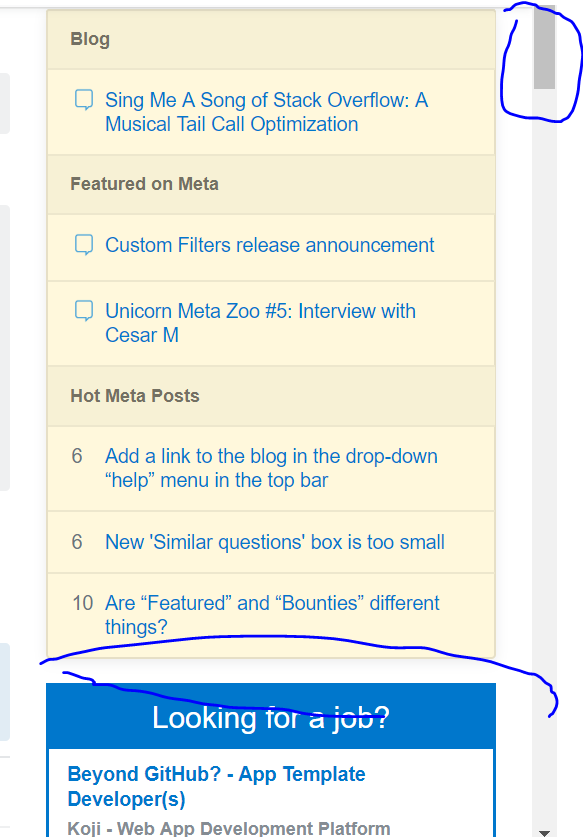
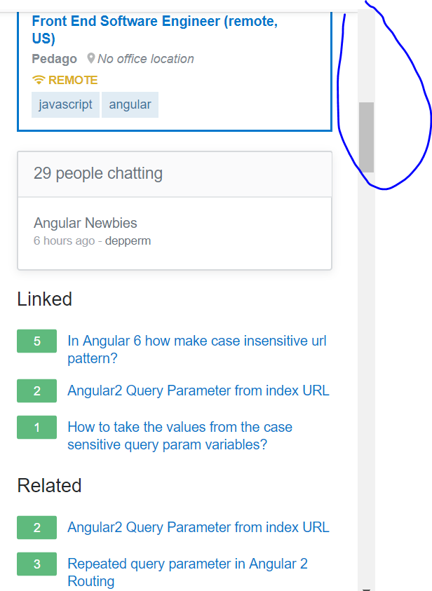
Here's a fancier user style for de-cluttering the sidebar only on small screens, which I kind of hope SO might some day adopt:
/* for users with left sidebar enabled */
@media screen and (max-width: 980px) {
    html.html__responsive:not(.html__unpinned-leftnav) #sidebar > div:not(.module):not(#feed-link) {
        display: none;
    }
}

/* for users with left sidebar disabled */
@media screen and (max-width: 816px) {
    html.html__responsive.html__unpinned-leftnav #sidebar > div:not(.module):not(#feed-link) {
        display: none;
    }
}
The max-width media queries and the beginning of the selectors inside them are copied from the SO style sheet, and cause these styles to only apply on screens where the sidebar is moved below the main content. (Nobody ever scrolls down there anyway, unless they really want to see the linked questions, so it's unlikely that SE would lose any ad revenue by adopting these styles.)
Note that this style also hides the yellow box with links to blog and meta posts. If you'd like to keep it, append :not(.s-sidebarwidget__yellow) to the selector(s).
(Conversely, if you'd like to always remove ads and the yellow meta box from the sidebar, even on wide screens, you don't need all that fancy CSS above; a simple #sidebar > div:not(.module):not(#feed-link) { display: none } will do. Add #sidebar > #hot-network-questions { display: none } if you also wish to hide the HNQ sidebar.)


