I don't like changes so I decided to hide the new shiny left navigation and to keep the good old design with 2 columns instead of 3.
After hiding the left navigation I noticed that the main Q&A page stretches differently than the question page.
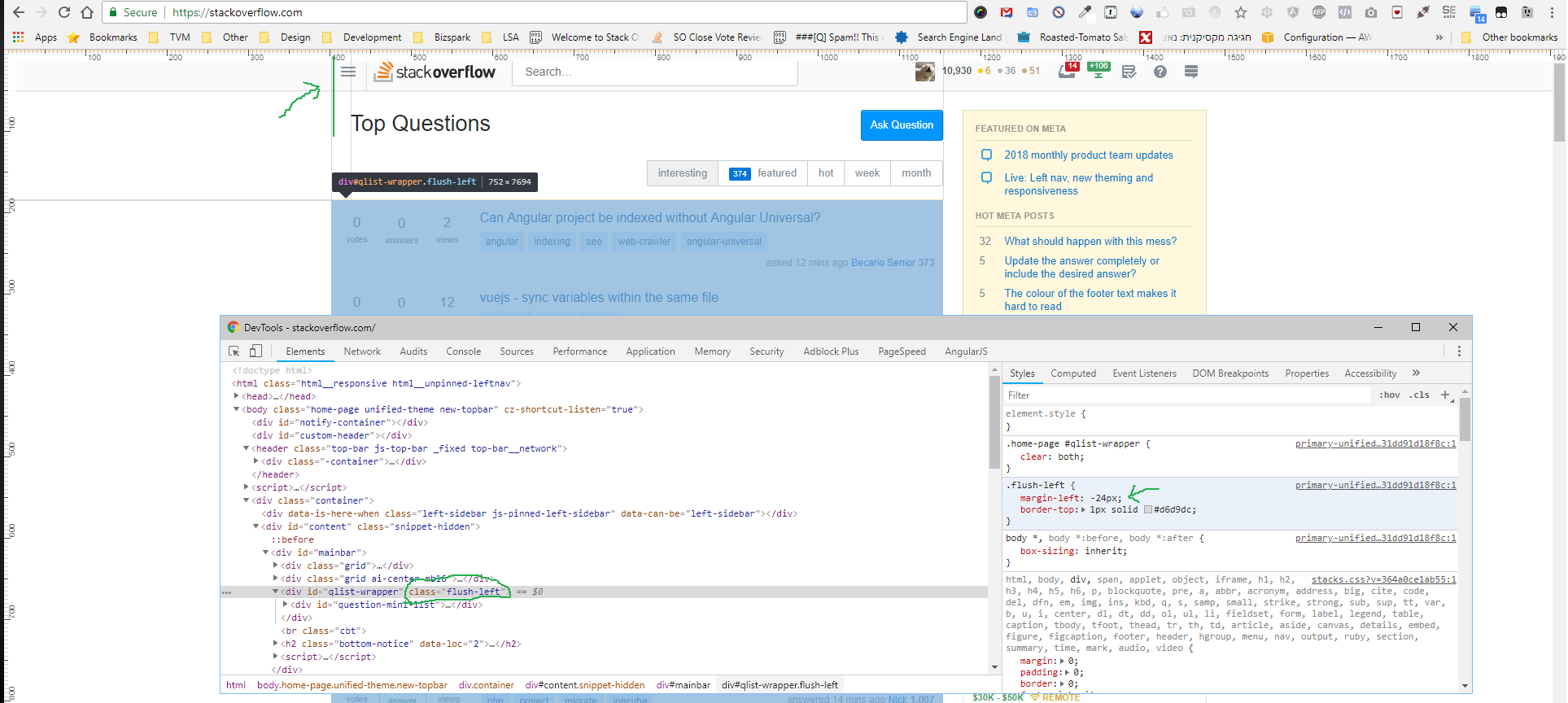
This is a screenshot of the Q&A page:
As you can see, the question list wrapper element has a .flush-left class with margin-left: -24px; that stretches the list to start from the left of the hamburger menu.
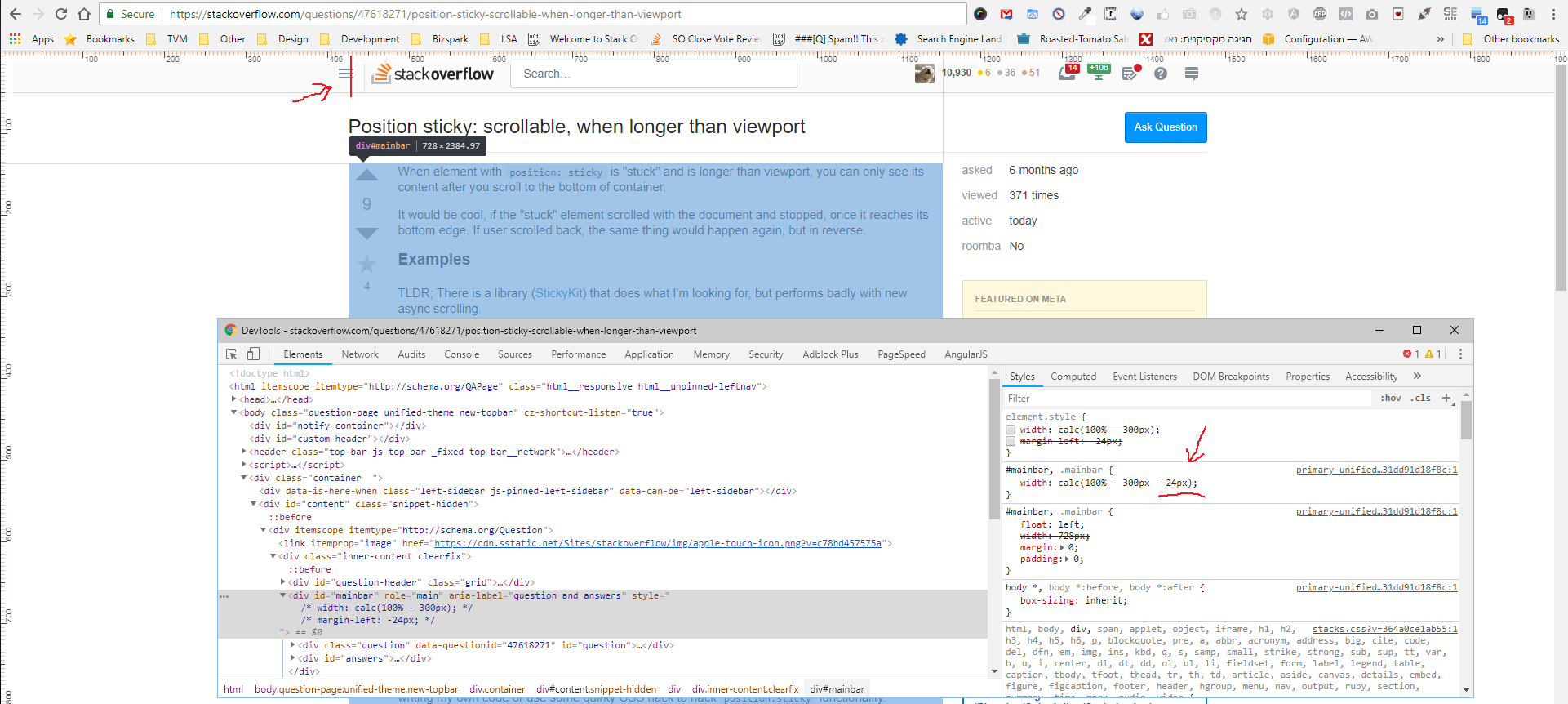
And this is a screenshot of a random question:
As you can see from the second screenshot, the body of the question has a different offset from the hamburger menu. It has the following style: width: calc(100% - 300px - 24px); (Note the: - 24px).
I believe that this is a bug because it's very noticeable and looks weird IMO. I tried changing the #mainbar element style to width: calc(100% - 300px); margin-left: -24px; and it seems to make things to look a bit better.

