108

I like the new notification version of the review icon, which I'm guessing is still undergoing A/B testing:

Red dot icon

It does a better job at saying "attention here, please" than the old icon which was almost indiscernible, and certainly easily ignored.

What it doesn't do is tell me any useful information behind the alert. It's obvious that Shog's request is not being implemented (yet), but I'm curious about the logic behind this new look.

Does the red icon light up via the same logic as before? E.g. when the review queues haven't been visited in an hour. Or does it light up when a particular queue is full to a certain threshold? I ask because only some of the queues have red dots next to them in the new dropdown style.

Also, if I have used up all my reviews in total, or for a given queue, will the red dot still appear for me if I have not visited the queues in a while? It would be a bit annoying to see a red dot for the CV queue if I have done 40 reviews already.
6
  • 1
    Just confirming I don't see this yet (support it though as it looks like my suggestion a couple months back)
    – CalvT
    Commented Aug 17, 2017 at 19:36
  • 1
    @CalvT븃 they are likely A/B Testing Some Changes to the Top Nav that's why not everyone sees it
    – gnat
    Commented Aug 17, 2017 at 19:38
  • @canon I kind of consider the notification as part of the icon, but you're right, I could word it a bit more clearly. I've edited the question a bit.
    – TylerH
    Commented Aug 17, 2017 at 19:56
  • Related: Top-bar review drop down can be much quicker (this is not really implemented, but removing the count is a good move)
    – Kobi
    Commented Sep 14, 2017 at 5:00
  • I'm relatively new to reviews and was wondering what this did too. Was really confused (did I imagine it having numbers, or did I do something wrong?). An explanation on the help center would have been nice. But maybe that's not the way to go learning about stackoverflow features?
    – Geeky I
    Commented Oct 13, 2017 at 2:45
  • Now I see it as well. Awful.
    – J. Doe
    Commented Oct 19, 2017 at 18:25

2 Answers 2

79

Or does it light up when a particular queue is full to a certain threshold?

This. Currently the thresholds are based on 90% of the max hourly value over the past couple weeks (test is done, thresholds now aspirational - see below); we'll adjust those based on the initial test results in an effort to determine if that'll help with prioritization and, uh, indicator blindness.

Kudos to the many people who suggested something like this in response to my previous thread on the matter; if it doesn't work I'm holding you all personally responsible.

September 11, 2017 - test is successful, new UI is live for everyone

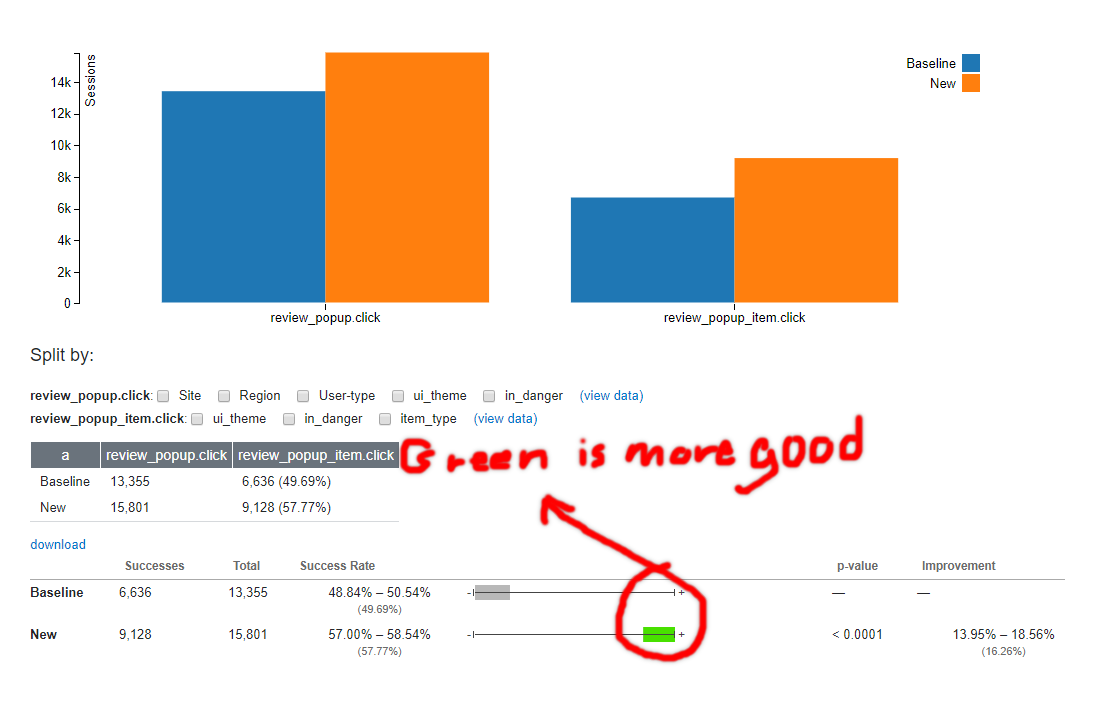
The results over nearly a month of testing were pretty conclusive: the new indicator draws more people to click the button and to click through to specific queues once the drop-down is displayed. But don't believe me - believe this screenshot of our funky internal testing tool!

about 18% more clicks to the button, with another 8% more clicks to items in the list

The BIG win here is that we can now direct folks to specific queues that need more attention - things like Suggested Edits or Low Quality. With the test at an end, I've gone and altered the thresholds to make it much more likely that those two queues will light up promptly (while hopefully keeping them high enough that folks don't end up disappointed when too many reviewers hit the queue at once). Current "danger zone" thresholds (subject to change without notice) are:

  • Low Quality, First Posts & Late Answers: 90 tasks
  • Suggested Edits: 90 tasks
  • Triage: 100 tasks
  • Reopen and Help/Improvement: 150 tasks
  • Close: 10000 tasks

Thanks again to everyone who suggested this, and especially those who patiently suffered with seemingly-random UI changes while the test was underway.

27
  • 10
    The cv queue is hopeless (you just age away my vote), the LQP queue mods will clean up, in the end I think the best use you can do of me is if I hit the suggested edit queue? Commented Aug 17, 2017 at 19:58
  • 9
    I saw the red dots, and I figured it was something like this. It would be helpful if this were also reflected on the main review queue page, stackoverflow.com/review . When I went there, there wasn't any indication of what the red dots were about. Maybe a red dot on that page, and an brief explanation such as "this review queue needs additional attention." Commented Aug 17, 2017 at 19:58
  • 9
    I'm holding you all personally responsible Sounds like 6-8 weeks is getting a redesign too
    – Machavity Mod
    Commented Aug 17, 2017 at 20:17
  • 6
  • 1
    @Shog9 Thanks, any idea about the 2nd question? An exemption for folks who have no reviews left to give?
    – TylerH
    Commented Aug 17, 2017 at 20:47
  • 1
    AFAIK, it does not take that into account, @TylerH.
    – Shog9 Mod
    Commented Aug 17, 2017 at 21:08
  • 1
    @Petter The way the system is designed, mods only come in and clean up the LQP queue when the community doesn't get it done in time or cannot agree. For really obvious cases of "not an answer", I don't have a problem with letting mods handle it. But for less obvious cases, I'd actually rather have domain experts use their delete votes. I feel better about three experts deciding an answer is of too low quality to be useful and deleting it than I do about me or one of the other mods casting a unilateral delete vote. So please don't avoid LQP entirely.
    – Cody Gray Mod
    Commented Aug 18, 2017 at 4:35
  • 4
    It doesn't seem to be working very well: i.sstatic.net/Av8un.png I see a red dot on "Late answers" but this is precisely the only queue without any item. I assume it must be some caching thingie, but still quite confusing.
    – fedorqui
    Commented Aug 18, 2017 at 11:08
  • 2
    Yeah, the thresholds for those were too low to be practical, @fedorqui - I've adjusted them to be somewhat more sane.
    – Shog9 Mod
    Commented Aug 18, 2017 at 18:45
  • 3
    Any chance we can have the numbers back? It was handy/nice to see how deep a queue was without having to leave the page you where on. Commented Aug 21, 2017 at 19:59
  • 6
    The grey circles mean there are tasks in the queue but it isn't dangerously full. The red circle means it is. @TemporalWolf
    – Shog9 Mod
    Commented Aug 24, 2017 at 20:39
  • 1
    That <10k posts in the Close review queue is not a sign of "danger" is concerning to me... That's where I think I would want to prioritize reviewer attention.
    – Cody Gray Mod
    Commented Sep 13, 2017 at 18:03
  • 1
    There are about 1500-2500 close tasks created each day, @Cody - that's more than any other queue, and each requires 3-7 reviews from folks with >= 3000 rep. The only queues that come close in volume are First Posts (which take one review per task and are open to everyone with >= 500 rep) and SuggestedEdits (which require 2-3 reviews/task and are open to post owners and everyone with >= 2000 rep). As a long-term goal, I'd consider somewhere in 5-6K to be an appropriate "danger-zone", but I'm reluctant to put that in place until we're out of the woods on the other queues.
    – Shog9 Mod
    Commented Sep 13, 2017 at 22:16
  • 2
    @Shog9 - Forgive me if this was asked, but are the thresholds going to be site definable? I mean, if Mechanics.SE gets 20 closes in the queue, that's quite a bit ... we'd never come close to 10k (heck, we are just encroaching on 14k questions total at this time). Commented Sep 16, 2017 at 11:59
  • 3
    They are site-specific, @Pᴀᴜʟsᴛᴇʀ2.
    – Shog9 Mod
    Commented Sep 29, 2017 at 16:32
6

Just in case anyone decides that the lack of any useful information behind the alert is enough of a reason to want to hide the redness altogether, @Glorfindel made a nice little script that hides exactly that part of the CSS over here.

Of course, at some point your wishes may be granted in a more constructive fashion - so be sure to disable it now and then so you don't miss any improvements.

1
  • 1
    It's unfortunate that the red circle shows when nothing is there to review as it directly conflicts with the goal of getting more attention. If a user clicks the queue and gets nothing to do they will start to learn that the red dot doesn't mean anything and they should ignore it even when there is something to review. Commented Aug 18, 2022 at 13:25

You must log in to answer this question.

Not the answer you're looking for? Browse other questions tagged .