32

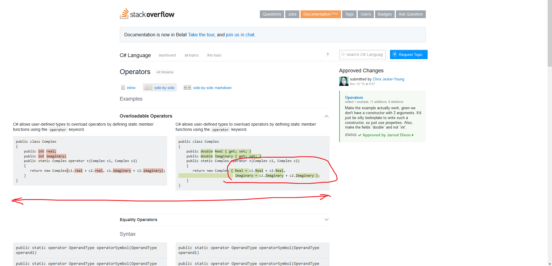
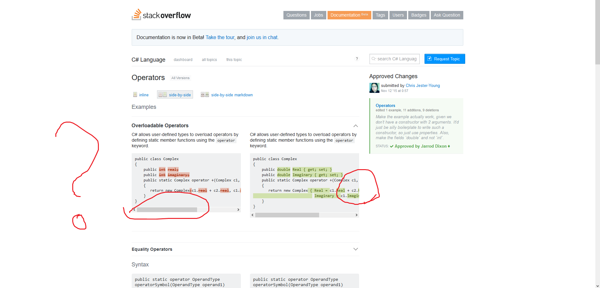
Currently it's very hard to review changes with big code blocks as columns in diffs are very narrow and viewing code requires constantly moving scrollbars back and forth. Inline mode helps sometimes, as it's only one column which is much wider, bit it's absolutely unusable if there're any code changes, not just additions.

I have a wide monitor, which is pretty standard nowadays, so it's annoying to see so much space wasted on margins.

Solution: use empty space on the left if the window is wide enough.

Here's user CSS I'm using:

@media (min-width: 1180px /*calc(1060px + 60px * 2)*/) {
    .side-by-side-html,
    .side-by-side-markdown {
        width: calc((100vw - 1060px) / 2 + 728px - 60px);
        margin-left: calc((1060px - 100vw) / 2 + 60px);
    }
}
@media (min-width: 2636px /*calc(1060px + (728px + 60px) * 2)*/) {
    .side-by-side-html,
    .side-by-side-markdown {
        width: 1456px;
        margin-left: -728px;
    }
}
6
  • They can also put the right column at the top and expand the side-by-side area. That is if they actually considering implement your necessary request
    – Alon Eitan
    Commented Aug 19, 2016 at 11:42
  • @AlonEitan Even if the sidebar is removed, it won't be enough to make both columns full-width, but yes, it makes preserving center alignment possible, which I guess is better from designer's point of view. (I just chose the simplest route for my user CSS.)
    – Athari
    Commented Aug 19, 2016 at 11:50
  • 6
    I don't see why this should be limited to diffs, in general I think the site should make better use of wide screen monitors and let the user decide how wide to make everything based on window size.
    – Joe W
    Commented Aug 19, 2016 at 12:53
  • @JoeW I don't like too long lines as they're harder to follow with eyes, plus it'll motivate users to not wrap code lines which is bad. :) And resizing windows isn't really a solution as window borders make it harder to click on controls at the edge of the screen (title bar, scroll bar etc.). Though looks like studies are inconclusive on the line length.
    – Athari
    Commented Aug 19, 2016 at 14:28
  • 1
    You may not like the long lines and have issues with resizing the windows, but for me all the wasted white space on the screen drives me crazy. It shouldn't be to difficult to have two css styles, one to maximize screen usage and one for the current style that is down the middle of the screen.
    – Joe W
    Commented Aug 19, 2016 at 14:31
  • @JoeW I doubt it'll ever happen, so you should head to userstyles.org, I think there were some styles with content having 100% width.
    – Athari
    Commented Aug 19, 2016 at 14:34

1 Answer 1

14

This feature is planned as part of the review queue updates announced in the August 4th Documentation Update.

5
  • I guess it's not explicitly spelled out in that post, but you can see in the screenshot that the available space for the diffs is greater than the current UI.
    – Kurtis Beavers Staff
    Commented Aug 19, 2016 at 14:32
  • Speaking of the screenshot in that post, will filtering be limited to just 3 tags, like in the rest of the queues?
    – Athari
    Commented Aug 19, 2016 at 14:37
  • @Squidward that's still being worked out.
    – Kurtis Beavers Staff
    Commented Aug 19, 2016 at 14:42
  • status-completed?
    – Athari
    Commented Oct 2, 2016 at 16:54
  • I've just asked a question that has been marked as a duplicate of this one. Let me ask you a couple of things: 1) What's the current status? 2) Is it only about documentation, or will it also be applied to other diffs, like the one while reviewing suggested edits (which is what I am focusing on)? Commented Mar 30, 2017 at 23:00

Not the answer you're looking for? Browse other questions tagged .