32

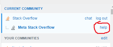
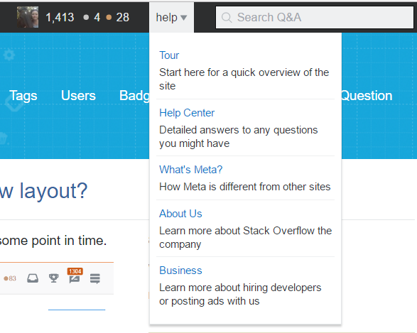
I am happy that help made it back into the design.

enter image description here

\o/ yay

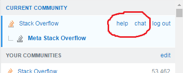
That said, there seems to be an issue with some users reading the link instead as "help chat". For example, in c# we are getting users asking about their question bans. I assume they just clicked on the first chat tile and we happened to be the most recent one, which would also imply that other rooms have seen this happening recently as well.

enter image description here

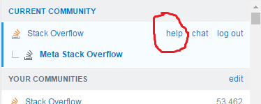
Perhaps, it could be moved down just one line? Just to differentiate the two?

enter image description here

Alternatively, as suggested by BSMP in a comment there could be pipes used to differentiate the links

enter image description here

Or maybe there could be a different color scheme used, or hover effect.. something? Not set in stone on either approach, any suggestions for alternatives would also be appreciated.
5
  • 21
    Moving it down could imply that the help link is for Meta instead of the main site. I get what you're saying about placing them together but if new users are thinking that help and chat are the same link then they'll likely make that mistake too. Maybe pipes between the links? help | chat | log out
    – BSMP
    Mar 9, 2017 at 21:46
  • @BSMP - Yeah the implication of help being for meta instead of main is true (although they are the same page). However, I really like the pipes. That is a good idea. Perhaps you can post it as an answer? Here is what it would look like: i.imgur.com/7VEOd2p.png
    – Travis J
    Mar 9, 2017 at 21:50
  • Conversely, I suppose that sending users to chat to ask mundane help questions could also be seen as a bonus feature.
    – Travis J
    Mar 9, 2017 at 21:52
  • 1
    I actually have to drive someplace very shortly. I don't mind you posting that as an answer or editing into your question though.
    – BSMP
    Mar 9, 2017 at 21:57
  • 2
    Well I vote for the pipes, looks nice and clean.
    – Gimby
    Mar 10, 2017 at 11:43

3 Answers 3

25

The help obviously needs to be visible directly at the main page, without the need to go click some strange unintuitive monochrome burger-shaped icon. To hide it away in the burger menu creates a worse site for everyone.

  • New users can't easily find the help. This will potentially lead to overall lower quality of the site.

  • Helpful users can't easily find the help when they need to link it to the newbies. Personally I thought it was removed from the menu entirely until I saw this post.

    (Being a 1337 haxor, I found it by typing out https://stackoverflow.com/help instead).

Edit after clarification in comments below:

The solution is to keep the question mark icon on the menu no matter who the user is.

5
  • 2
    "Helpful users can't easily find the help when they need to link it to the newbies. Personally I thought it was removed from the menu entirely until I saw this post." so true
    – ASh
    Mar 10, 2017 at 13:39
  • 2
    The help is visible to unregistered users as another menu item (open in an incognito tab/log out) not sure about new/low rep users though Mar 10, 2017 at 13:42
  • @TheLethalCoder So if a newbie asks me where to find the help and I tell him to click on the monochrome burger, they won't find it there?
    – Lundin
    Mar 10, 2017 at 13:47
  • @Lundin They'll see it there as well (screenshot taken from incognito mode in chrome) i.stack.imgur.com/doTAI.png Mar 10, 2017 at 13:50
  • "The solution is to keep the question mark icon on the menu no matter who the user is." Definitely the ideal solution.
    – Travis J
    Mar 10, 2017 at 20:31
5

For a new user this help link is not visible from the current menu and it took a meta post on MSE for me to figure out where it was (so how a new user will find it, I do not know)

enter image description here

The help section is in the footer

enter image description here

You have to click on the sites bar on the right and it's not clear where to find it by looking at the icons.

enter image description here

Unlike the current layout for all other sites

enter image description here

which is much clearer on where to find things, with a drop down menu

enter image description here

The help section needs to be in a prominent place, with a drop down list, as we are so often referring new users to it.

2
  • 2
    Dunno who downvoted but I agree - we need to help new users understand how to ask as much as possible... Mar 12, 2017 at 2:54
  • New users are taken through the full-page Tour when they sign up. They then proceed to ignore it. Don't bother wasting time making "help" prominent. Mar 12, 2017 at 14:55
3

Instead of pipes for distinguish items I suggest to use dots like already used in achivements popup:

achivements

1
  • Consistency is a good thing. If we use pipes in one menu, we should us them everywhere. Otherwise, reuse the dots. Jun 5, 2017 at 16:05

You must log in to answer this question.

Not the answer you're looking for? Browse other questions tagged .